


The finished product. The club wanted to remain true to their old colors, along with retaining a badge, so I created one that gave a more modern and sleek visual approach. Additionally, I left space below the building logo to include the Eller College / University of Arizona logo to visually tie their student organization alongside the University of Arizona.

This was the starting point for all the logos. I wanted to reinvigorate the club's old logo, which had an illustrated version of the Arizona School of Business, Eller College. Instead of redoing an illustration, I went for a more modern and minimalist approach to the building aspect of the logo. I wanted to juxtapose the minimalist lines of the building with the weight of the type, so I opted for Bio Sans Bold.
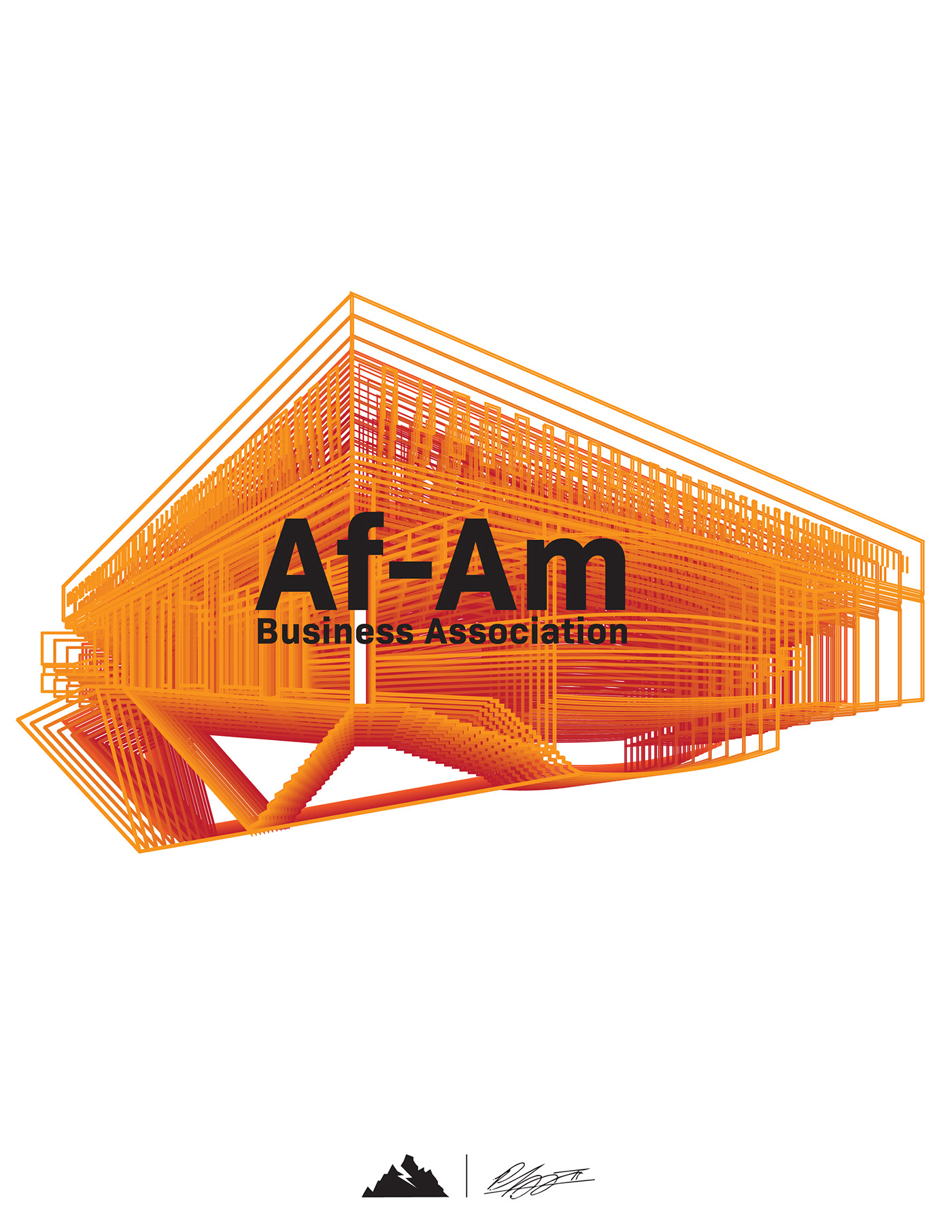
An abstracted version of the base (line) logo using the Blend Tool in Illustrator. In my opinion, this logo would best serve as an eye catching poster or email invite for events.

This was the first logo created after the line drawing of the Eller Building was made. Instead of having the full "African American" Business Association, I wanted to play around with the abbreviation. Af-Am had a nice balance, and felt sophisticated aesthetically. However, the club went with a different direction out of the mockups.


