
This is the work process of my design for a coffee cup for Frans de Grebber, a local coffee roaster and shop with whom I've been collaborating on coffee packaging for a while.
Because the client and I have been working together on previous occasions, the brief wasn't complicated: design a happy, character-based, summery coffee cup to be used for takeaway coffee in the shop. Include Frans' black caravan that is used at events.
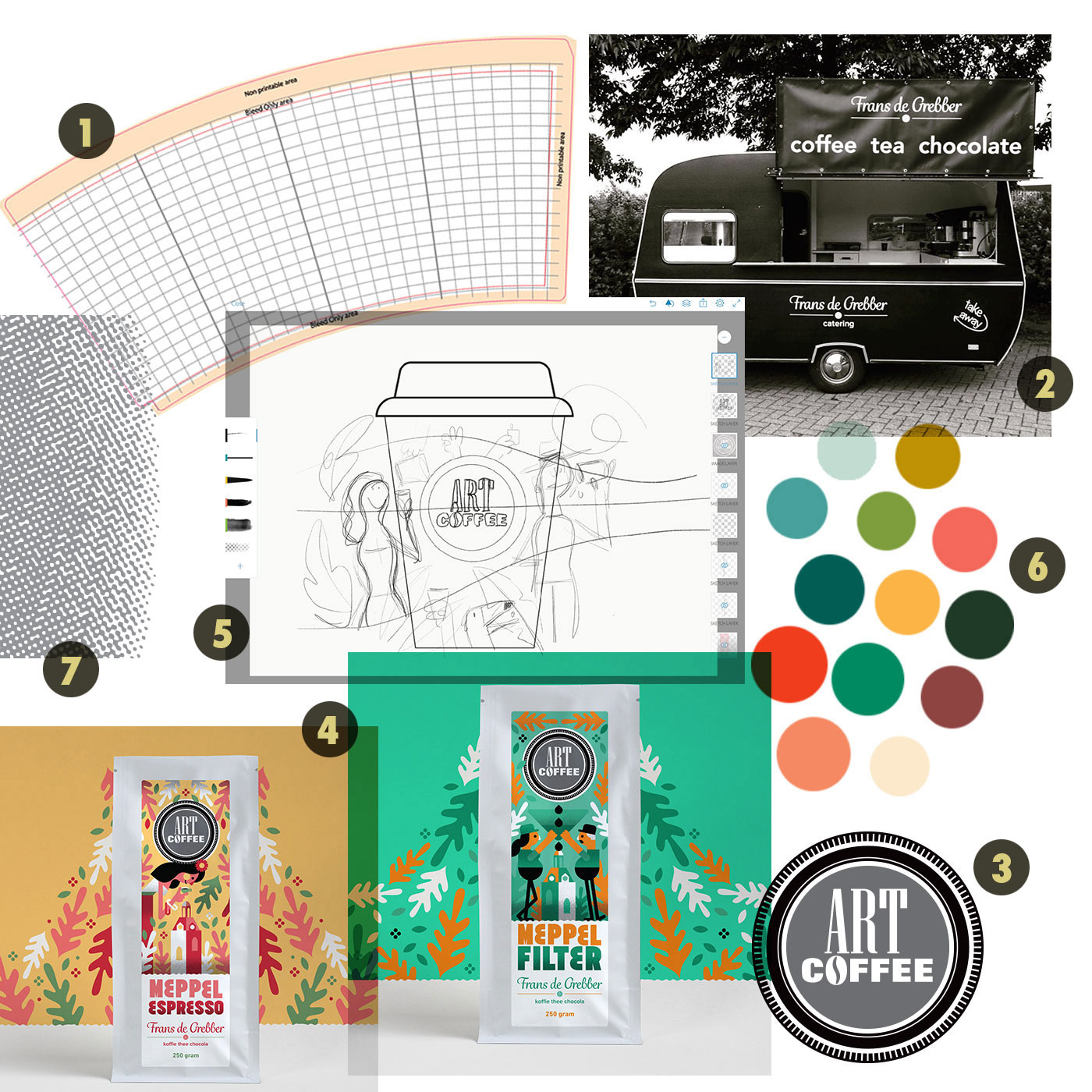
An overview of the project before going digital:
1. The design template. I like to work context-first and it's great to have the dimensions and technical specifications ready before starting illustrating digitally.
2. Photo reference of the caravan to be included in the illustration.
3. Art Coffee, the logo for the label of Frans de Grebber.
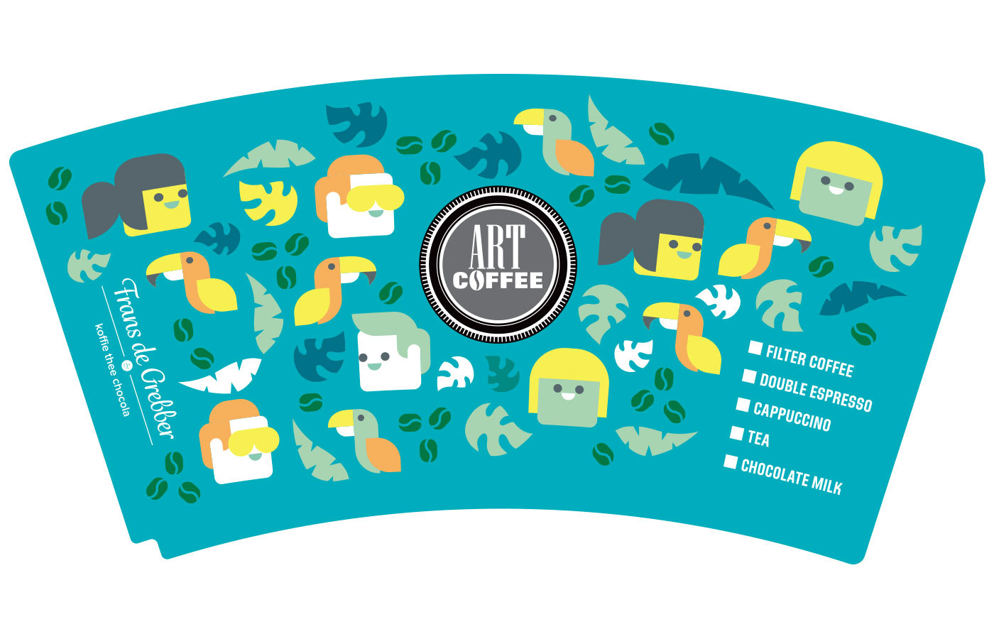
4. A couple previous illustrations I made for the client used for reference as we need to keep the same vibe and style to tie the individual projects together.
5. A quick, loose sketch for the concept on my iPad: a layered landscape with characters.
6. Reference colours that I gathered from previous work, online inspiration and saved palettes. I am never strict with a reference palette but I like to have an initial direction to start with.
7. I made a custom print pattern that I want to include in the illustration to add additional depth.
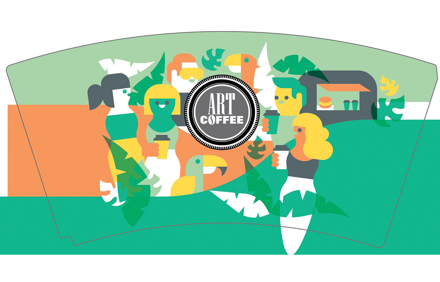
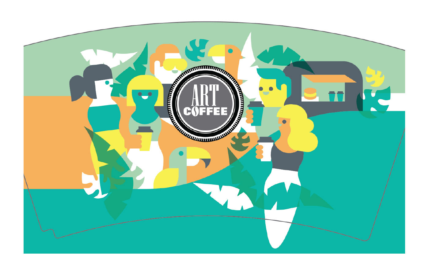
First steps after going digital: Comping out a scene of characters, plants, the caravan and birds. I am often asked to do character based work which is why this part of the process is really smooth, intuitive and in-the-zone. For me, composition-heavy concepts with multiple characters always evolve digitally which is why I didn't spend a lot of time sketching on the iPad. I knew what I wanted to go for and knew it needed a bit of playtime directly in Adobe Illustrator.
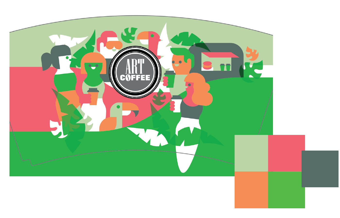
A colour variation. I have a blog post on how I explore colours using Photoshops' Hue menu.
Another variation that is a bit toned down but lacking depth and warmth.

Final colour palette. Added a salmon colour that's pretty close to the moodboard actually, and took better advantage of depth created by overlaying colours. Added the copy and shop's logo.
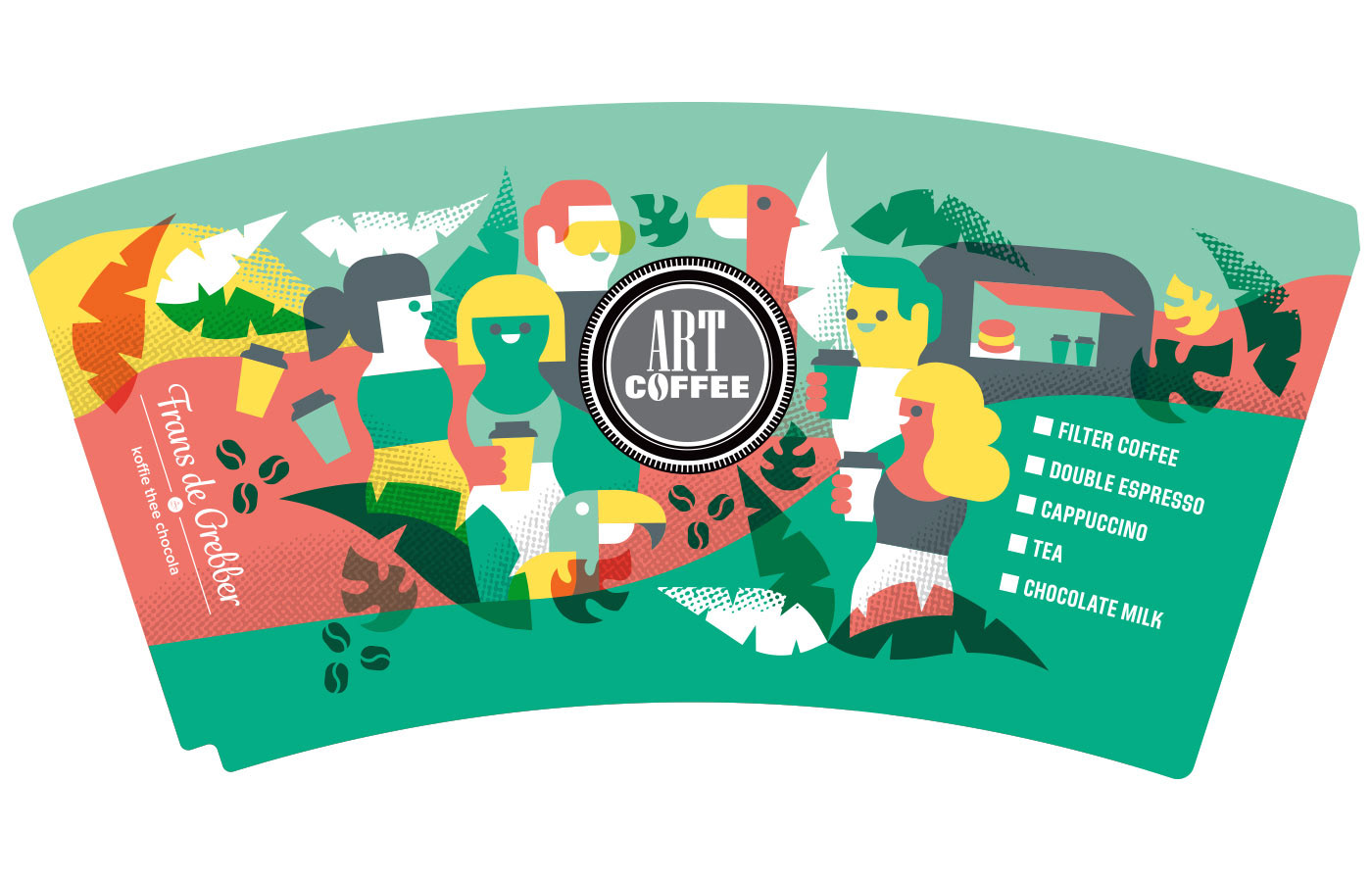
Added the texture to create more depth and to break the clean shapes. I made a print proof and realised the copy needed to follow the curve of the template for the text to appear horizontally on the coffee cup. Making a lot of coffee cups for my side project Drip For Drip helped a lot in understanding working on a 3D cup template.
A little detour as I wanted to see what happened if we tried an isolated shape direction. Looks fun and playful but hasn't enough of an identity to work well on the cup.
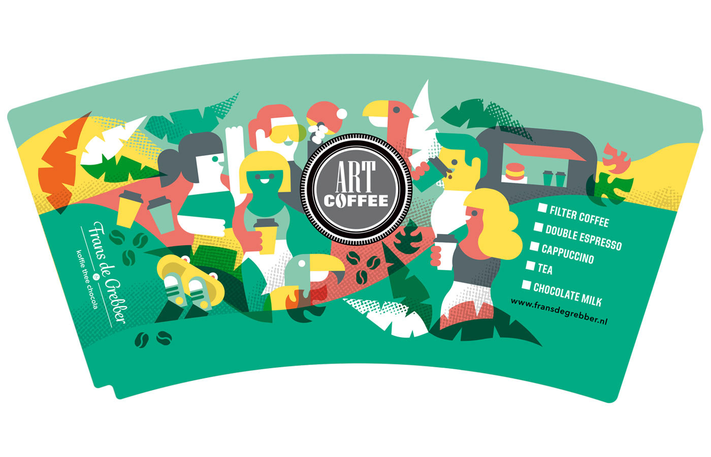
After sharing the last version with the client we did a round of revisions. Added more dynamic to the characters by adding coffee slurping, pingpong and a skateboard. The client also wanted to horizon to match as closely as possible. We changed the background colours so that the green base colour wraps around the cup when printed. Doing these small changes breaks up the rhythm so I had to move some shapes around to make it work again.
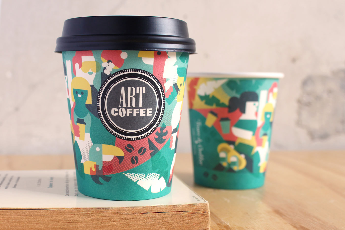
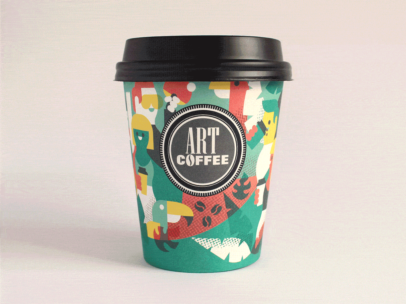
The final printed cups!