

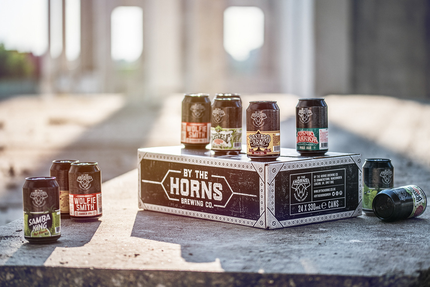
Client: By The Horns Brewing Co.
Task: Logo design / packaging
Design: Nebojsa Matkovic
Photo: Milos Milenkovic
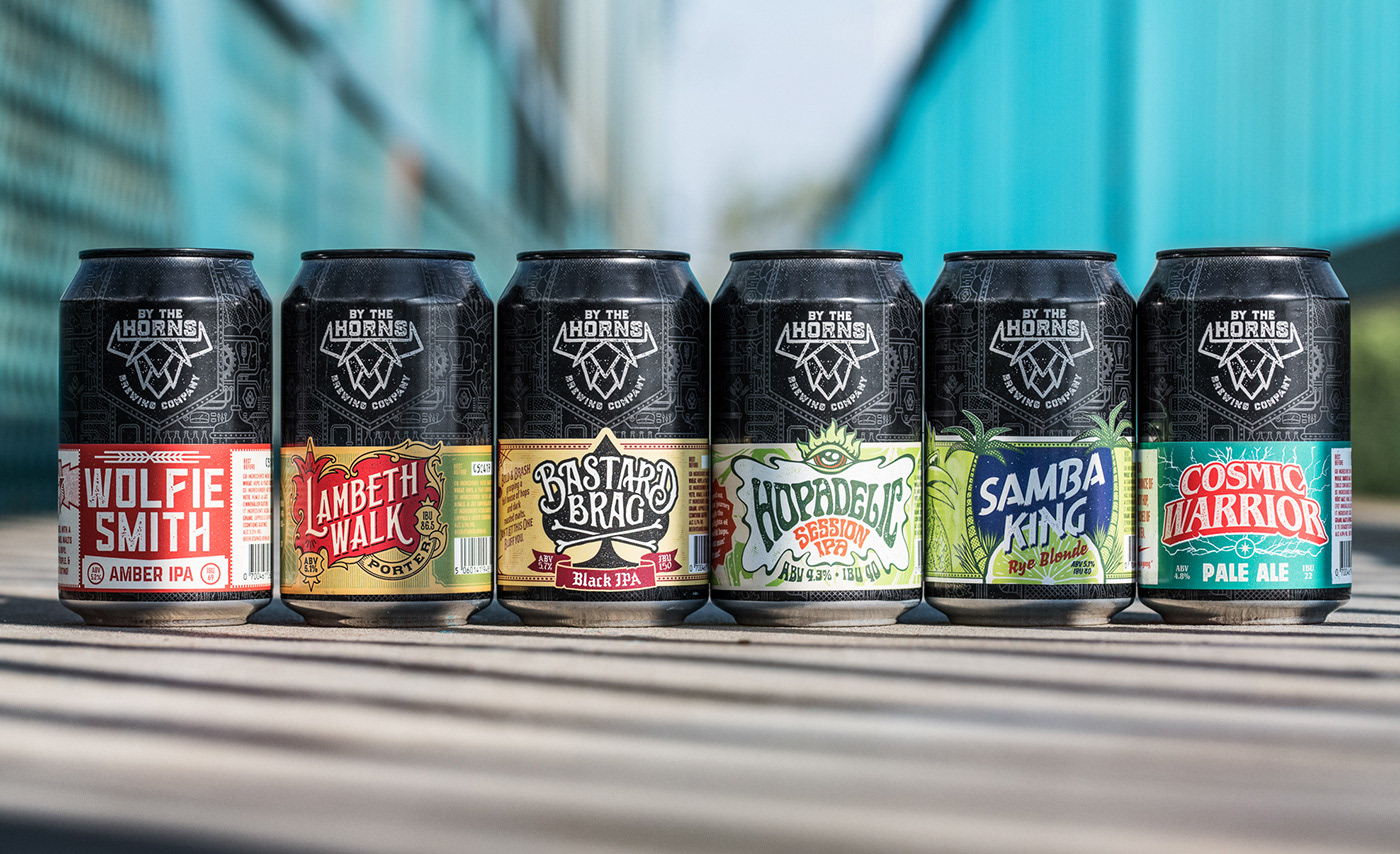
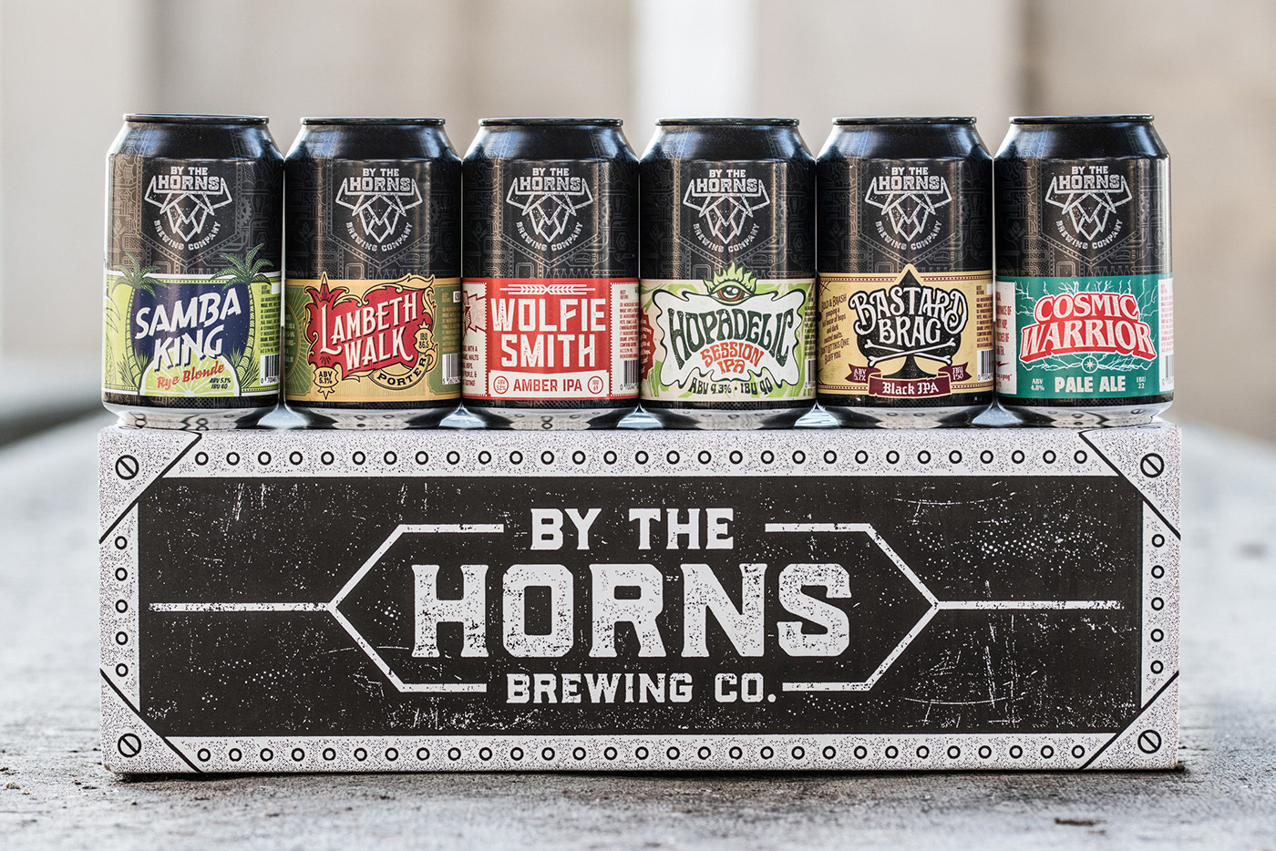
By the Horns is a London based brewery working since 2011. and for the 2018 they planned to launch their first can line.
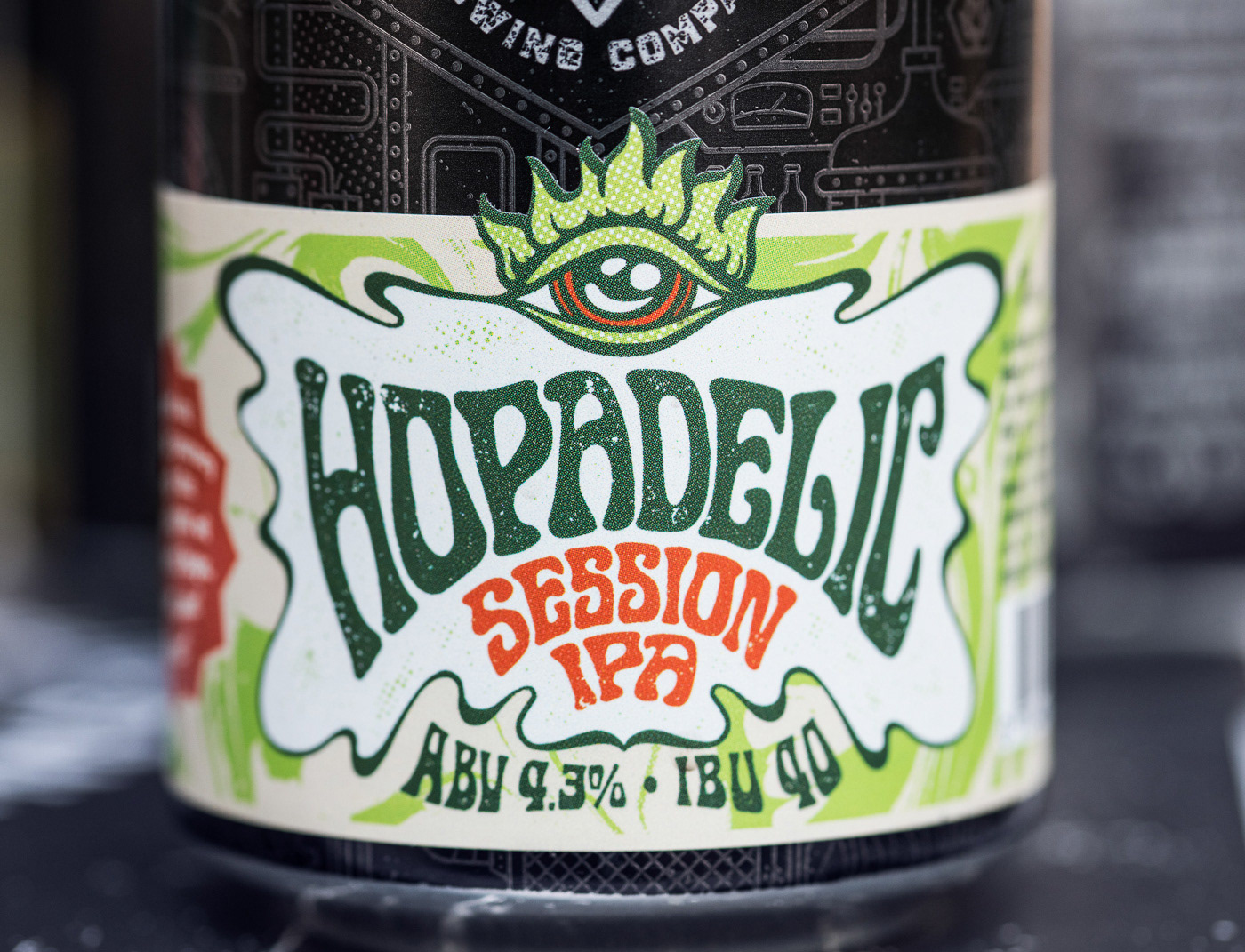
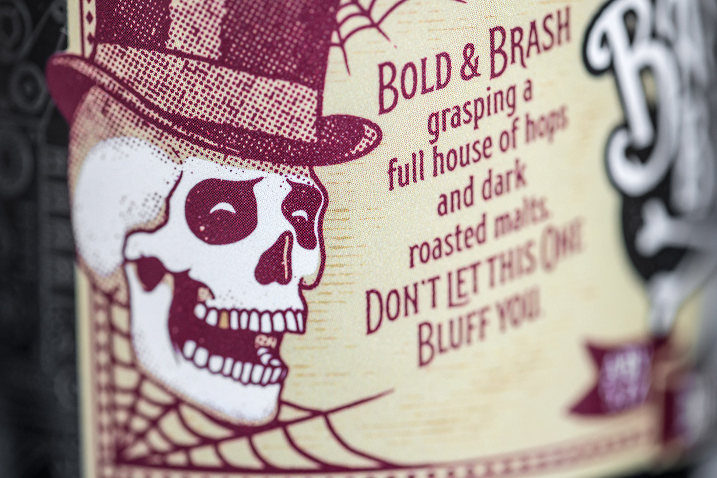
I got a short description of the art direction: "we want a bold looking design with a combination of vintage / retro / steampunk and a touch of grunge for the old factory feel".
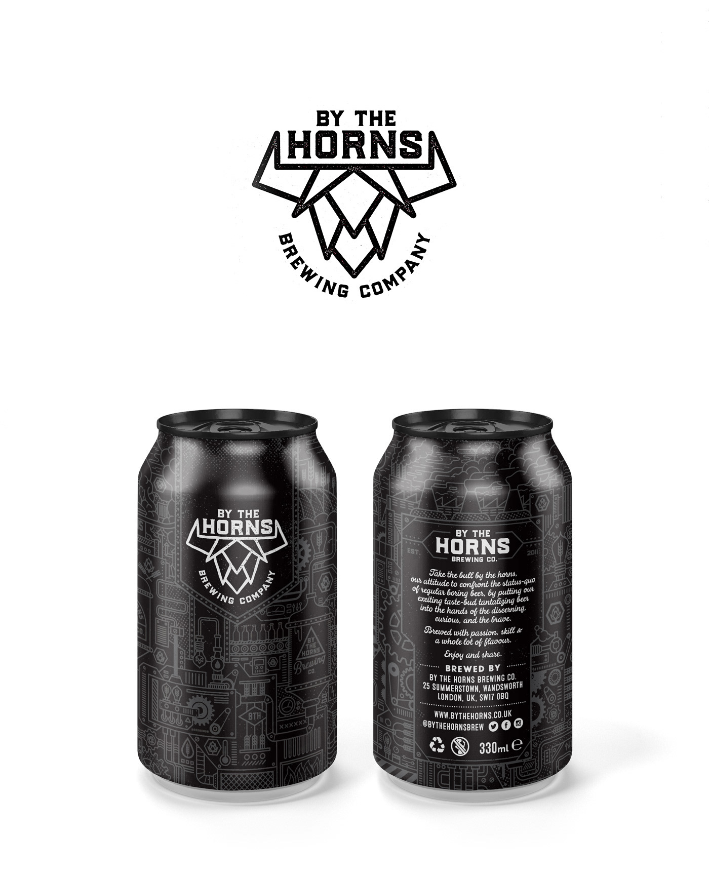
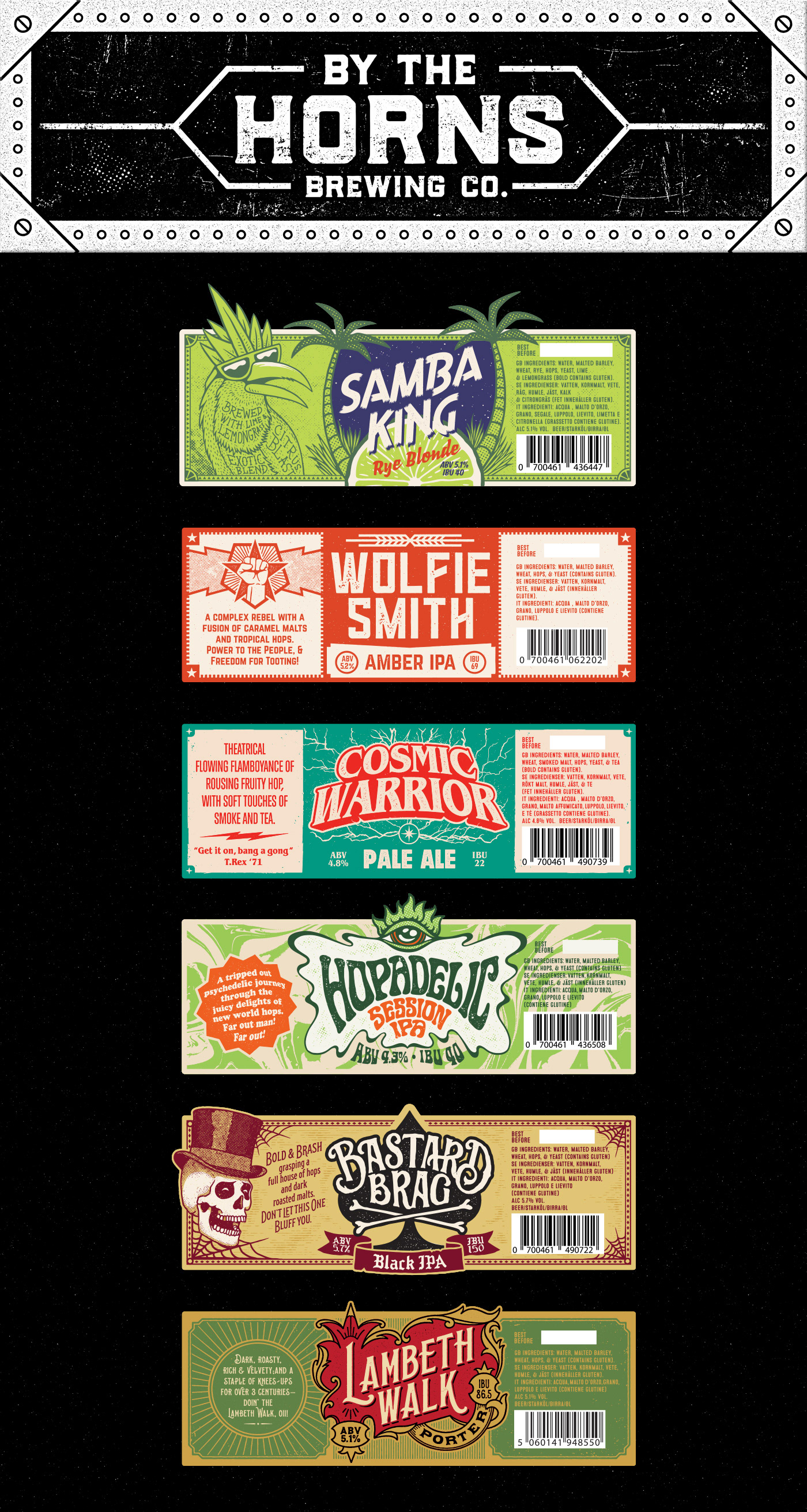
My task was to design a logo, default beer can, labels for their 6 core beers, keg badges and shipping box for the cans.
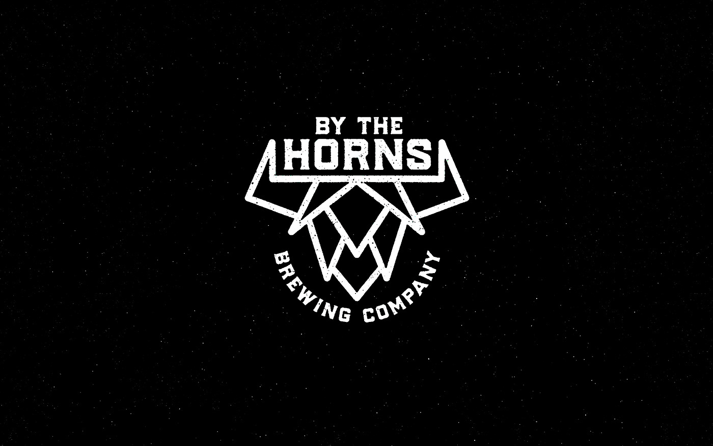
Logo concept: "To have the bull by the horns" means to have the situation under control... this guys are making some tasty beer so in this matter they have things under control... hop with bull horns as a brewery symbol? Sure!
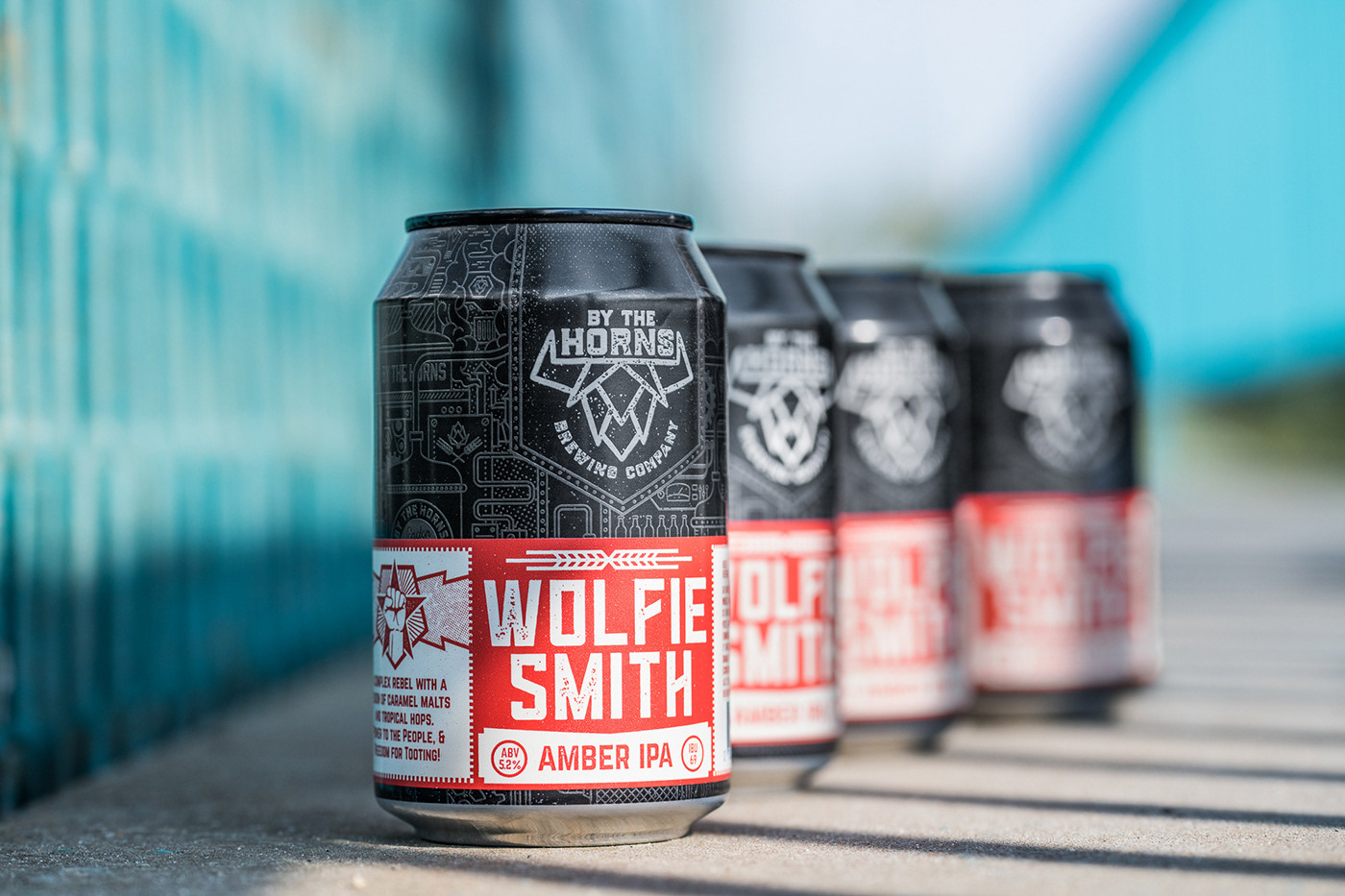
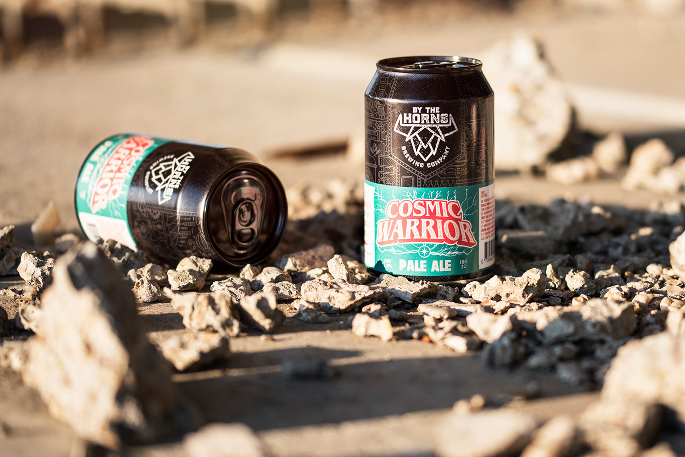
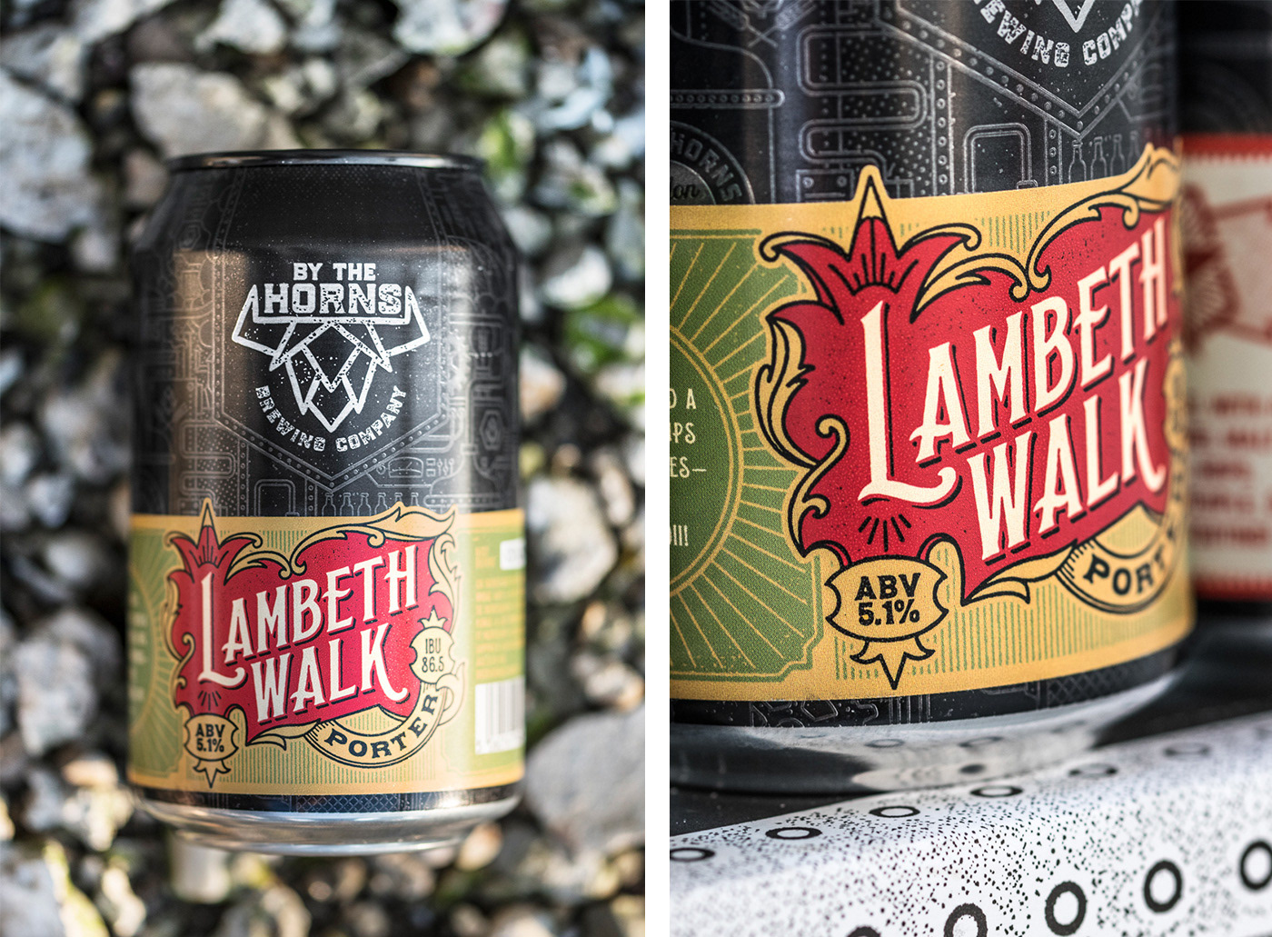
Can design: Cans would be printed in the print factory and labels for each beer would be added later in the brewery. Since each beer is a story for itself I needed to come up with a can design that is subtle, that will just add some depth to the overall look when each label is placed.
-
visit BY THE HORNS


Thanks for watching.
Cheers!


