
Perfumaria Phebo: Before and After
Think of a traditional brand. For a Brazilian, there’s a big chance Phebo went through the mind. Founded in 1930 in Belém by the Portuguese cousins Antonio and Mario Santiago, Phebo was born with the vision of being a very high quality perfumery, with remarkable and original fragrances.
So many years and many new products later, its classic product is still the traditional Odor de Rosas soap bar, which almost every Brazilian has used and have fond olfactive memories. For these classics, the logo stamping the packaging is called the Phebo Tradicional (Phebo Traditional).

Phebo Tradicional - the mother brand and original logo

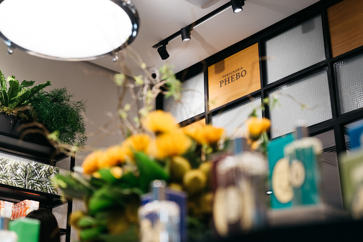
For the fine perfumery line, a lesser known logo was used. The creation of a new concept store for Perfumaria Phebo was the perfect time to revitalize this logo and breathe a new life to the brand.
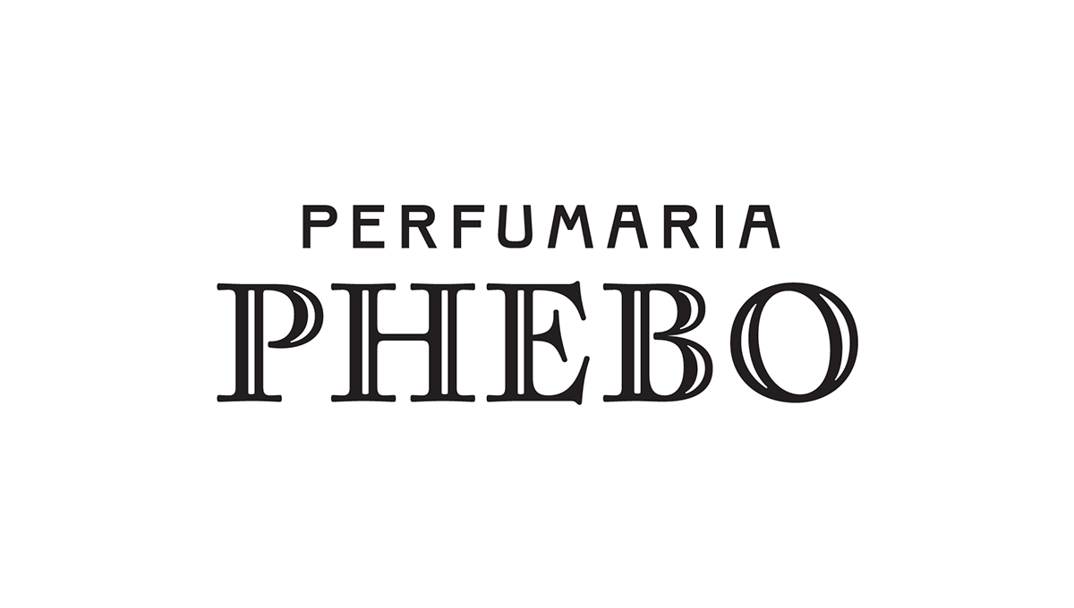
The new Perfumaria Phebo logotype
Starting from function
The main points of practical improvement of the logo were functional, since the former had been created with out-of-the-box fonts, without the refinements that a logo to be used in various sizes and contexts should receive. We tackled this by designing a center aligned, compact mark. We also removed the sun symbol, which was making the previous logotype unbalanced.
Inspired by the brand’s rich history
The traditional Phebo logo and the rich graphic history of Phebo and its sister brand Granado was the starting point for our design. We researched their vast archive of advertisements, packaging and typography spanning through decades. We drew the word Phebo with the same chiselled style of the Phebo Tradicional logo. The difference was that all letters are upper case, organic rather than constructed and sport more calligraphic details than the original.

Details
1. Lettering inspired by a Casa Granado Type Specimen from 1943.
2. Phebo Tradicional style chiselled finish.
3. Organic, broad-nib calligraphy inspired flairs.
4. Diagonal stress, also a consequence of the broad-nib calligraphy. Of the 5 letters, the O is the only one that shows the stress more clearly.
5. Center aligned logotype composition makes it easier to use in different contexts.
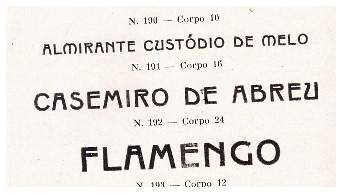
With Phebo well resolved, the word Perfumaria should also be a carrier of the brand’s vintage personality. We began by abusing the idiosyncrasies of a source we found in a type specimen for Granado’s own printing house, dated 1949. As we further reviewed the wordmark, we realised that making the letters more integrated would make it simpler and more timeless.

Launching a new classic
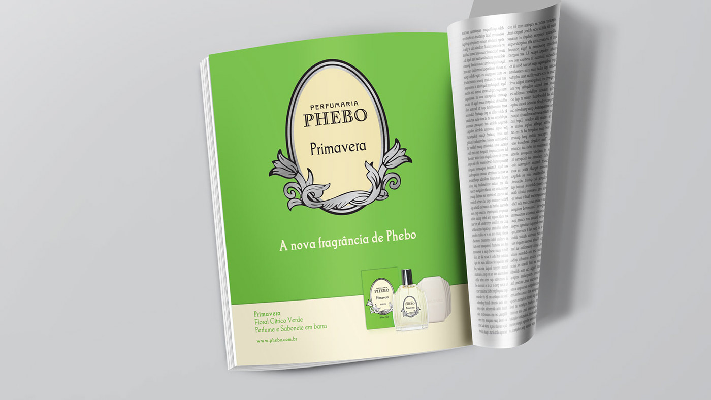
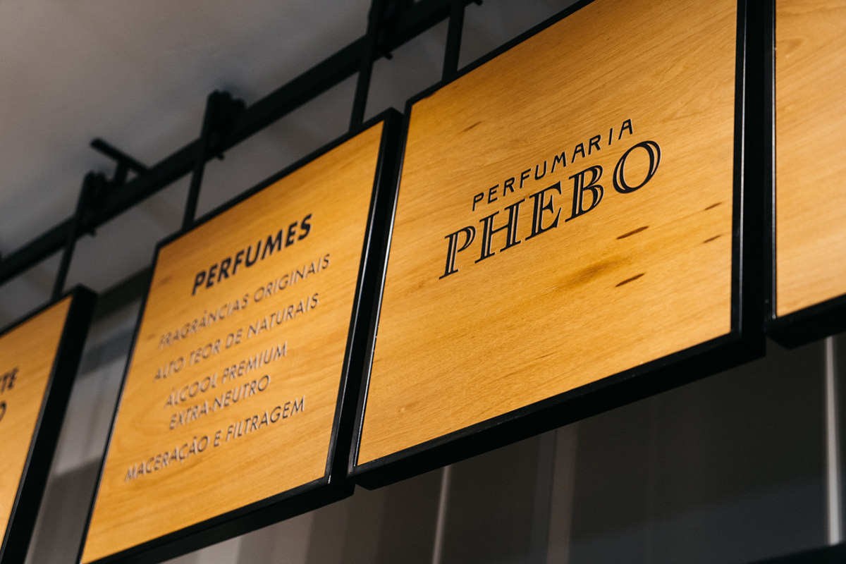
With the logo approved, we also created the “Phebo, desde 1930” seal and the isolated Sun symbol. We also added versions for reduced size applications, with generous letter spacing and no chiselled effect.






Credits
Art Direction Mai Silva, Isabel W de Nonno, Higo Lopes.
Lettering & Type Design Flora de Carvalho
Creative Direction Rodrigo Saiani
Architecture Jorge Nascimento e Adriana Saggese
Graphic Design Flora de Carvalho, Carlos Mignot, Rodrigo Saiani


