

Bloc Intimates was an exercise I had during my time at Bloc.io when I was learning code. One of their coding assignments was to design an interface for an e-commerce site called BlocShop where I would sell a product or service. That assignment evolved into Bloc Intimates.
I wanted to keep the name Bloc and use it as a euphemism for a woman’s unmentionable place. I wanted it to have two sides, upscale and sexy like La Perla, while also being accessible to the general public as Aerie by American Apparel.
PINTEREST & MOOD BOARD
All of my projects start with a Pinterest board that have a minimum of 5 icons, logos, websites, collateral, and general photos to speak to the brand and its field as well as six keywords chosen by the client. Bloc Intimates 6 words were:
Sexy Flirty Flushed Rich Confident Silky
On my Pinterest board I gravitated more towards lacy, flowery lingerie pieces and very feminine logo designs.
I wanted to brand to be sweet, blushing and sexy. For the color scheme, I went towards shades of blush and rose, from light to dark. In my opinion, the final colors resemble the tones of a woman’s cheeks when she blushes.


LOGO CREATION
For the logo, I wanted to use the shape of a box or block for the icon and try out how to embellish the box along with the font for the logo. That lead to the three choices below.
I wanted options that had a mixture of font types and really emphasized the spelling of “Bloc” and then whispering “Intimates.” I wanted the word “Intimates” to feel and look intimate to the viewers! My number one choice was the middle one with the last being a reliable alternative. I wanted the box to be as delicate as the name but then realized when the box becomes smaller it would lose the thin, inside line and merely be a square.
In the end, the final logo was a combination of my first two choices.


BRAND FOLIO
All of my projects also include a brand folio which houses all of the information relevant to the company and its brand. From the brand color, logos, fonts, and more.


LAUNCH FILES
I kept the shape of a square for the business card as well. It was an easy choice and made sense since different size business cards are becoming more common and more in style.
The other launch file chosen was a package of 3 hero images. All are promoting a vital component of the brand, the flowers, the basics, and the lace.


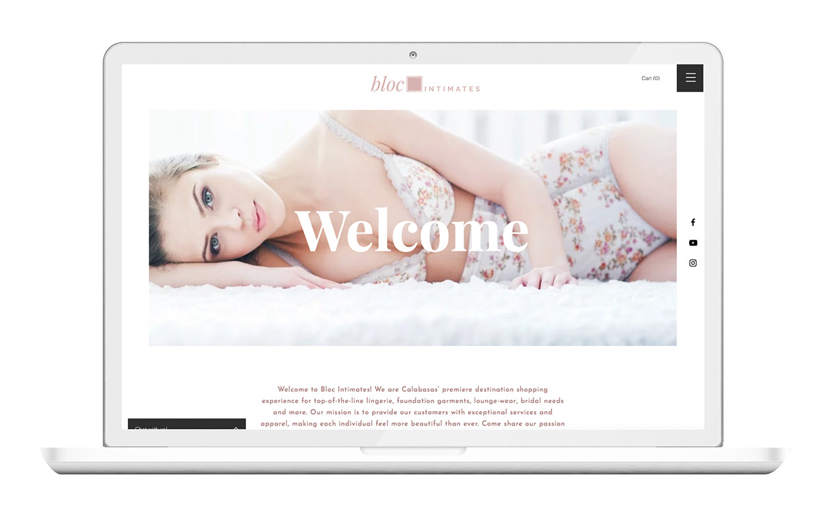
WEBSITE
For the website, the goal was to keep it as simple as possible. The brand is soft, so the site became that as well. It’s almost barely there but covers the key areas, just like the lingerie it sells!
As a whole, this was the most fun I had in creating a brand. When I showed the final package to my design community, they weren’t expecting BlocShop to become a lingerie brand and honestly neither was I! It turned out to be tasteful and understated. Only a few people caught the double meaning behind the name, but only when they thought about it.


