Credible, Professional & Dependable.
Ashford & Ashford’s mark holds great symbolic importance to the company as a whole. Two main ideas founded the mark. The first: to create a very structured mark to convey stability, credibility, and legality. The second idea was to use an underlying organic feeling in order to communicate reliability, approachability, and accessibility.
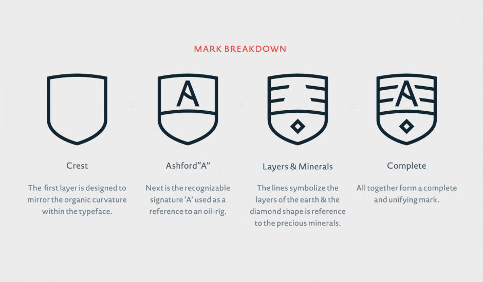
This balance was struck in both the typography and the crest itself. The typeface is structured yet curvilinear. When creating the crest of the mark, we did so in layers. The first layer, the outlining of the crest, is designed to mirror the organic curvature within the typeface. Next was the incorporation of the signature ‘A.’ The 'A' is used as a reference to an oil-rig, in relation to the work of Ashford & Ashford. Finally, three curvilinear lines were integrated behind the ‘A’, used to symbolize the layers of the earth. The placing of the diamond in the lower half of the crest was chosen as a reference to minerals.


