Branding Campaign
Our Challenge
The OFFF Festival was born a decade ago as a post-digital era festival. A meeting place to host contemporary creation together with conferences, workshops and
performances by the most relevant artists of our time.
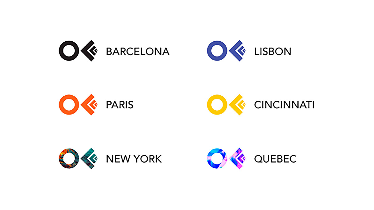
These days, OFFF keeps being a reference event throughout the world and its celebrated in Barcelona, New York, Lisbon and Paris
Our challenge was to develop a complete rebranding for the OFFF Festival accord to the new international recognition of the event; a unique new website and an app for the attenders.
Creativity
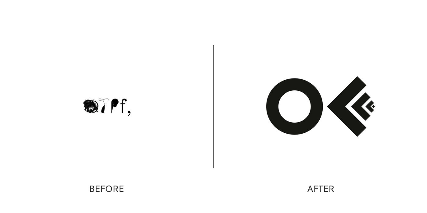
In its beginnings the festival was presented as Online Flash Film Festival because of its target. After adding more creative disciplines into the festival, the three F lost their significance.
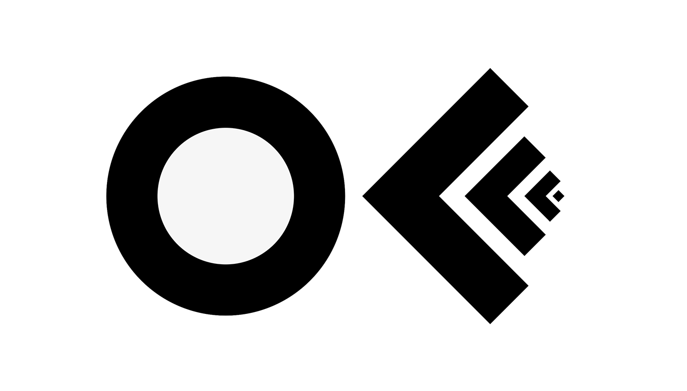
We created a brand new graphic identity focused into an imagotype to synthetize all the meanings and nature of the OFFF Festival.
Proposal
_______________________________________________________________________________________________________________________
New Logotype
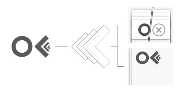
The new concept represents the values of the Festival. We created a logotype that projects the nature of the Brand and its meanings.
We have put the “Creative Point” together with the “Constant movement and layers of the event”.
This new whole creates a reinvented imaginary of the brand.
__________________________________________________________________________________________________________________
Applications
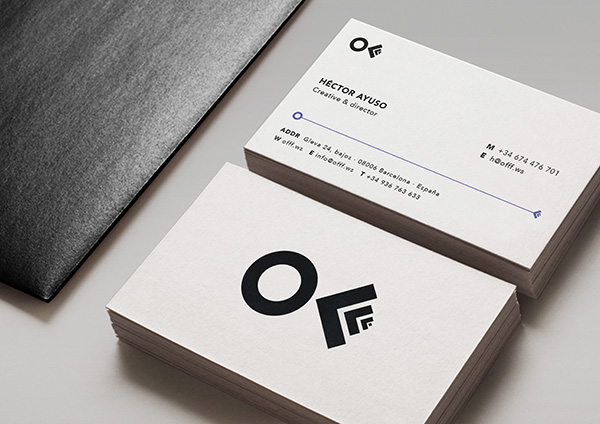
Stationery
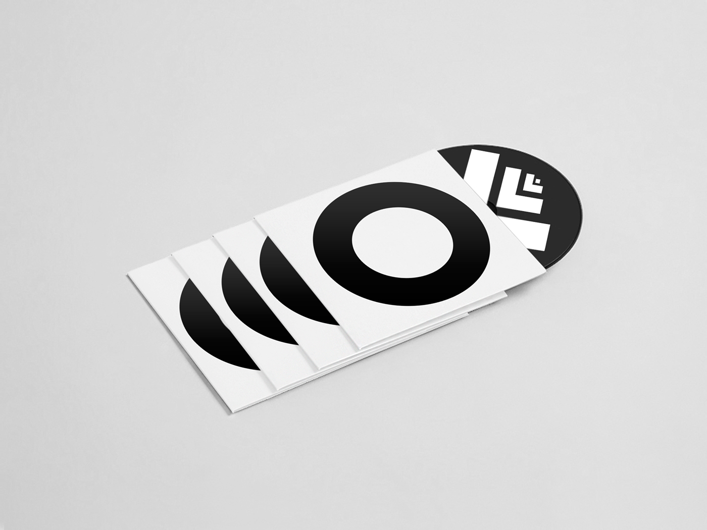
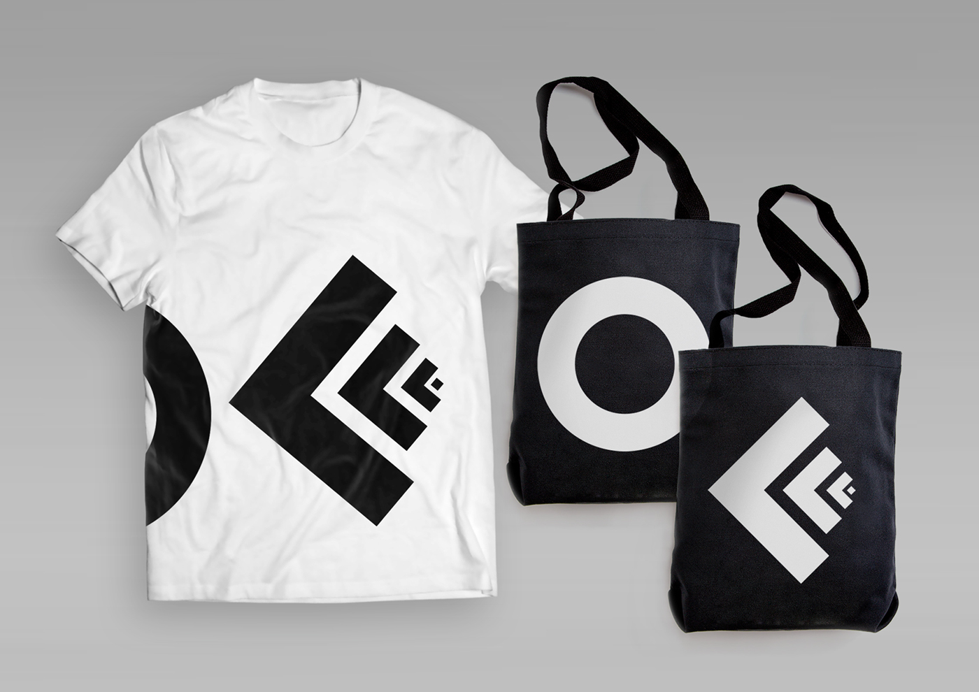
T-Shirt & Bags
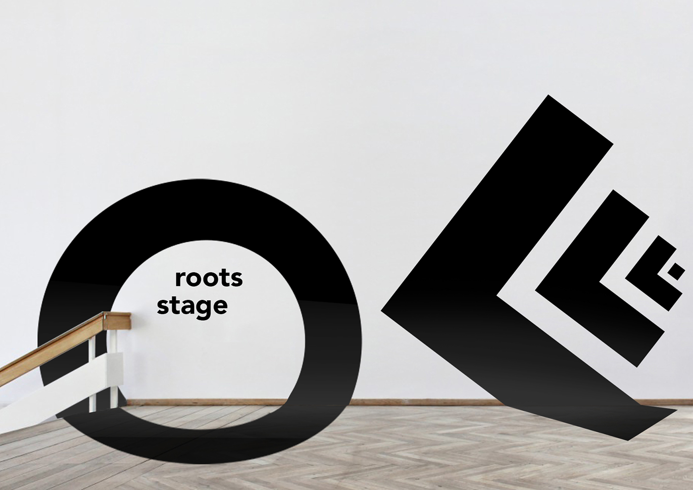
Signage
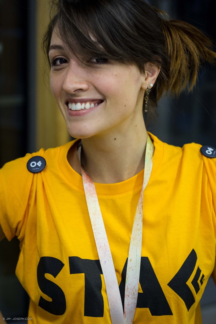
Merchandising
________________________________________________________________________________________________________
Website & App
Website & App
The new website and app are part of a superior brand idea.
They become touch points that perfectly communicate the brand personality and identity.
The new experience in the medium is the message.
Concept
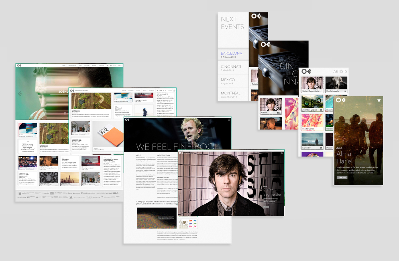
We studied a new way of navigation based on the logotype. We transfered the disign of the "F" in the logotype to the navegation. It's based in layers for each level of the web
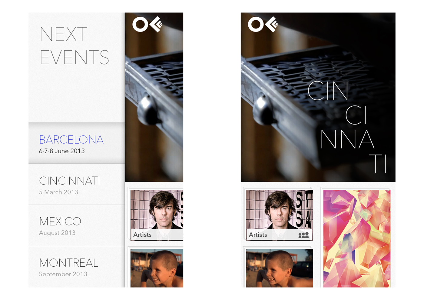
In the website the layers are vertically organized, and in the app horizontally, making it easier to access the content and improveing the user experience.
_________________________________________________________________________________________
Website
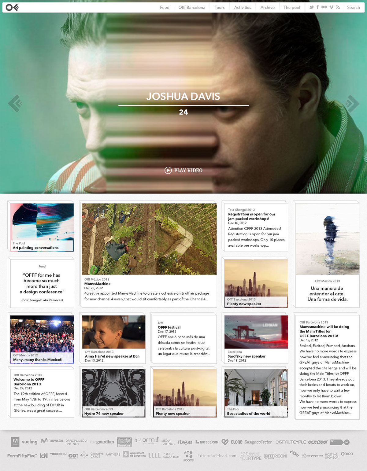
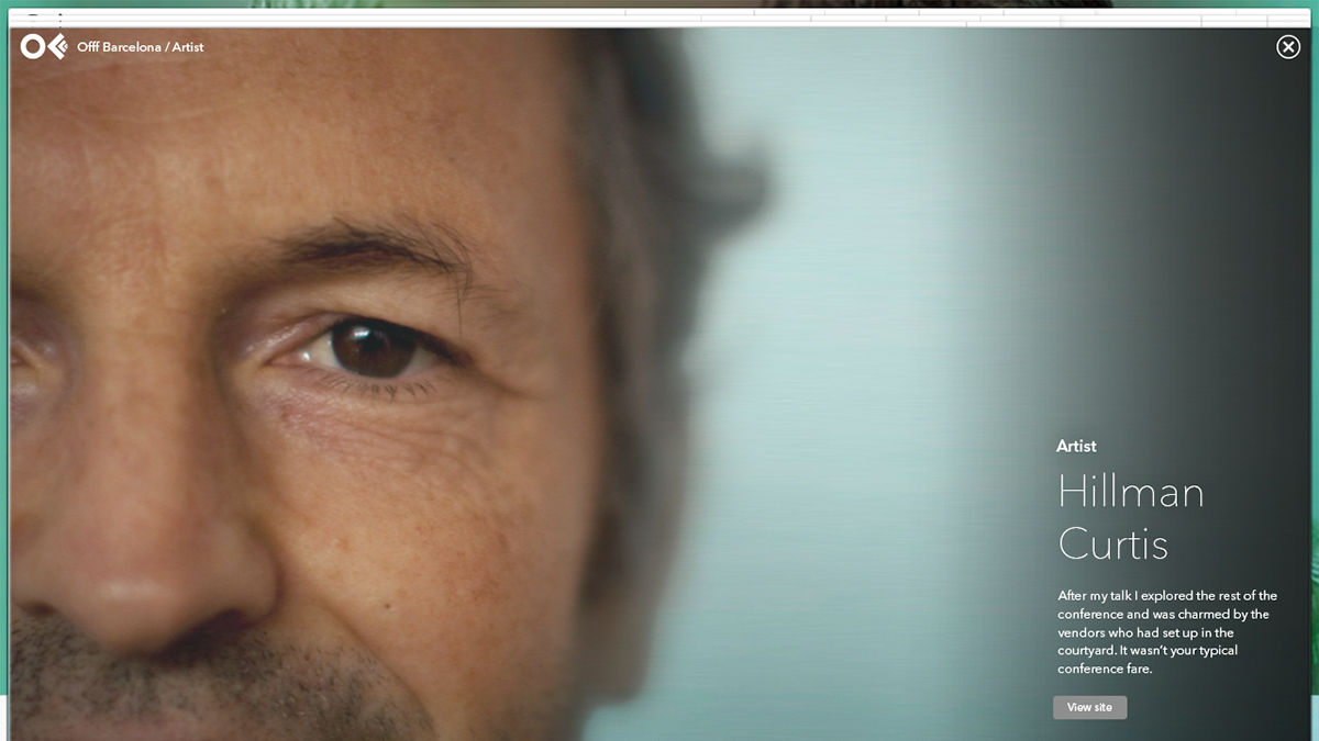
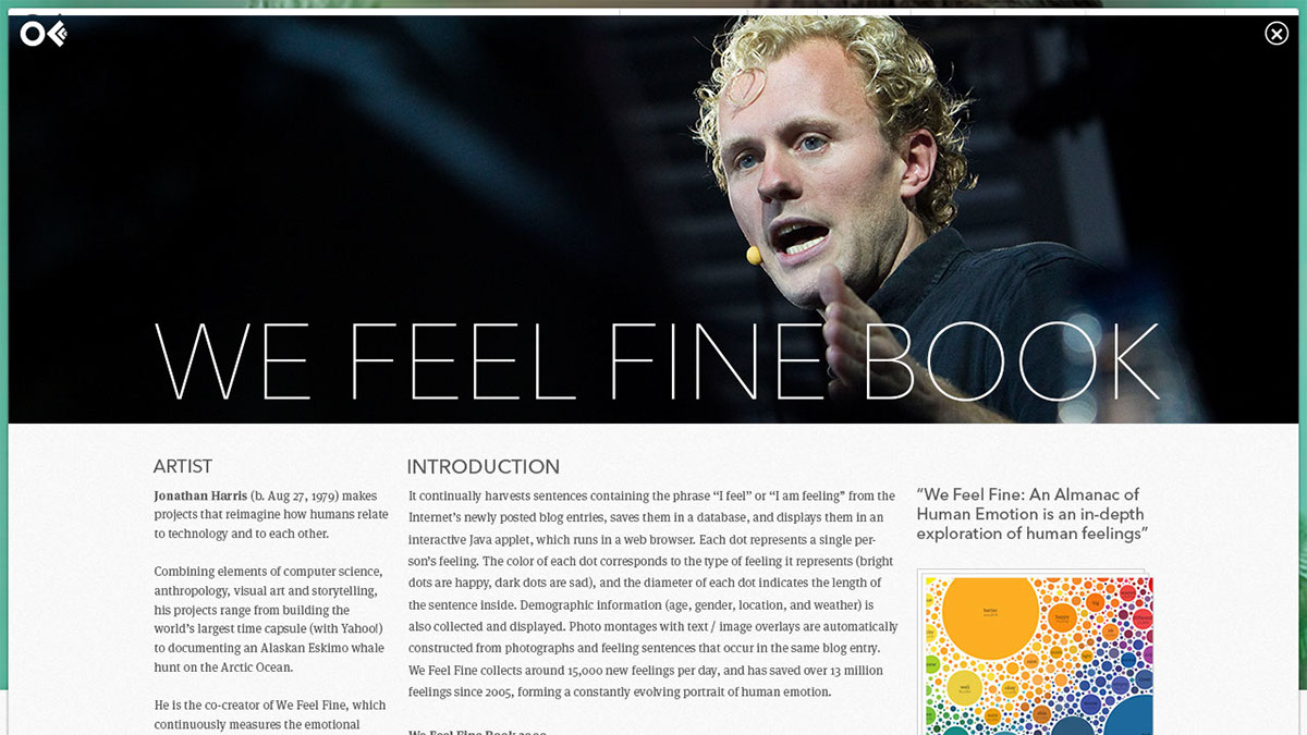
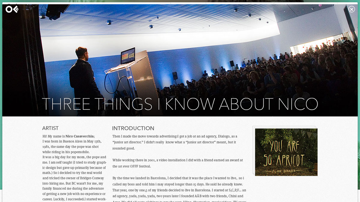
The website is programmed in a way that loads in the background all the content and it doesn't have to reload every time, so it makes it so agile and light to navigate.
At the same time, it is possible to display the content's loading in an animated way. This method provides a great usability and an amazing user experience.There is also a mobile website version.
Apart from what users can see, the website has been created together with a web manager that makes it incredibly easy to manipule the site contents and make new uploads of the web.


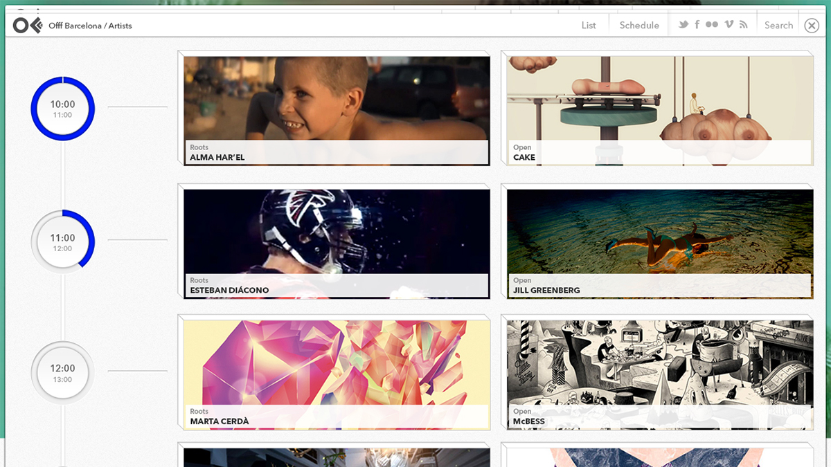
The schedule showed the conferences and displayed in a very intuitive way the finished ones and the ones that were in course in that precise momement.
_________________________________________________________________________________________
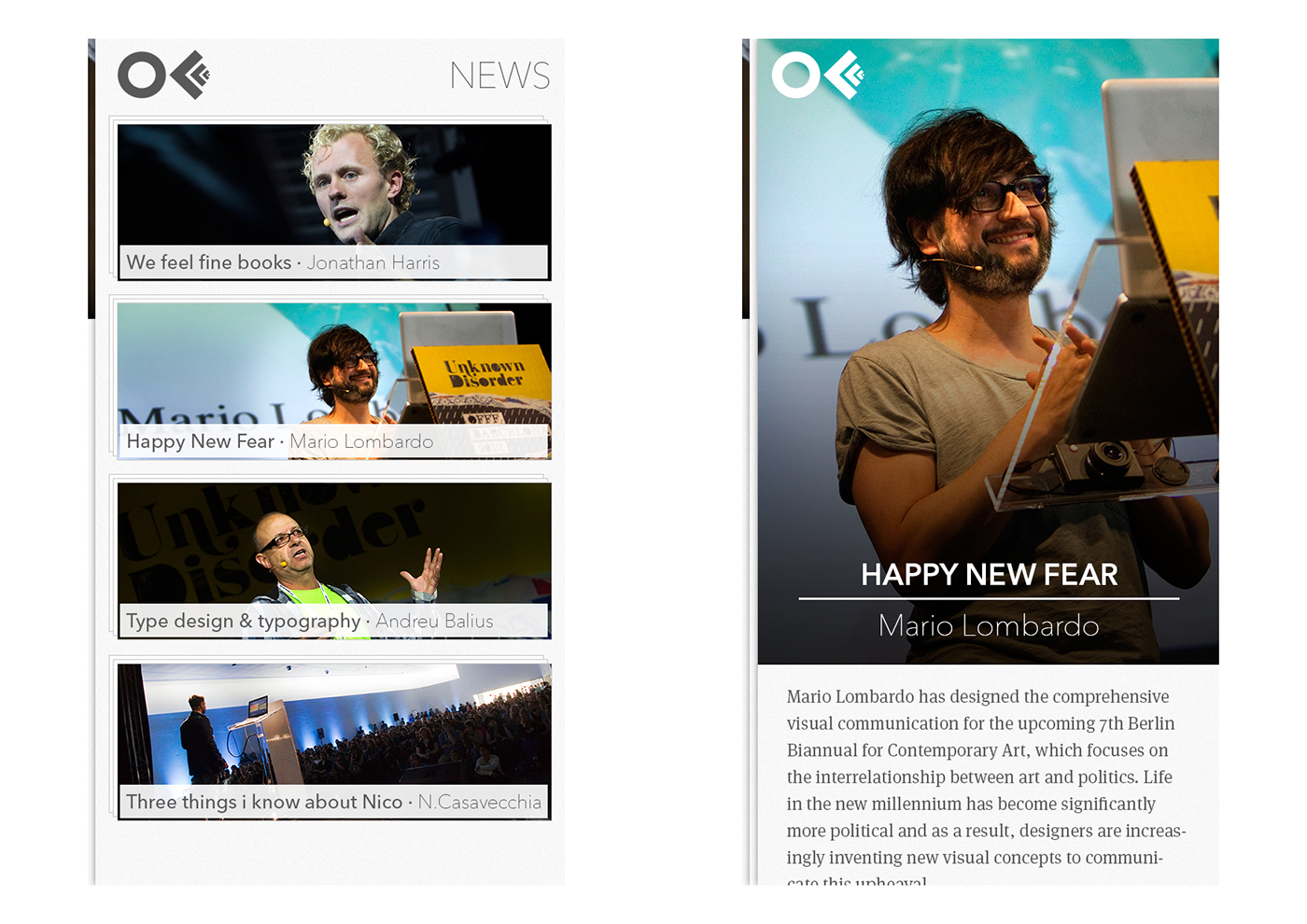
App
iOS Native App.
The app was a great tool to keep festival attendees informed. Its function was to display festival information, artists, schedule, etc. It is possible to navigate though all the app only with gestures.
It is programmed from scratch, so it's absolutely adapted to the app and the native system.
The app graphic design is awesome and goes accord to the website.


Client
OFFF
Direction, creation & Art Direction
CROWD STUDIO
Motions
David Durà
·


