

Branding with a star view
The company Kovalska Nerukhomist applied to us. We received the task to develop a name, logo, corporate style and advertising campaign for a new The company has been building houses in Kyiv for 15 years. The Teleskop is a comfort class project with 25 floors. It is being built in the Darnytskyi district, near the Pozniaky underground station. Residents of the new house will have a beautiful view of the Dnipro and the whole district.

Specificity
The design in this project is not the face of the brand. This is the one big advertising campaign. Each element of the corporate style has to be memorable and visually add value to the project.

Logo “for everyone”
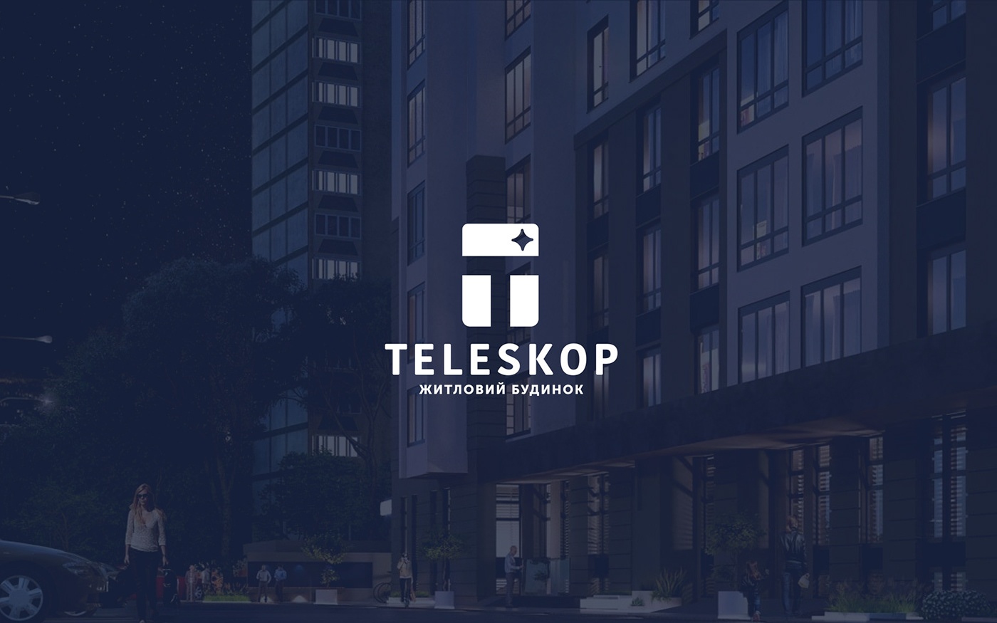
A window with a star is an image that is close to customers. It is winning as it brings up personal associations from every viewer. Someone will see a warm family nest and home comfort in it. Others will see security and reliability. Still others will associate it with dreams. The logo speaks to customers in their own language.
The letter “T” unites the windows and stands on the foundation – the name of the house. This way the sign echoes with the logo of the brand “Kovalska”. It can be read from afar and is quickly memorized.
The letter “T” unites the windows and stands on the foundation – the name of the house. This way the sign echoes with the logo of the brand “Kovalska”. It can be read from afar and is quickly memorized.


Branding the sky
Corporate style performs the function of advertising. It should be simple, dense and express the reliability of the builder.
The colors of the brand are blue and white. They bring up associations with something strict, pure and honest. Also, a direct reference to the name and sign is working, as these are the colors of the night sky and stars.
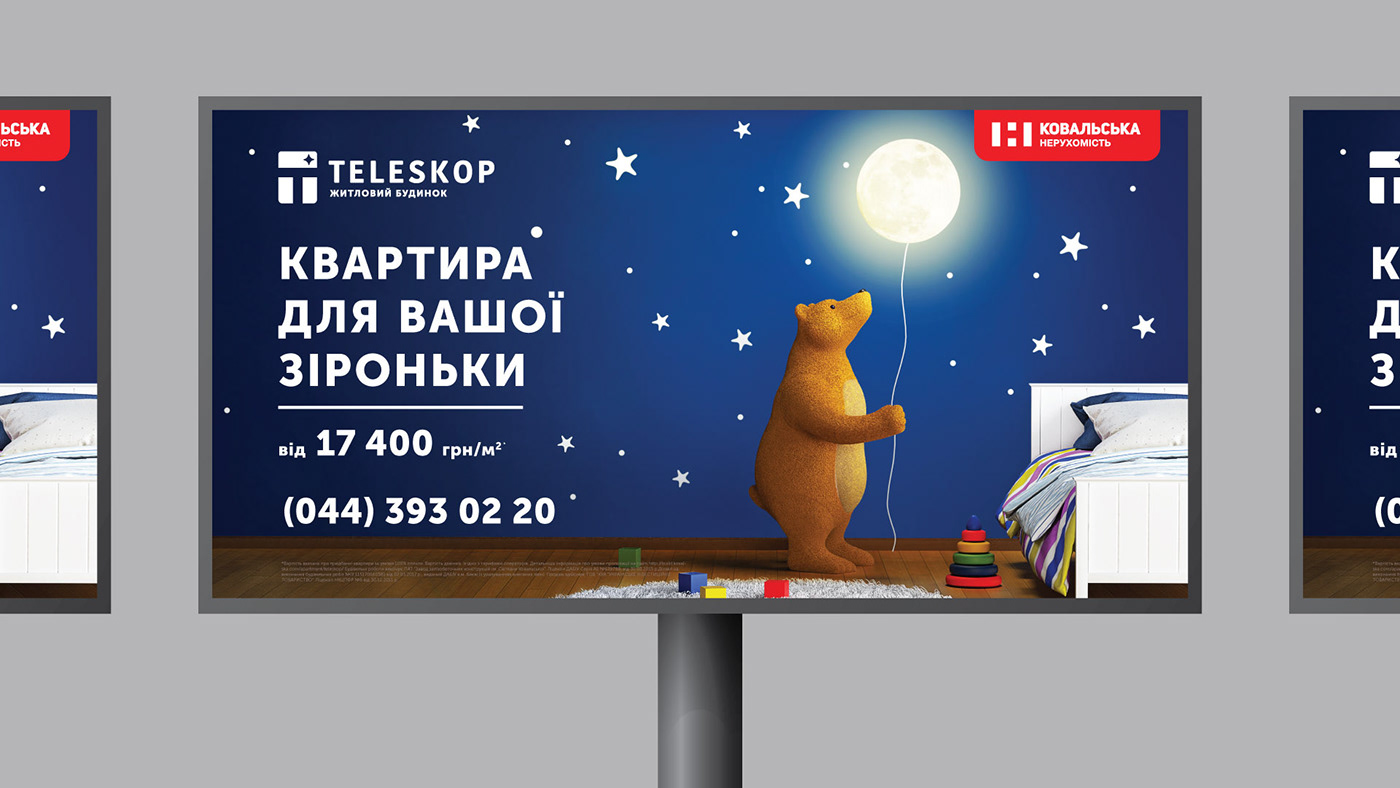
We chose the constellations as a style-building element. They make the brand unique and help to memorize it. Constellations can be used in different versions and on all media. For example, on business cards, letterheads, on the website, in social networks and so on. Carriers of the corporate style have become an atlas of the starry sky.
The colors of the brand are blue and white. They bring up associations with something strict, pure and honest. Also, a direct reference to the name and sign is working, as these are the colors of the night sky and stars.
We chose the constellations as a style-building element. They make the brand unique and help to memorize it. Constellations can be used in different versions and on all media. For example, on business cards, letterheads, on the website, in social networks and so on. Carriers of the corporate style have become an atlas of the starry sky.


Space advertising campaign
The brand sells not just apartments. It offers comfort, home – everything that people call “their corner”. Therefore, advertising should bring up cozy, home and family associations.
We found the right image in 3D characters. The characters came out to be friendly, soft and positive. Customers can easily associate them with themselves. Also, illustrations have become the unique visual language of the brand.
“Star” stories continued the corporate style. The brand speaks to the audience with phrases from our daily life. This causes a person to feel something familiar to them.


Stars are close
We wanted to make the brand friendly and strong at the same time. And we succeeded. All elements of the style interact with each other and work as a single entity. They are familiar and understandable to every person. This makes the brand close to its target audience.

Designed by Gra Agency in Kyiv
Executive Manager: Sergey Maksutenko
Account manager: Adelina Martynenko
Designer: Yaroslav Kryzhanivsky
3D: Alexander Bondarenko
Copywriter: Natalia Denysenko


