


Branding para el Año Europeo del Patrimonio Cultural 2018.
Preselección por IED Design Madrid.
Objetivo:
El objetivo de mi trabajo fué dennotar y connotar unidad y diversidad, hacerlo de una forma moderna, para así poder llegar a los jóvenes, ya que esto es una parte del objetivo de este año Europeo.
El objetivo de mi trabajo fué dennotar y connotar unidad y diversidad, hacerlo de una forma moderna, para así poder llegar a los jóvenes, ya que esto es una parte del objetivo de este año Europeo.
------
Branding for the European Year of Cultural Heritage 2018.
Pre-selection by IED Design Madrid.
Pre-selection by IED Design Madrid.
Objective:
The objective of my work was to denote and connote unity and diversity, to do it in a modern way, in order to reach young people, since this is a part of the objective of this European year.
The objective of my work was to denote and connote unity and diversity, to do it in a modern way, in order to reach young people, since this is a part of the objective of this European year.


PROCESO CREATIVO LOGO:
Todo proceso creativo debe llevar consigo una parte de investigación, luego de ello, mi trabajo fué tomar notas de frases y palabras claves que me abrirían un aspectro en cuanto a lo conceptual, para así poder empezar a crear mi sistema visual, algunas de las palabras y frases que llevaron a comenzar mi trabajo fueron: “Integración de Europa - 12 estrellas doradas: hay doce estrellas porque el número doce es tradicionalmente el símbolo de la perfección, lo completo y la unidad - Unida en la diversidad - En este Año Europeo, queremos llegar sobre todo a los jóvenes - Sentimiento de pertenencia a un espacio europeo común - El patrimonio cultural tiene un valor universal para nosotros como personas, comunidades y sociedades, es importante preservarlo y transmitirlo a las generaciones futuras - Jóvenes - Valor universial” Luego de esto empecé a bocetar mi logo, el cual incluye las 12 estrellas de la bandera de la Unión Europea, lo diseñé en forma circular para connotar la unidad, en el centro se muestra una figura humana (son las personas, las responsables de su creación y de que esto siga adelante en futuras genereaciones), esta figura no es de una sola persona, ya que esto es un trabajo en comunidad, por lo que de forma simétrica el rostro muestra dos perfiles, podrían ser dos mujeres, dos hombres, un hombre y una mujer, de esta forma quiero unir la diversidad en la creación de esta nueva y vanguardista identidad.
Todo proceso creativo debe llevar consigo una parte de investigación, luego de ello, mi trabajo fué tomar notas de frases y palabras claves que me abrirían un aspectro en cuanto a lo conceptual, para así poder empezar a crear mi sistema visual, algunas de las palabras y frases que llevaron a comenzar mi trabajo fueron: “Integración de Europa - 12 estrellas doradas: hay doce estrellas porque el número doce es tradicionalmente el símbolo de la perfección, lo completo y la unidad - Unida en la diversidad - En este Año Europeo, queremos llegar sobre todo a los jóvenes - Sentimiento de pertenencia a un espacio europeo común - El patrimonio cultural tiene un valor universal para nosotros como personas, comunidades y sociedades, es importante preservarlo y transmitirlo a las generaciones futuras - Jóvenes - Valor universial” Luego de esto empecé a bocetar mi logo, el cual incluye las 12 estrellas de la bandera de la Unión Europea, lo diseñé en forma circular para connotar la unidad, en el centro se muestra una figura humana (son las personas, las responsables de su creación y de que esto siga adelante en futuras genereaciones), esta figura no es de una sola persona, ya que esto es un trabajo en comunidad, por lo que de forma simétrica el rostro muestra dos perfiles, podrían ser dos mujeres, dos hombres, un hombre y una mujer, de esta forma quiero unir la diversidad en la creación de esta nueva y vanguardista identidad.
------
LOGO CREATIVE PROCESS:
Every creative process must carry with it a part of research, then of it, my job was to take notes of phrases and keywords that would open me an aspectro as far as the conceptual thing, so to be able to begin to create my visual system, some of the words and phrases that took to begin my work were: "Integration of Europe - 12 golden stars: there are twelve stars because the number twelve is traditionally the symbol of perfection, completeness and unity - United in diversity - In this European Year, we want to reach young people above all - Feeling of belonging to a common European space - Cultural heritage has a universal value for us as people , communities and societies, it is important to preserve it and transmit it to future generations - Young people - Universal value " After this i began to sketch my logo, which includes the 12 stars of the European Union flan, i designed it in a circular way to connote the unit, in the center a human figure is shown (they are the people, those responsible for its creation and for this to continue in future generations), this figure is not of a single person, since this is a work in community, so in a symmetrical way the face shows two profiles, could be two women, two men, a man and a woman, in this way I want to unite the diversity in the creation
Every creative process must carry with it a part of research, then of it, my job was to take notes of phrases and keywords that would open me an aspectro as far as the conceptual thing, so to be able to begin to create my visual system, some of the words and phrases that took to begin my work were: "Integration of Europe - 12 golden stars: there are twelve stars because the number twelve is traditionally the symbol of perfection, completeness and unity - United in diversity - In this European Year, we want to reach young people above all - Feeling of belonging to a common European space - Cultural heritage has a universal value for us as people , communities and societies, it is important to preserve it and transmit it to future generations - Young people - Universal value " After this i began to sketch my logo, which includes the 12 stars of the European Union flan, i designed it in a circular way to connote the unit, in the center a human figure is shown (they are the people, those responsible for its creation and for this to continue in future generations), this figure is not of a single person, since this is a work in community, so in a symmetrical way the face shows two profiles, could be two women, two men, a man and a woman, in this way I want to unite the diversity in the creation
of this new and avant-garde identity.


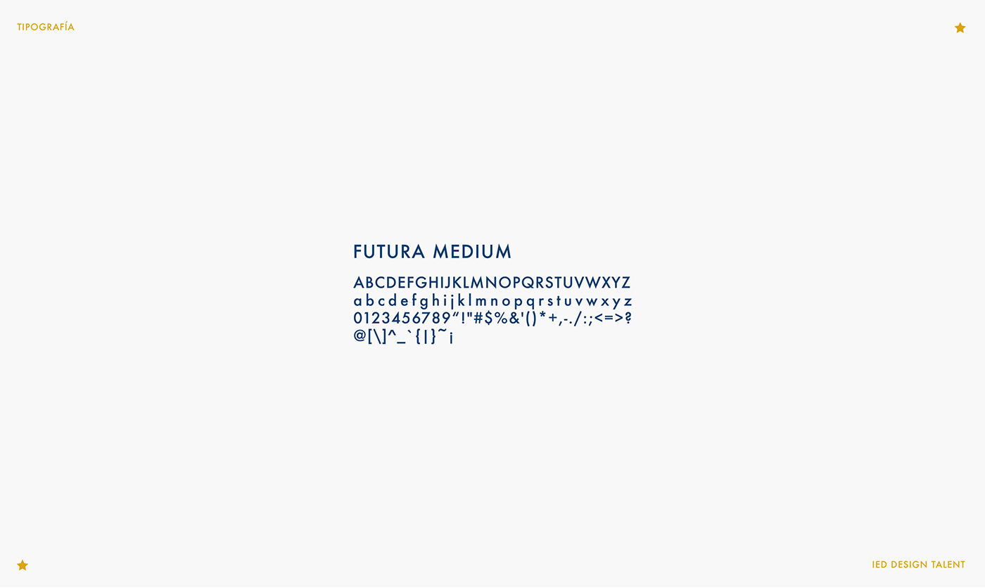
El logo fué trabajado en forma vectorial en Adobe Illustrator, utilizando mi Wacom personal, con la cual ilustro de forma digital, comencé ilustrando mi figura humana utilizando la pen tool para que mis strokes sean perfectamente simétricos, comencé con el rostro, el cual sería compartido por ambos perfiles para así poder demostrar la unidad que mencioné anteriormente, una vez que tuve el rostro y mi estructura terminada dentro del círculo, armé los dos perfiles con dos cabellos diferentes para mostrar la diversidad, no se trata de una sola persona, para el cromatismo decidí usar los colores de la bandera de la Unión Europea, los cuales, en cuanto a mi criterio, deberían estar presentes ya que son el origen del patrimonio, por supuesto decidí incorporar las 12 estrellas y rodeando lo que sería mi isotipo, el nombre del patrimonio, la tipografía utilizada es la Futura, acompañando de forma visual mi diseño geométrico e iconicamente moderno y a su vez de forma conceptual acompaña lo importante de hacerles llegar esto a los jóvenes
y futuras generaciones.
------
The logo was worked in vector form in Adobe Illustrator, using my personal Wacom, with which i ilustrare in digital form, i started illustrating my human figure using the pen tool so that my strokes are perfectly symmetrical, i started with the face, which would be shared by both profiles in order to demostraste the unit that i mentioned previously, once I had the face and my structure finished inside the circle, I armed the two profiles with two different hairs to show the diversity, it is not a single person, for the chromatism I decided to use the colors of the flag of the European Union, which, in my opinion, should be present since they are the origin of the heritage, of course I decided to incorporate the 12 stars and surrounding what would be my isotype, the name of the heritage, the typography used is Futura, accompanying my geometric design in a visual way and iconically modern and at the same time in a conceptual way accompanies the important to make this happen to the young and future generaciones.


PROCESO CREATIVO GRáfica publicitaria:
Para la creación del logo dije que todo proceso creativo debe llevar consigo una parte de investigación, esto aplica también para la creación de la gráfica publicitaria, ya tenía mis frases y palabras inspiradoras con las cuales creé mi logo, me faltaba llevar a cabo la comunicación del patrimonio,
Para la creación del logo dije que todo proceso creativo debe llevar consigo una parte de investigación, esto aplica también para la creación de la gráfica publicitaria, ya tenía mis frases y palabras inspiradoras con las cuales creé mi logo, me faltaba llevar a cabo la comunicación del patrimonio,
y ahí me acordé de que en europa.eu citaban lo siguiente “El patrimonio cultural se manifiesta de muchas maneras y puede ser: material, inmaterial, natural y digital”. Esto me llevó a querer mostrar imágenes de la flora, la fauna, comidas originarias ,arquitectura típica. De esta forma comencé a trabajar mi estética, la cual explico a continuación junto con cada gráfica.
------
CREATIVE PROCESS Advertising Graphics:
For the creation of the logo i said that all creative process must carry a part of research, this also applies to the creation of advertising graphics, i already had my inspirational words and phrases with which i created my logo, i still had to carry out the communication of the patrimony, and there I remembered that in europa.eu they quoted the following "The cultural patrimonio It manifests in many ways and can be: material, immaterial, natural and digital ". This led me to want to show images of flora, fauna, native foods, typical architecture. In this way i started working my aesthetics, which I explain below along with each graphic.
For the creation of the logo i said that all creative process must carry a part of research, this also applies to the creation of advertising graphics, i already had my inspirational words and phrases with which i created my logo, i still had to carry out the communication of the patrimony, and there I remembered that in europa.eu they quoted the following "The cultural patrimonio It manifests in many ways and can be: material, immaterial, natural and digital ". This led me to want to show images of flora, fauna, native foods, typical architecture. In this way i started working my aesthetics, which I explain below along with each graphic.


explicación GRáfica publicitaria:
“El objetivo del Año Europeo del Patrimonio Cultural es animar a más personas a descubrir y comprometerse con el Patrimonio Cultural Europeo y a reforzar el sentimiento de pertenencia a un espacio europeo común.” “El patrimonio cultural se manifiesta de muchas maneras y puede ser: material, inmaterial, natural y digital”. Con mi concepto y claim elegido, mi logo terminado, y mi investigación ya avanzada comencé a trabajar en la comunicación publicitaria, para esto armé un sistema de 3 piezas, eligiendo mostrar al Herrerillo común (pájaro ampliamente distribuido por Europa, en España se encuentra en la mayoría de comunidades, incluyendo las islas Baleares) haciendo hincapié al manifiesto natural, en este caso a la Fauna; para mostrar algo referido
“El objetivo del Año Europeo del Patrimonio Cultural es animar a más personas a descubrir y comprometerse con el Patrimonio Cultural Europeo y a reforzar el sentimiento de pertenencia a un espacio europeo común.” “El patrimonio cultural se manifiesta de muchas maneras y puede ser: material, inmaterial, natural y digital”. Con mi concepto y claim elegido, mi logo terminado, y mi investigación ya avanzada comencé a trabajar en la comunicación publicitaria, para esto armé un sistema de 3 piezas, eligiendo mostrar al Herrerillo común (pájaro ampliamente distribuido por Europa, en España se encuentra en la mayoría de comunidades, incluyendo las islas Baleares) haciendo hincapié al manifiesto natural, en este caso a la Fauna; para mostrar algo referido
a lo inmaterial utilicé un primer plano de pastas frescas, en este caso ravioles (es muy común que se conozca a la gastronomía de Italia por sus platos más famosos, como la pizza y las pastas); para mostrar algo material, es decír arquitectónico, ciudades históricas, etc.. trabajé con la edificación típica de la gran plaza de Bruselas (que ha sido clasificada como Patrimonio de la Humanidad por la UNESCO. En esta plaza están los edificios más importantes de la ciudad); hay muchas imágenes que se pueden utilizar teniendo en cuenta la totalidad de los paises que conforman hoy día la Unión Europea, pudiendo ampliar el sistema con miles de imágenes más, y así animar a más personas a descubrir y comprometerse con el Patrimonio Cultural Europeo. El diseño de la gráfica lo realicé en Adobe Photoshop, allí trabajé las imágenes con efecto monotone, siguiendo
con mi paleta cromática y utilizando el sistema de puntos halftone, para así darle a mi comunicación una connotación histórica y también moderna, decidí dividir mis imágenes dejando parte de la gráfica en monótono y parte en escala de grises, de esta forma quiero mostrar la unidad de una misma imagen, pero marcando historia, el pasado (escala de grises) y el presente (color), la tipografía usada es la Futura (siguiendo un mismo criterio que refleja mi branding y mi sistema visual), en mis gráficas incluí el año 1945 (año en el que comienza la historia de la Unión Europea) y 2018 (actualidad), cerrando las piezas, incluí el claim "Juntos somos más" (declaración simple, concisa y directa que refleja unidad, diversidad, fuerza, valor universal y comunidad), el hashtag #EuropeUnitedInDiversity (para generar campaña en las redes sociales, sobre todo en los jóvenes)
y por último el logo creado para este Año Europeo del Patrimonio Cultural 2018.
------
explanation Advertising Graphics:
"The aim of the European Year of Cultural Heritage is to encourage more people to discover and commit to the European Cultural Heritage and to reinforce the feeling of belonging to a common European space." "Cultural heritage manifestó itself in many ways and can be: material, immaterial, natural and digital." With my chosen concept and claim, my finished logo, and my research already advanced I began to work in advertising communication, for this I assembled a 3-piece system, choosing to show the Blue Tit (bird widely distributed in Europe, in Spain it is in the majority of communities, including the Balearic Islands) emphasizing the natural manifesto, in this case the Fauna; to show something referred to the immaterial I used a close-up of fresh pasta, in this case ravioli (it is very common to know the cuisine of Italy for its most famous dishes, like pizza and pasta); to show something material, is to say architectural, historic cities, etc .. I worked with the typical building of the great square of Brussels (which has been classified as a World Heritage Site by UNESCO. In this square they are the most important buildings in the city); there are many images that can be used taking into account all the countries that make up the European Union today, being able to expand the system with thousands of more images, and thus encourage more people to discover and commit to the European Cultural Heritage. I made the graphic designin Adobe Photoshop, I worked there the images with monotone effect, continuing with my chromatic paletee and using the halftone dot system, to give my communication a historical connotación and also modern, I decided to divide my images leaving part of the graphic in monotone and part in grayscale, in this way I want to show the unity of the same image, but marking history, the past (grayscale) and the present (color), the typography used is Futura (following the same criteria that reflects my branding and my visual system), in my graphics I included the year 1945 (year in which the story begins of the European Union) and 2018 (present), closing the pieces, I included the claim "Together we are more" (it is a simple, concise and direct statement that reflects unity, diversity, strength, universal value and community.) the hashtag #EuropeUnitedInDiversity (to generate a campaign on social networks, especially among young people) and by last the logo created for this European Year of the Cultural Heritage 2018.
"The aim of the European Year of Cultural Heritage is to encourage more people to discover and commit to the European Cultural Heritage and to reinforce the feeling of belonging to a common European space." "Cultural heritage manifestó itself in many ways and can be: material, immaterial, natural and digital." With my chosen concept and claim, my finished logo, and my research already advanced I began to work in advertising communication, for this I assembled a 3-piece system, choosing to show the Blue Tit (bird widely distributed in Europe, in Spain it is in the majority of communities, including the Balearic Islands) emphasizing the natural manifesto, in this case the Fauna; to show something referred to the immaterial I used a close-up of fresh pasta, in this case ravioli (it is very common to know the cuisine of Italy for its most famous dishes, like pizza and pasta); to show something material, is to say architectural, historic cities, etc .. I worked with the typical building of the great square of Brussels (which has been classified as a World Heritage Site by UNESCO. In this square they are the most important buildings in the city); there are many images that can be used taking into account all the countries that make up the European Union today, being able to expand the system with thousands of more images, and thus encourage more people to discover and commit to the European Cultural Heritage. I made the graphic designin Adobe Photoshop, I worked there the images with monotone effect, continuing with my chromatic paletee and using the halftone dot system, to give my communication a historical connotación and also modern, I decided to divide my images leaving part of the graphic in monotone and part in grayscale, in this way I want to show the unity of the same image, but marking history, the past (grayscale) and the present (color), the typography used is Futura (following the same criteria that reflects my branding and my visual system), in my graphics I included the year 1945 (year in which the story begins of the European Union) and 2018 (present), closing the pieces, I included the claim "Together we are more" (it is a simple, concise and direct statement that reflects unity, diversity, strength, universal value and community.) the hashtag #EuropeUnitedInDiversity (to generate a campaign on social networks, especially among young people) and by last the logo created for this European Year of the Cultural Heritage 2018.


