


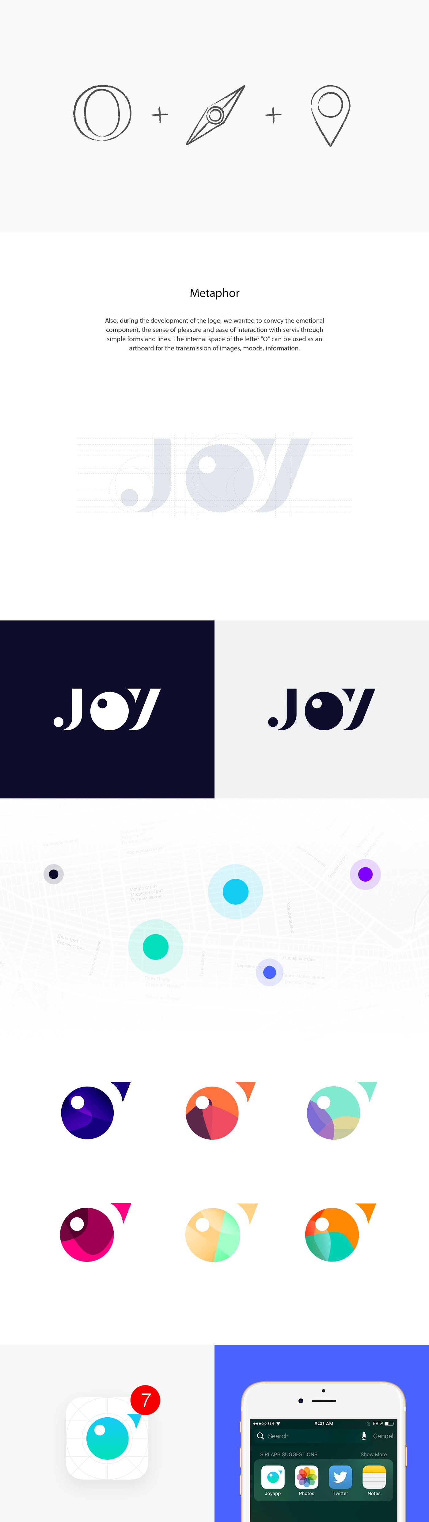
"Joy" is a service that unites performers and customers, helping to easily and directly find a quality ulugu or master in the field of beauty. Therefore, after working through all ideas, the main metaphor for the logo was the image of the geolocation icon, the compass needle, which virtually indicates the direction, the meeting place of the client and the performer.
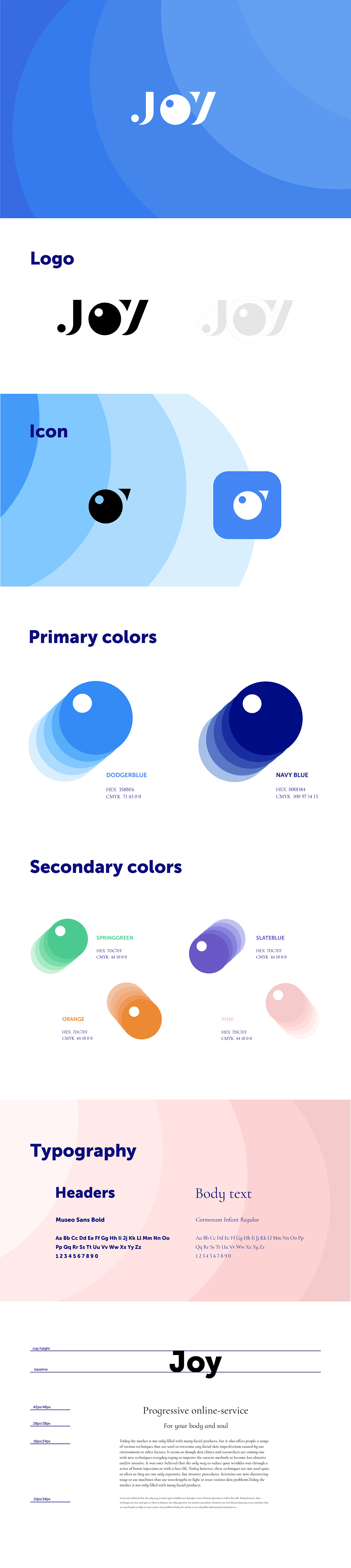
Logo.
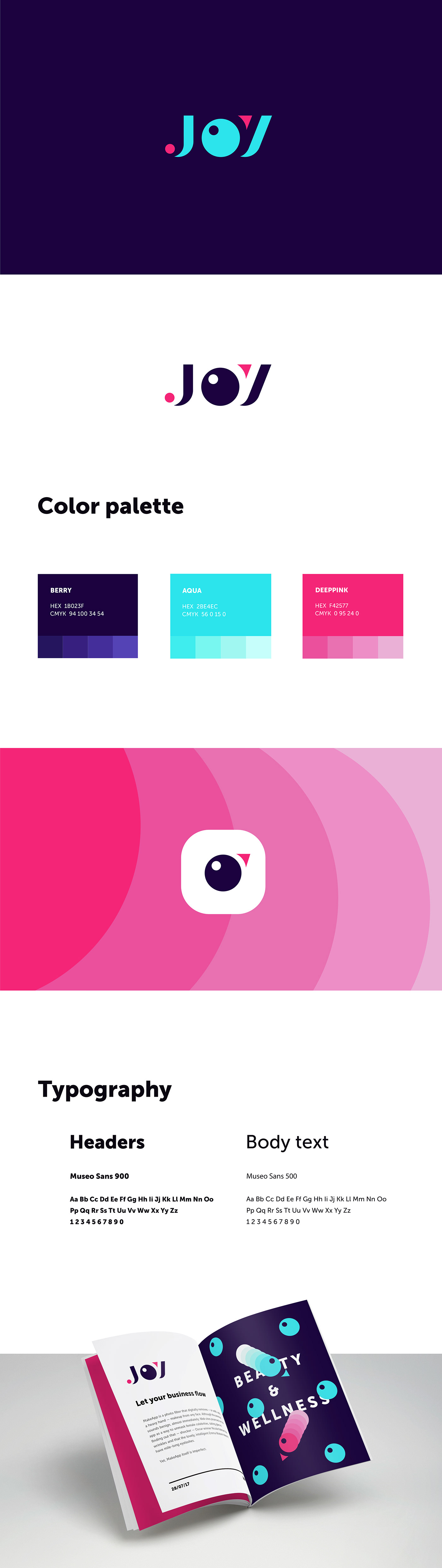
Branding.
First concept.
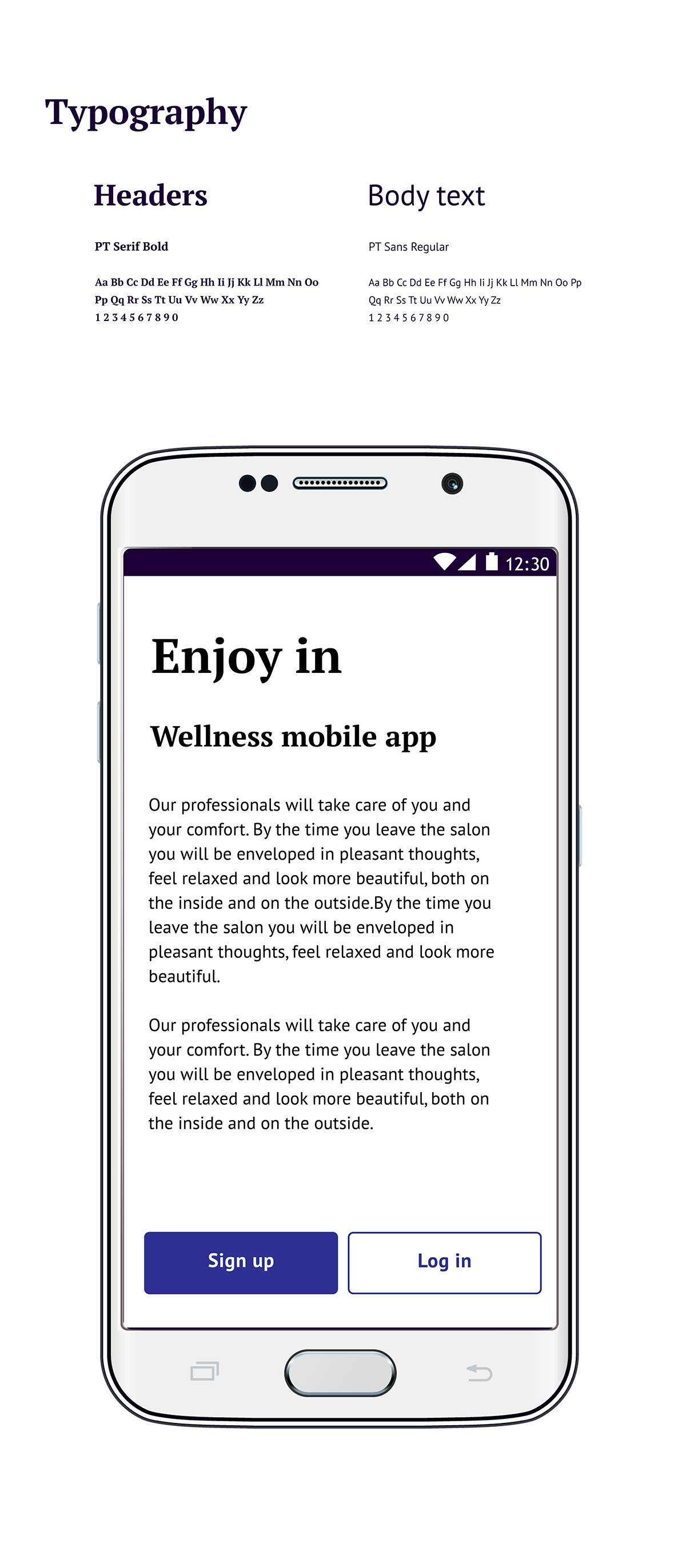
Fonts iterations.


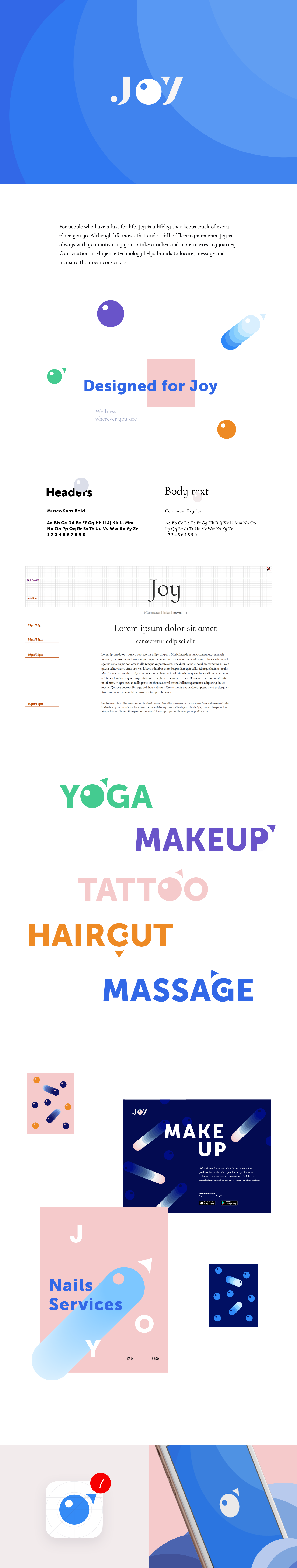
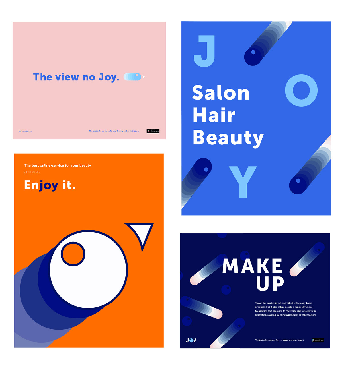
Advertising banners
Branding.
Second concept.
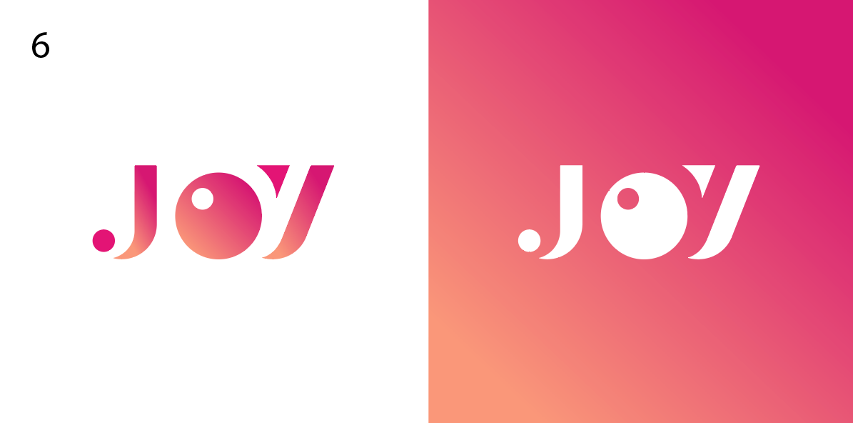
Logo.
Color variations.


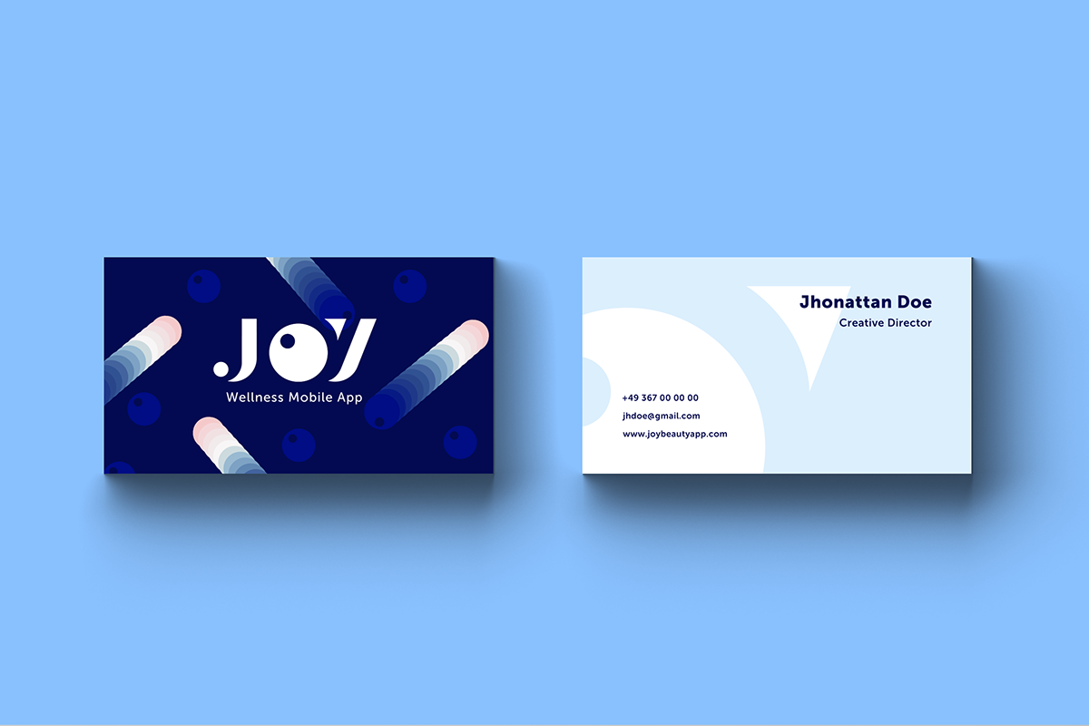
Other materials.
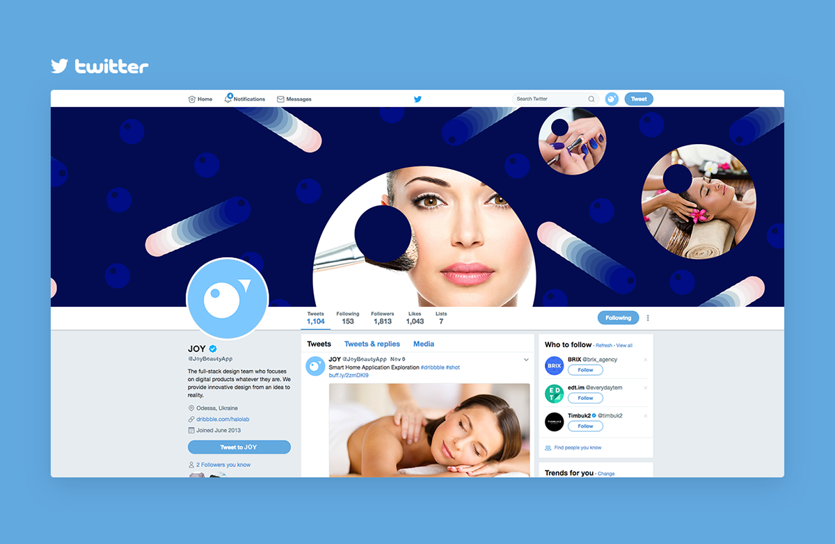
Covers for social networks.


Clothing design.


follow us
-
Searching for cool web design and development?
Visit our site www.geometric.agency or
send us an email: geometric.digital@gmail.com
and don't forget appreciate it ;)


