NOT咖啡 NOT CAFE
-
市场上以清新简约、女性化风格呈现的休闲餐饮越来越多,品牌同质化严重。创始人寻求独特的品牌主张,希望为年轻一代提供一个有力量感的餐饮品牌。
我们提出的新品牌命名为“NOT”,契合都市新潮一代的独特个性特征,也表达品牌敢于打破常规、突破界限的核心创新精神。品牌名称同时含有以下涵义,N代表Natural Food,O代表Ocean Wave,T代表Think Different,传达品牌推崇天然饮食、向往自由、勇敢创变的态度。
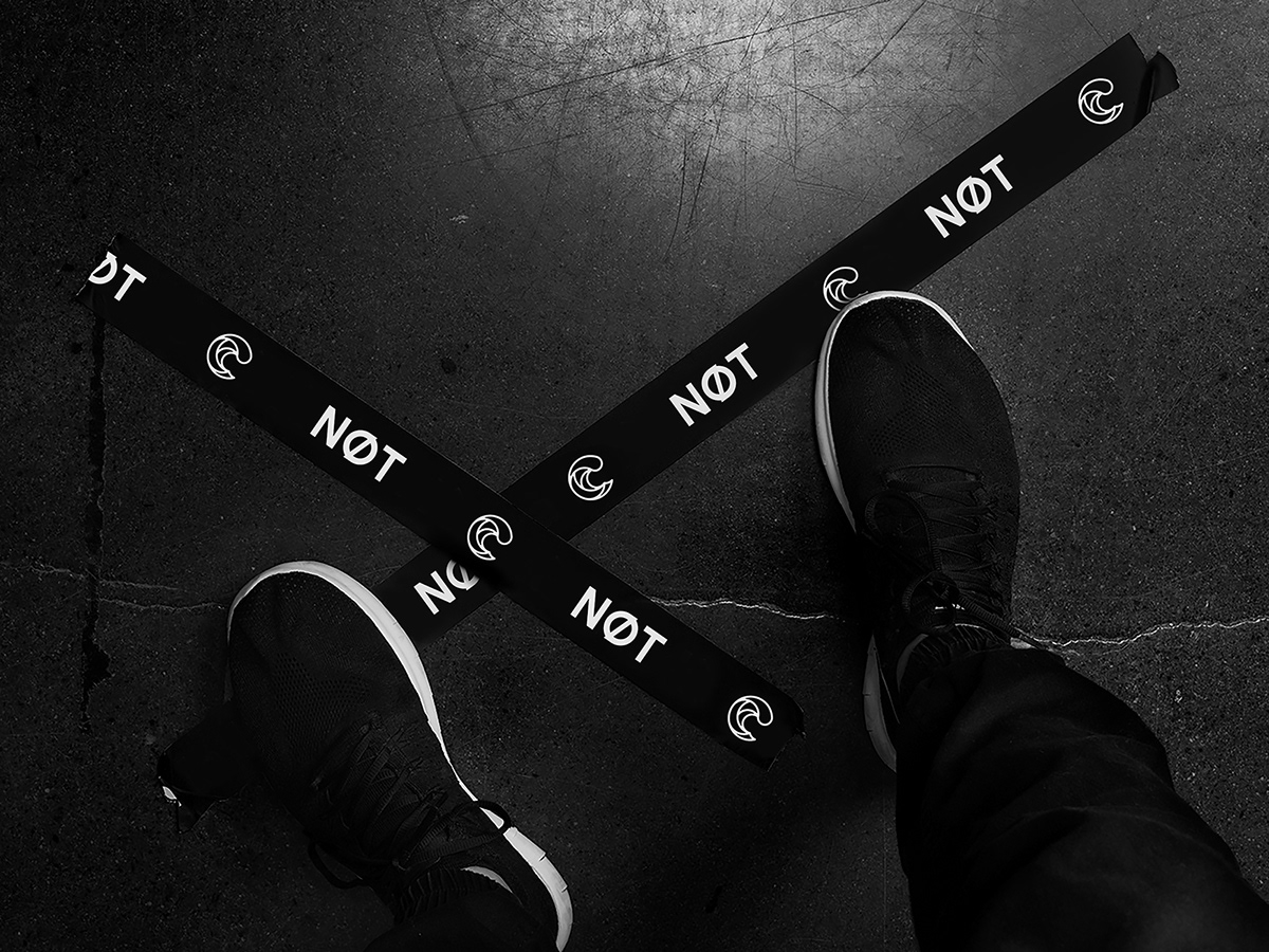
- 设计以品牌名称为核心,在“O”中加入斜杠代表“NOT”突破自我,并产生指向不同的“△”多维创意。
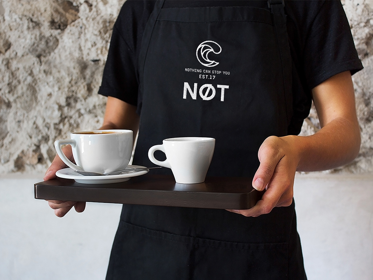
- 标志造型来自“海浪”,寓意自由freedom、力量power与艺术artist,传递NOT追崇新一代质感生活与敢于突破的品牌愿景。
- 色彩选用黑色、深蓝、浅蓝的统一色系,整体性强,体现力量与独特的品牌定位。
Nowadays , there are more and more leisurely restaurants with simple and feminine style, which is homogenized in the market. The founder is looking for a unique brand idea in the hope of representing young adults with a powerful catering brand.
We name the new brand as “NOT”, featuring its unique and fashion which meets the aesthetics of young people and shows the creative spirits of breaking down boundries and rules.
Speaking of the logo, there are a couple of hidden meanings:
- “N” represents natural food, “O” represents ocean wave, “T” represents think different. It indicates that the spirits of this brand are natural food, freedom and innovation.
- The slash inside of the letter “O” represents that making a break through your personal barriers.
- The logo features” ocearn wave”, representing freedom, power and art, symbolizing the pursuit of a remarkable life and the courage to make a breakthrough
- It uses black, dark blue and light blue as main colors which represents the power and its unique brand positioning.
-
2017 · SHENZHEN 深圳
STRATEGY 品牌策划 / VI 视觉系统 / SI 空间设计