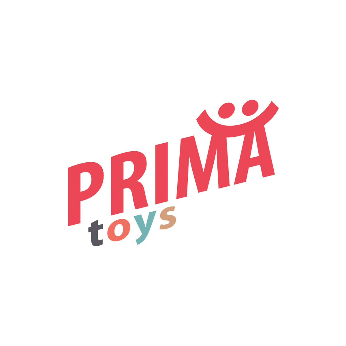
The initial logo I presented to Prima Toys.
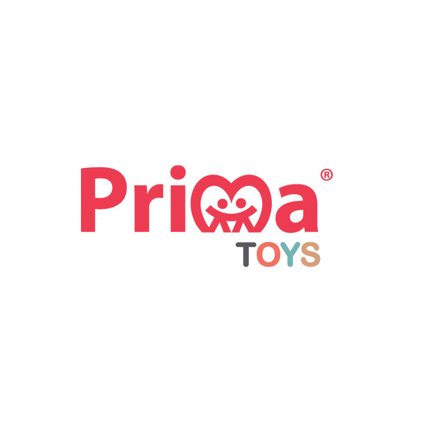
Further development experimenting with using the heart shape as an 'm'.

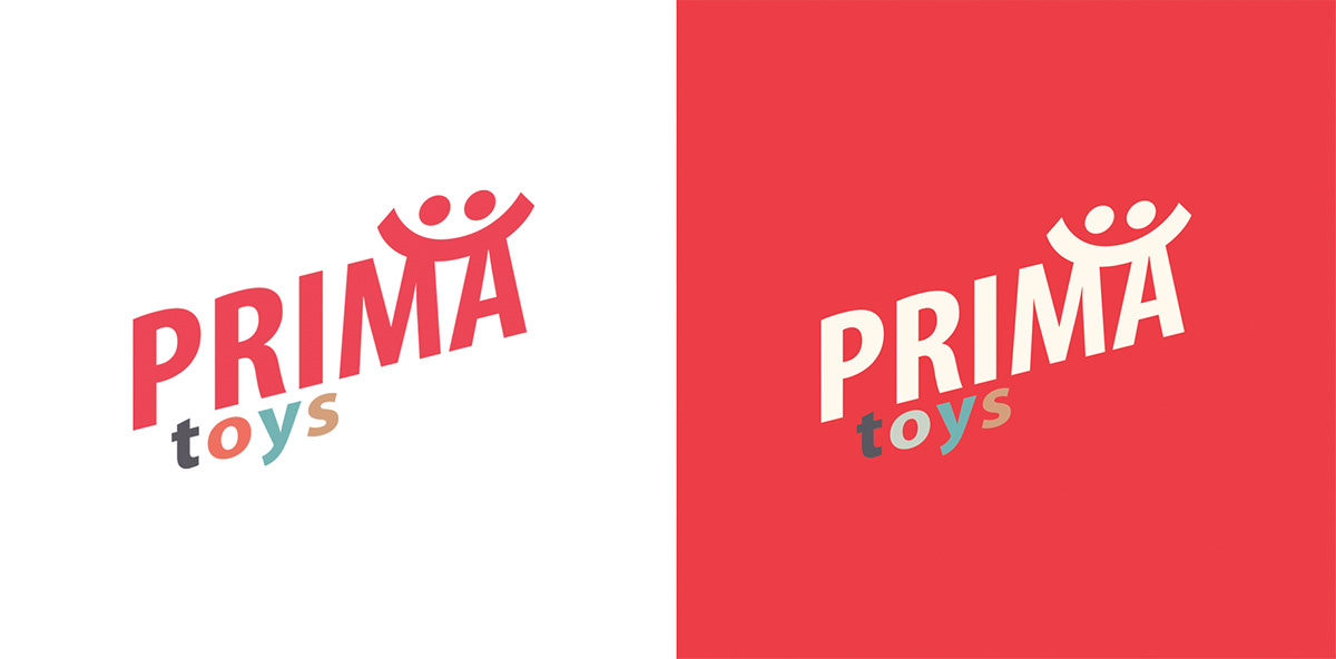
Another option.
Further experiments using a holding shape which the client required.
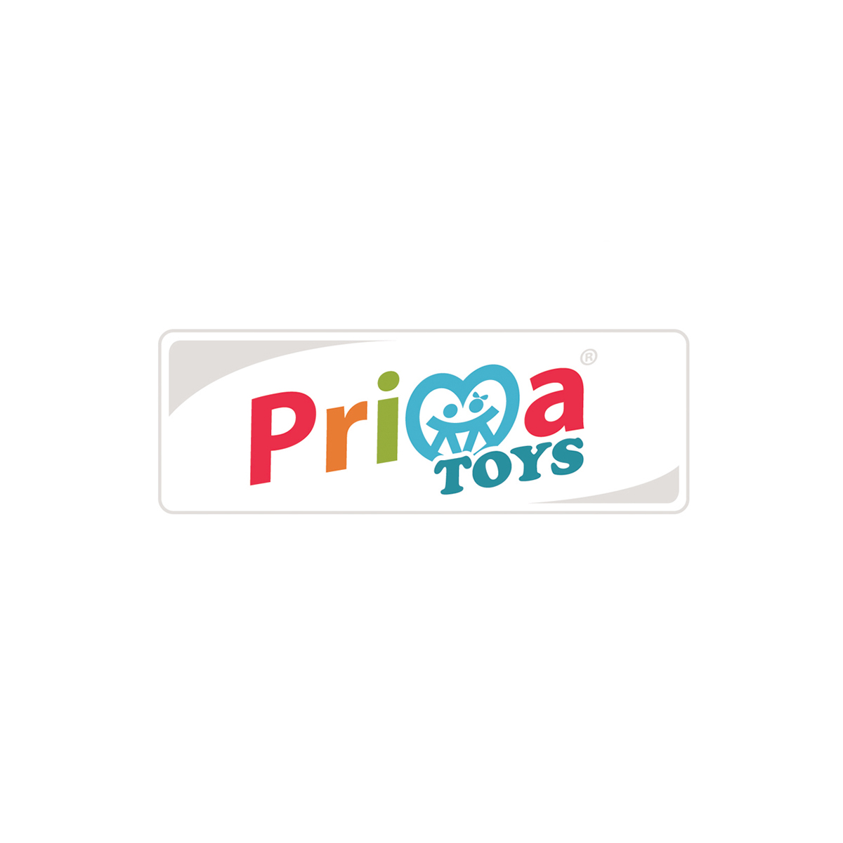
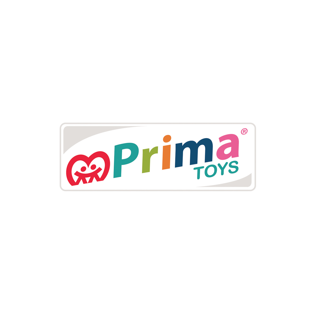
The final Logo. The client specified the colours, added the bow on the girls' head, and asked me to add the stroke around the word 'TOYS'. Though not the option I would've picked, it's a vast improvement on the current CI.

