EN:
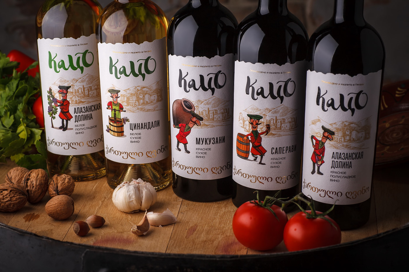
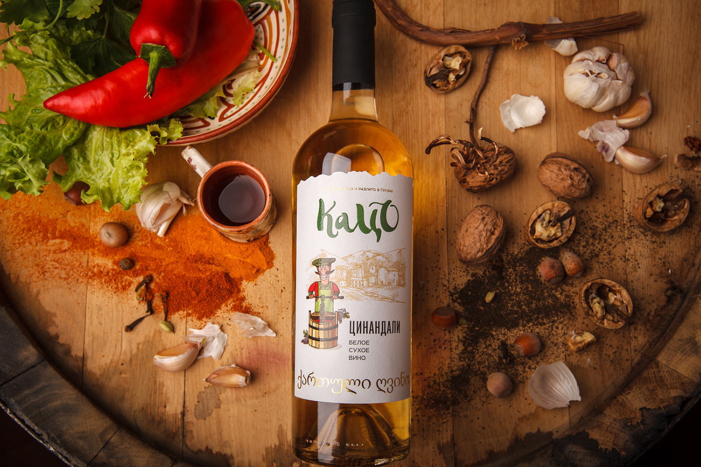
Explosive temper, respect for traditions, excellent sense of humor, unrivaled hospitality, and unique culture - these are the main associations that come to mind when one mentions the country of Georgia. That’s why when we’ve started developing the labels for Georgian wines Tatso, we instantly came up with an image of a picturesque Georgian winemaker, which embodies the main traits and some cultural stereotypes associated with the product’s country of origin. Moreover, the producer has expressed the desire to add a slightly humorous and funny feel to the label that would emphasize the festive spirit of this particular wine.
The label design for Katso wines wields two distinct features. On one hand, the packaging features a traditional Georgian wine aesthetic with a special label shape, relevant font types, and a stylized illustration that allows a precise geographic identification of the product. On the other hand, the label also features a stylized character, the very Katso, which depicts the brand and adds a humorous note to the composition. Each position in the product line features the character performing different types of work associated with winemaking, which amplifies the overall associations with traditional Georgian winemaking and emphasizes the fun spirit of the product.
RU:
Взрывной темперамент, верность традициям, отменное чувство юмора, непревзойденное гостеприимство, и самобытная культура - именно эти ассоциации невольно возникают при упоминании Грузии. Поэтому, когда мы начали работу над серией этикеток для грузинских вин Кацо, перед нами сразу возник образ колоритного грузинского винодела, который воплощает в себе основные достоинства и некоторые культурные стереотипы, связанные со страной происхождения напитка. Тем более, производитель изъявил желание придать оформлению немного юморной, веселый оттенок, который бы подчеркнул лёгкий, застольный характер продукта.
Дизайн этикетки для серии вин Кацо отличается двумя основными моментами. С одной стороны оформление выполнено в характерном для грузинских вин ключе, с особой высечкой этикетки, релевантными шрифтовыми решениями, и стилизованной иллюстрацией, обеспечивающей географическую идентификацию продукта. С другой стороны, на этикетке также присутствует стилизованный персонаж, тот самый Кацо, который олицетворяет торговую марку и привносит юмористический оттенок в композицию. Для каждой позиции в линейке персонаж изображён выполняющим определенную работу, связанную с вином, что усиливает общие ассоциации с традиционным грузинским виноделием и подчеркивает веселый характер продукта.