


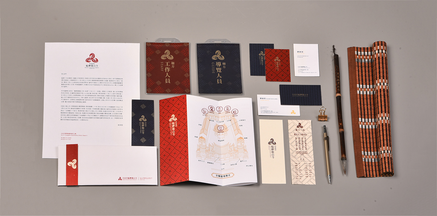
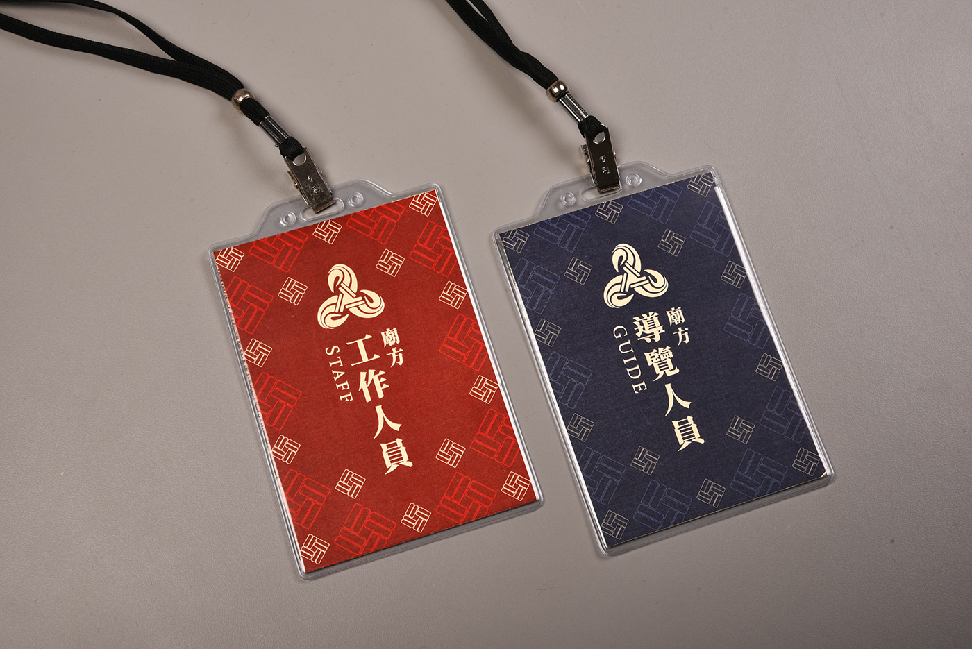
艋舺龍山寺視覺系統設計
Manka Lungshan Temple - Visual Identity
-
艋舺龍山寺默默守護著台北萬華這繁榮的都市,是附近居民心靈上的依託,靜靜地撫慰著居民的心。
Manka Long Shan Temple has been guarding Wanhua, a prosperous city, like a caring mother. It has always been the spiritual sustenance for residents. Long Shan Temple is more than a building, it is pacifying and comforting to the locals.
祭拜求得心中的安寧,龍山寺匯聚了人民的心,用信仰牽起人與人心中的線,守護著這片土地。
By gathering the spirits of those who seek inner peace, Long Shan Temple holds us carefully on its palms; and with faith and belief, it brought our hearts closer together.


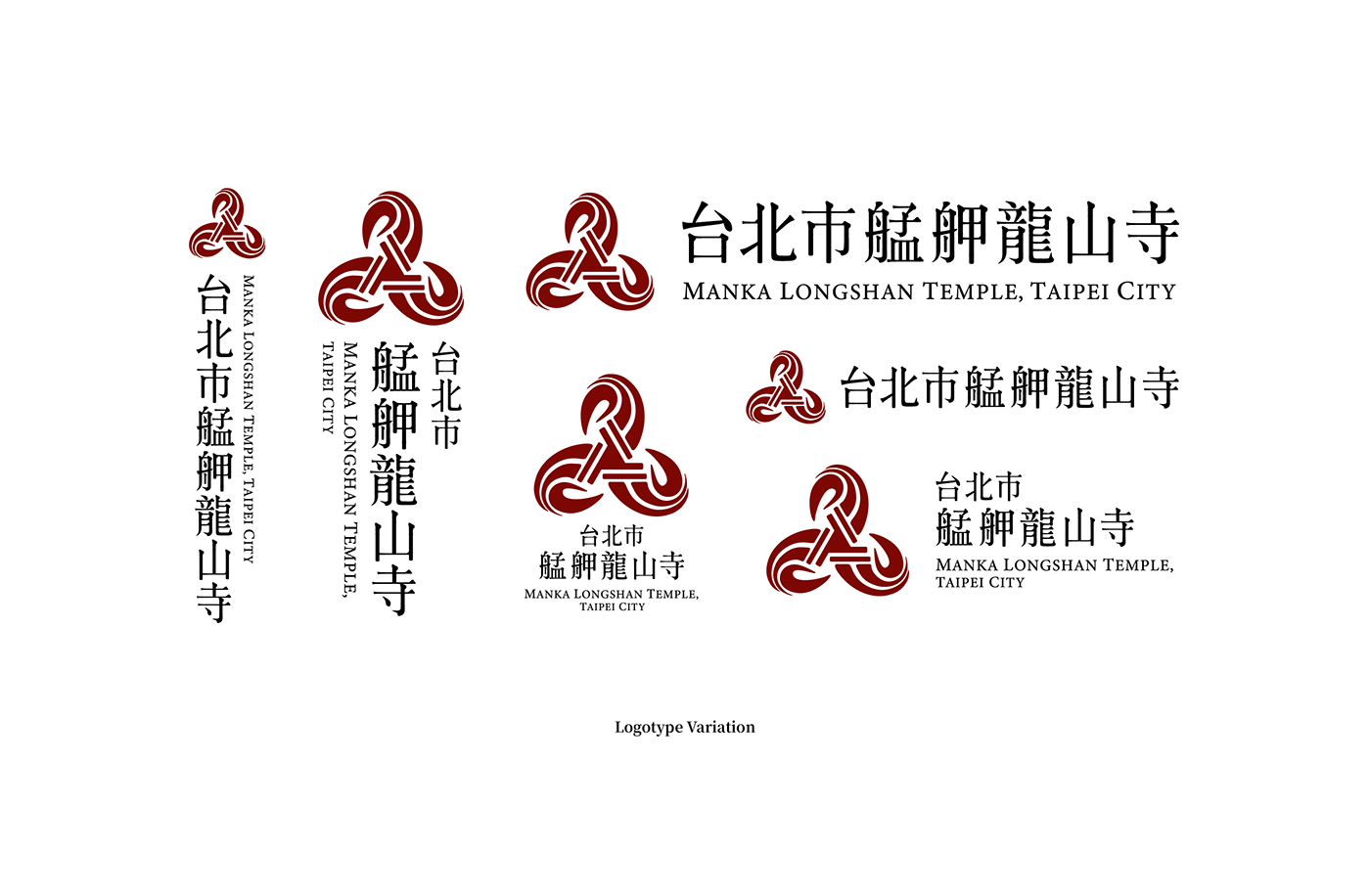
設計理念
Concept
-
中央的結象徵它能代表當地居民的連結感。結造型的對稱、向內「匯聚」之感是想表達寺廟為聚落信仰中心,能夠吸引四方信徒,同時也代表先民遠渡而來匯集於此地。
The knot in the middle stands for the connection between local residents.Long Shan Temple is the core of faith in Wanhua; the symmetry and the inwards, converging feel of the logo, represent that Long Shan temple fascinates believers from all around, and to pay tribute to ancestors who traveled across oceans settling here.
龍爪則同是來自於全台唯一的銅鑄龍柱,其飛龍上的利爪,用以代表龍山寺的獨一無二。
The Dragon Claw comes from the one and only Bronzed Dragon Pillar in the temple. Unique and unmatched, just like the temple itself.


設計 - 謝宗宜 游硯棋 李宜軒
指導 - 李根在 教授
(此作品為概念設計,非艋舺龍山寺官方設計)


