

Darrow dermocosmetics
Client
Darrow Dermocosméticos is a company of Pierre Fabre French group, however, it started as a Brazilian laboratory. Their line consists of skin and hair care products.
Project goals
According to company research, the brand is widely recognized and prescribed by dermatologists and presents an excellent cost-benefit. However, it didn’t catch the consumer’s eye in drugstores. Darrow has been seen as a brand that did not evolve, not perceived as a dermocosmetic product and reminded as the soap brand. Therefore, Darrow needed a transition. It was necessary to change the conservative and methodical image to one that is sympathetic, dynamic, feminine, accessible, simple, yet efficient. Besides, many Darrow consumers do not connect the products they use to its brand. That is why it was important to create this connection visually.
Creative solution
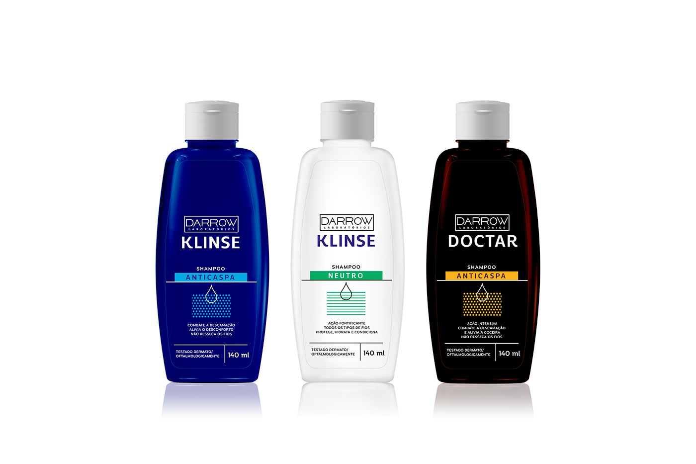
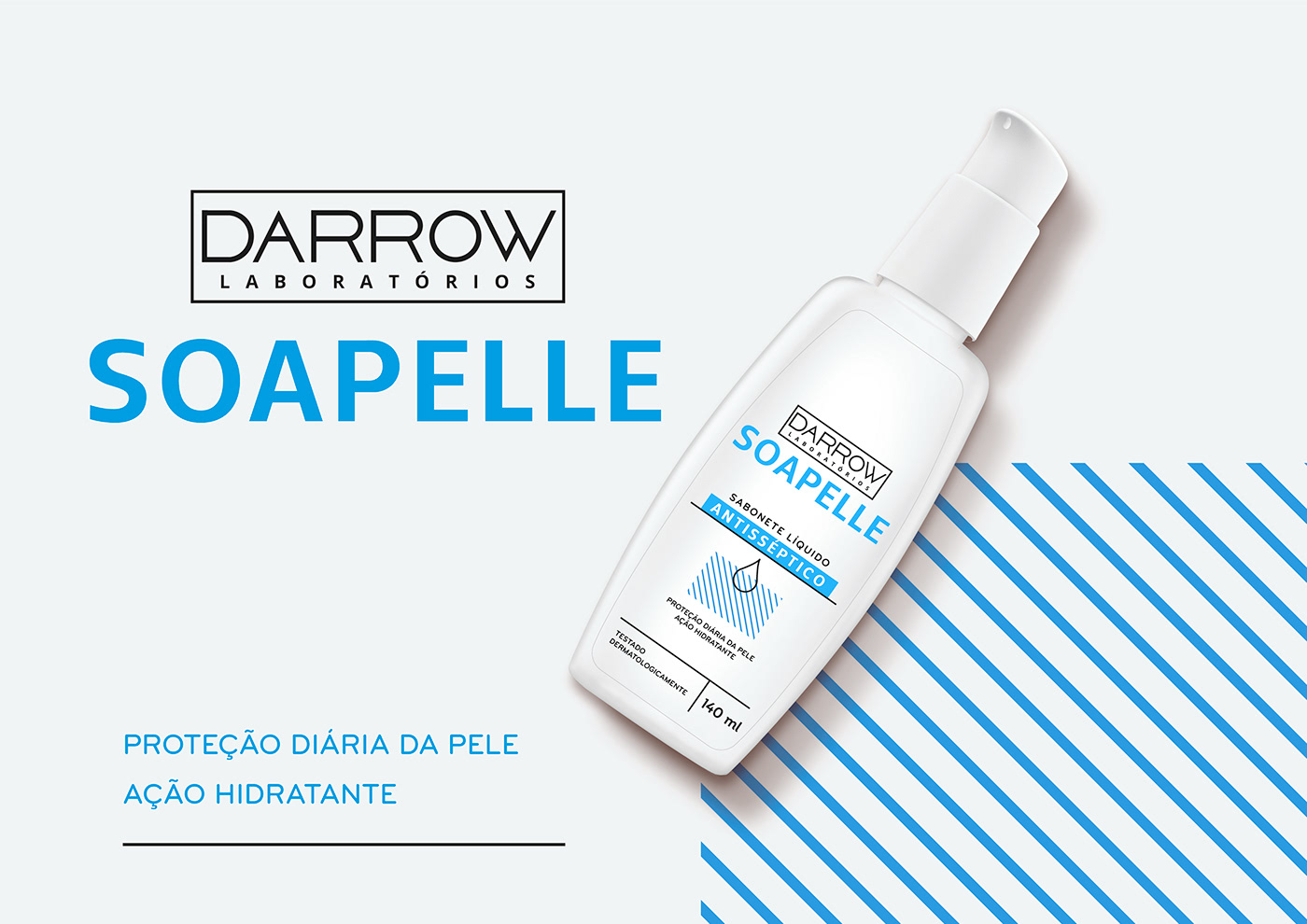
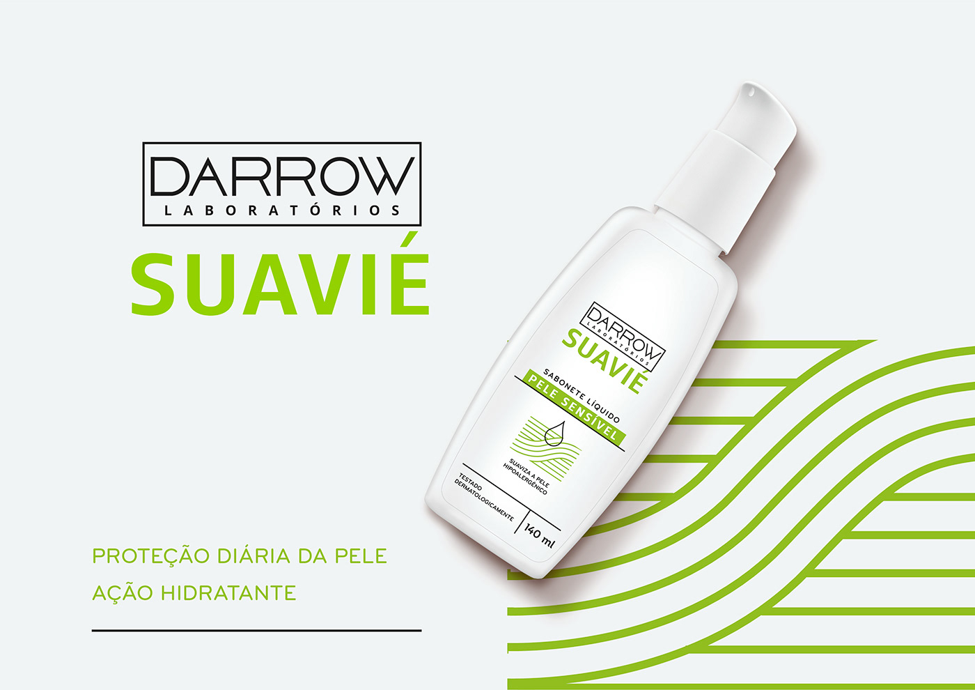
The visual solution was to renew the layout completely, using bright colors and also the black to bring out seriousness. Originally appearing separated, Darrow’s brand and its sub-brands are now close to each other in order that the consumer be conscious of the lab. Also, icons were developed to depict each different line. They follow a line pattern creating textures that hint what the product was made for.


Agency: Rafdesign
Graphic Design: Thatiana Ferreira
Client: Darrow
Year: 2017
Graphic Design: Thatiana Ferreira
Client: Darrow
Year: 2017


