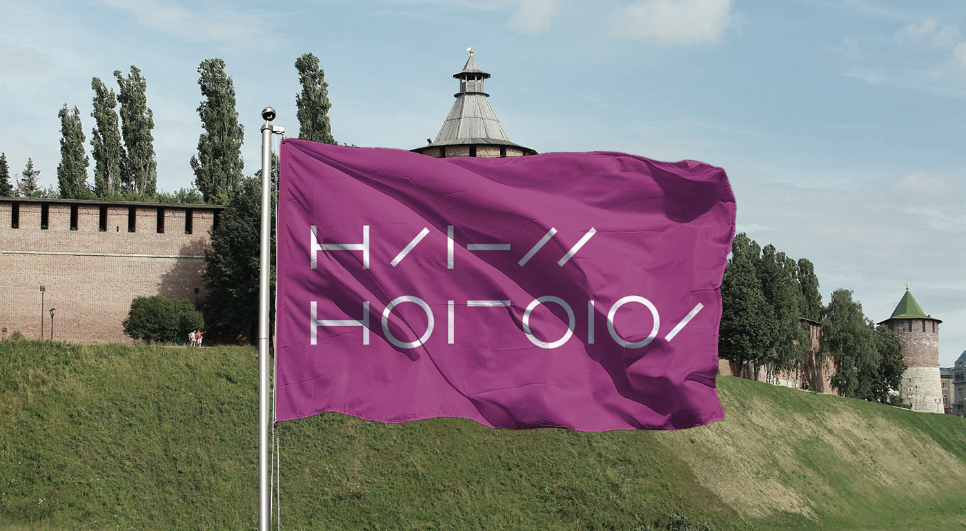
Brand of the city of Nizhny Novgorod
(Russia)
(Russia)
The only thing we know for sure is that everything changes, we must change or accept the changes, accept them as they are. The pace of change is growing. If you want to keep up with the times, it's better to accelerate, start to understand yourself better. This is the message today. However, it would be useful to recall that our basic needs are unchanged. The need to be noticed and appreciated is the main thing.
The need for intimacy and care, in a droplet of love! It is satisfied only in the slowness of human relations. To subdue the changes, we need to regain our leisure, reflection and unity. In them we will find the true rebirth of ourselves and as a consequence of the world around us.
The need for intimacy and care, in a droplet of love! It is satisfied only in the slowness of human relations. To subdue the changes, we need to regain our leisure, reflection and unity. In them we will find the true rebirth of ourselves and as a consequence of the world around us.
Project site: brandnizhnynovgorod.ru
When we decided to make a new brand for the city, we faced a very difficult task - whether to use symbols or not, if so what to choose, what to build on, and whether they are needed?
We decided to do branding for our hometown and faced a difficult task: what symbols to use as a brand?
How does the inhabitant of the city come into contact with his story, how does he interact with her when he comes to the center, looks at monuments or thinks about something?
Where does the real life of the city flow and what is its true center?
We answered with our decision: the city is for everyone, the city is you.


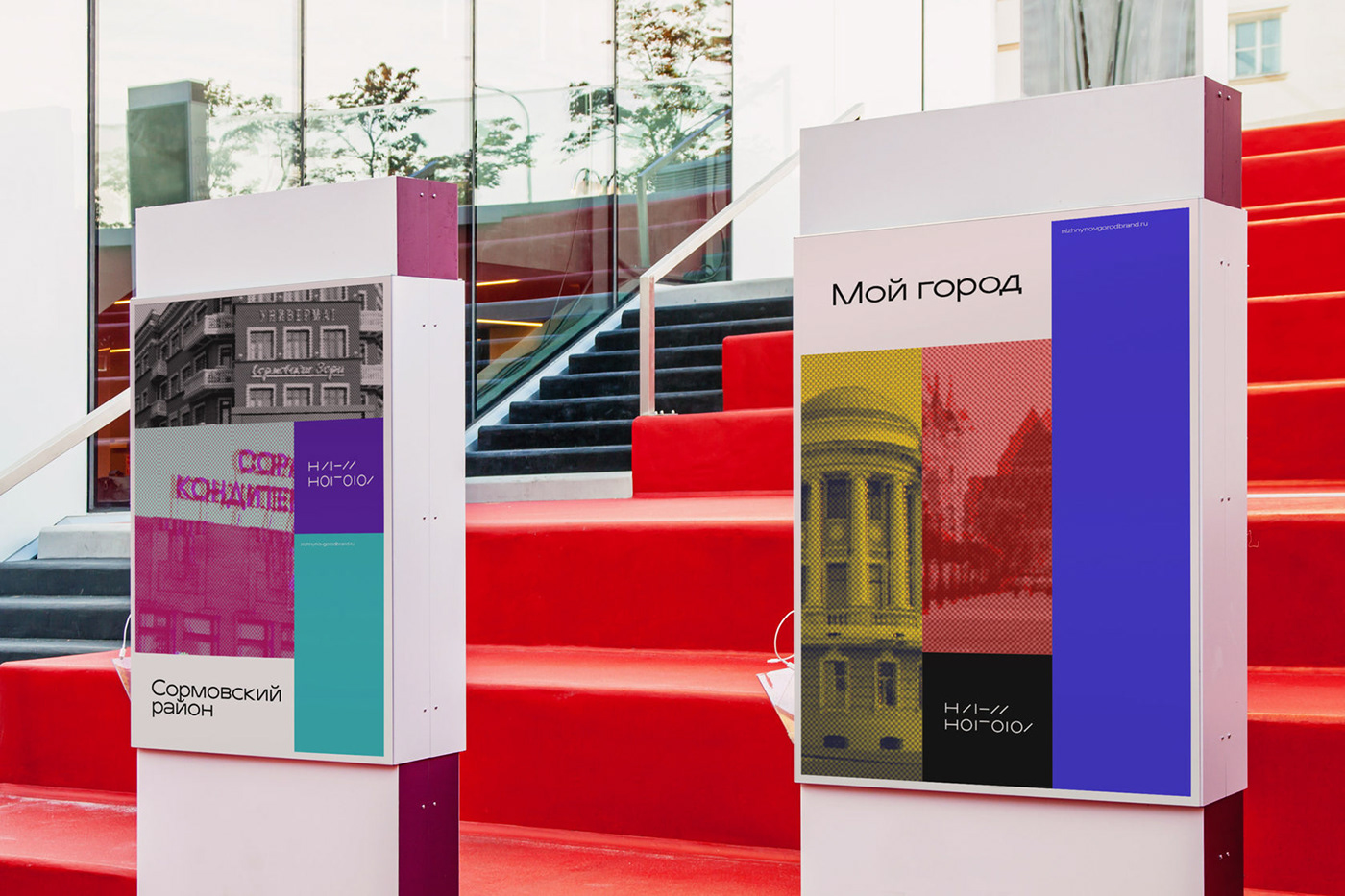
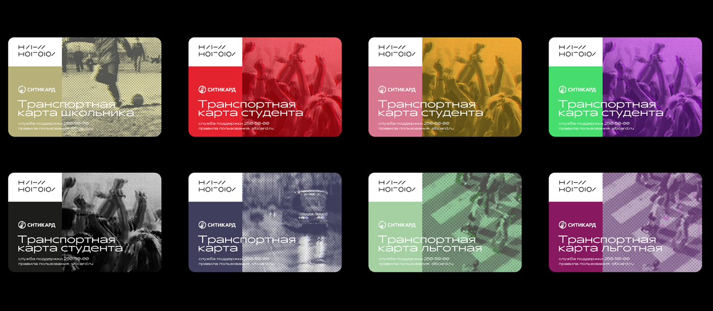
The key visual image of the brand of Nizhny Novgorod - color pictures depicting the city and its inhabitants, made in the original and recognizable style
For each media, the original image is selected and processed.


A lot of mock-ups have been developed for all cases of city life:
templates for outdoor advertising, posters, urban navigation, transport maps, clothes, promotional materials and many other mock-ups.