FPO is a company that provides financial services to businesses that range from accounting to financial administration. However, FPO was recently born as a spin-off from a bigger conglomerate in order to simplify its service portfolio; because of this, a new brand was needed and our team had to work all the way from just a name and a value offer to a fully fleshed marketing concept.
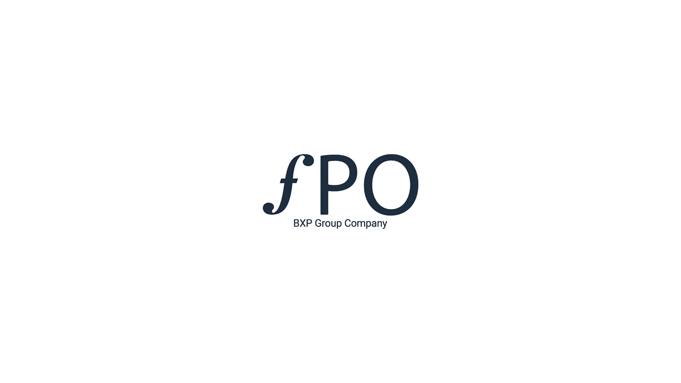
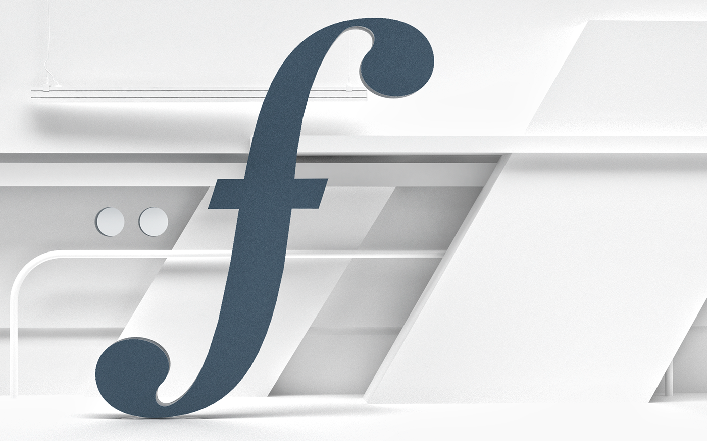
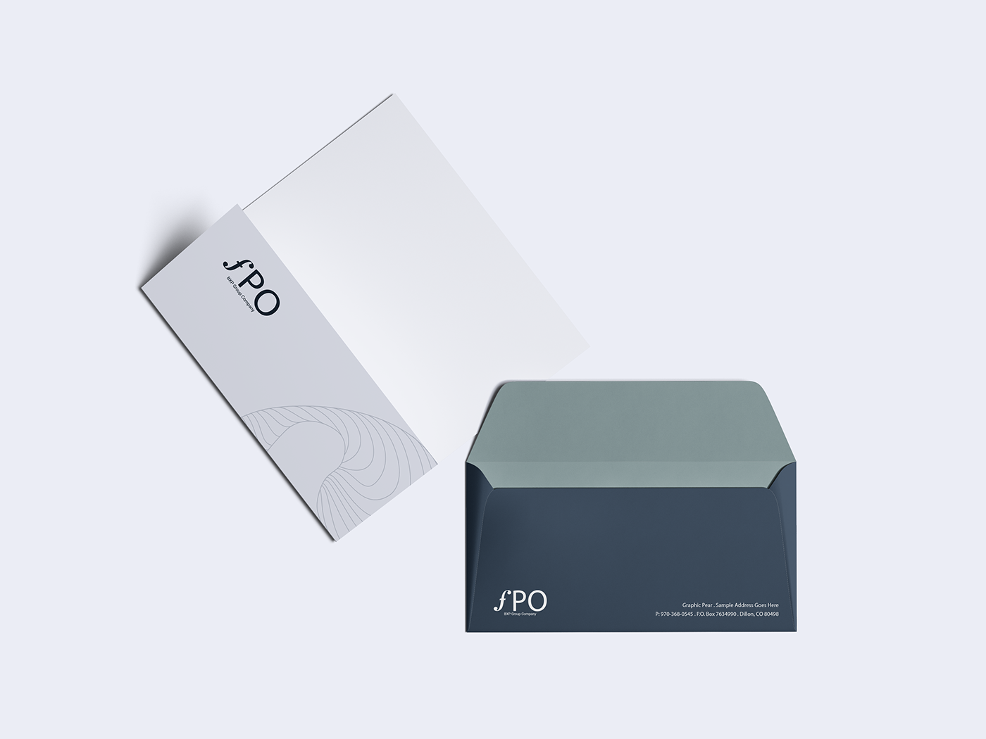
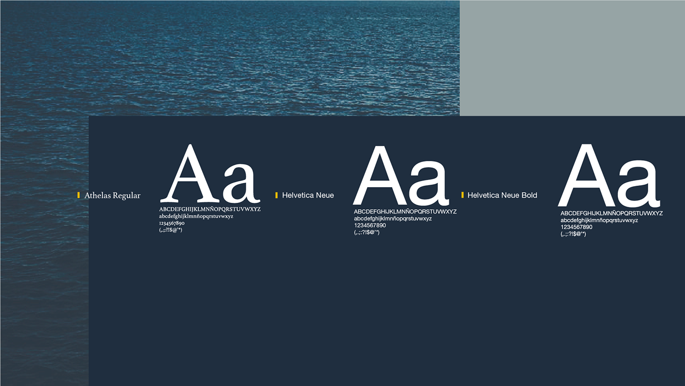
The logotype uses 3 main elements: a typography contrast that puts emphasis on the 'F' (as an allegory to Excel worksheets, accounting and mathematics), a sans-serif typeface that aims to create a sophisticated, clean and contemporary appearance (achieving a fresh look that diverges from the traditional brands of accounting firms) and a color palette that references the corporate environment with its heavy use of blue and white.
This symbol started to open new possibilities for the brand to grow from and we envisioned the usage of the 'F' as a branding element that could merge with textures and secondary elements that would help us to meet our communication goals; especially when using it as an allegory for precision, mathematics and technology.


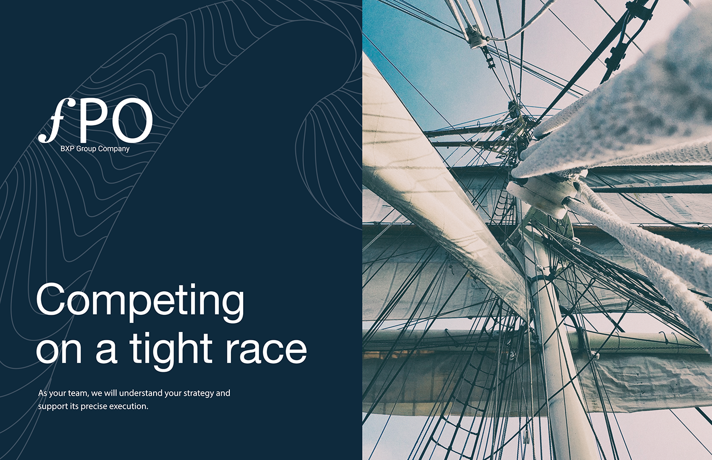
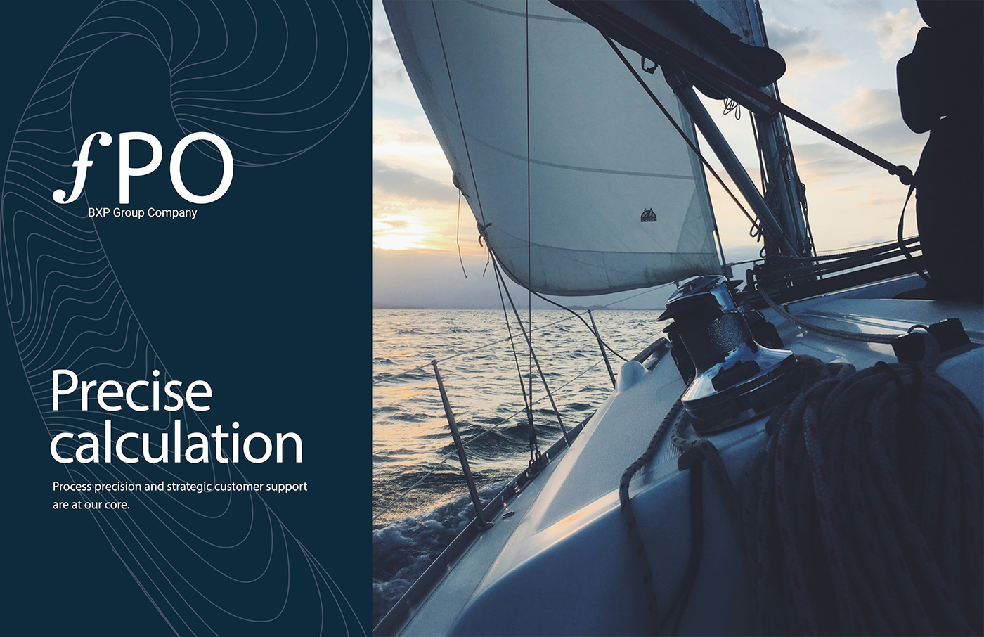
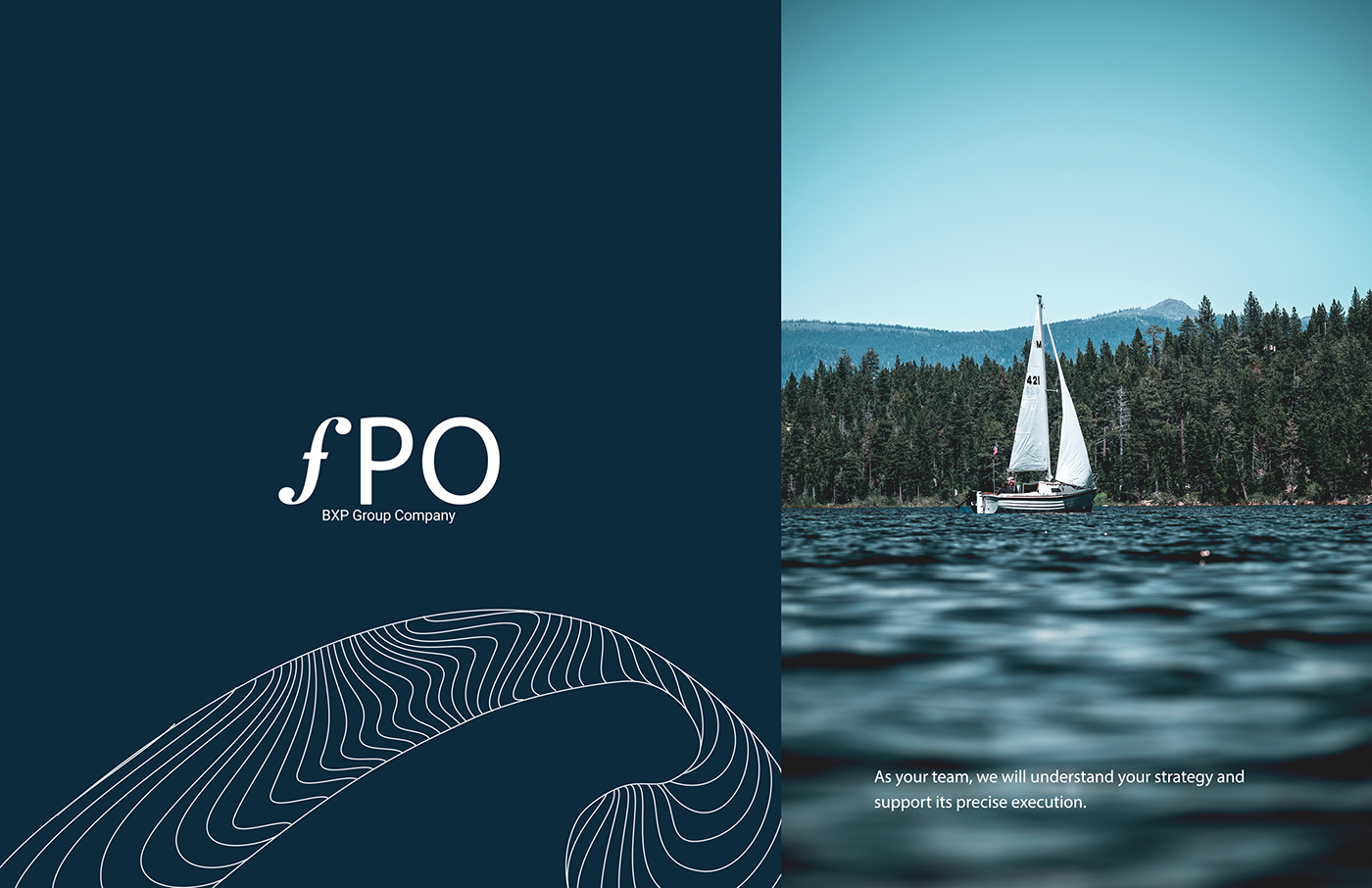
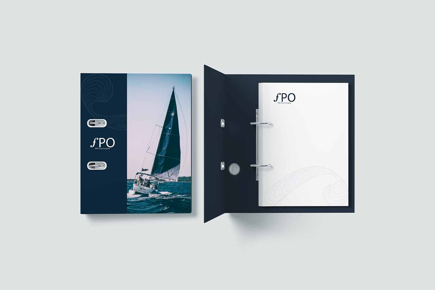
The project took an interesting turn when the team realized the brand needed a unique concept to stand out in a crowd of thousands of accounting firms that relied heavily on clichéd accounting elements and stock photos of business people and financial charts. With client support, the team took a leap into uncharted lands by using nautical elements and navigation visual metaphors to create an aura that would align with our communication objectives.
In this new environment, the brand uses boats and yachts as an allegory to companies (e.g. 'We are in the same boat'); nautical maps and coordinates as an equivalent to financial reports and accounting calculations (e.g. 'Navigate using precise coordinates'); and sails, ropes and pulleys as a metaphor for teamwork, solidarity, commitment and responsibility.
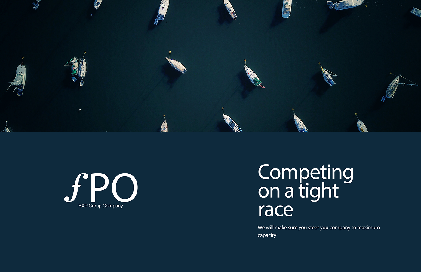

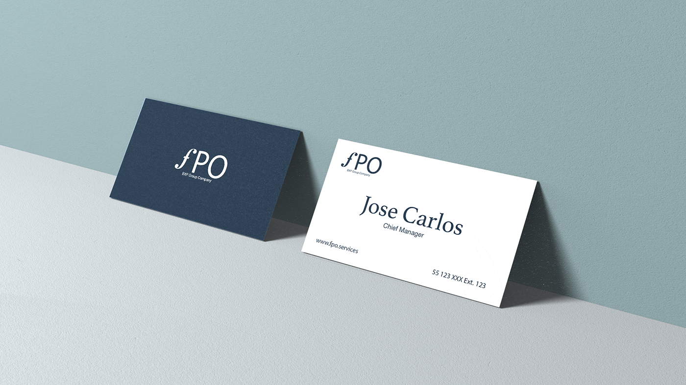
Finally, our team worked on several branding applications, including a responsive website that would put everything together. Overall, our design objetives were not only met but surpassed, the final look-and-feel achieved secondary connotations like calmness (which was related to the whole outsourcing component of the company), corporate competition (through the use of several boats on a single image) and the reinforcement of the whole narrative.