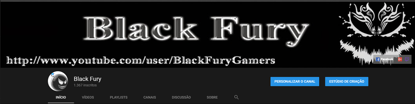
Old artwork and layout.
New logo, we kept the bomb symbol, but we made it more simple, in a vibrant and provocative neon like pink tone.

For the new channel art we decided to use the "new retro" lettering style, using "Terminator Two" and "Outrun Future" fonts to give an "anarchy over order" impression.
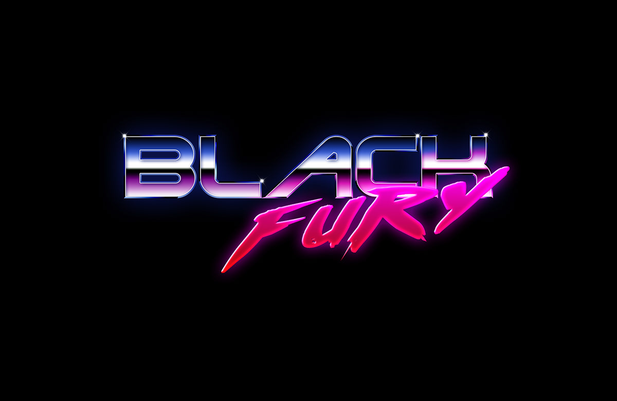
The cold metal pattern colors in "Black" communicates a feeling of order, the creation of expectancy. The pink and red gradient in "Fury" show an sudden break on the order, a expectancy break.
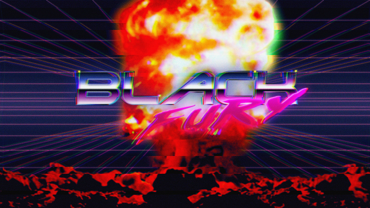
I tried to use an explosion and the VHS glitch effect, to enhance the retro vibe of the cover art, but the image became too much noisy.
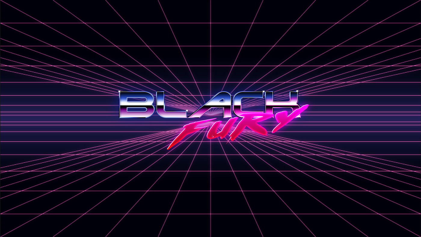
This is the final version of the cover art, we get rid of all the noise and glitch effects and the explosion. The result is a more clean and pleasing image.
New Layout

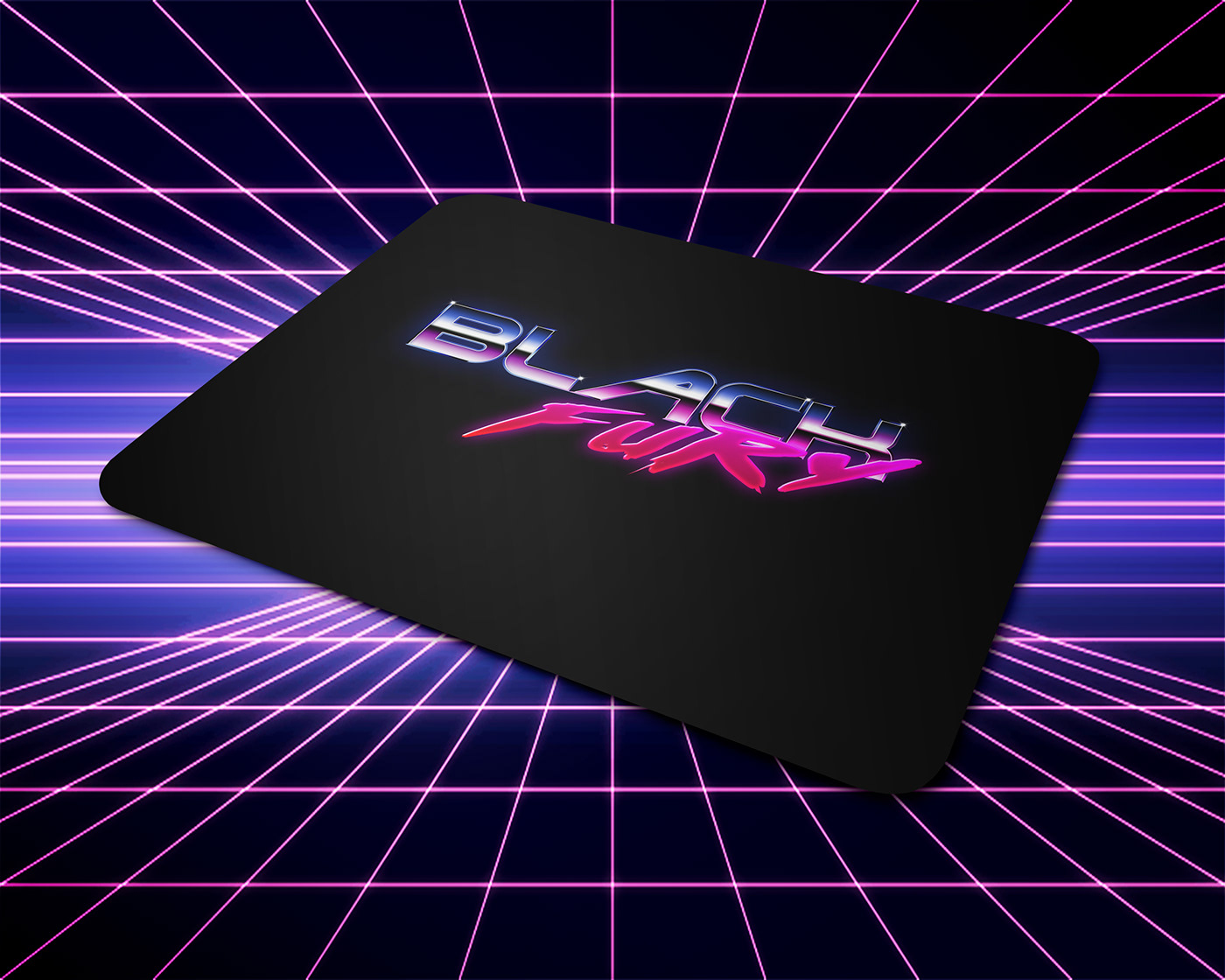
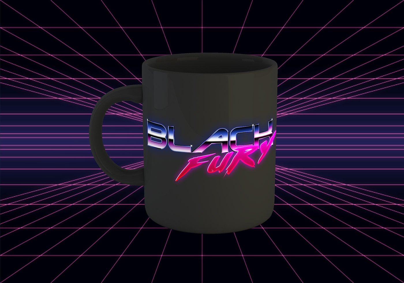
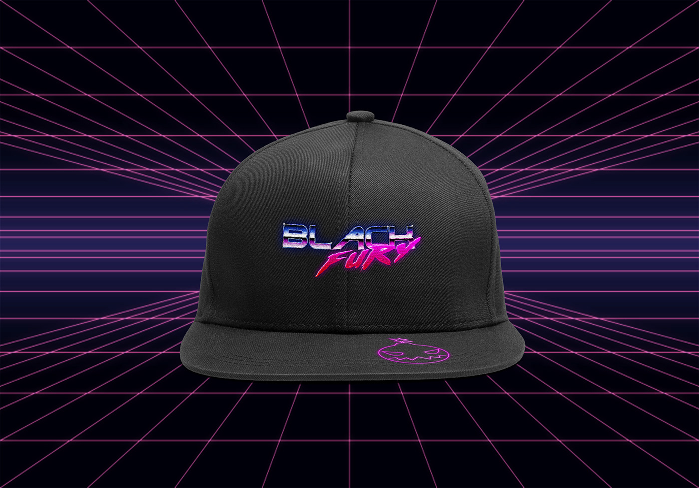
These are a few mockups of practical applications on products and merchandise.