Paupys
Identity for the new ambitious district in the capital city
Challenge
To reveal the main advantage of the project – nature and harmony in the city. The idea comes from the location itself – the area is close to both the center and the green part of the city.
Our solution
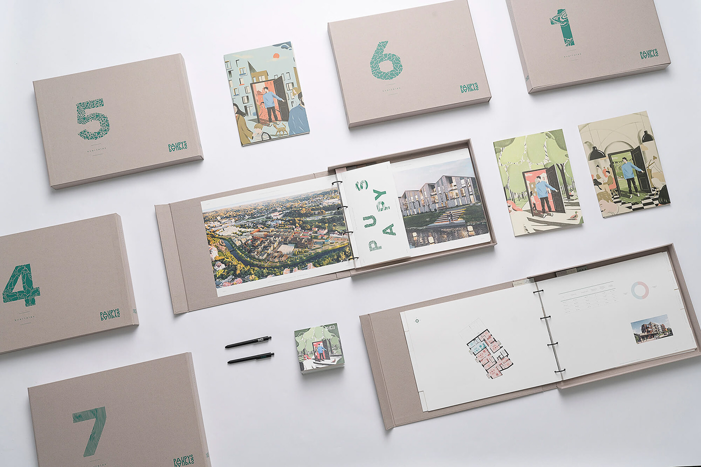
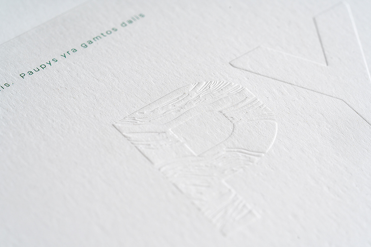
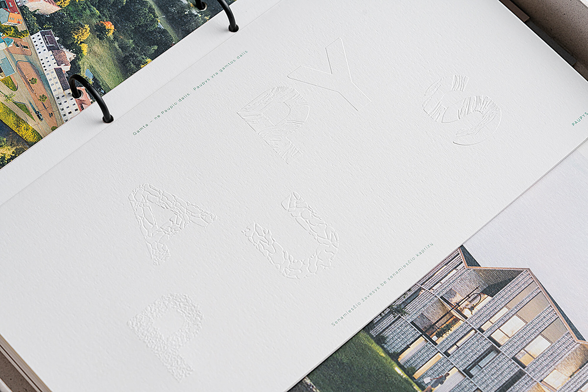
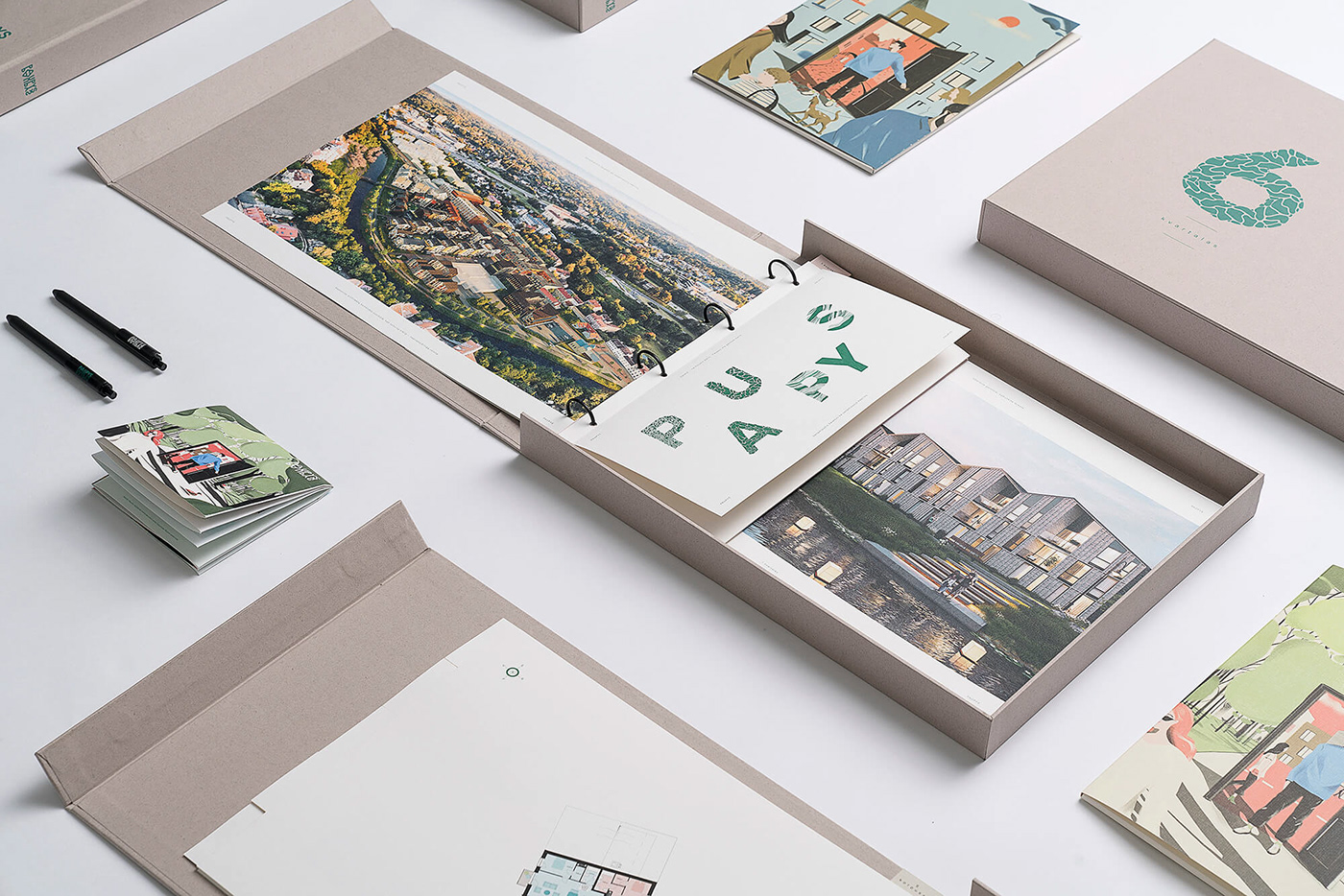
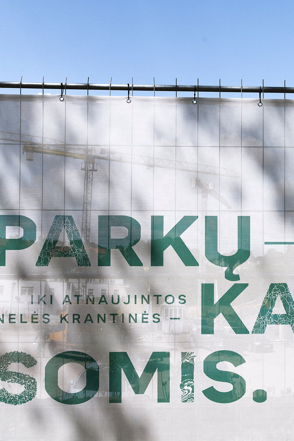
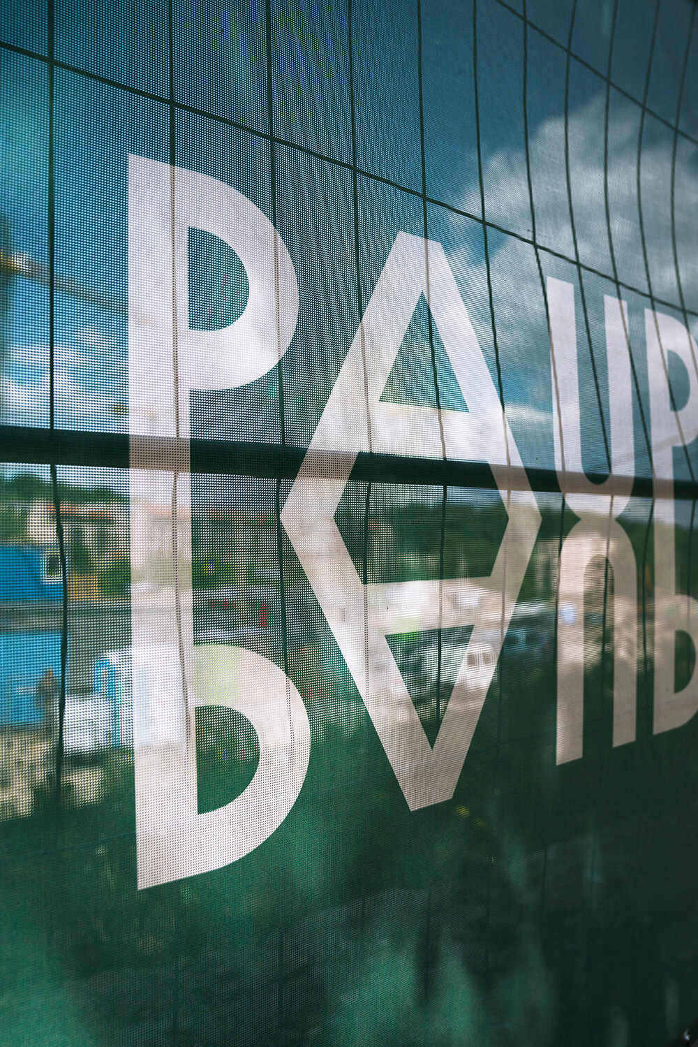
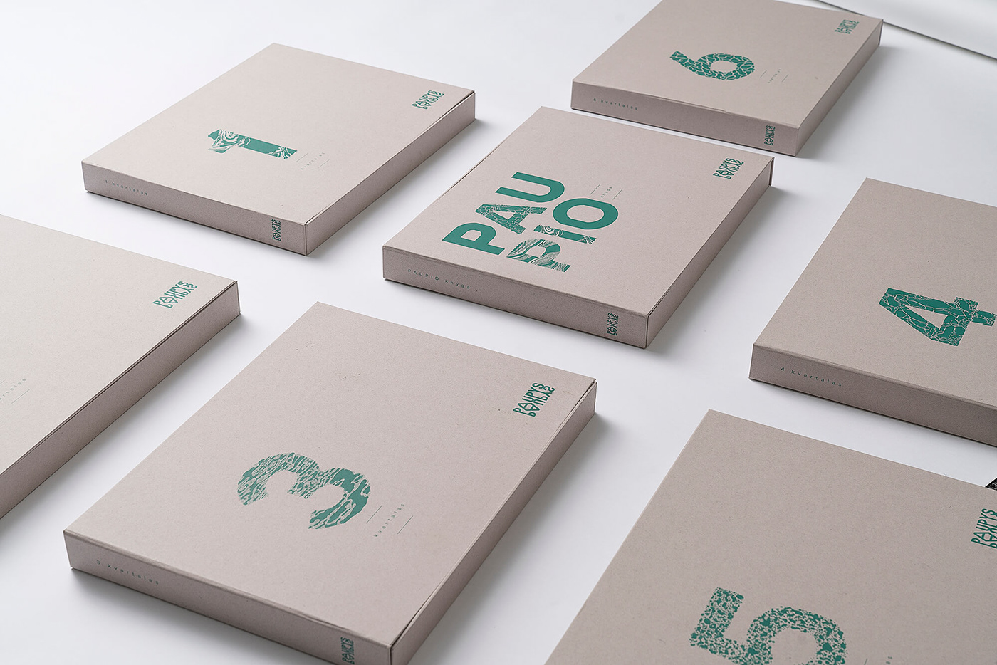
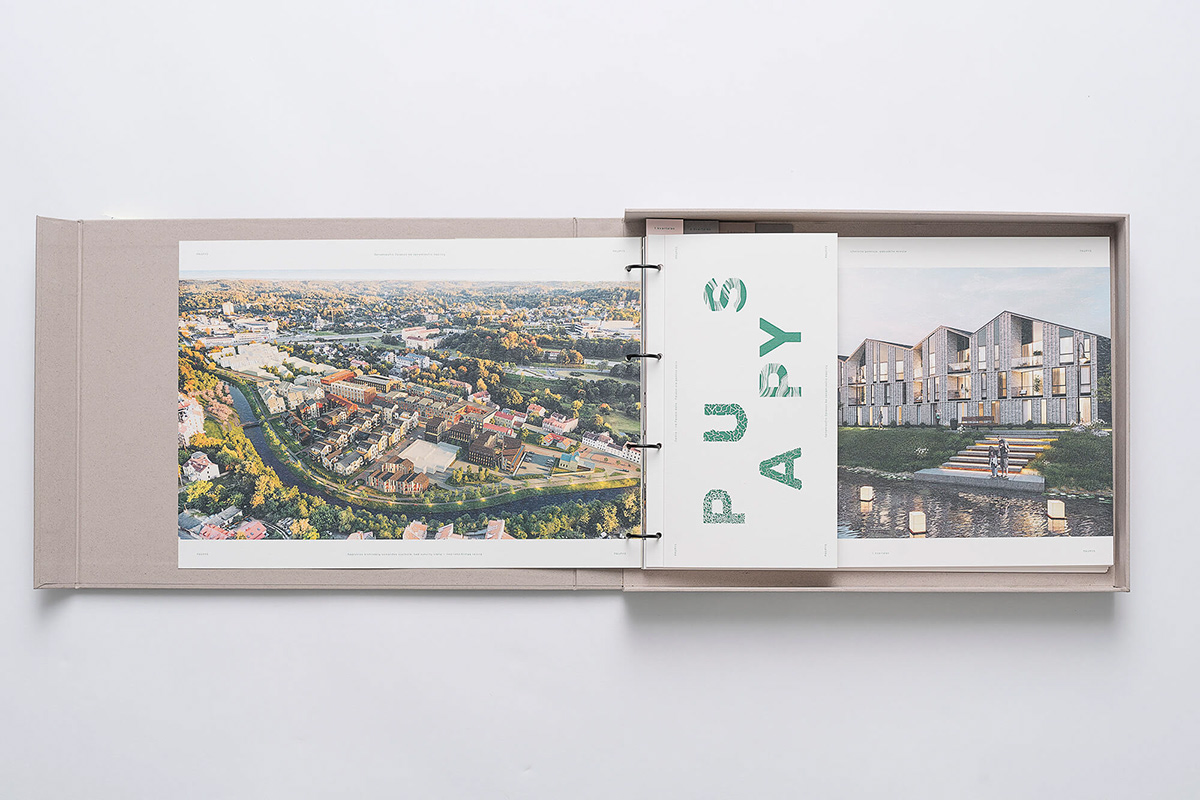
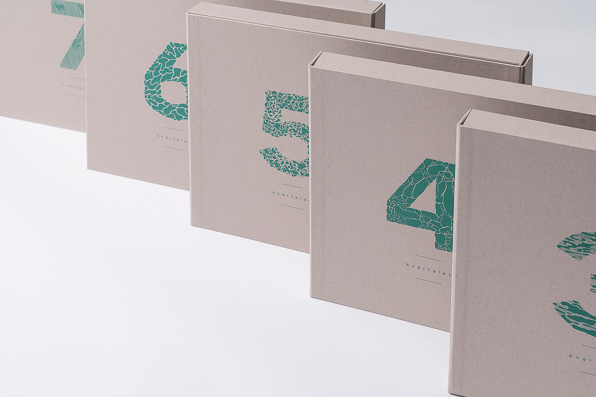
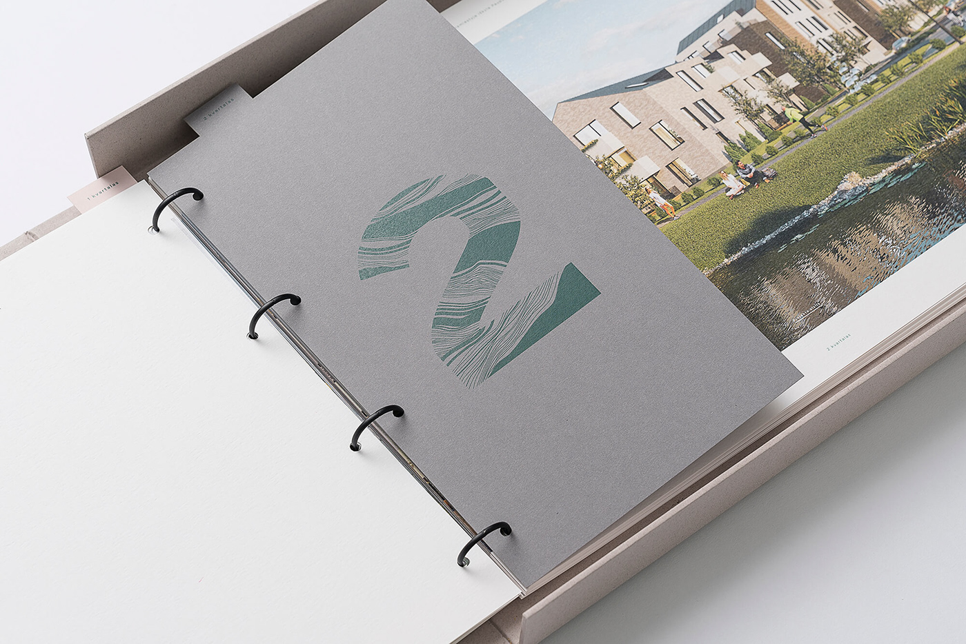
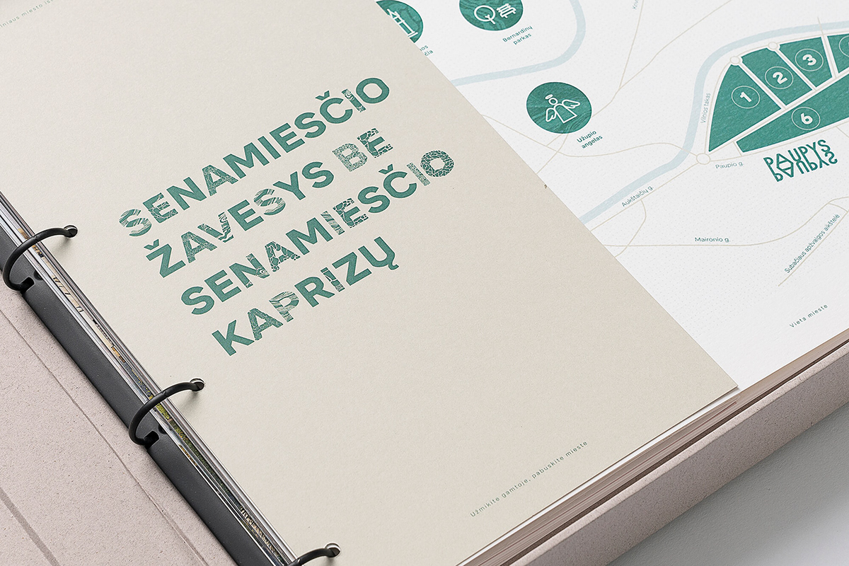
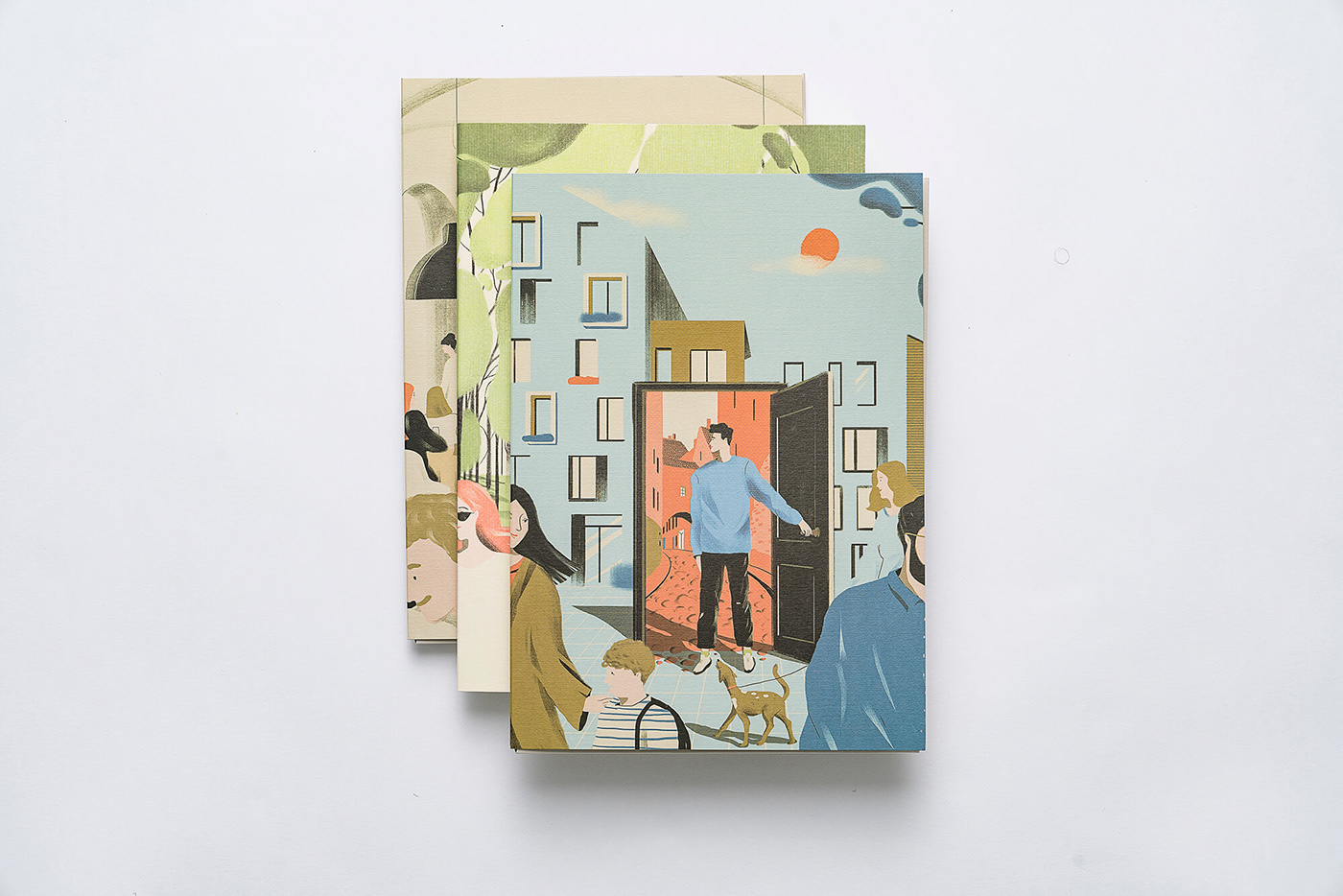
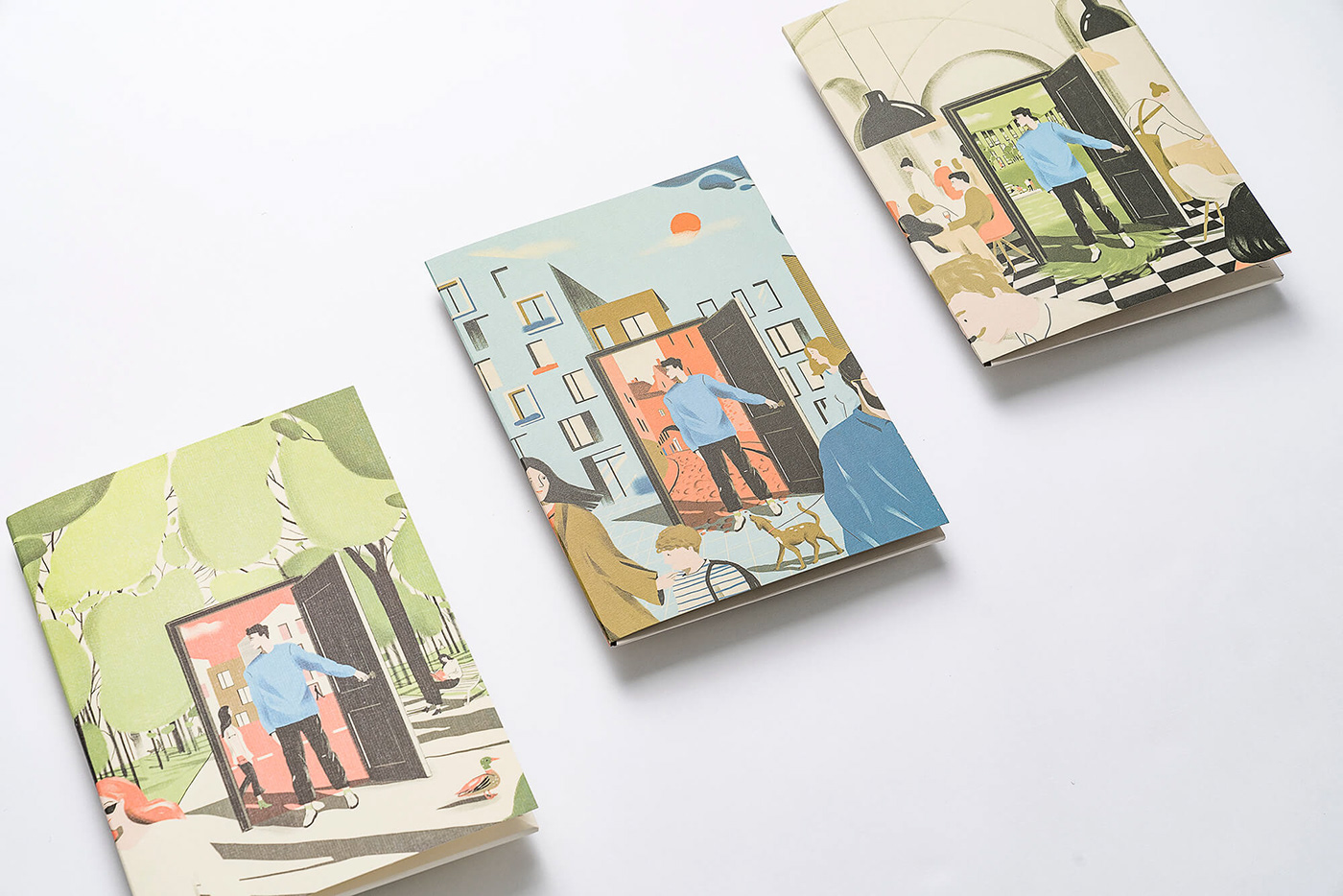
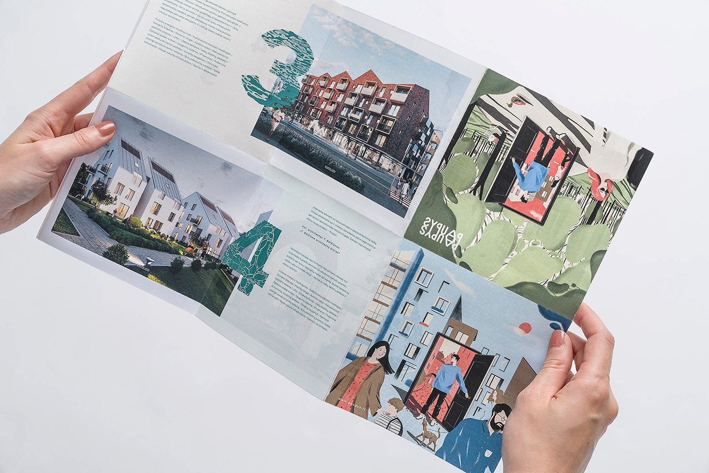
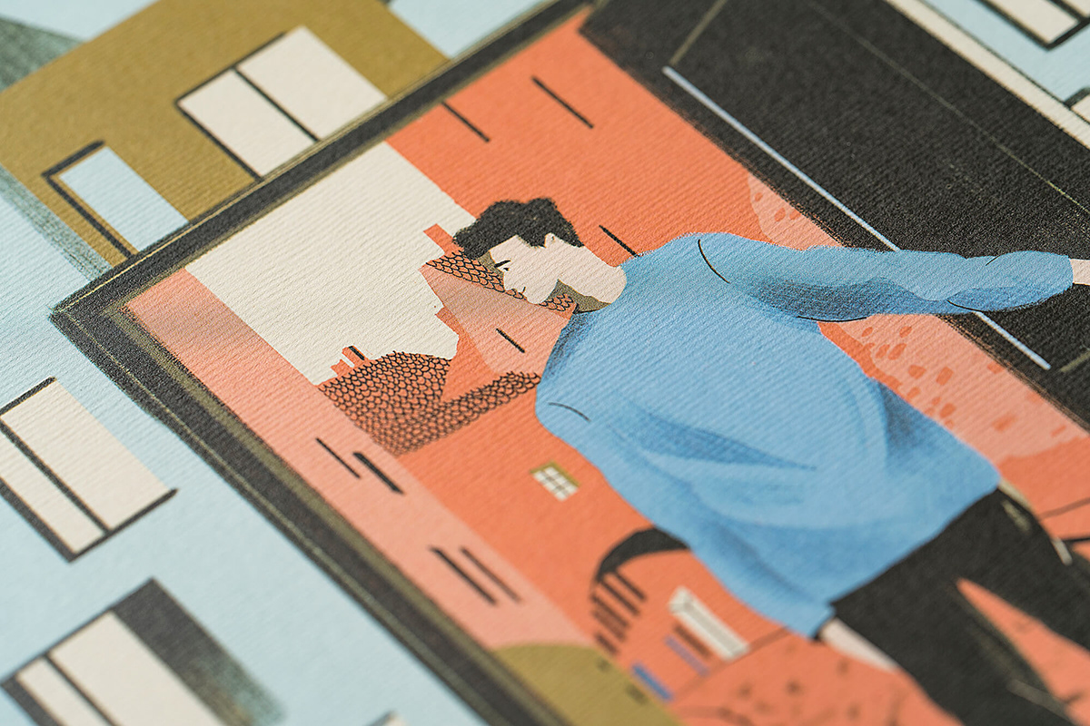
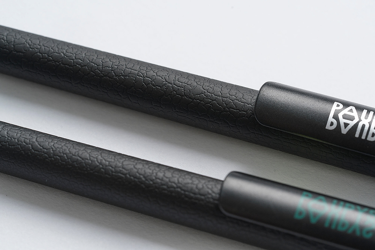
The main logo is created using a reflection, because the whole area is located by the river. The fonts correspond to the sharpness and rigor of the city corners, but their textures and patterns stand for the fluidity and truthfulness of nature. On pens and cards we used a variety of tactile textures that recalls the sensation of touching sand, earth and wood. The doors used in the illustrations symbolise the line that the city dweller crosses to come out of the city and suddenly find himself in nature.


Follow us on Instagram


