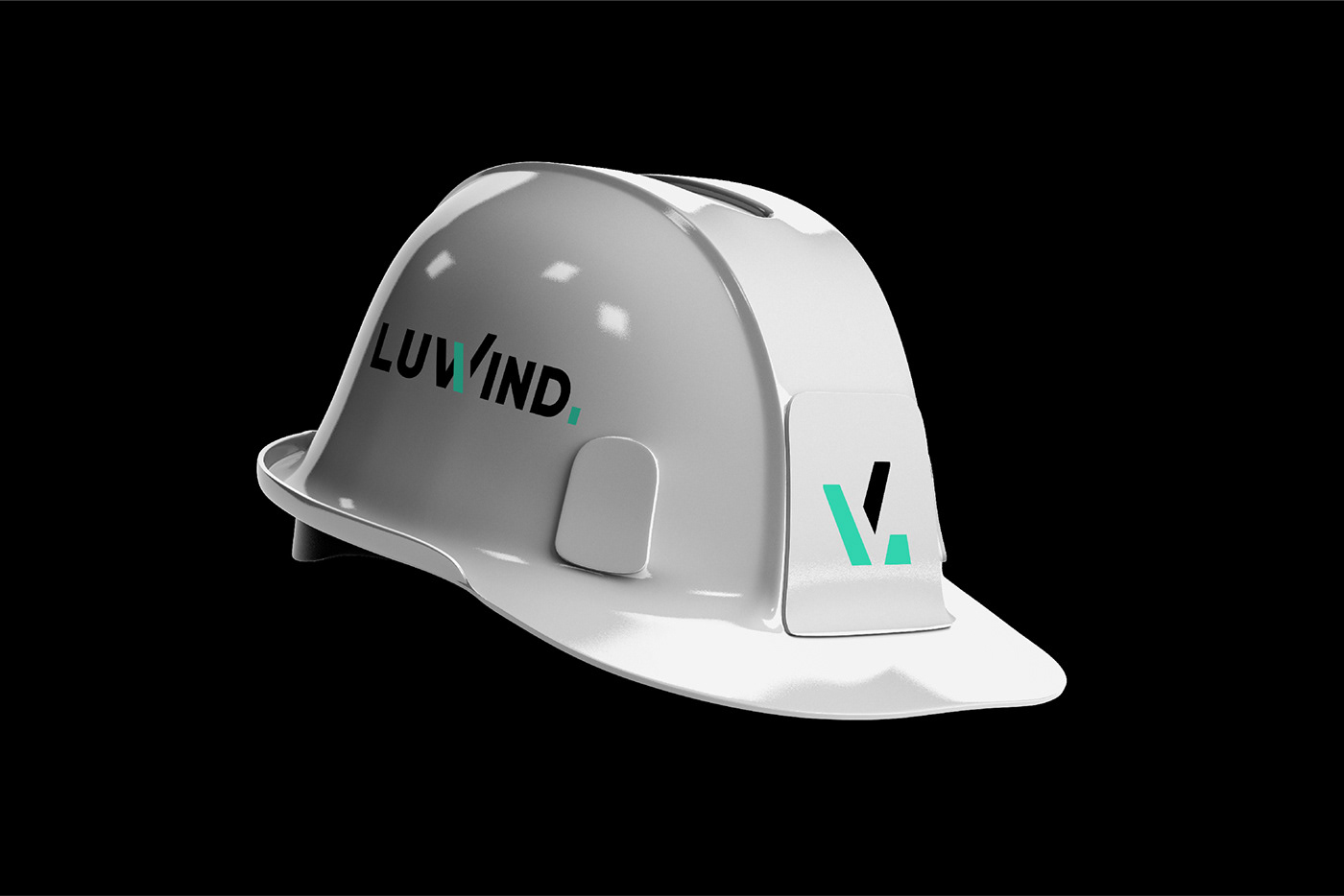
Tatyana Kirichenko's profile

LUWIND. BRAND IDENTITY

Branding
Illustrator


Luwind.
Сonstruction company

LuWind is a large construction company specializes in capital construction, reconstruction and restoration of buildings, technical advice and expertise in the design, development of design and technical and budget documentation with the optimization of the best solutions, provides a full range of general contractor and general design services.
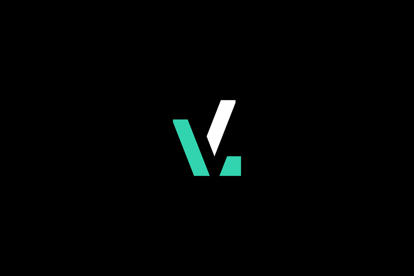


Logo

The logo includes a tick, as a sign that the company is taking on any tasks, and a point, which means that LuWind is doing all the work to the end. Also the sign is similar to a crane and rotated in space, because the company name means a light vortex.


Concept

​​​​​​​LuWind means a light vortex (luminous wind) , respectively, the concept is based on the lines - the rays enveloping space from which the structures are built.  The project implements unique numbers and icons, often used on the identity carriers. The colors are chosen so that people can be seen from the height according to safety rules.On print, the colors remain as bright as the pantone 3385 c and pantone black 6c.


▼Follow for more
——

Tatyana Kirichenko | @krechet_studio

Открыта к диалогу по любым вопросам


LUWIND. BRAND IDENTITY
Published:

LUWIND. BRAND IDENTITY

Brand Identity for a large construction company specializes in capital construction, reconstruction and restoration of buildings, technical advic Read More

Published: