


Johnston Vs Gill Sans.
A comparison booklet of two British Typefaces.
The brief was to create an informational graphics piece based on a typeface. I decided to base the project on comparing the two typefaces Johnston, the London underground typeface and Gill Sans. I choose these two because they were both designed during the early 1900’s and both British types. These two typefaces are also often confused for one another due to being so similar, and thus I brought it upon myself to design a booklet that communicated the differences.

The booklet front cover.
I created a booklet that used a mixture of patterns, overlays and large scale letters to visually communicate the differences between the letter forms, overall creating a visually interesting and playful book. Acetate was also used for the overlay spreads to make the piece more engaging and so the differences could be observed. Pastel coloured versions of the Great British flag were used, to reinforce the Britishness of the two typefaces.

Overlaying the typeface to compare, added to with acetate.

The use of patterns to compare the typefaces.

The use of patterns to compare the typefaces.

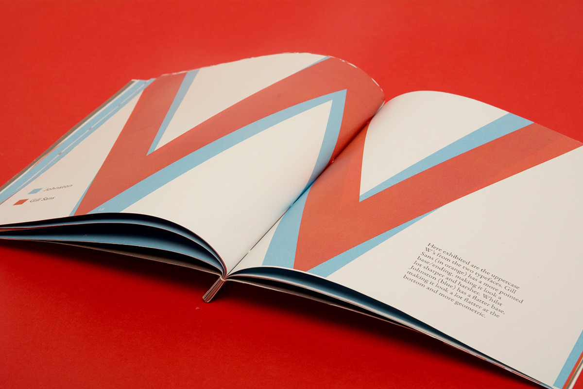
Zooming in on specific differences between typefaces.
Overlaying the typefaces to compare.


