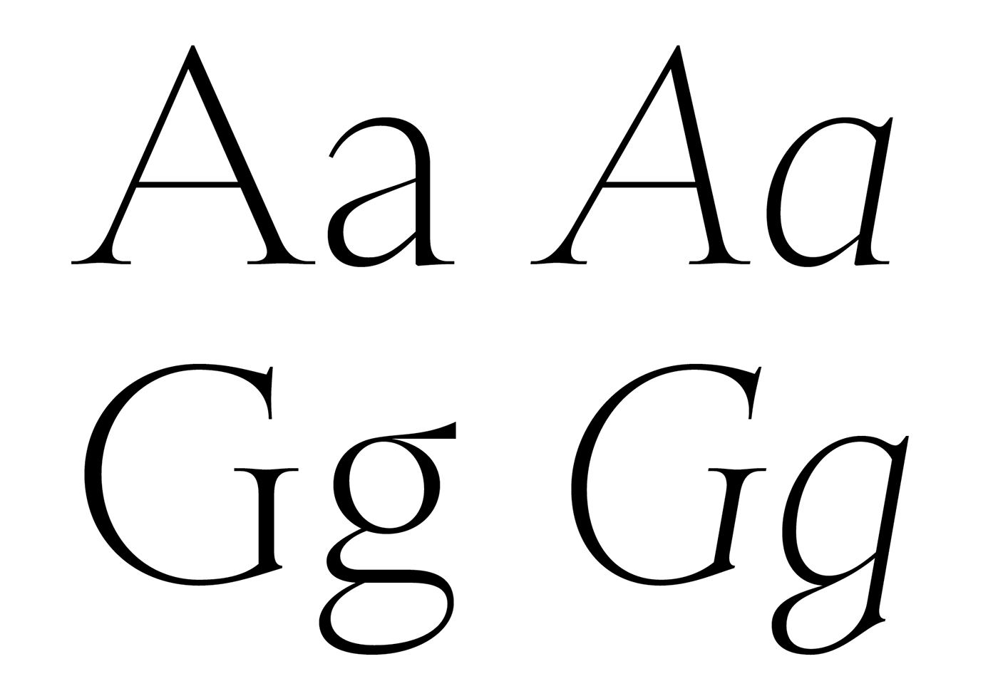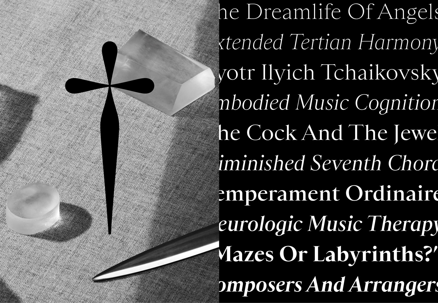
Sainte Colombe is a new serif typeface available in a range of five weights, from extra light to bold. Decidedly not driven by geometry or symmetry, Sainte Colombe is actually just the opposite—expressive, like music, but also with a repressed shell trying to contain that expression. It’s not afraid to move, as long as that movement happens in subtle ways.
There are lovely details designers will immediately notice: the lowercase italic g, its notched stem curving into itself—a flat note in the company of sharps. The lowercase a across all the styles are beautifully stern, and the firm buoyancy across the caps give gravitas to titling settings. The shapes of Sainte Colombe don't necessarily conform to a tool—a subtle discordance that was inspired by the still-life painting, “Le Dessert de Gaufrettes,” in which all the cast shadows are illogical. The irregularity of Sainte Colombe's glyphs is suitably counterbalanced by a quiet, classical stability across the typeface.
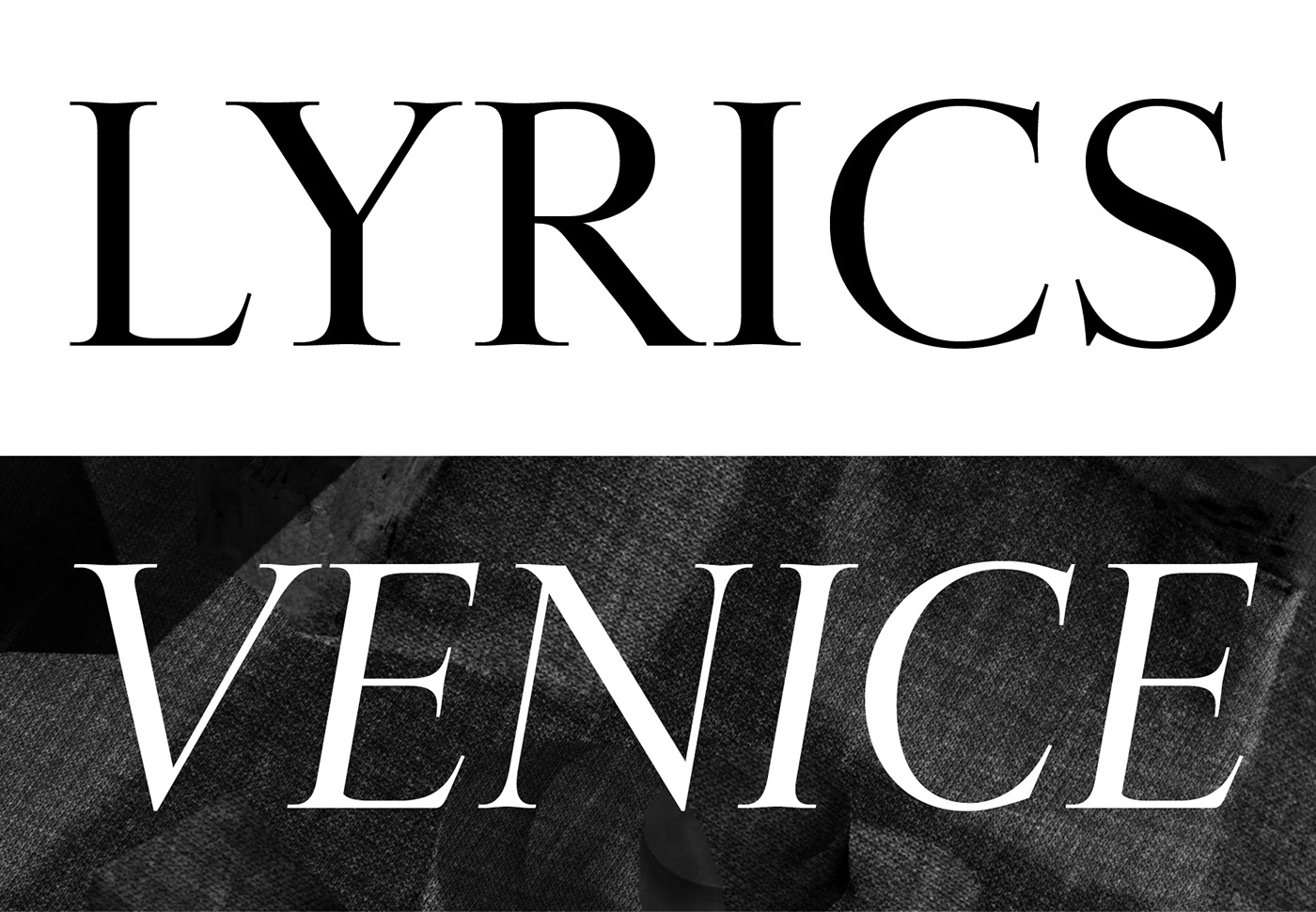
Sainte Colombe has a beautiful texture and color when set in text. It’s delicate, but its proportions keep it warm. In heavier weights it does gain contrast, so these letters should be handled with care in color and with image. The effect will be the slow and deliberate adagio, not a crescendo—fitting for a typeface named after Jean de Sainte Colombe, a 17th-Century French composer and violist credited with influentially adding a seventh string to the instrument. The typeface’s unique sharpness, flagrant serifs, and open counters brim with musical resonance.
Buy Sainte-Colombe from 60€
Design: Yoann Minet. Team: Quentin Schmerber.
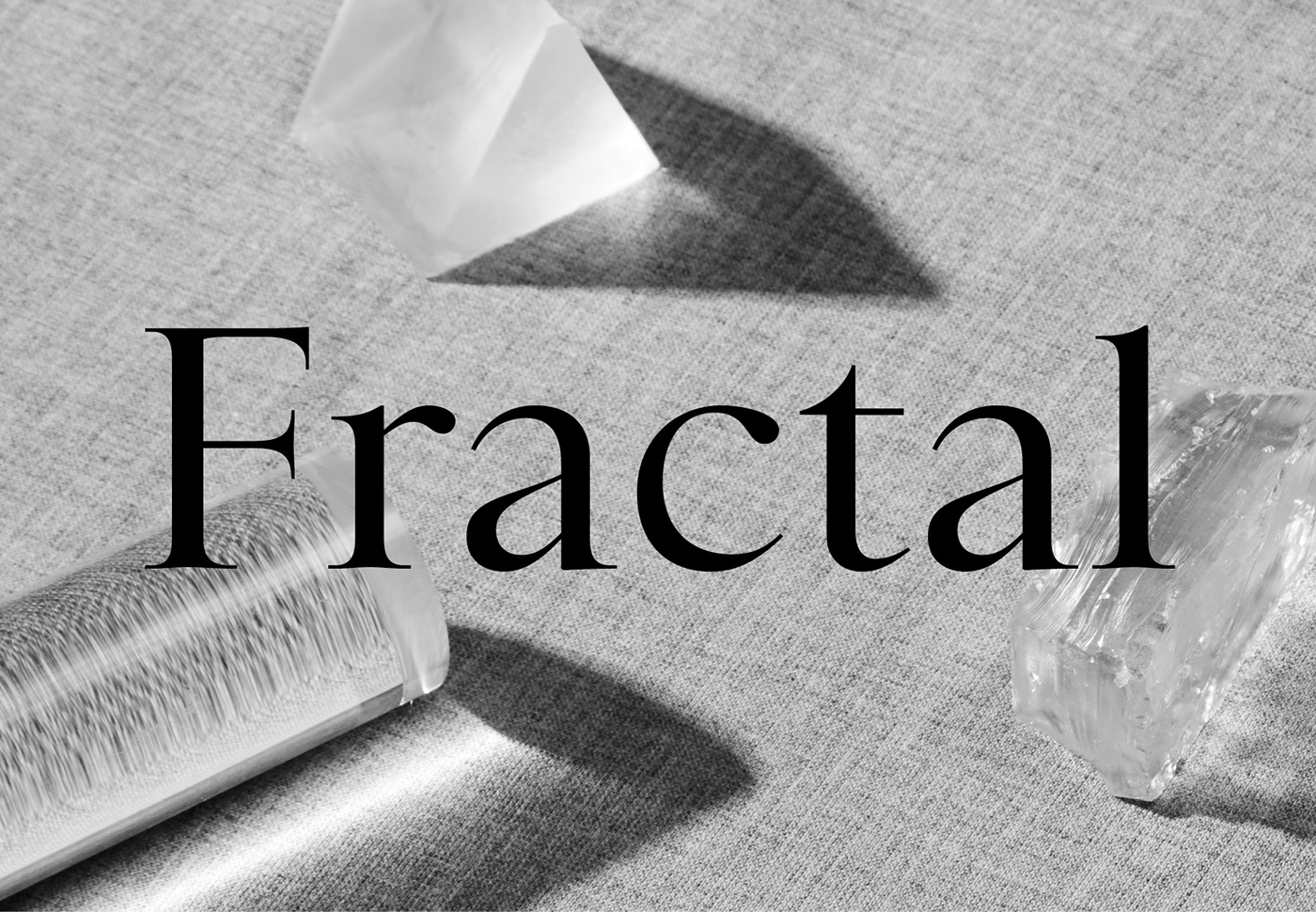
Picture by Florent Tanet with art direction by Anne-Dorothée Schulz.
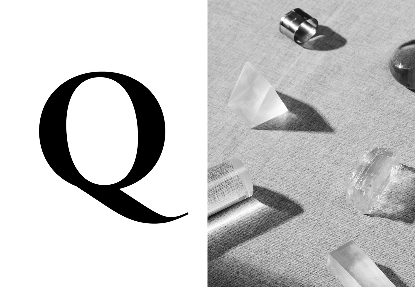
Picture by Florent Tanet with art direction by Anne-Dorothée Schulz.


