Family Doctor is the first Russian network of private clinics and medical centers.
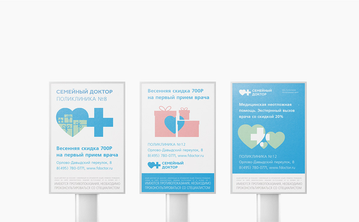
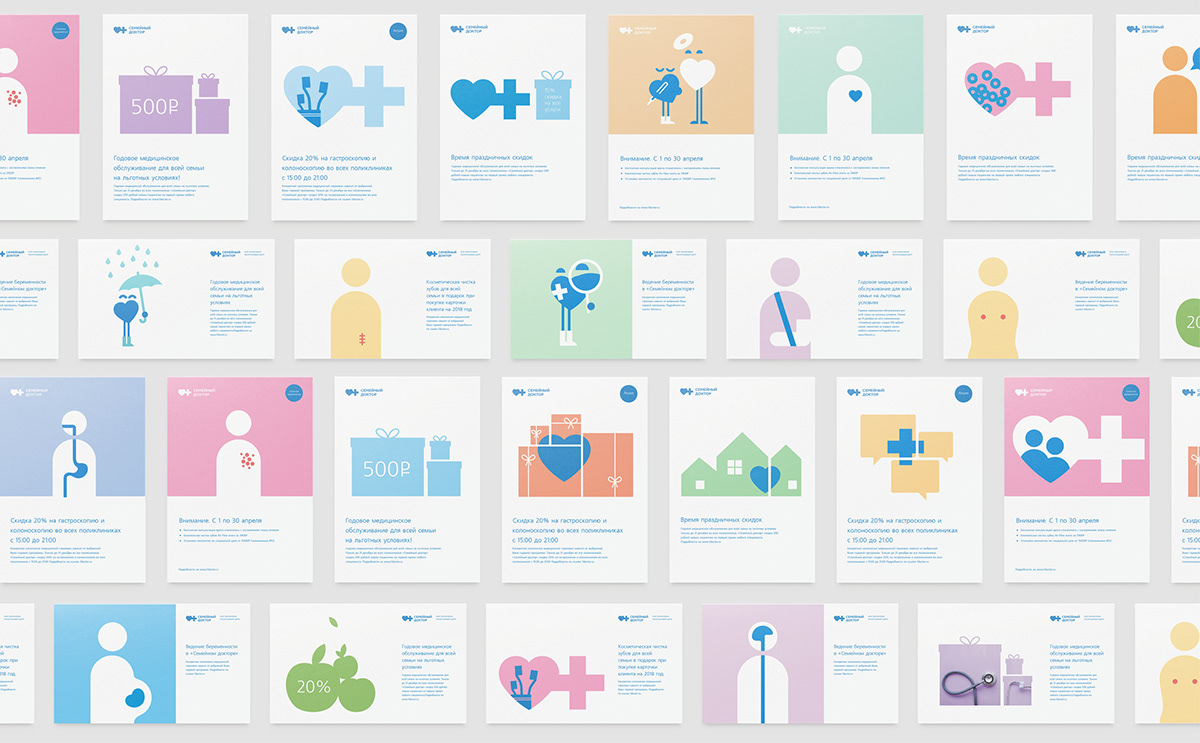
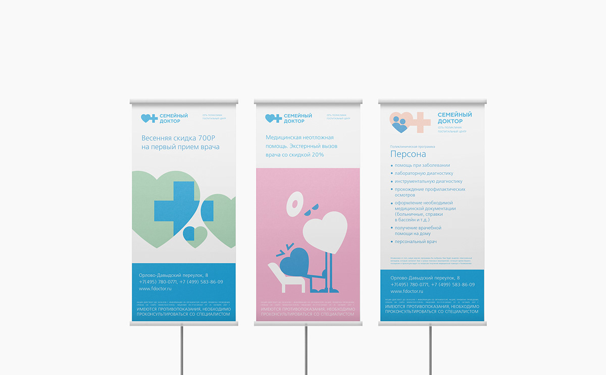
Following the family approach, the сlinics are open for patients of all age groups: you and your child can be served in one clinic. Family and professional approach to treatment in the clinic extends to corporate identity. The general concept of the whole visual language based on the "unification". Various objects are united by two basic symbols "heart" and "cross".
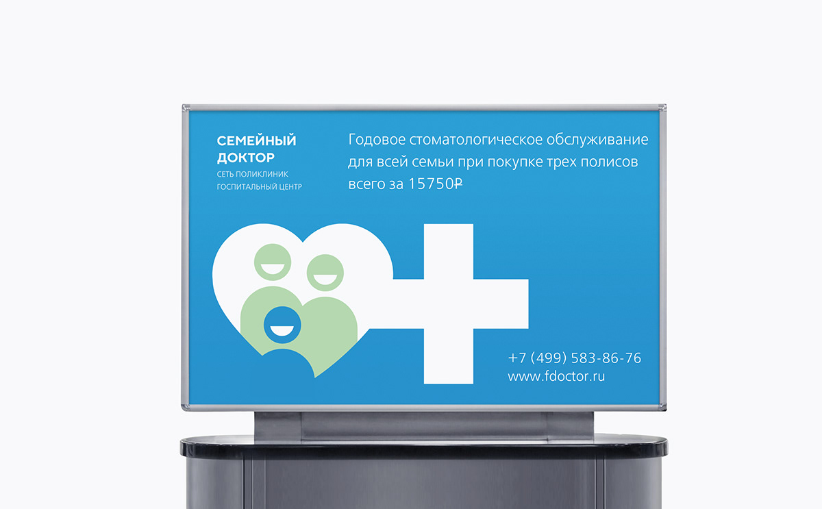
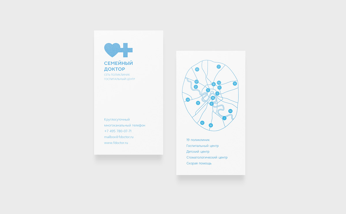
The overall visual style is laconic, with subdued tones of basic colors and well-adjusted layout of branded materials.
The overall visual style is laconic, with subdued tones of basic colors and well-adjusted layout of branded materials.



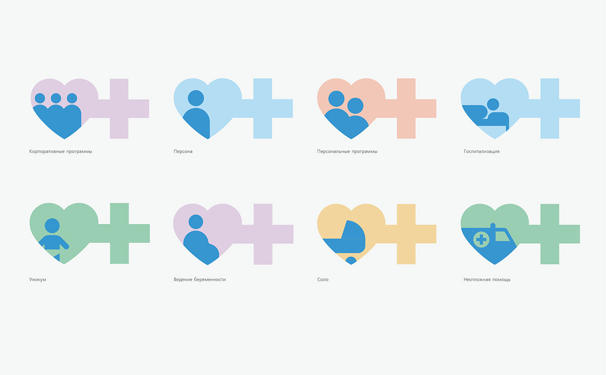






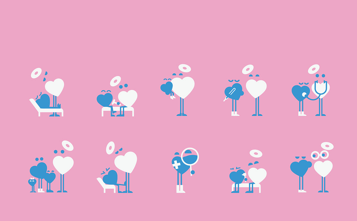
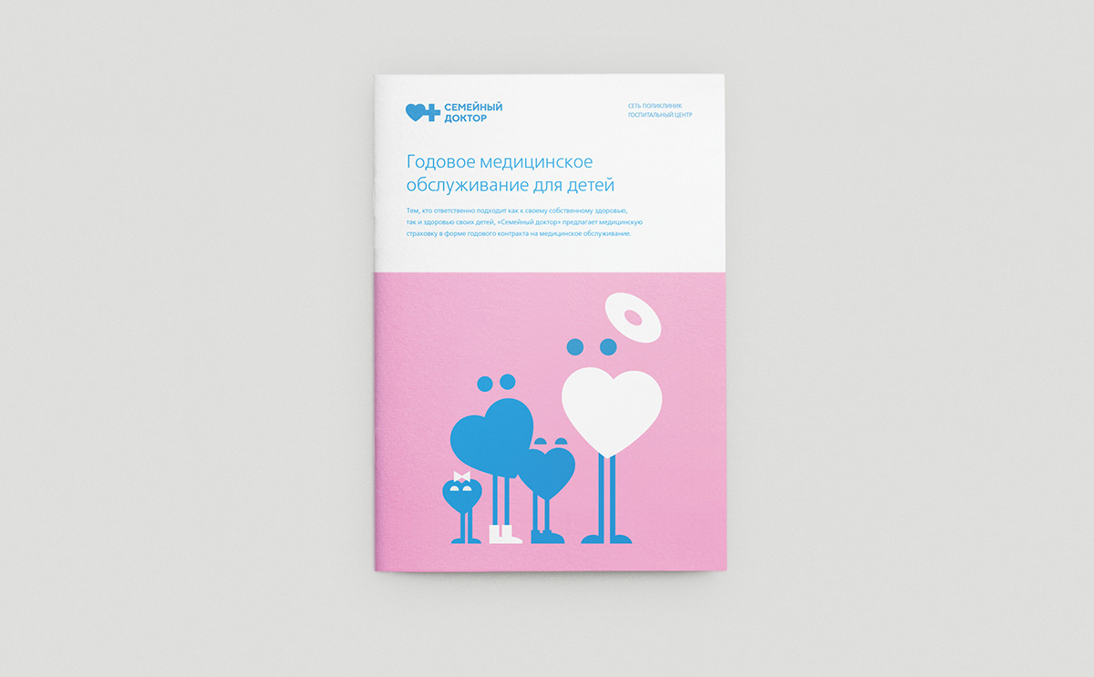
An addition series of mascottes for Family Doctor's treatment programs for children




Made in Suprematika branding agency.
