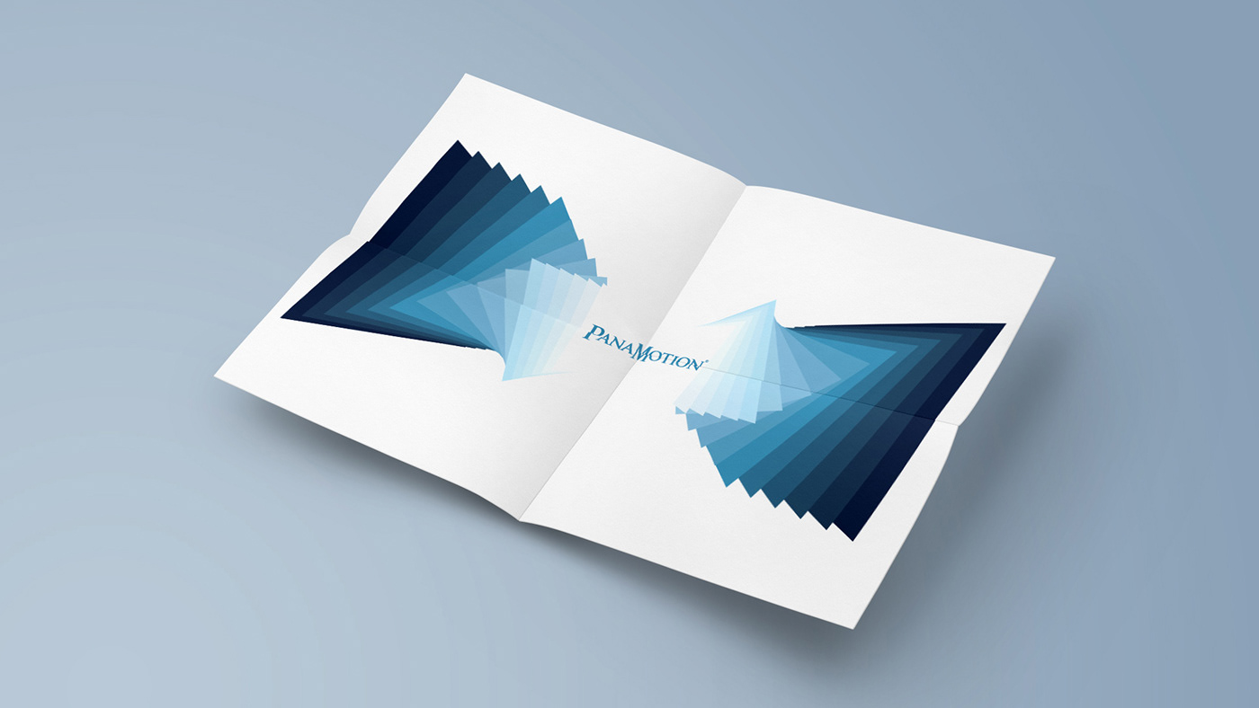
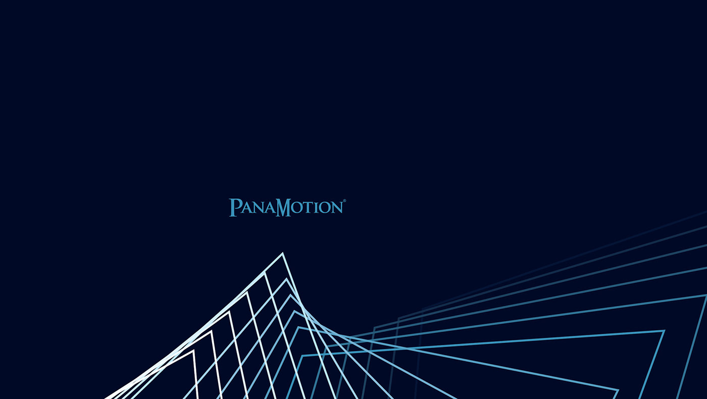
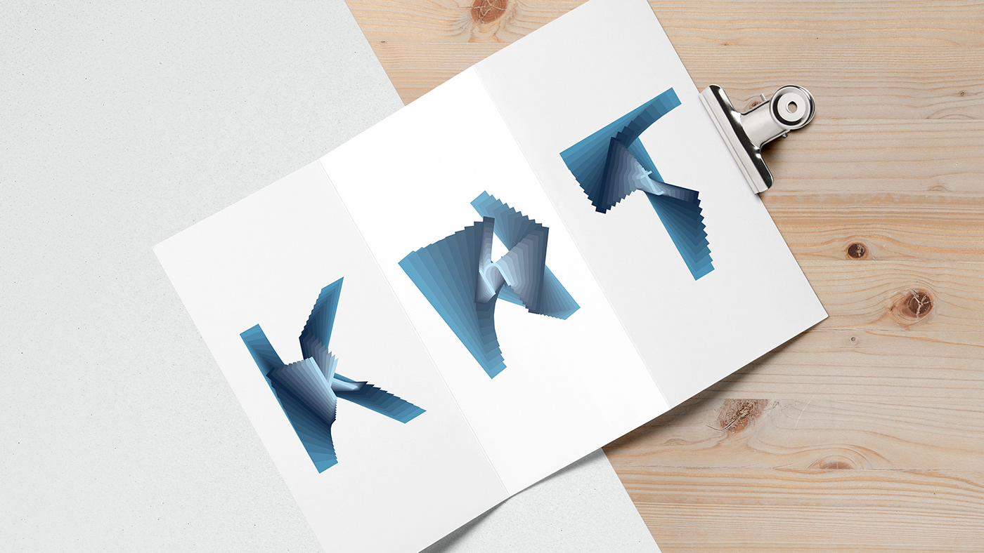
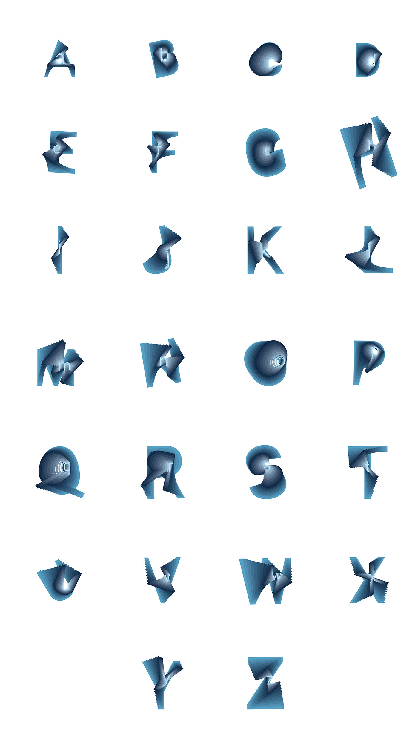
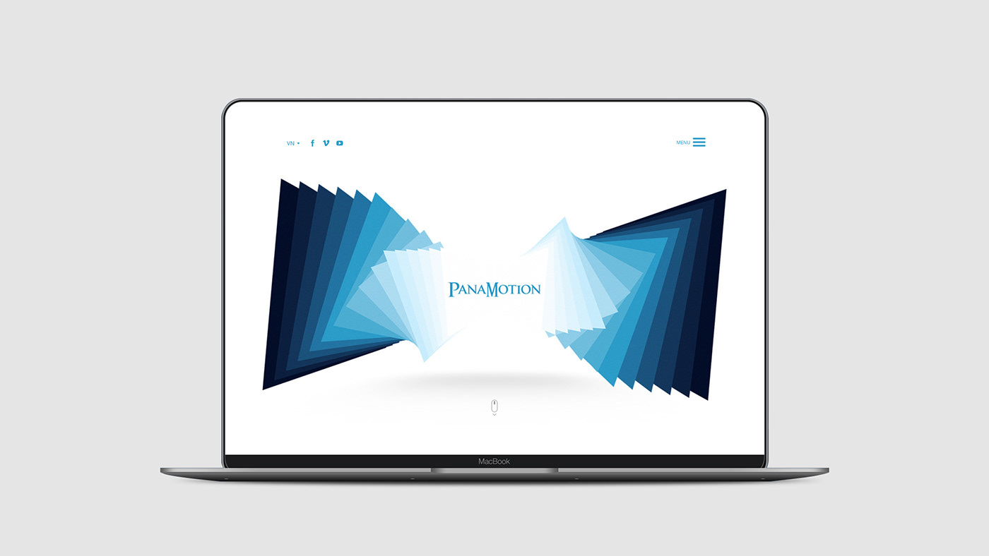
PanaMotion is a VFX studio in Vietnam (Hanoi). In 2015 they wanted to re-new their visual brand identity system. The challenge was they didn’t want to change the logo, color scheme and the hardest is they didn’t have much material except the logo. I just focused on two things: Watching (screen, wide,…) and Motion (pieces, step by step, frame by frame,…). I really love the concept idea so I thought “Why not make custom typeface?” I decided to make an “alphabets in motion” (look and feel).
Creative, Art direction & Design: Sonny Nguyen
Website development (front end & back end): TechUp


Thanks for scrolling!