

DEFINING THE GOALS and Methods
Discovering the pain-points involved when it came to shopping and purchasing insurance was essential to develop a user-centric website design. The overall goals were to (1) find out how clients typically shop for a particular insurance plan, (2) learn what competitors offer on their websites and how they categorized products for easy navigating, (3) understand how the insurance industry standardizes products and why, (4) and discover what website features are attractive for users looking to shop or learn more about a product.
The methods used
Secondary Research: Learn about the insurance industry and standard requirements. Gain knowledge about a typical user seeking insurance.
Competitive Analysis: Research and compile a list what other competitors may offer and feature on their websites. Look into the design of sites along with how competitors organize product categories.
Individual Interviews: Useful to talk in detail about topics along with probing an individual’s beliefs, attitudes, and experiences to get a better understanding of how they come to their decisions on insurance.
Questionnaires/Surveys: With a short survey, demographics can be reveal trends of who might be making the decision of insurance based on age ranges, income status, race, and more.
Competitive analysis
A competitive analysis was used to learn the strengths and weaknesses of competitors to identify potential opportunities.

interviews
INTERVIEW SUMMARY
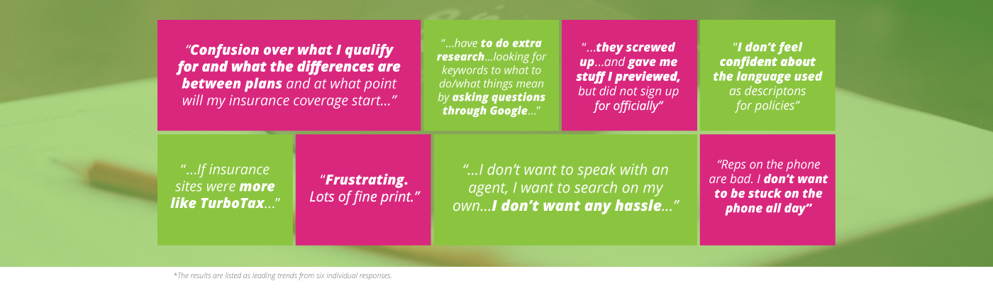
Six participants were asked a series of questions to of their experience when shopping and/or purchasing an insurance policy. The overall goal was to find out how these participants typical shopped and searched for their particular insurance plan.
Six participants were asked a series of questions to of their experience when shopping and/or purchasing an insurance policy. The overall goal was to find out how these participants typical shopped and searched for their particular insurance plan.
PARTICIPANTS DEMOGRAPHICS
- 2 females and 3 males
- Ages range from 25 to over 55 and single
- No children under 21
- Income ranges $25k to $75k
- 2 one-on-one interviews
- 4 responses from question survey
- 2 females and 3 males
- Ages range from 25 to over 55 and single
- No children under 21
- Income ranges $25k to $75k
- 2 one-on-one interviews
- 4 responses from question survey
SAMPLE OF QUESTIONS
Demographic questions such as age, occupation, income, device preference.
How is your experience when you purchased your insurance?
What are 3 pain-points that you have come across when shopping/purchasing your insurance policy?
How do you track your insurance policy, plans, payments, etc?
Are there any features that would have improved your experience when it came to shopping or purchasing?
INITIAL FINDINGS
Users that were shopping or purchasing insurance found the entire experience frustrating. One user even stated that finding insurance is “like doing your taxes”.
Most insurance website added to this frustrating experience by providing difficult and complex language descriptions for insurance plans that users didn’t understand, confusing navigation, and lacked a clear walk-through to assist users with what plans they were purchasing.
WHAT USERS WANT
An online platform dedicated to the users being able to purchase insurance easily and efficiently without the need of an agent.
Transparency with pricings and very clear, detailed plans that are understandable.
Easy-to-understand language of different policies. The website would need to have simple ways of purchasing insurance accurately.
Provide the options to change insurance, policies, and any other account information.
The direct Feedback
In combination of the survey results and the one-on-one interviews, trends revealed that shopping/purchasing insurance is a frustrating experience due to insurance plans having complex and confusing descriptions, websites are using difficult language for the average user to comprehend, and these websites are focused on pushing users to call an agent even though users prefer shop for their policies through the website.
Persona and Empathy Map
After synthesizing the feedback from those six participants, a persona was developed to represent a typical user’s personality allowing us to understand their problems, and how Kaus.com could fill in those pain-points and become a “one-stop-shop” for insurance.
Using an empathy map allow us to understand, communicate the problems, and mindset of our users in an easily digestible manner.


SKETCHES and SITE MAP
The criteria was to sketch out a homepage that would be simple and clean; this establishes a foundation design that would be the layout for the rest of the site’s pages to follow.

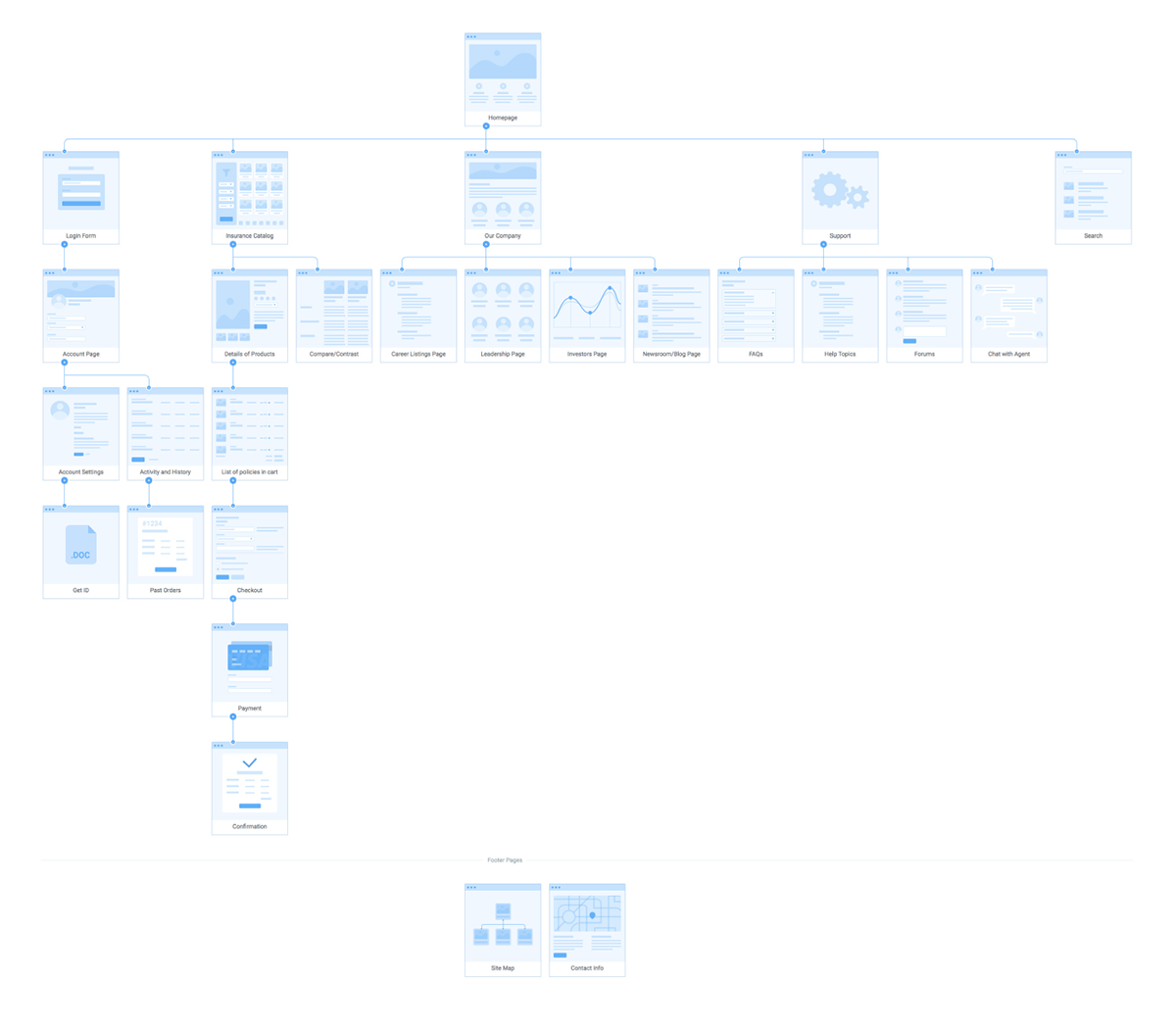

Task and User Flows


wireframes
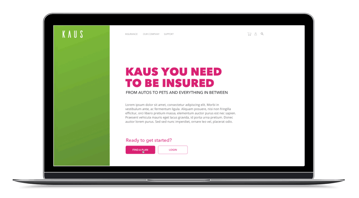
The KAUS LOGO
When I designed the logo it needed to follow certain criteria: to be modern, bold, edgy, simple, fresh, cool, and professional.

The Brand
The brand is focused on a younger demographic audience that is between 22 to 37 years based on information collected during interviews and the project goals. This included the use of white space, san-serif fonts, illustrations, iconography, colors/gradients, and mobile-style UI that gives the brand a refreshing, clean, and modern style.


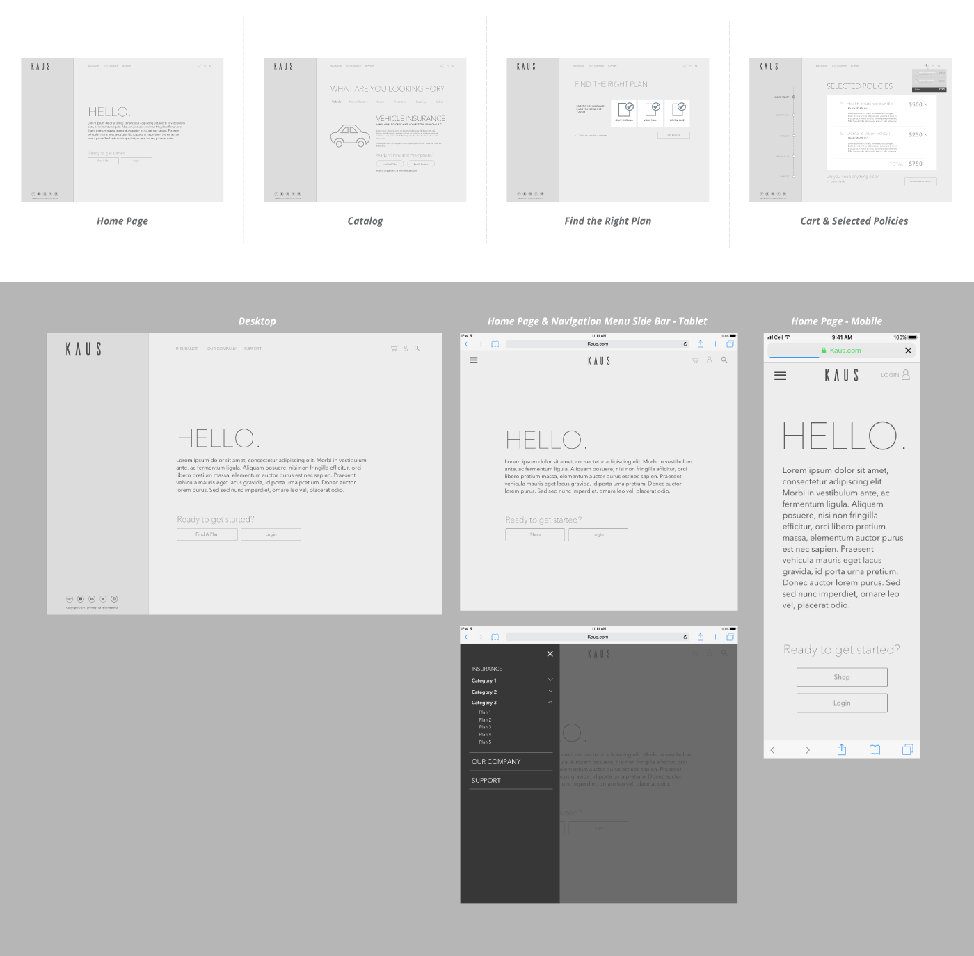
High-fidelity Responsive wireframes
Taking the brand's style guides, I developed a clean and modern website that would be responsive for desktop, tablet, and mobile.


usability testing
PARTICIPANTS
- Four males users test desktop high-fidelity prototype.
- Ranging between the ages of 25 to 35 years old.
- Remotely and observed using a combination of Zoom, Discord, Slack, and Invision.
- Four males users test desktop high-fidelity prototype.
- Ranging between the ages of 25 to 35 years old.
- Remotely and observed using a combination of Zoom, Discord, Slack, and Invision.
TASK
Participants were asked to role-play as a self-employed videographer that needed to find and purchase 1 health insurance bundle policy and 1 dental & vision bundle policy.
TEST GOALS
- Identify pain-points of the site.
- Gather feedback ranging from users navigation through the site to the ease of purchasing policies.
- Observe how the user flows through the site to locate the two policies.
- Discover what interests the user about the site. (i.e. visuals, tasks, etc)
Affinity Mapping
An affinity diagram was used to quickly organize the usability test results.

Desktop Prototype
The desktop prototype was build through Invision to test the flow and navigation as well as the user’s understanding of the site.
View prototype
THANK YOU
© 2018, Copyright Heather O'Neal


