RE-BRANDING:
INSTITUTO CERVEZAS DE AMÉRICA
The American Beer Institute needed a new corporate identity, and this is the result.
The primary focus was to create a logo that could tell a story and, through a brand, effectively function across different platforms and formats to convey the proposal.
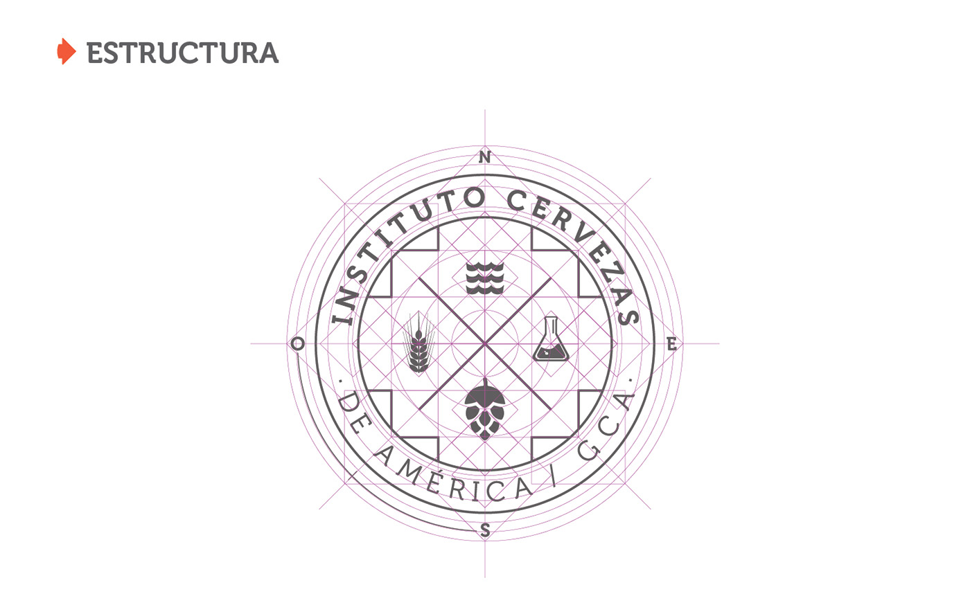
This led us to the compass rose, indicating the Southwest, representing the Southern Cone region and Chile. Then, we enclosed beer elements within the symbol of the "chakana," which characterizes the indigenous peoples of the Andes.
The chosen typeface is "Museo," which strikes a balance between modern font style and classic characters, linking it to the European history of beer and its current revolution.
When we introduced the brand in June 2017, we did so by unveiling it over a black flag, symbolizing the transition as part of the story we wanted to tell. The journeys by sea, the crusades, the conquests... the revolutions.