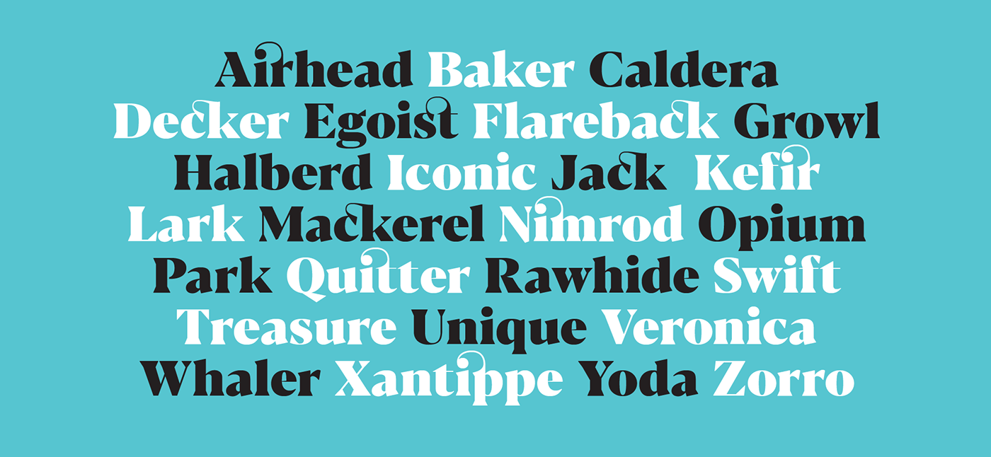
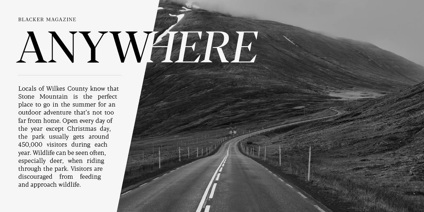
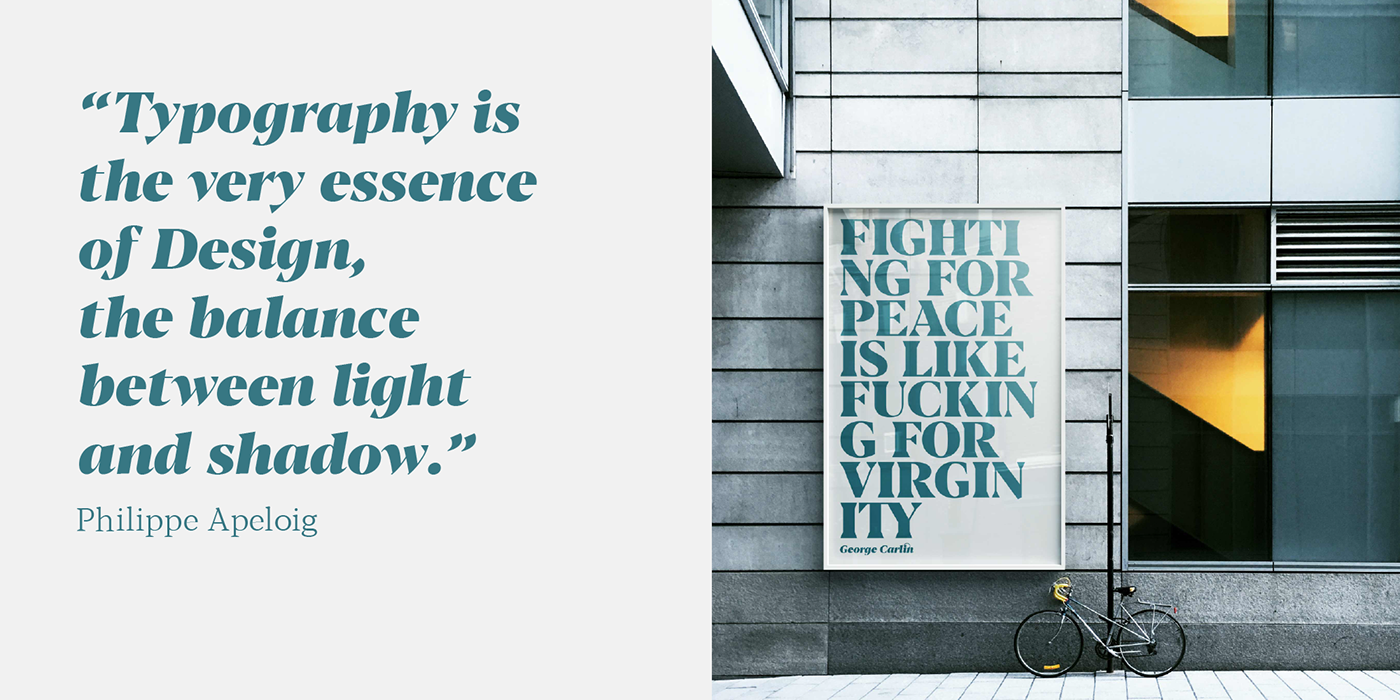
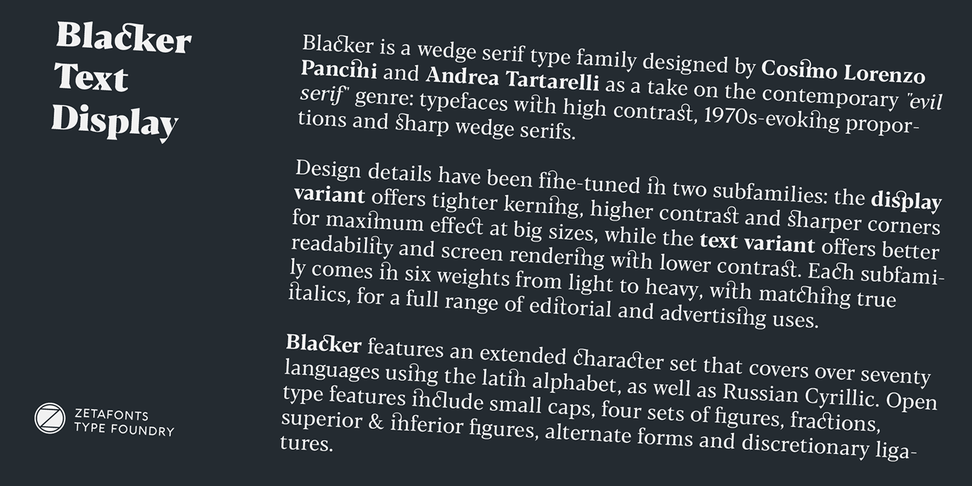
Blacker is a wedge serif type family designed by Cosimo Lorenzo Pancini and Andrea Tartarelli as a take on the contemporary "evil serif" genre: typefaces with high contrast, 1970s-evoking proportions and sharp wedge serifs.
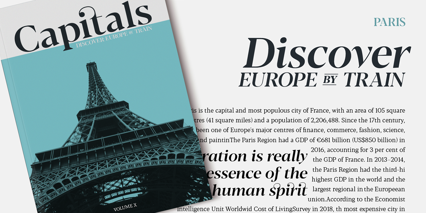
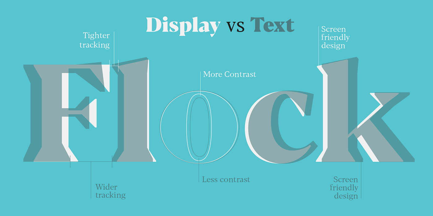
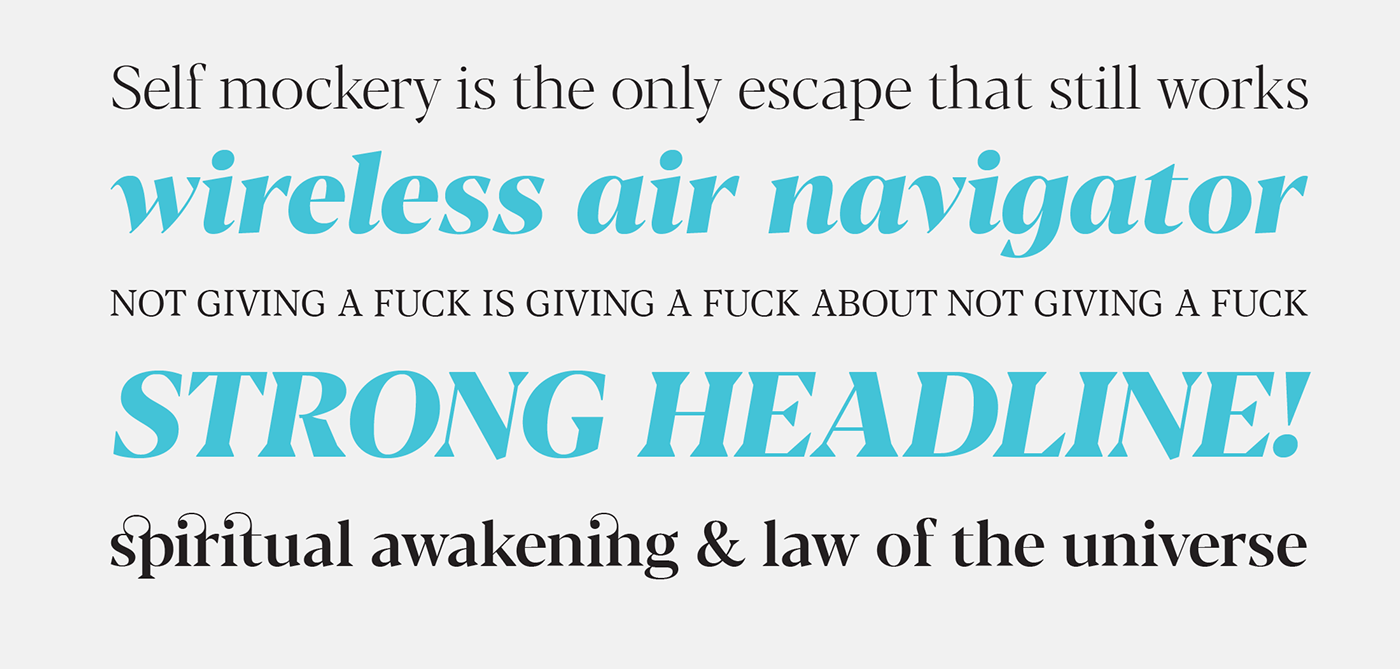
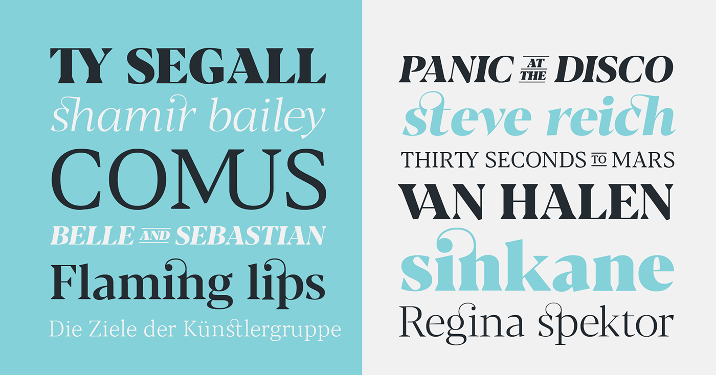
Design details have been fine-tuned in two subfamilies: the display variant offers tighter kerning, higher contrast and sharper corners for maximum effect at big sizes, while the text variant offers better readability and screen rendering with lower contrast. Each subfamily comes in six weights from light to heavy, with matching true italics, for a full range of editorial and advertising uses.
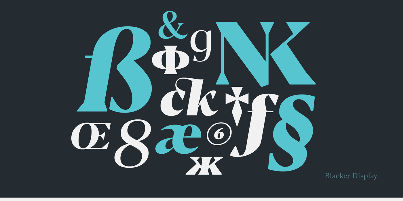
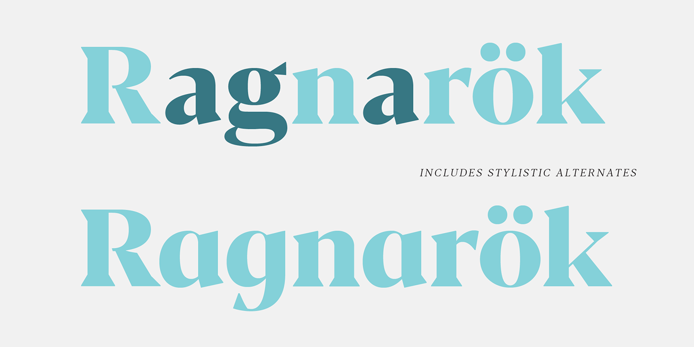
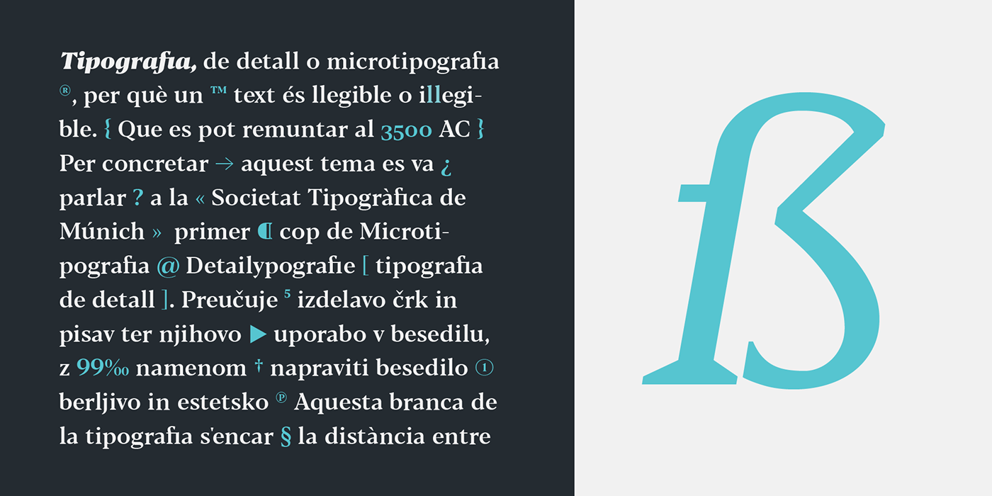
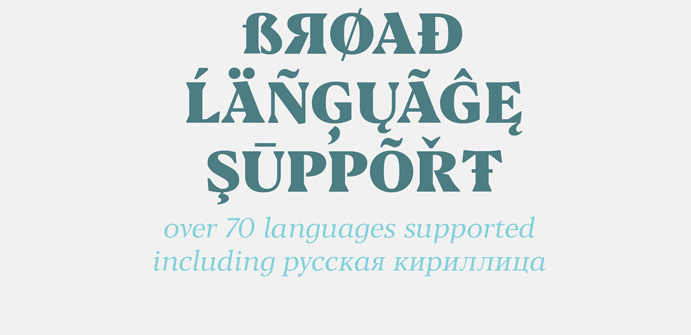
Blacker features an extended character set that covers over seventy languages using the latin alphabet, as well as Russian Cyrillic. Open type features include small caps, four sets of figures, fractions, superior & inferior figures, alternate forms and discretionary ligatures.
Download Blacker trial family
(including two completely free weights) at