


Irundo Visual Identity
We were honored to have been approached by Zig Zag Apartments, the first integrated hotel in Croatia, to execute their rebranding. Together with Fabular, responsible for the brand strategy and naming, we spent months working on their new visual identity and implementation.
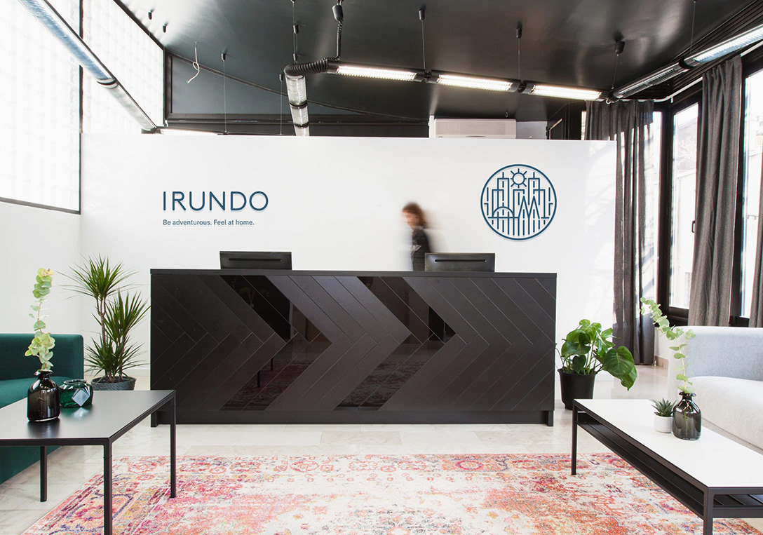
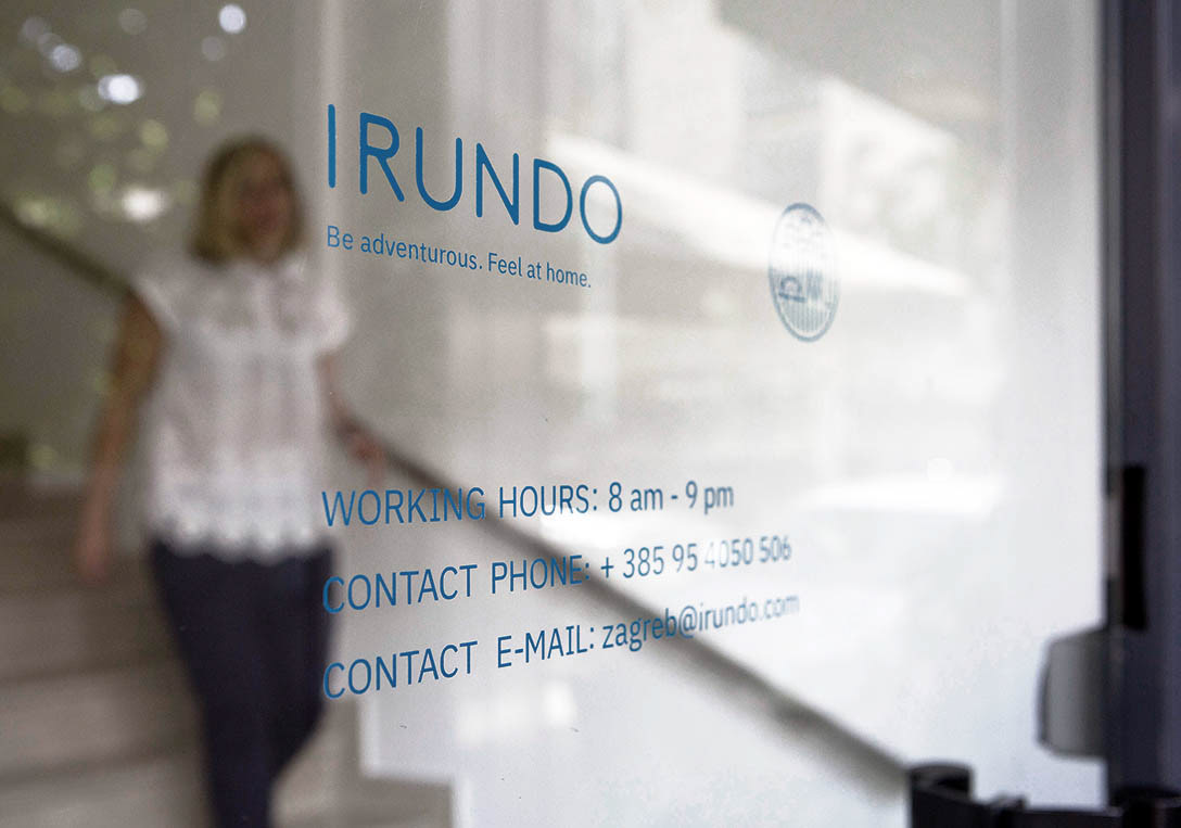
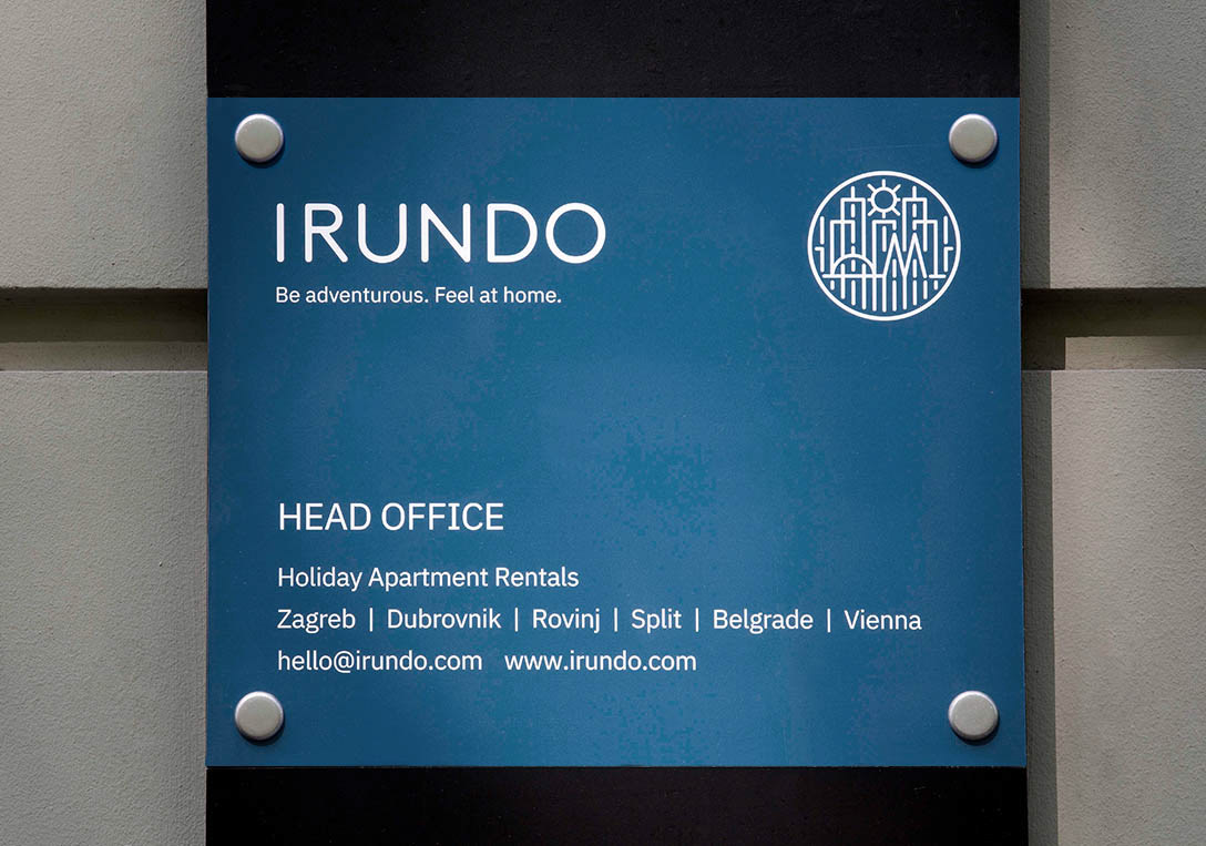
The new brand strategy was inspired by the key wishes of the guests, who want to get to know more closely the city they have visited and to immerse themselves into authentic and local experiences. Furthermore, they want to choose the proper accommodation, which gives them the feeling of warmth and the comfort of their own home. These two key insights helped us in creating new brand name and slogan. We have renamed Zig Zag into Irundo. Irundo, comes from the Latin word hirundo, meaning swallow - a migratory bird that always returns home. Irundo means also I-run-do because our guests are adventurous, and want to feel at home. Along with brand name, we have created the brand slogan Be adventurous. Feel at home. which in a simple and striking way communicates the very essence of the brand.
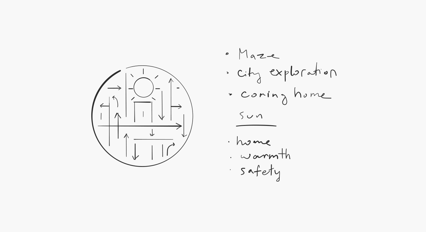
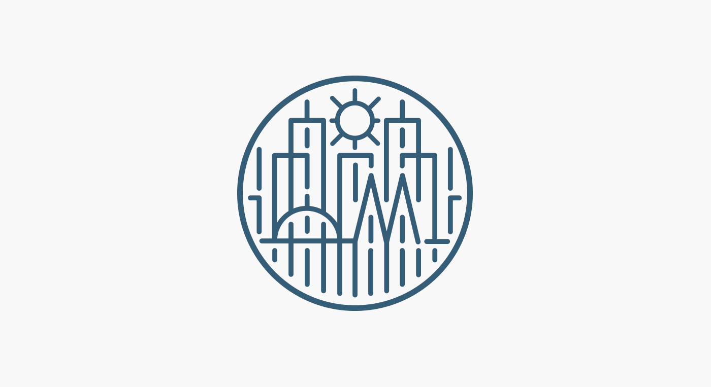
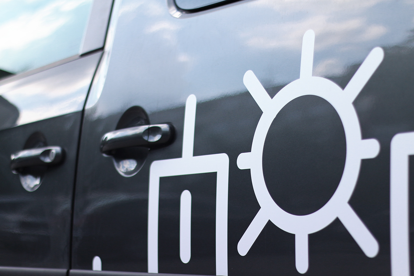
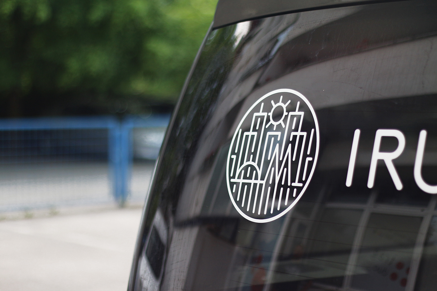
The concept for new visual identity uses the symbolism of a street maze to communicate adventure and city exploration. Irundo apartments are always centrally located, so a letter I is hidden in the center of the logo, accentuated with a sun. The sun is a symbol of home - warm, light and safe, which is what all explorers want while travelling the world. Dark navy blue color was selected for its near-black sophistication and compatibility with many different environments, fitting well within continental as well as seaside city centers.
Client: Irundo
Agency: Manasteriotti DS
Art Direction and Design: Igor Manasteriotti
Brand Strategy and Naming: Fabular
Production: Trag Duo
Agency: Manasteriotti DS
Art Direction and Design: Igor Manasteriotti
Brand Strategy and Naming: Fabular
Production: Trag Duo


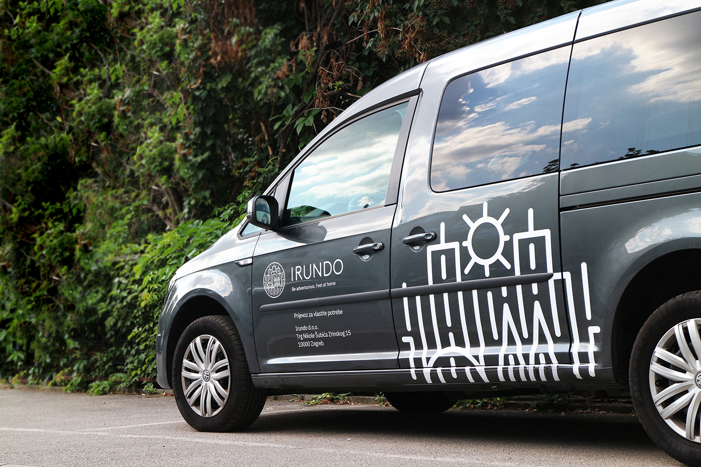
Irundo VW Caddy is a company vehicle and shuttle service for picking up tourists at the airport. We designed the graphics to make the most impact on the city streets. We wish it could have been Irundo blue, but this dark gray color is nice as well.

Irundo has apartments in a beautiful coastal town of Rovinj, with a bar/check in point at the ground level. We designed signs for the bar facade, making sure they imposed as little as possible, while still maintaining brand recognizability.


THANK YOU
www.facebook.com/Manasteriotti
www.manasteriotti.com
www.facebook.com/Manasteriotti
www.manasteriotti.com


