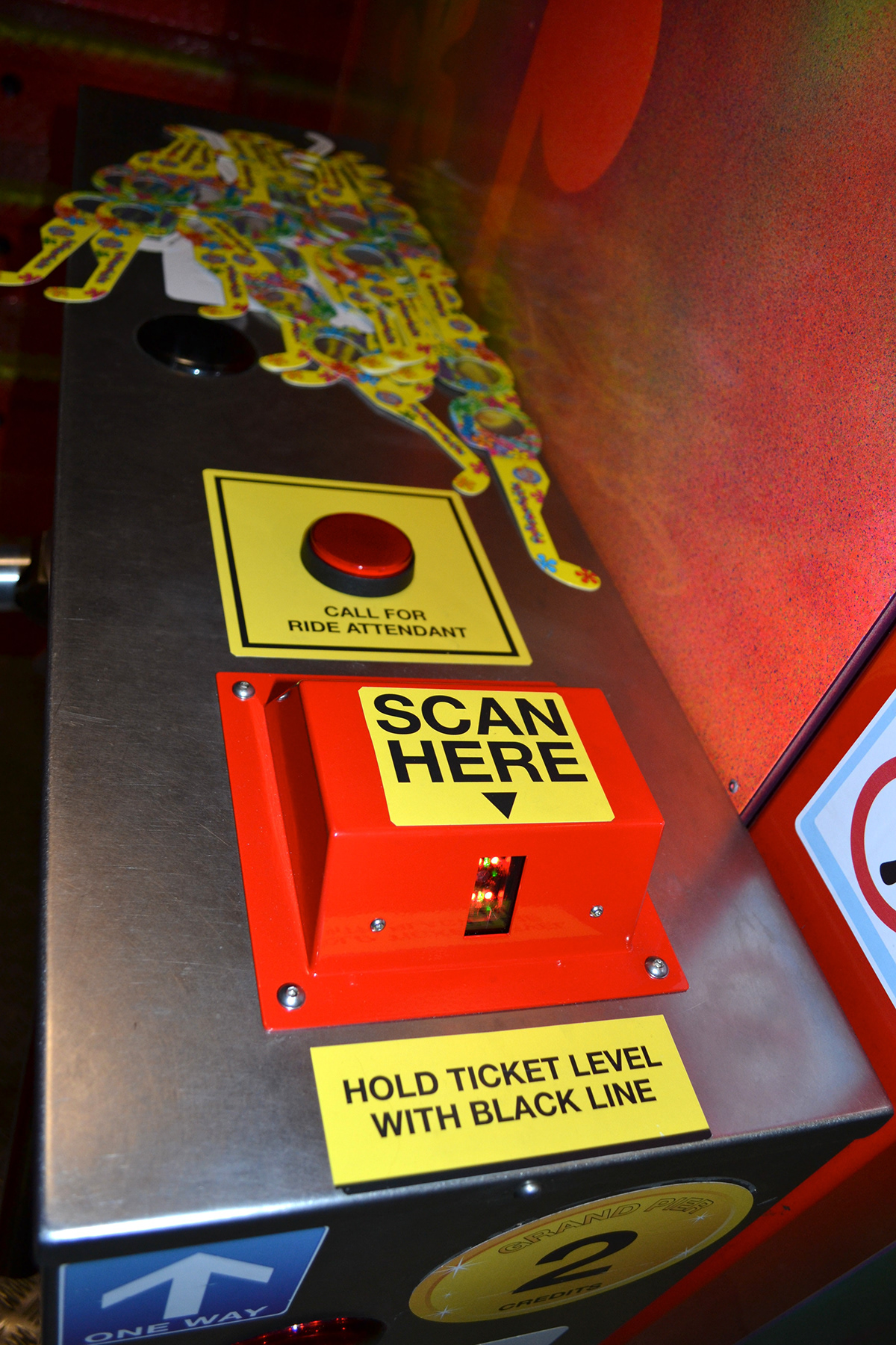
Signage & Ergonomic use.
The brief was to create a legible and ergonomic way for customers to call for assistance and scan there ticket. Research with in the pier showed that customers had issues in gaining attention for assitance in scanning
their tickets.
I wanted a style of legible, bold and symplistic, I feel I have achieved this through the colour scheme and typography. The colours jump out and grab your attention whilst the type simply states what you need to do.