SKY Mexico User Interface
SKY Mexico, one of Latin America's major cable providers, required a revised visual approach to their updated set top box user interface ahead of their launch. Working with the clients, I was part of a team as the sole and lead visual designer tasked to take the existing user interface and re-skin the existing product, keeping it on brand with SKY Mexico, and provide key screens and style guides to the engineers. The process involved exploring attributes of their current brand, expanding on it, and applying those learnings to the UI so that SKY Mexico felt that it reflected them in a more direct way. It was an intensive three week process, involving direct meetings with the major stakeholders at the SKY Mexico offices in Mexico City, and working within the very specific limitations of the existing product from an engineering and technical perspective.
The first phase of the process was to explore Sky Mexico’s brand on a high level to define its key characteristics and qualities. From that discussion, two sets of mood boards were presented as preliminary expressions of what the brand could look and feel like:
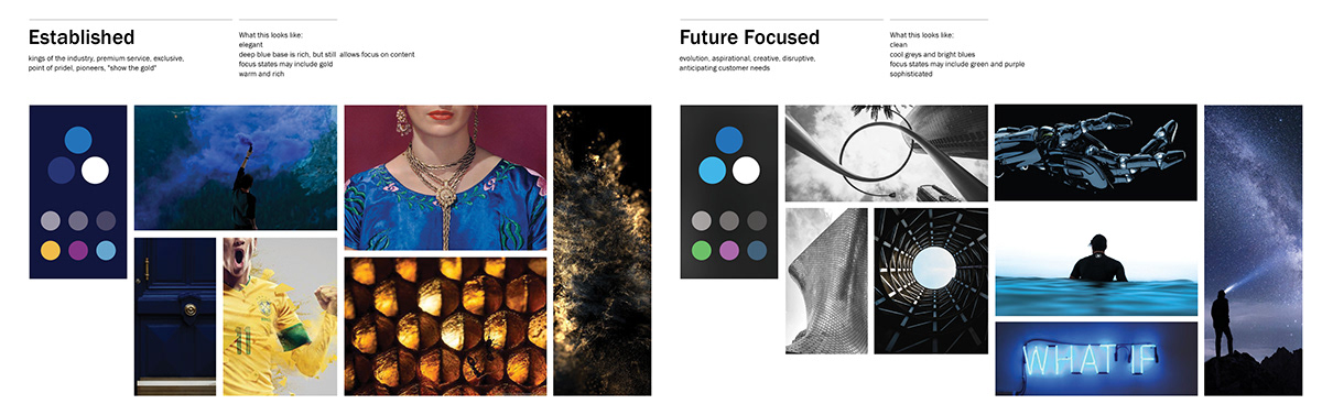
Upon reviewing these options, SKY Mexico chose to proceed with the Future Focused approach. It served both as a vision for how they saw themselves moving forward, as well as being a bit more consistent with some of their existing apps and online products.
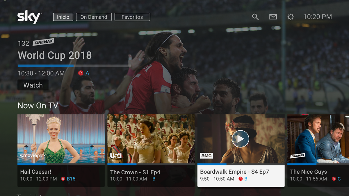
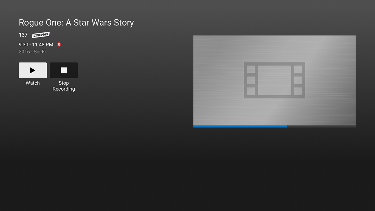
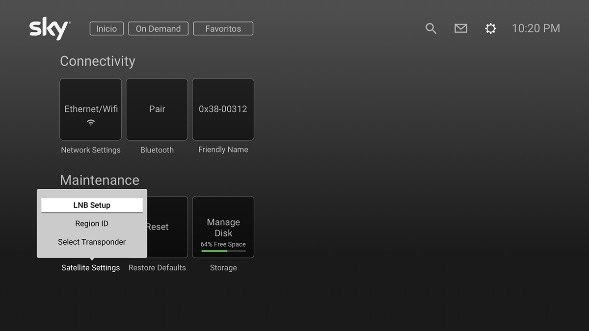
Sample Mockup Screens
When adapting the final mockups from the existing UI, the main takeaways from the Future Focused theme that I integrated into the design was pops of SKY blue in the progress bars and metal. SKY Mexico was very interested in metallic, cool surfaces, so it was used in the backdrop gradient layered over the video on the home screen, popups and panels, default posters and the backdrop of the settings screens. It was a direct and obvious step forward from interfaces used in years past, and helped to distinguish it from their competitors.