EN
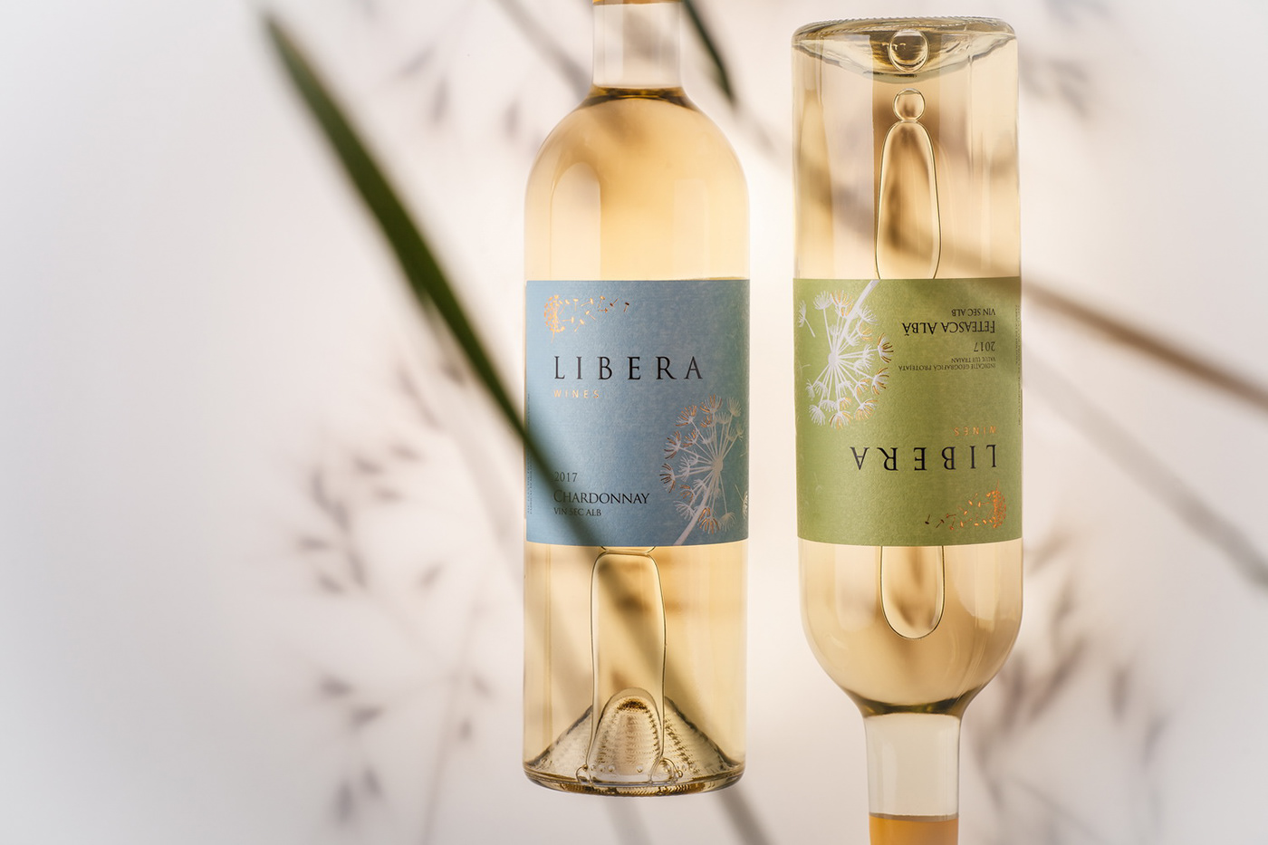
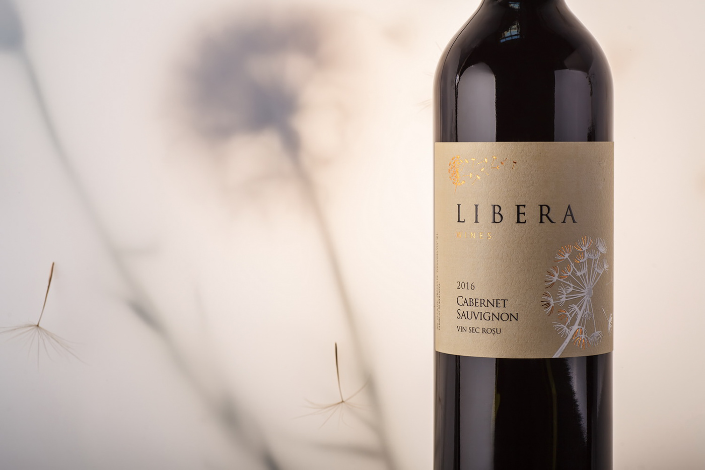
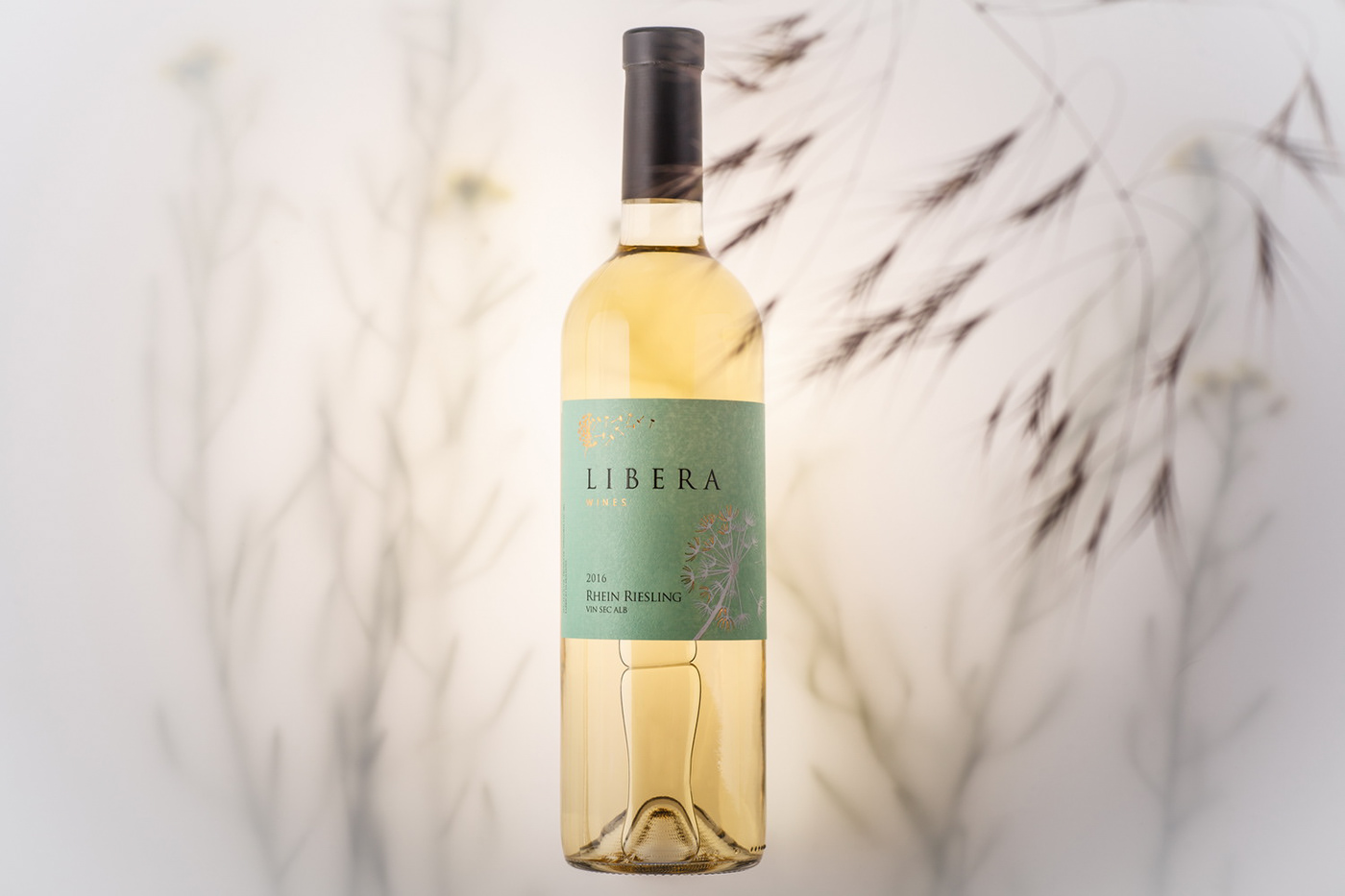
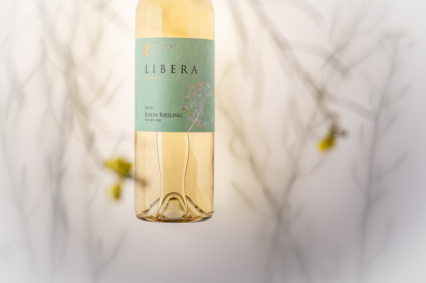
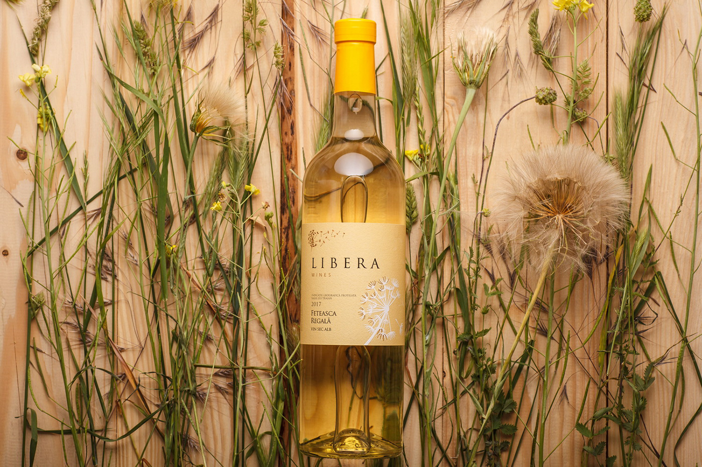
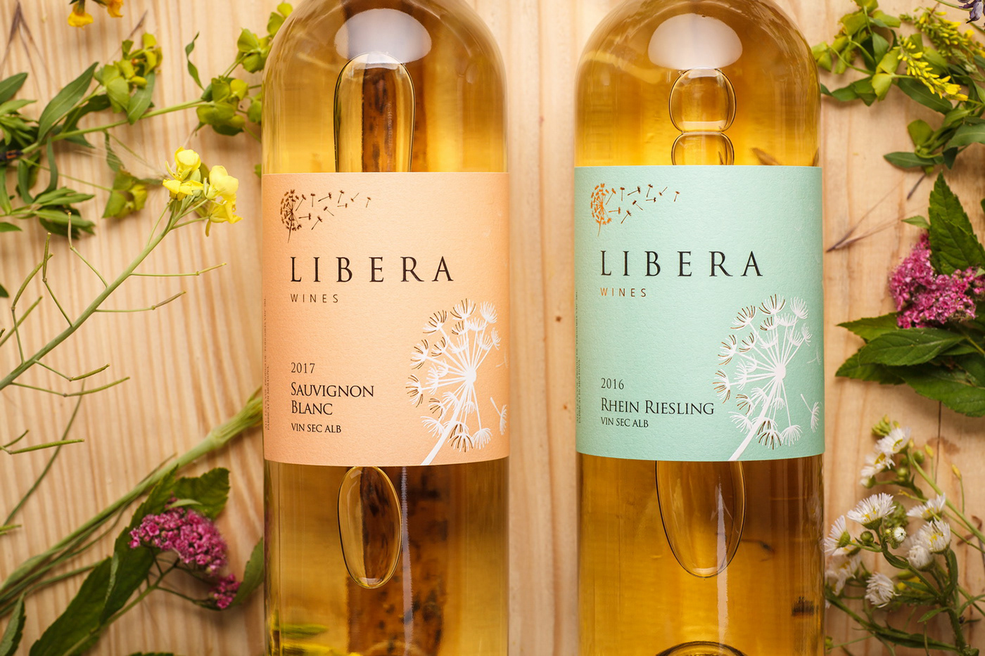
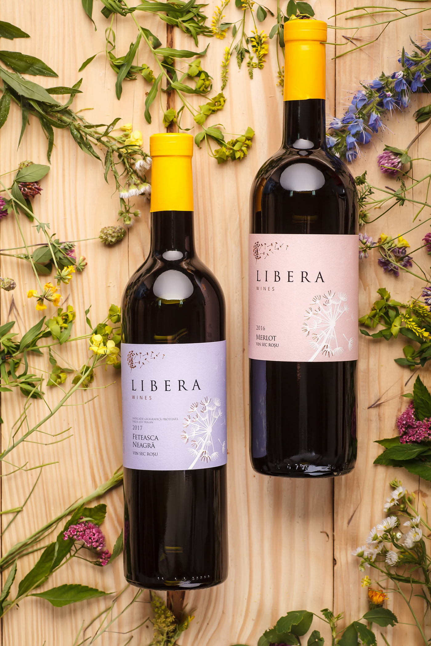
Libera light table wines produced by Podgoria Vin is the first result of our collaboration with the winemaking company that is quite known on CIS and EU markets thanks to their quality bulk wines. However, after making the decision to bottle some of the wines from their expansive collection, the company has faced the necessity of creating a separate brand that would accurately reflect the concept and positioning of this particular line of table wines. This is what our studio has focused on, creating a new and original brand for the Moldovan market, which emphasizes the light character of the wines making up the extensive product line.
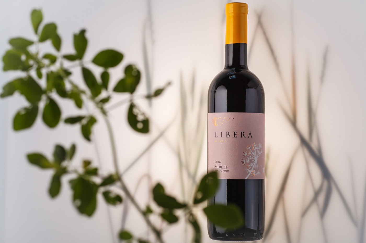
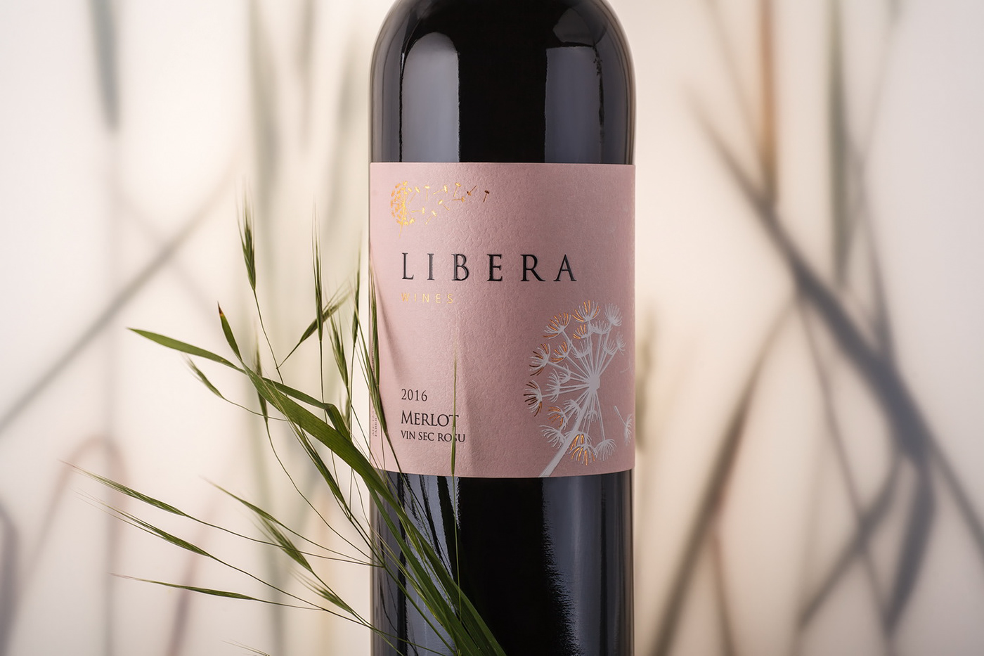
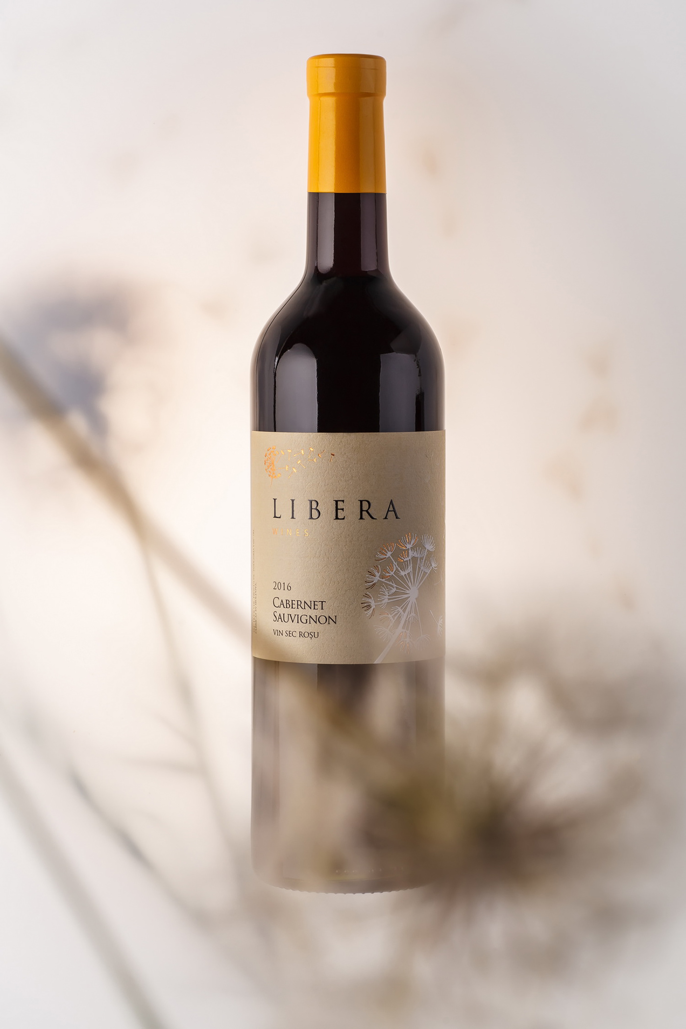
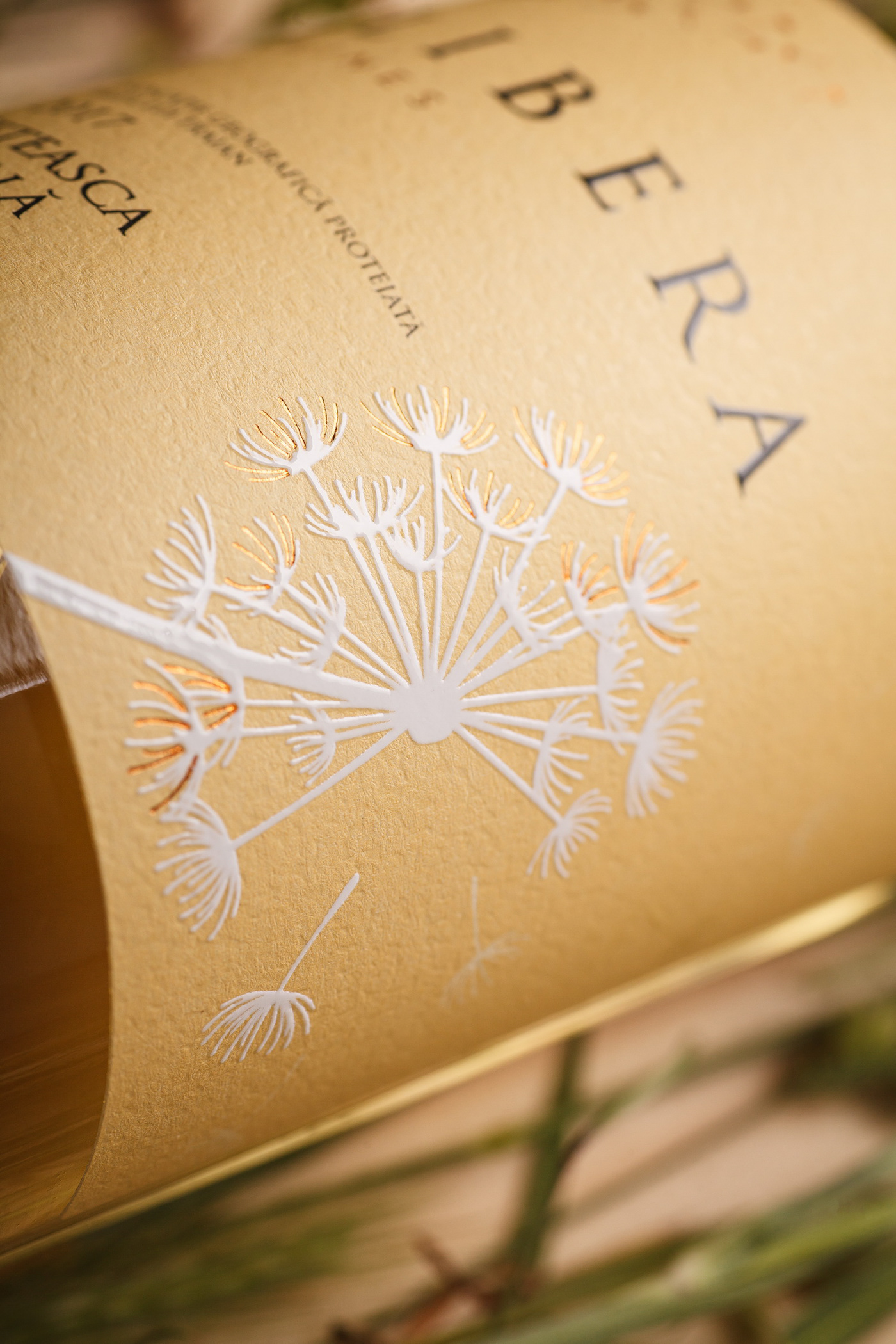
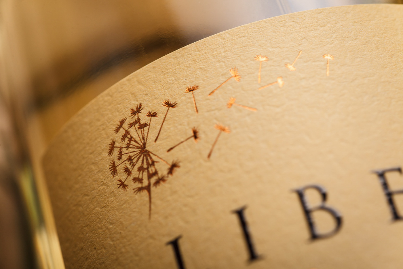
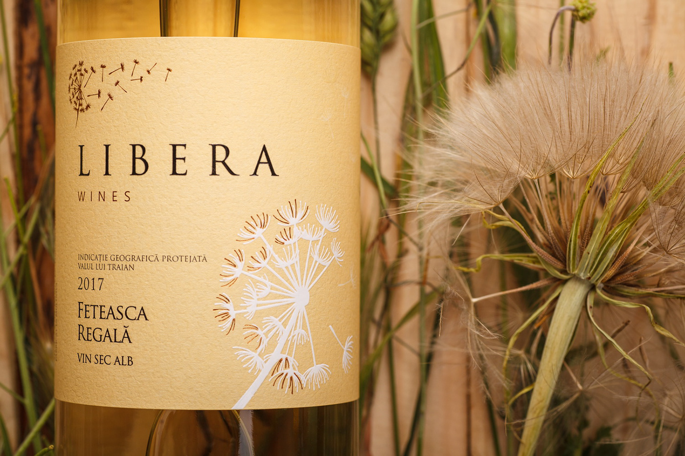
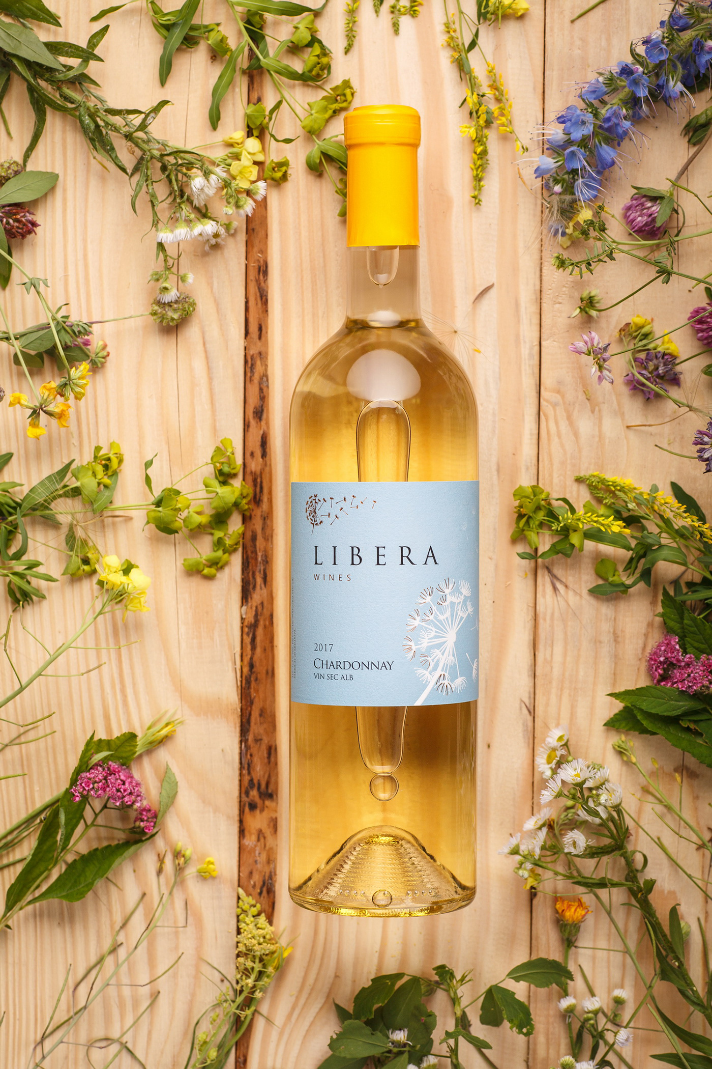
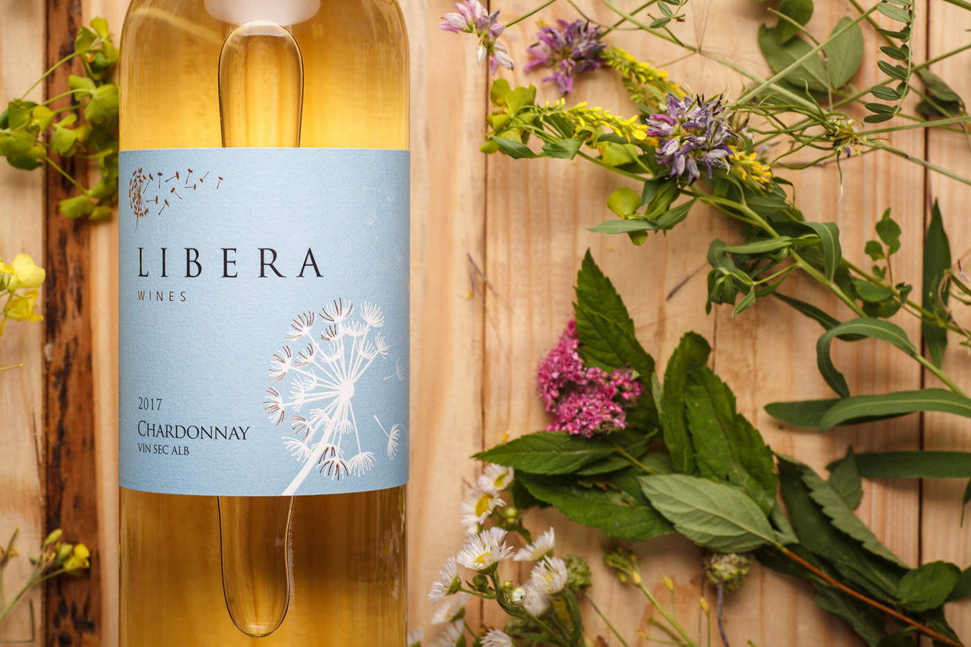
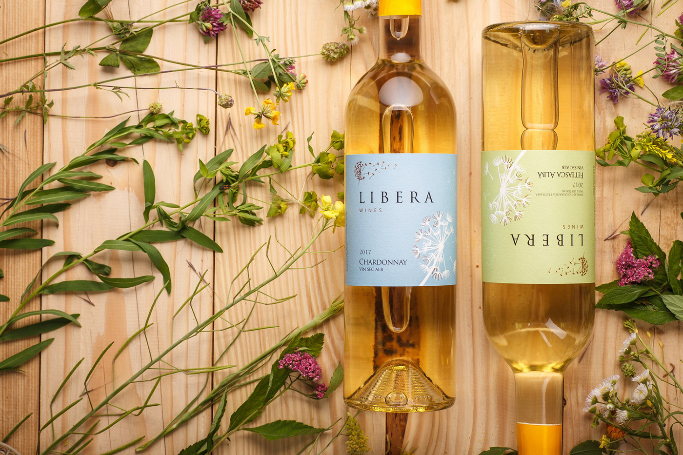
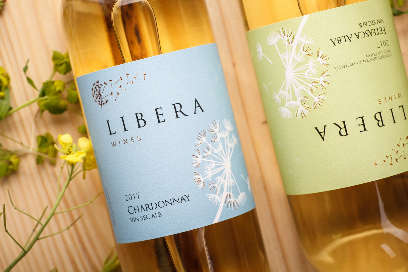
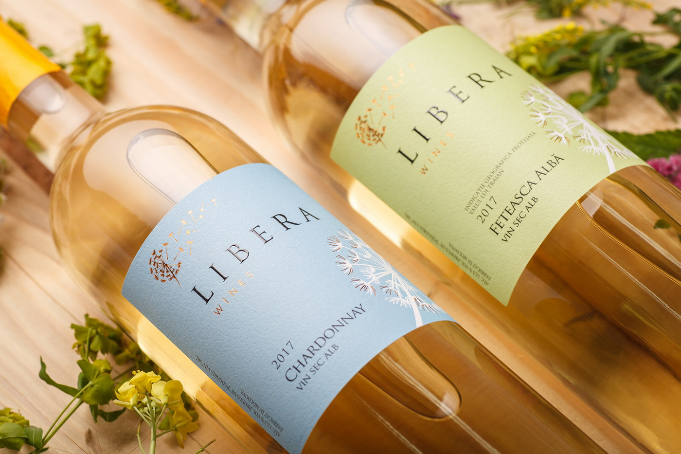
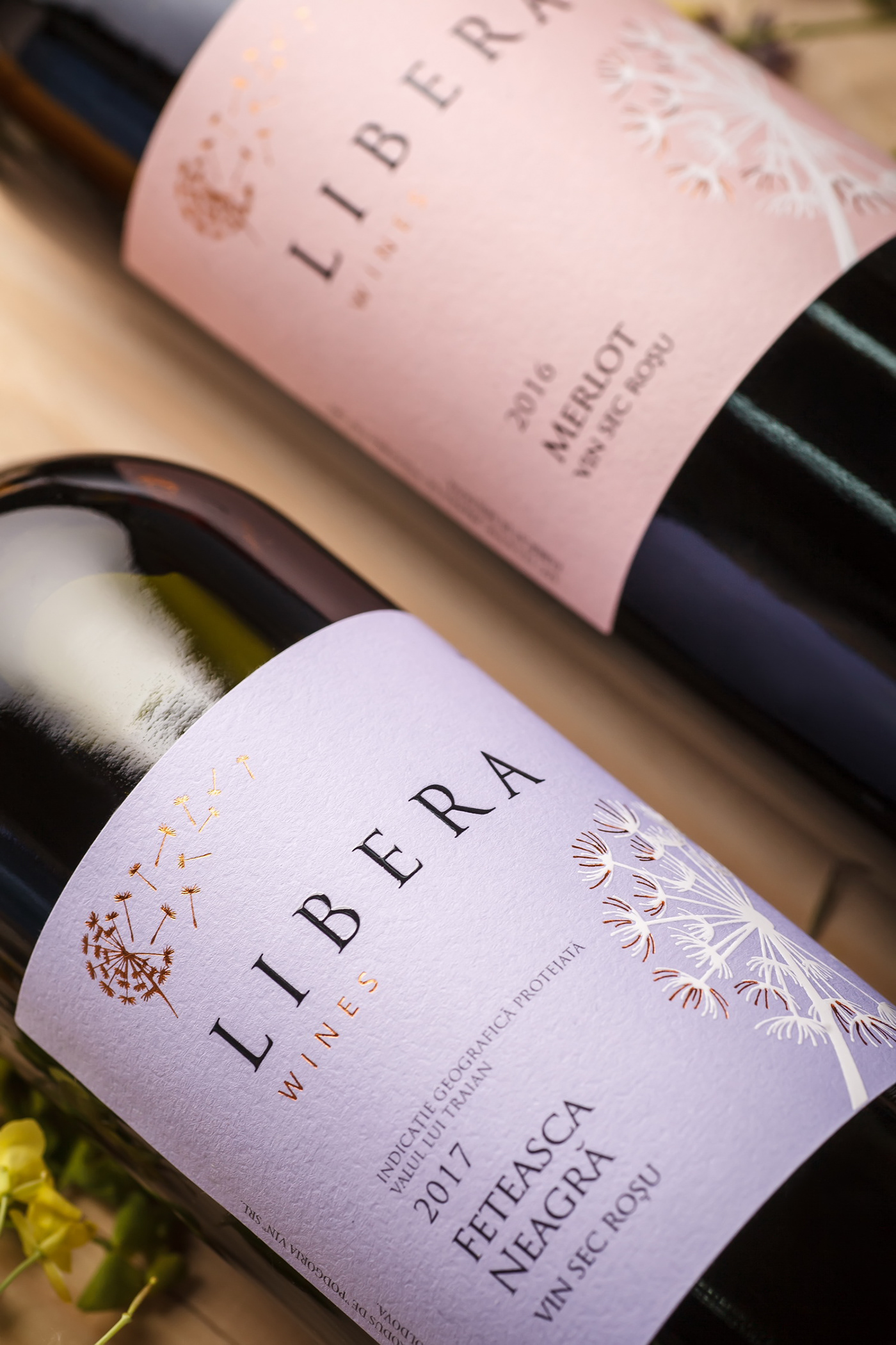
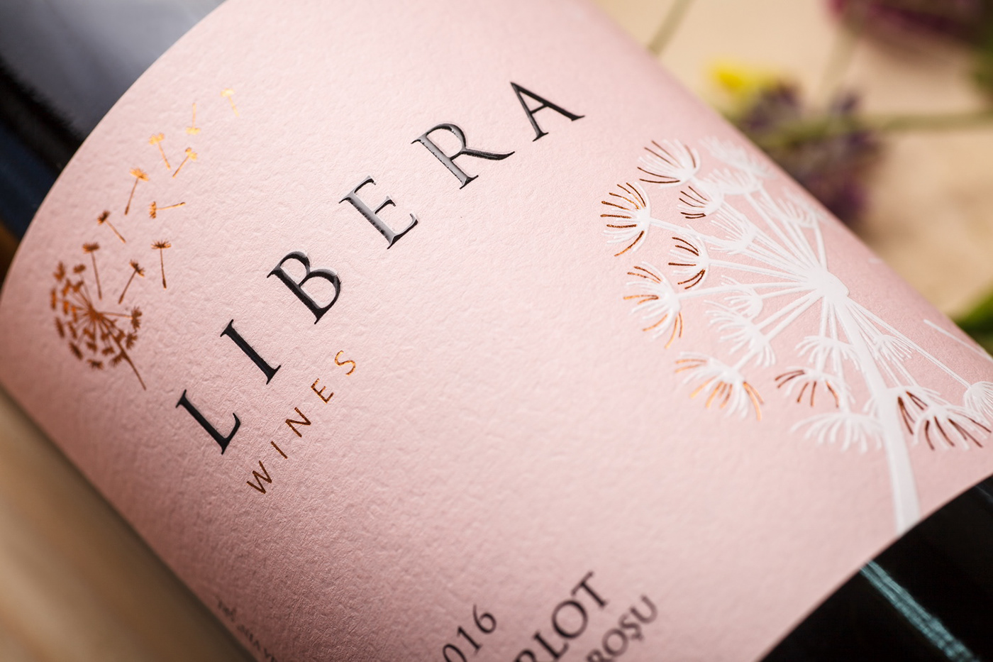
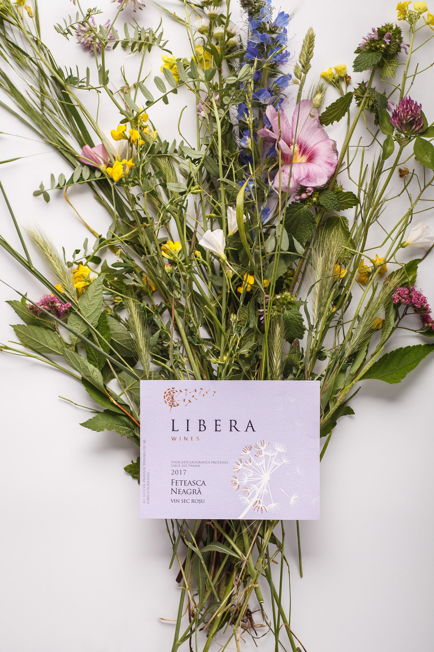
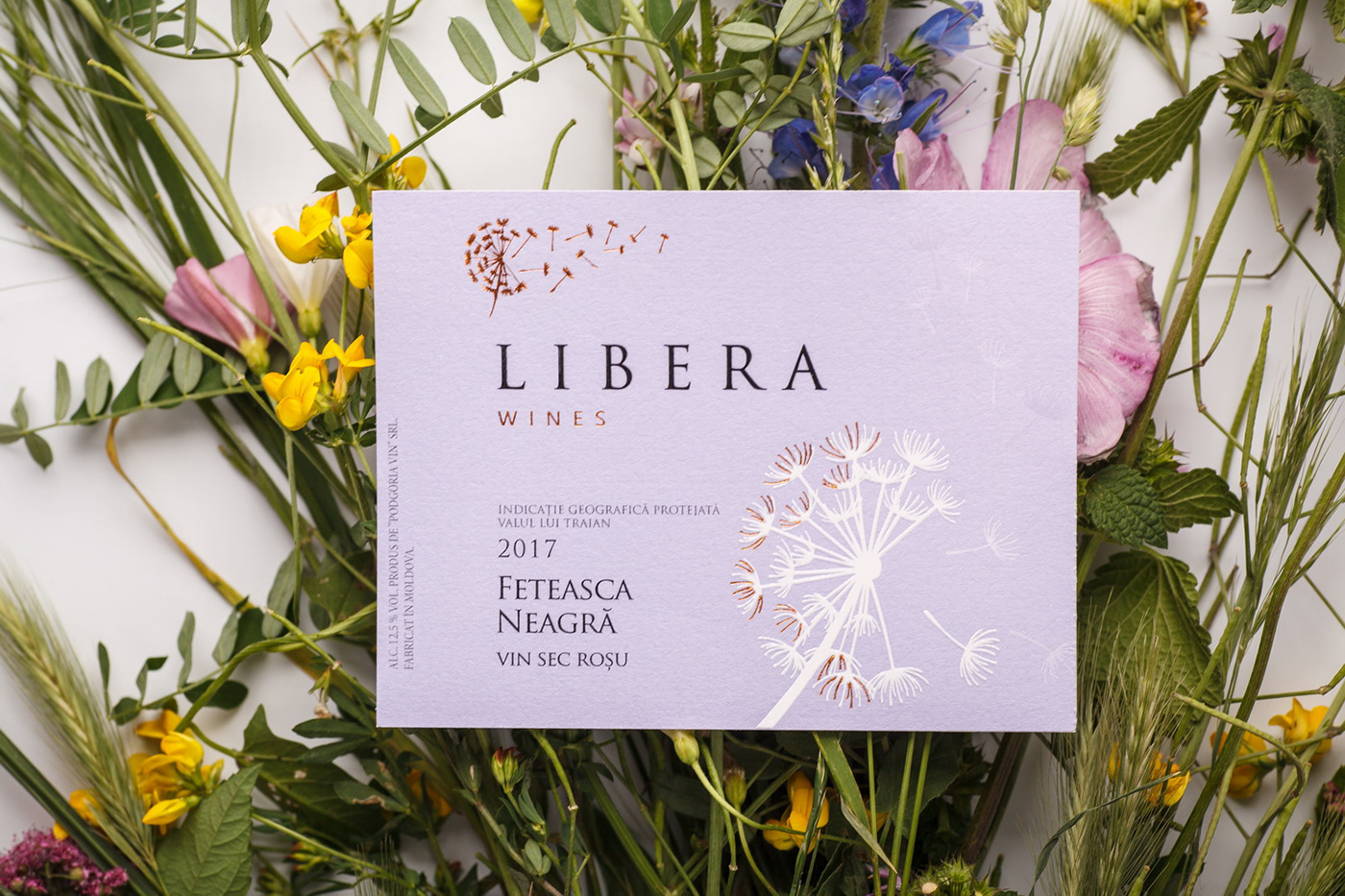
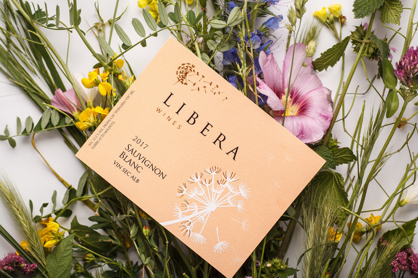
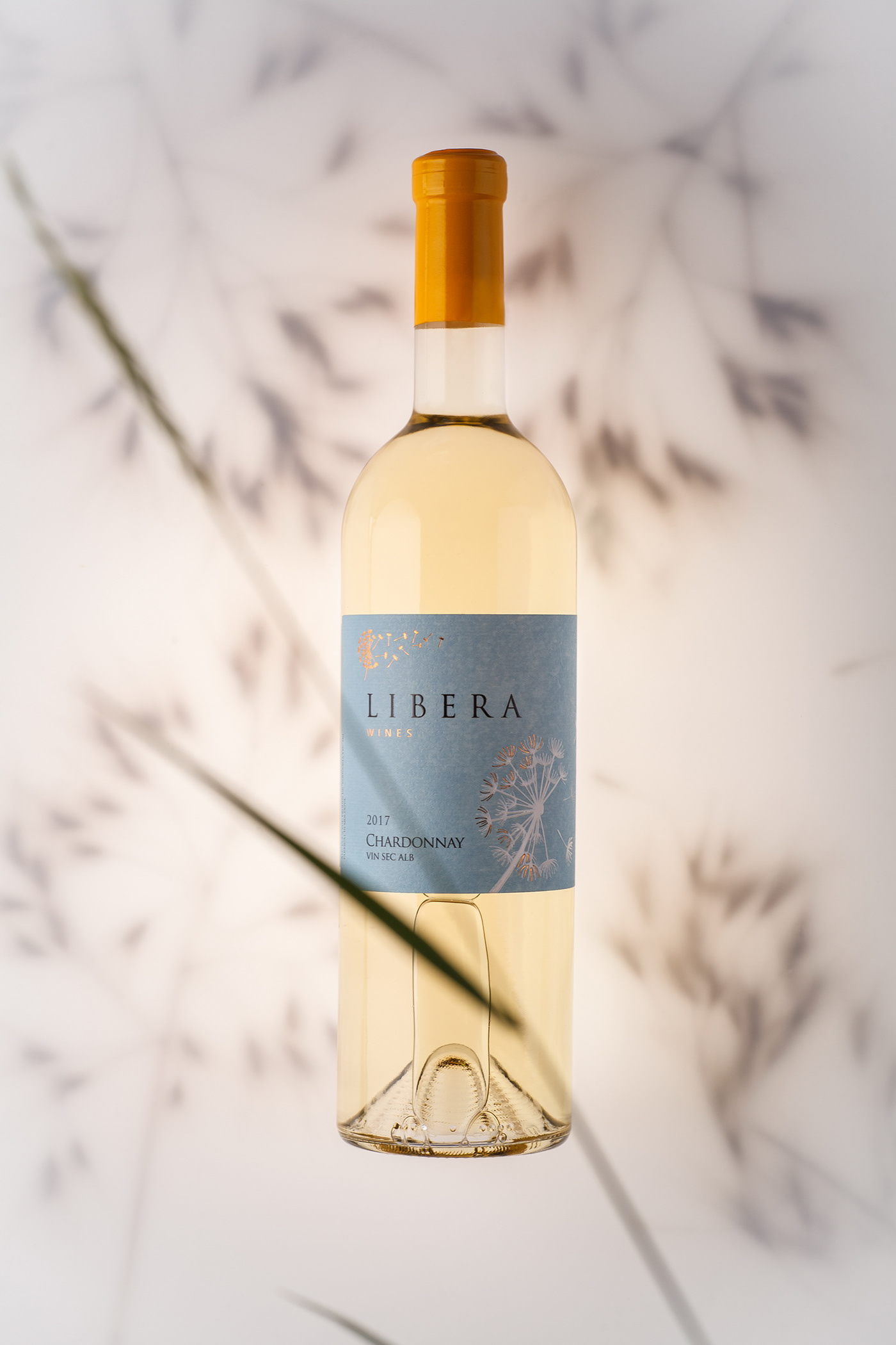
Libera is freedom, lightness, ease, airiness. In this case we’ve tried to create a label design that would completely replicate the name of the brand and its main concept. The feeling of lightness in the composition is achieved through the use of a small number of visual elements, selection of relevant font types, and application of soft, pastel tones for color differentiation of products within the line. The main visual element of the label is the illustration of a dandelion, the petals of which are being blown away by the wind. This image emphasizes the lightness and ease of Libera wines, which were created to be enjoyed during quiet moments with friends and loved ones.
RUS
Серия лёгких ординарных вин Libera от компании Podgoria Vin - первый результат сотрудничества нашей студии с производителем, который уже давно известен на рынках СНГ и Европы как оптовый поставщик качественных вин. Однако, приняв решение бутилировать некоторые вина из своей обширной коллекции, компания столкнулась с необходимостью создания отдельной торговой марки, которая бы четко отражала концепцию и позиционирование именно этой конкретной линейки ординарных вин. Именно этим и занялась наша студия, сосредоточившись на создании оригинального для молдавского рынка бренда, который бы акцентировал внимание потребителя на лёгкости вин, составляющих достаточно широкую продуктовую линейку.
Libera - это свобода, легкость, непринужденность, воздушность. В данном случае мы постарались создать дизайн этикетки, который был бы полностью созвучен с названием бренда и его основной концепцией. Ощущение лёгкости общей композиции достигается благодаря использованию минимального количества визуальных элементов, подборке соответствующих шрифтов, и применению мягких, пастельных тонов для цветовой дифференциации продуктов в линейке. Главным визуальным акцентом этикетки выступает иллюстрация одуванчика, лепестки которого сдувает ветром - этот образ подчёркивает лёгкость и непринужденность вин Libera, которые созданы для приятных мгновений в кругу друзей.