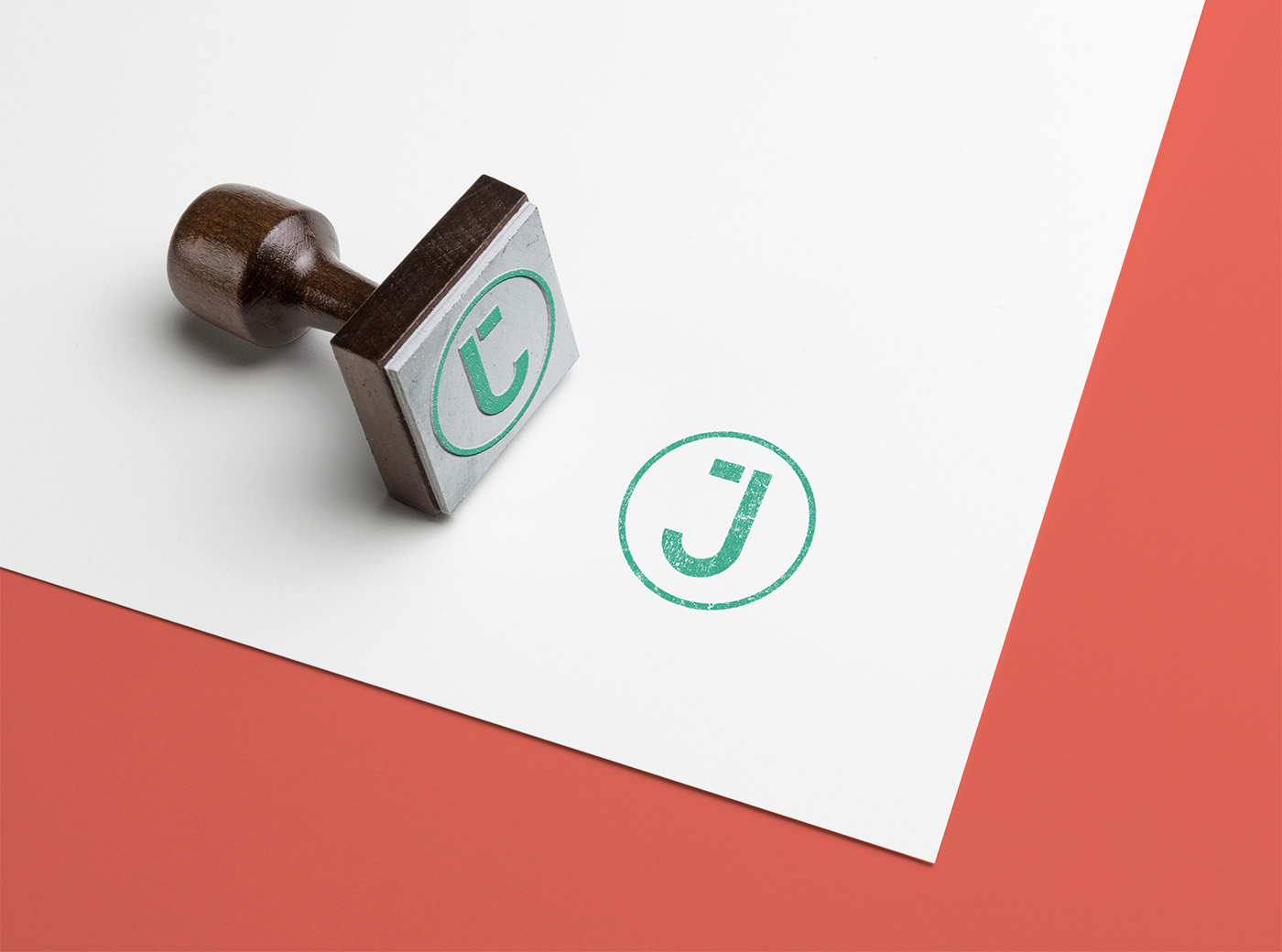
After nearly six years with my old branding, I decided it was time for a change. I wanted a simple logo that could be used in a wide range of ways; As a stamp, as a watermark, by its self or as a lock-up with some details.
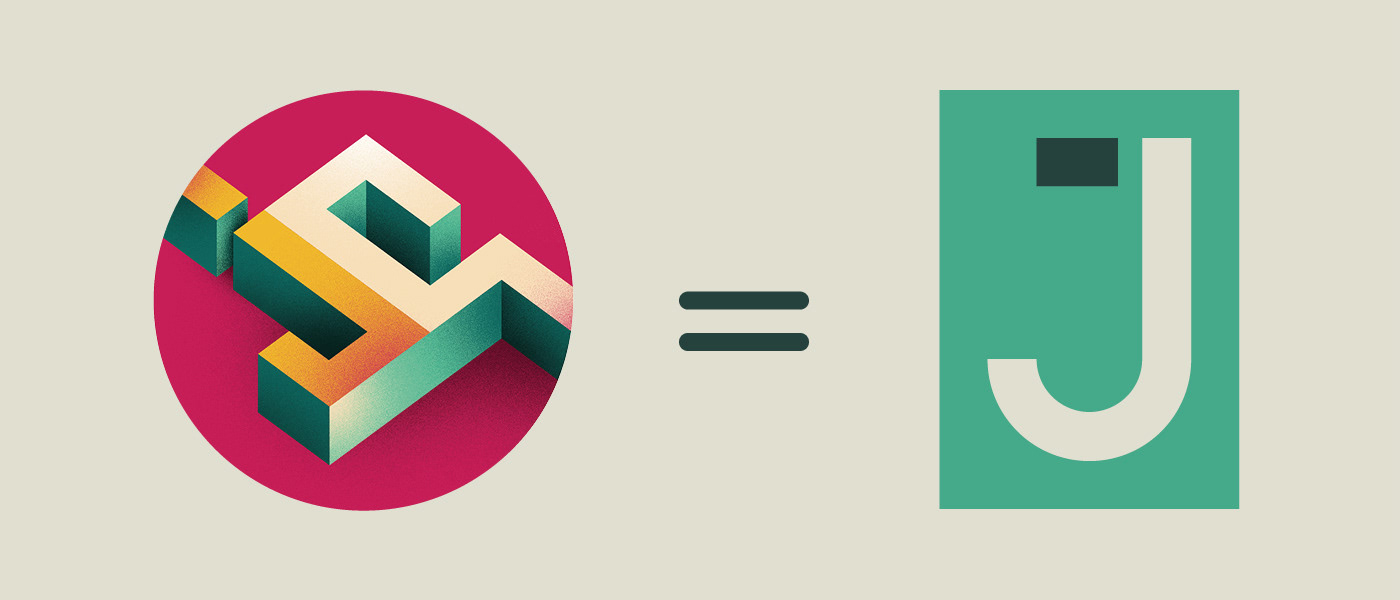
My old logo has had several revisions over the years ending in the above, with shadows and noise, creating, in my opinion a bit of a mess. I felt lost with the old logo and instead of trying to salvage it (once again) I decided to start from scratch. So I stripped it right back, falling on the classic design mantra 'Less is more'.

It was important to me that the new logo 'made sense' to me, everything connecting and using a grid of sorts, like in editorial design.

These are the selected colours for the new branding - Consistent colour across everything was important to me, the colours had to be able to be used in lots of different ways and combinations, but always work with each other.

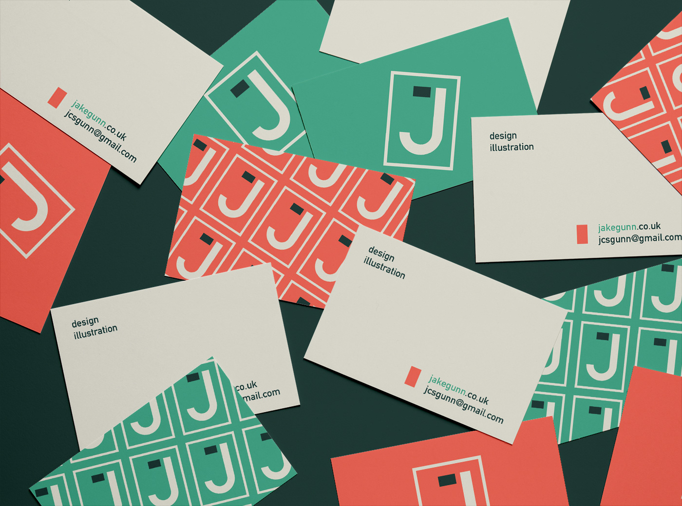
I've always been a fan of business cards that have several variations for the front, above are a few of my chosen designs.
The back of card is deliberately sparse, with lots of space for additional information; for example you could write a phone number down, or a reminder of who you are/where you met.
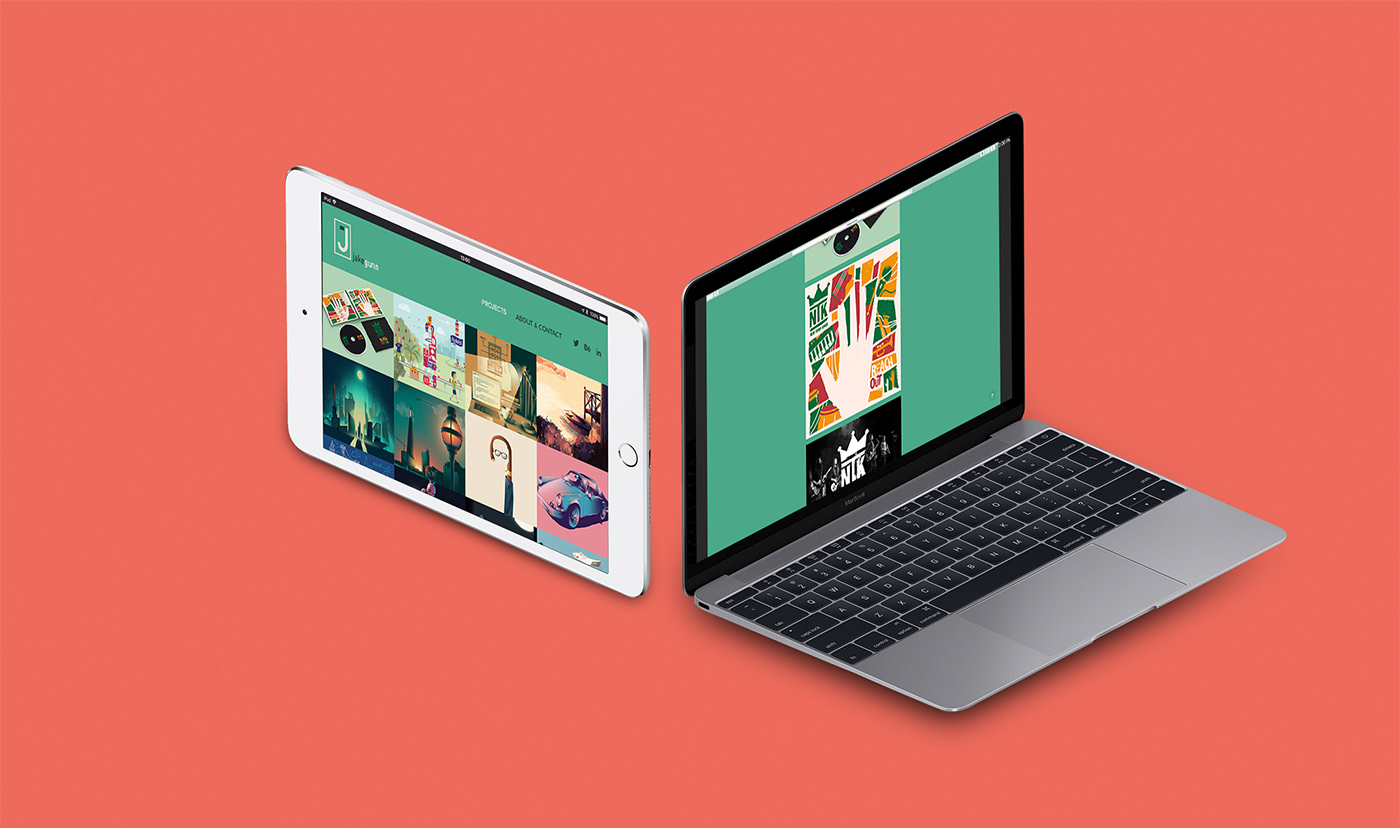
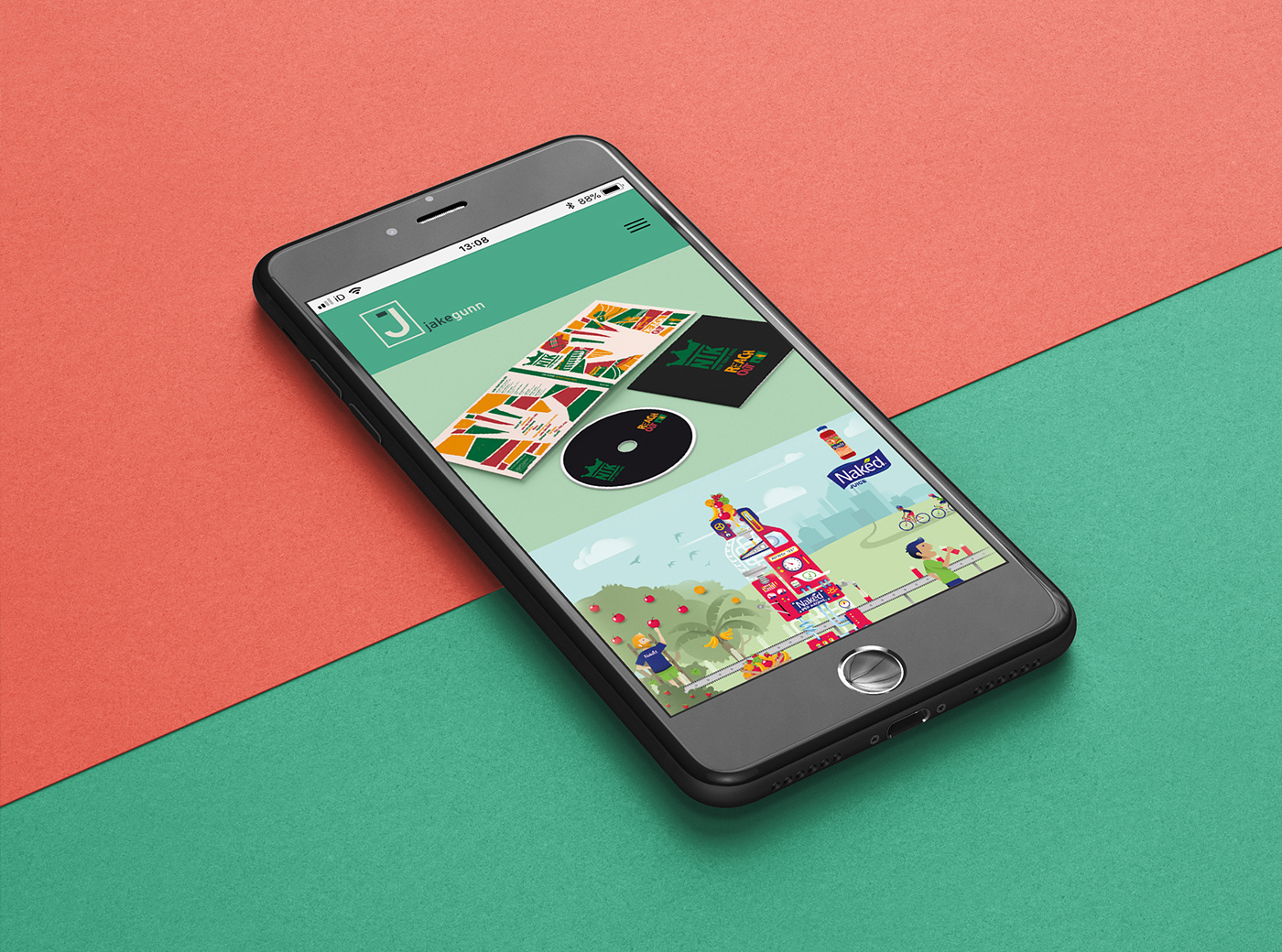
In keeping with the minimalist theme, the website is simple with the work being easy to access and fully in show.

How I see stationery being created under the new branding.