Vellis Rebranding
2015-2018
EN
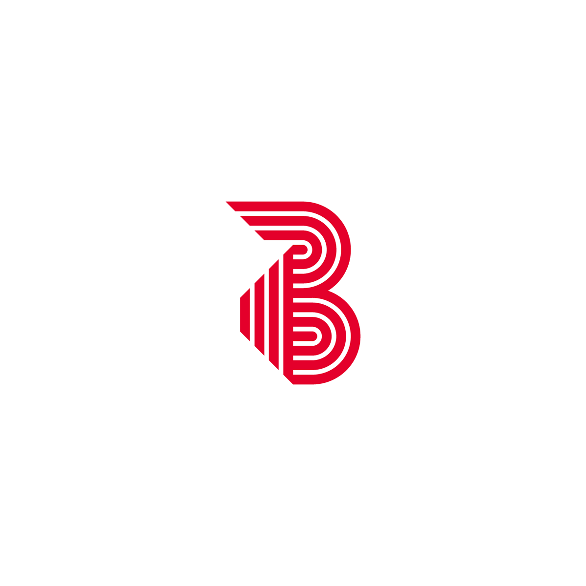
It was back in 2015, we were asked by C. Vellis S.A. a company that deals more that 100 years with industrial fabrics and plastics and strings, to redesign their logo and improve their packaging. First thing we changed was the symbol of the logo. The previous one had a confused message and didn't represent the company's name, but it was a nice red thread that related to the products. So we kept the idea of the red thread and made a strong B as a monogram to relate with company's name (in Greek).
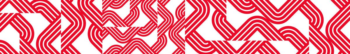
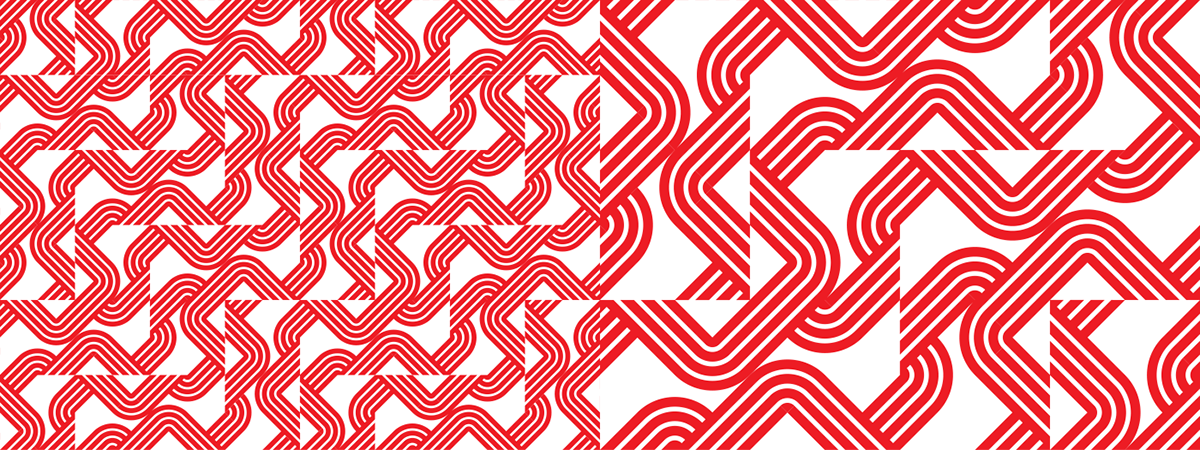
We accompanied the identity with a pattern that was born from the parts of the logo. The main goal was to come up with a packaging system for products, so we designed a simple yet effective clean layout as we had so solve the problem of multiple kinds, sizes and colors that the products have.
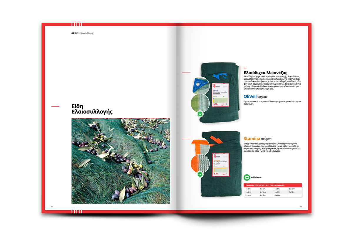
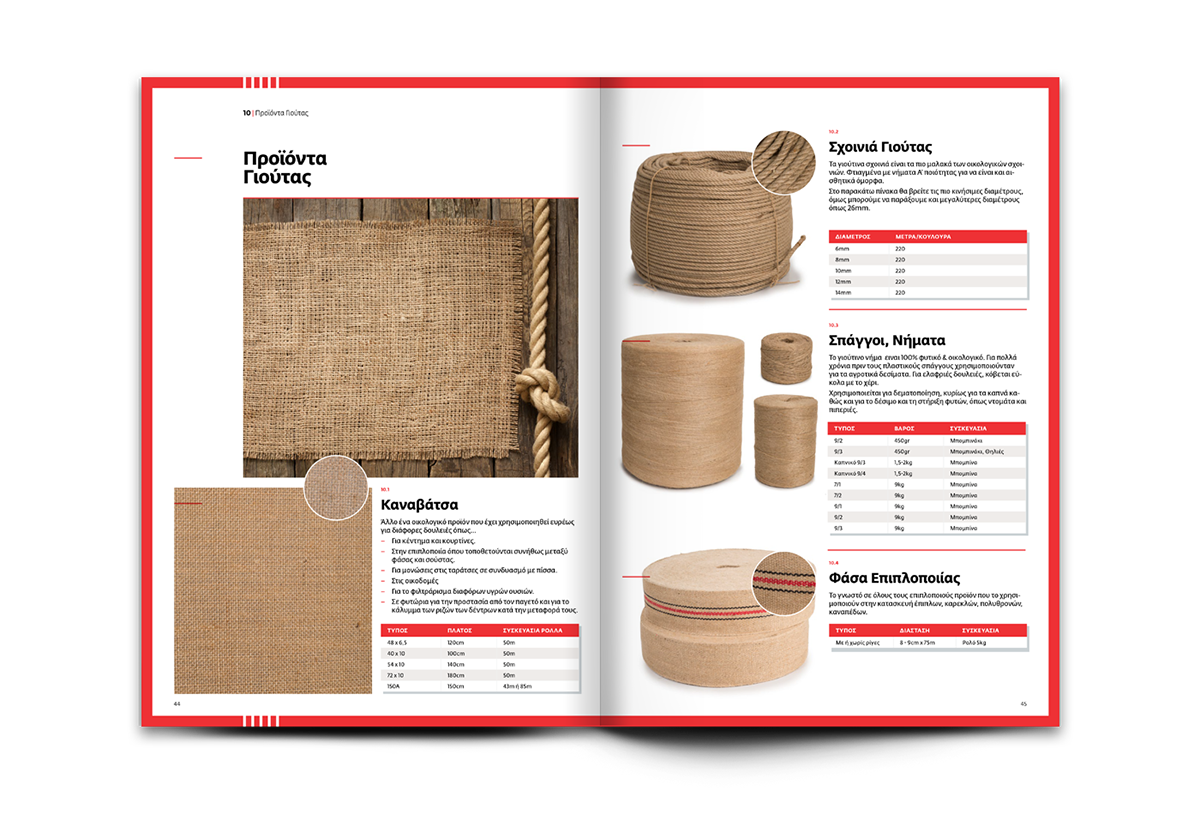
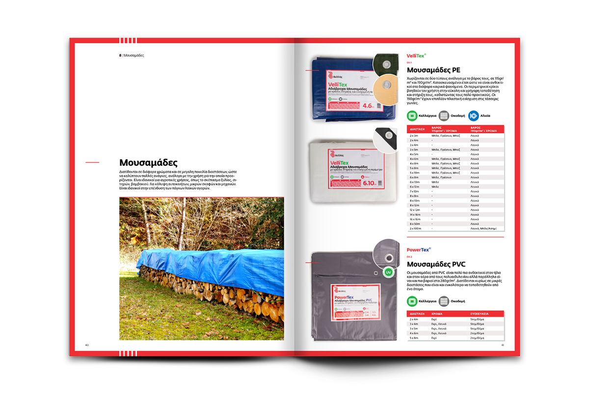
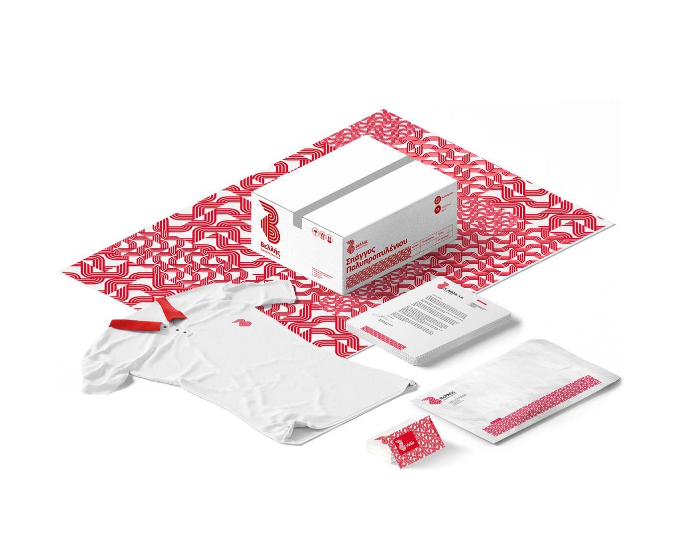
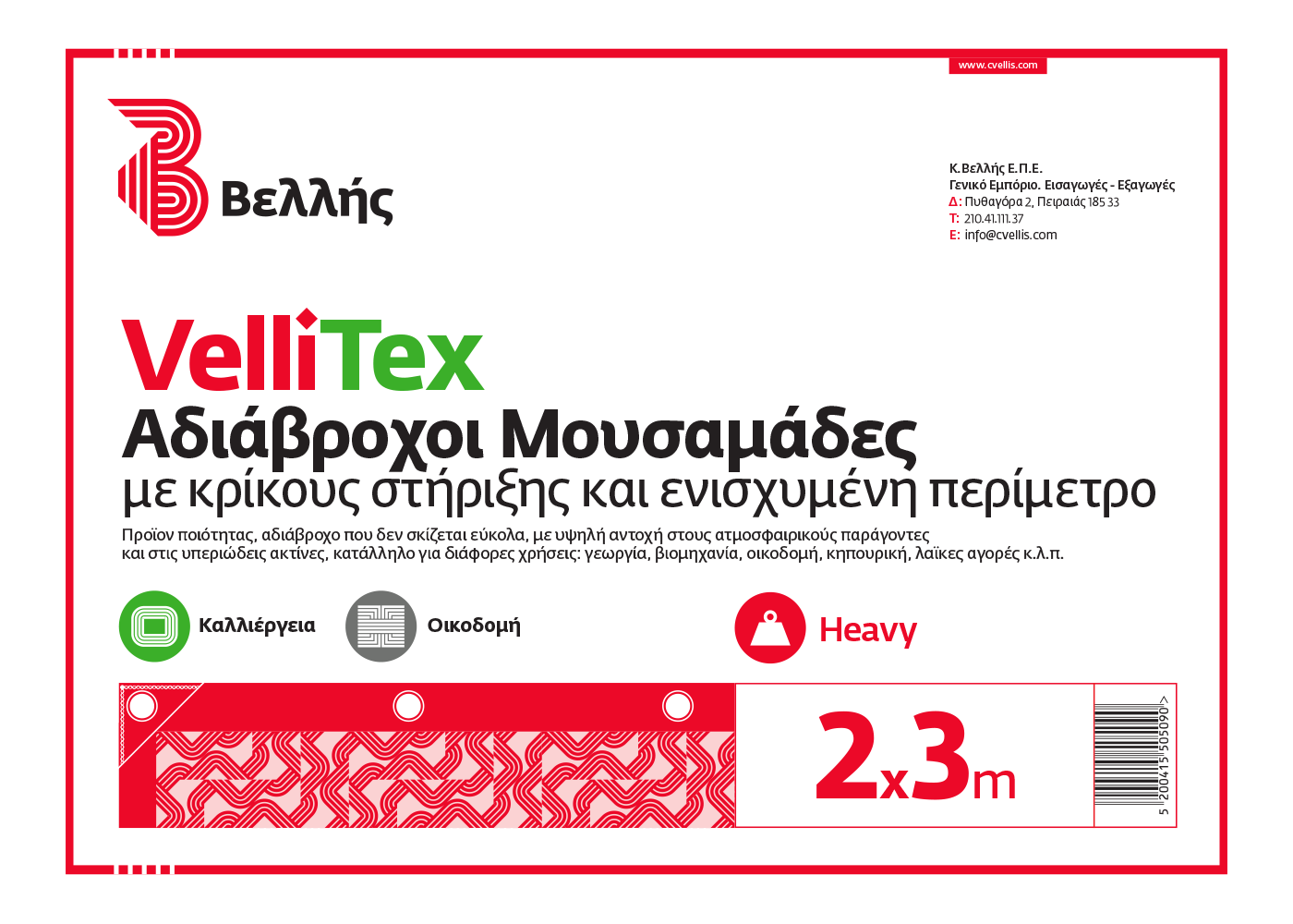
A strong red stoke covers the content and the information. Logo is placed on top left, then bold typography with the products name. The chart that has on the right the main information (sizes, color, type) and on the left side a simple vector pattern that represents the texture or the usage of the product.
It was back in 2015, we were asked by C. Vellis S.A. a company that deals more that 100 years with industrial fabrics and plastics and strings, to redesign their logo and improve their packaging. First thing we changed was the symbol of the logo. The previous one had a confused message and didn't represent the company's name, but it was a nice red thread that related to the products. So we kept the idea of the red thread and made a strong B as a monogram to relate with company's name (in Greek).
We accompanied the identity with a pattern that was born from the parts of the logo. The main goal was to come up with a packaging system for products, so we designed a simple yet effective clean layout as we had so solve the problem of multiple kinds, sizes and colors that the products have.
A strong red stoke covers the content and the information. Logo is placed on top left, then bold typography with the products name. The chart that has on the right the main information (sizes, color, type) and on the left side a simple vector pattern that represents the texture or the usage of the product.
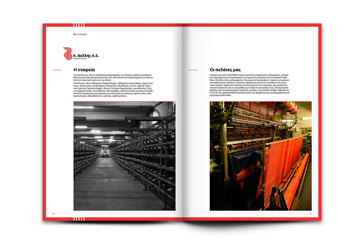
The packaging design process took almost two years to complete and we reached 2018 when we designed a complete products catalogue.
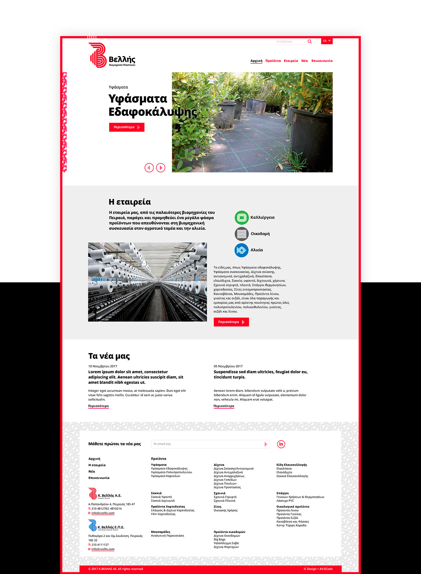
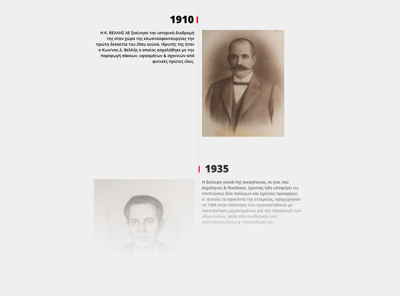
At the same time we re-designed their company web site as a responsive on-line product catalog. Based on the corporate identity and all the visual elements that had been created over the past few years to reinforce the brand. We also emphasized on the company's large history by creating a timeline to present their story through the years.
CREDITS
Creative Direction: Comeback Studio
Web Design: Christina Iliopoulou, ic Design
Web Development: Antonis Varzakakos, -[AV:SCODE]-

Logo | Before and after ©2016
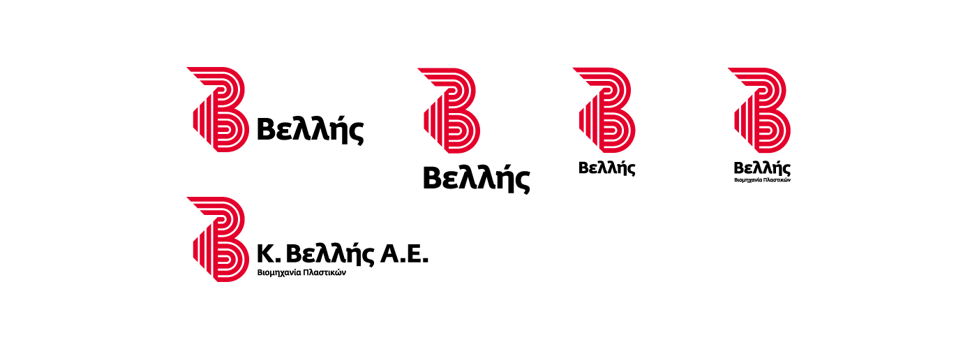
logo versions


categories symbols
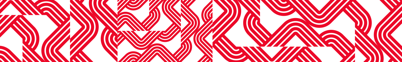
pattern

packaging layout sample