

厦門海勝豐 品牌重塑設計
XIAMEN HILLSON FANG TEXTILES CO., LTD Rebranding
XIAMEN HILLSON FANG TEXTILES CO., LTD Rebranding
Design Agency Creative Director : Yi-Hsuan Li 李宜軒
Art Direction : Yi-Hsuan Li 李宜軒
Visual design : Yi-Hsuan Li 李宜軒 / Kai Ho
Logo Animation Direction: Group.G 谷汩文化
Logo Animator : Cao Zhong 曹仲
Client : XIAMEN HILLSON FANG TEXTILES CO., LTD
Printer: Wei-Yang Printing Enterprise Co.,LTD
Date : Jan. 2018
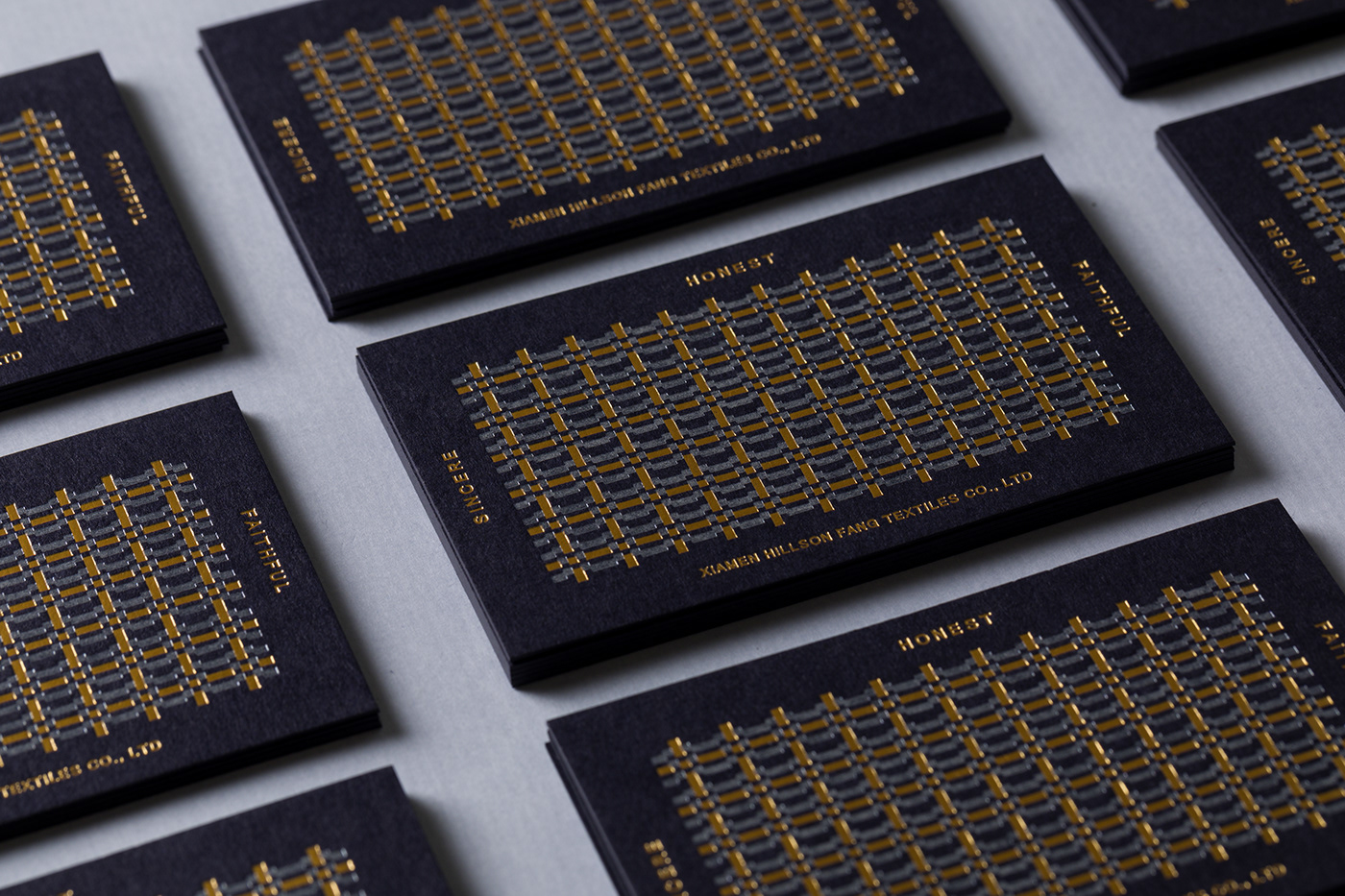
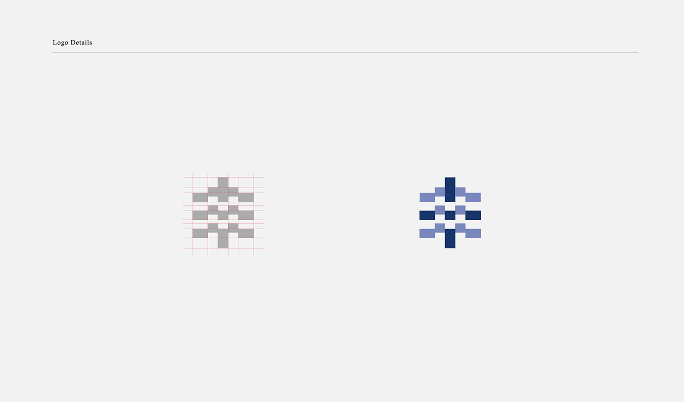
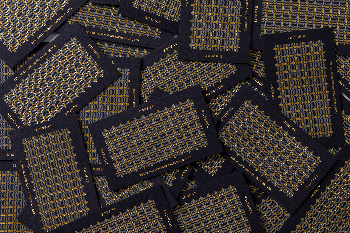
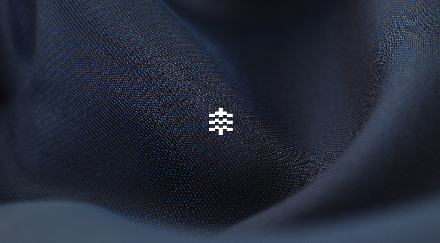
厦門海勝豐紡織公司專注於織品的製作與開發,商標設計以豐的簡寫為設計主軸,丰字交錯的字體結構經過重新設計,加入了以縱橫交錯的紡織概念,成了品牌獨一無二的識別。設計上既呼應產品本身,更緊扣著品牌名稱。為了讓品牌應用更加彈性,我們以logo的圖樣為基底,延伸出一組應用性極高的圖騰,大量的豐字元素,就如布匹微觀結構,讓紡織的意象更加突出。色彩規劃的部分,使用了藍色為增添產品的專業感,運用不同層次的藍色,並加入了燙金的元素,凸顯出品牌更新後的細緻高級感。
Xiamen Hillson Fang Textiles Co., Ltd focuses on the manufacture and development of fabrics. Its logo is designed upon the simplified Chinese character, Fang (丰). Added the concept of criss-cross pattern in fabrics, the cross strokes of Fang make it a unique feature of the brand logo. The design not only correlates the product but the brand itself. To make it more flexible for the brand, we use the logo as the base, and produce a highly-applicable image. Large amount of Fang elements are like the microscopic structure of textiles, to highlight the image of weave. As for coloring, we use blue color to add to the sense of professional specialty of the product. We use different blue gradient vectors and apply hot stamping methods to emphasize an even better sense of elegance after the brand upgrading.
Art Direction : Yi-Hsuan Li 李宜軒
Visual design : Yi-Hsuan Li 李宜軒 / Kai Ho
Logo Animation Direction: Group.G 谷汩文化
Logo Animator : Cao Zhong 曹仲
Client : XIAMEN HILLSON FANG TEXTILES CO., LTD
Printer: Wei-Yang Printing Enterprise Co.,LTD
Date : Jan. 2018
厦門海勝豐紡織公司專注於織品的製作與開發,商標設計以豐的簡寫為設計主軸,丰字交錯的字體結構經過重新設計,加入了以縱橫交錯的紡織概念,成了品牌獨一無二的識別。設計上既呼應產品本身,更緊扣著品牌名稱。為了讓品牌應用更加彈性,我們以logo的圖樣為基底,延伸出一組應用性極高的圖騰,大量的豐字元素,就如布匹微觀結構,讓紡織的意象更加突出。色彩規劃的部分,使用了藍色為增添產品的專業感,運用不同層次的藍色,並加入了燙金的元素,凸顯出品牌更新後的細緻高級感。
Xiamen Hillson Fang Textiles Co., Ltd focuses on the manufacture and development of fabrics. Its logo is designed upon the simplified Chinese character, Fang (丰). Added the concept of criss-cross pattern in fabrics, the cross strokes of Fang make it a unique feature of the brand logo. The design not only correlates the product but the brand itself. To make it more flexible for the brand, we use the logo as the base, and produce a highly-applicable image. Large amount of Fang elements are like the microscopic structure of textiles, to highlight the image of weave. As for coloring, we use blue color to add to the sense of professional specialty of the product. We use different blue gradient vectors and apply hot stamping methods to emphasize an even better sense of elegance after the brand upgrading.