
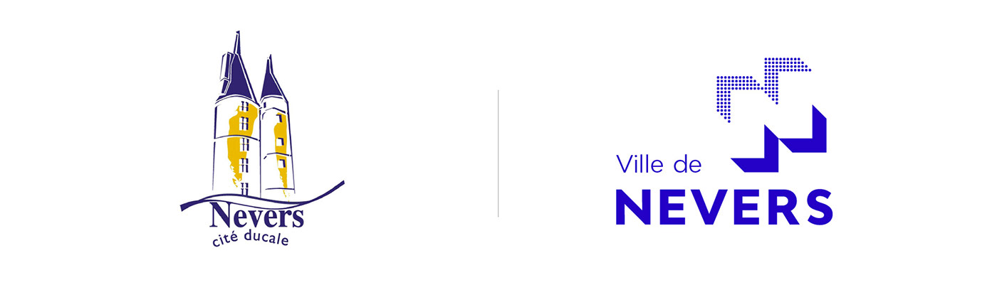
City of Nevers
A visual identity that looks to the future
A visual identity that looks to the future
"Nevers is built like a capital that a child can visit" wrote Marguerite Duras. Probably the most beautiful homage to this city, prefecture of Nièvre and located in the heart of France.
Nevers is a city rich in history and heritage. Yet, like many medium-sized cities, its demography is on the decline, leading to the inevitable economic slowdown. Nevers is often described as "sleeping beauty" and it is precisely this image that we have sought to change. In this context, choosing a new visual identity is choosing to assert an ambition! To give back the departmental, regional and national stature that Nevers deserves. This new identity is therefore there to inscribe the city in modernity, movement and energy.
—
Ville de Nevers
Une identité tournée vers l'avenir
Une identité tournée vers l'avenir
“Nevers est bâtie comme une capitale dont un enfant peut faire le tour”, écrivait Marguerite Duras. Probablement le plus bel hommage qu'il soit à cette ville, préfecture de la Nièvre et située en plein cœur de la France.
Nevers est une ville riche par son histoire et son patrimoine. Pourtant comme beaucoup de villes moyennes, sa démographie est sur le déclin, entrainant l'inévitable ralentissement économique. À moins que ce soit l'inverse. On qualifie souvent Nevers de « belle endormie » et c’est précisément, cette image que nous avons cherché à changer. Dans ce contexte, faire le choix d'une nouvelle identité visuelle, c'est faire le choix d'affirmer une ambition ! Pour redonner la stature départementale, régionale et nationale que Nevers mérite. Cette nouvelle identité est donc là pour inscrire la ville dans la modernité, le mouvement et l'énergie.
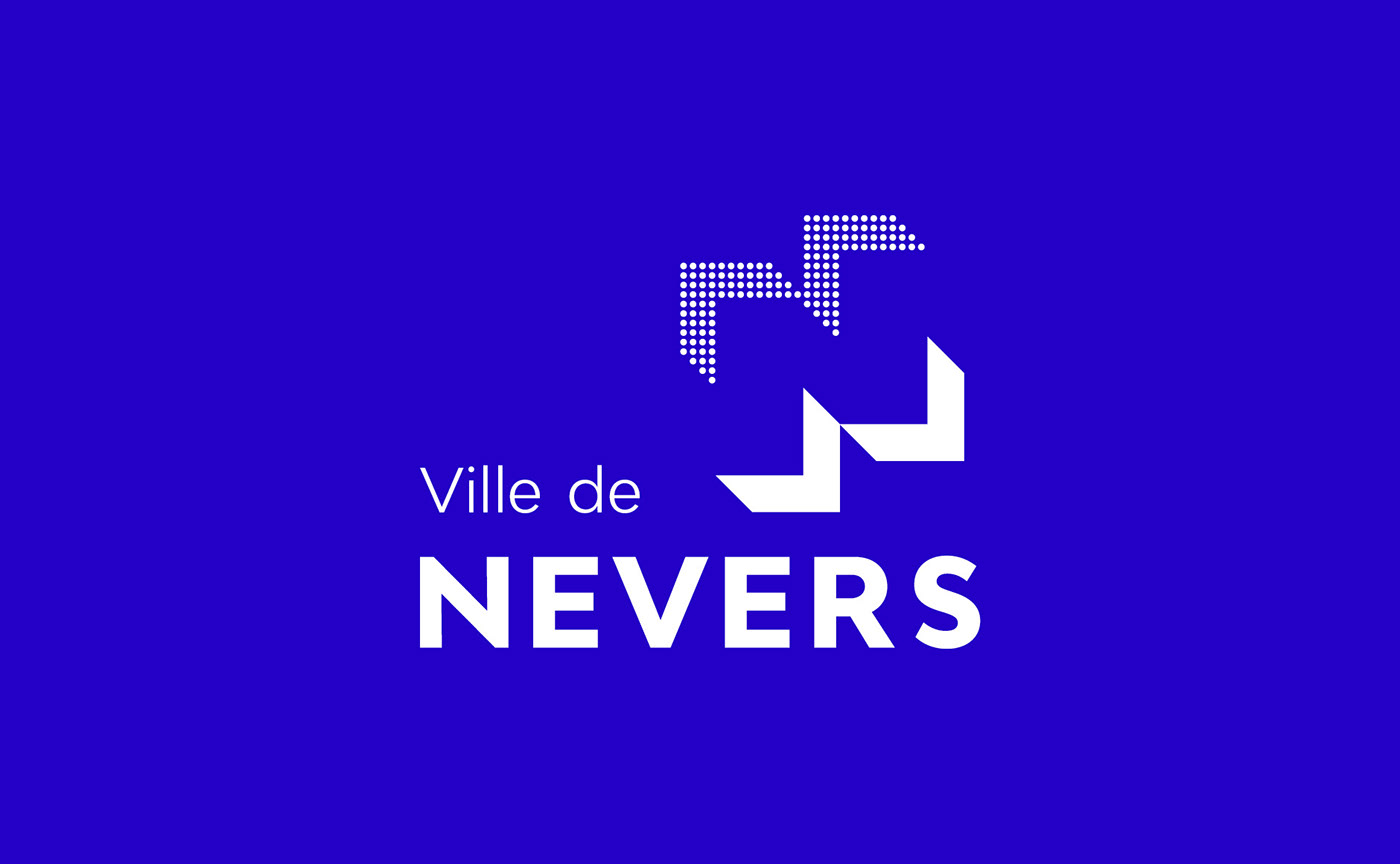


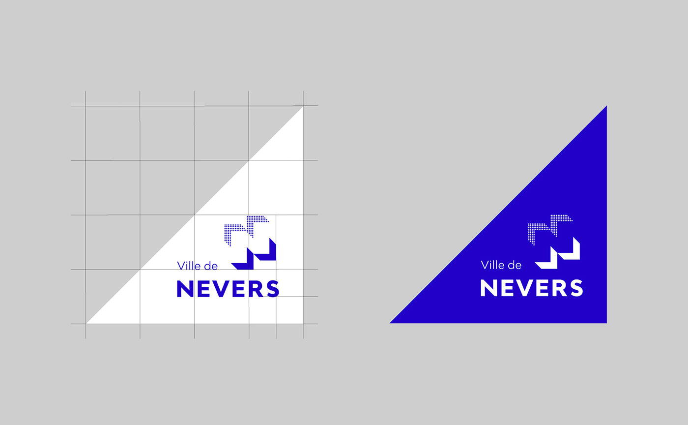
The logotype
The logo is designed in a modular way. In its initial configuration it draws the letter "N", but it can be recomposed in a thousand ways...
The idea of movement is written into his DNA. These arrows seem to open up as if to unfold the city's potential.
The idea of movement is written into his DNA. These arrows seem to open up as if to unfold the city's potential.
—
Le logotype
Le logo est conçu de manière modulaire. Dans sa configuration initiale il dessine la lettre "N", mais il peut se recomposer de mille manières...
L'idée du mouvement est inscrite dans son ADN. Les flèches semblent s'ouvrir comme pour déployer le potentiel de la ville.
L'idée du mouvement est inscrite dans son ADN. Les flèches semblent s'ouvrir comme pour déployer le potentiel de la ville.
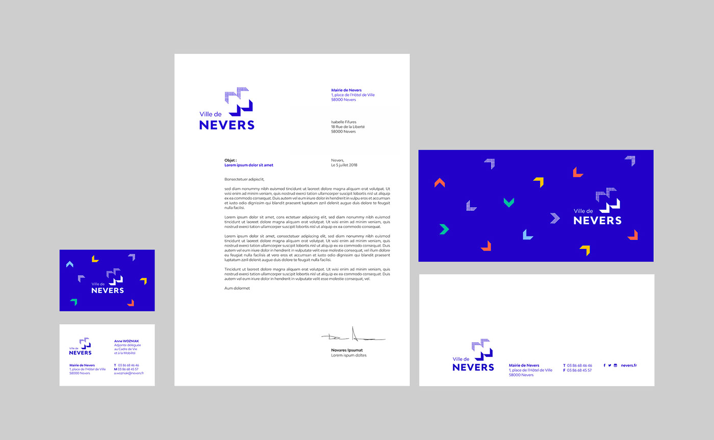


Stationery: simple, sober and functional. The chevrons, as the main ingredients of the identity, are used in a lively and colourful way.
—
La papeterie : simple, sobre et fonctionnelle. Les chevrons deviennent l'ingrédient identitaire et s'expriment de manière vivante et colorée.

The blue of Nevers
When it came to colour choices, the famous "Nevers blue" was chosen naturally. This cobalt blue obtained by firing manganese has been used to glaze Nevers earthenware for over 3 centuries. In addition, a more open range of colours enriches the system.
—
Le bleu de Nevers
En matière de choix colorés, le célèbre « bleu de Nevers » s'est imposé naturellement. Ce bleu cobalt obtenu par la cuisson du manganèse sert à émailler la faïence de Nevers depuis plus de 3 siècles. En complément, une gamme de couleurs plus ouverte vient enrichir le système. Ce sont des couleurs qui fonctionnent toutes sur le bleu cobalt.
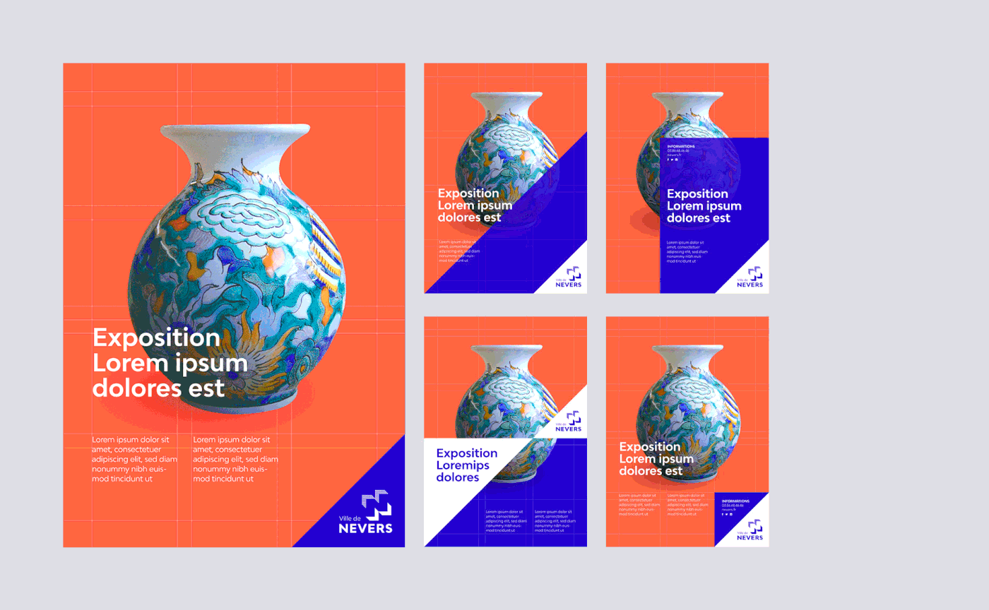
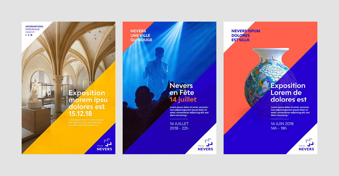
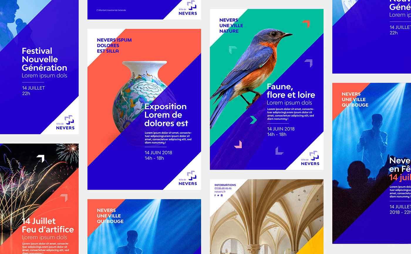
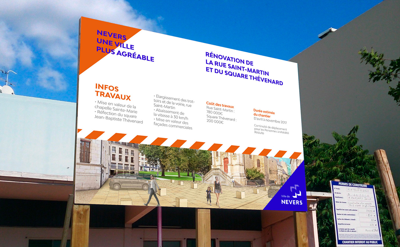
The posters
The angle of the logo is the starting point of the composition of the posters. Large diagonals cross the format to draw rhythms through the posters. Colours, texts and images produce structured and moving compositions. The system can be put in minor to give prominence to the visual, or express itself fully when the iconography is deficient.
—
Les affiches
L'angle du logo sert de point de départ à la composition des affiches. De grandes diagonales traversent le format pour dessiner des rythmes au fil des affiches. Couleurs, textes et images produisent des compositions structurées et mouvantes. Le système peut s'effacer pour laisser parler le visuel, ou bien s'exprimer pleinement lorsque l'iconographie est défaillante.
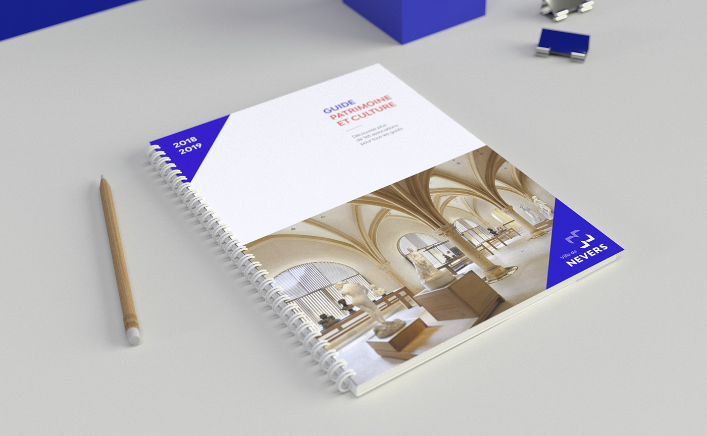
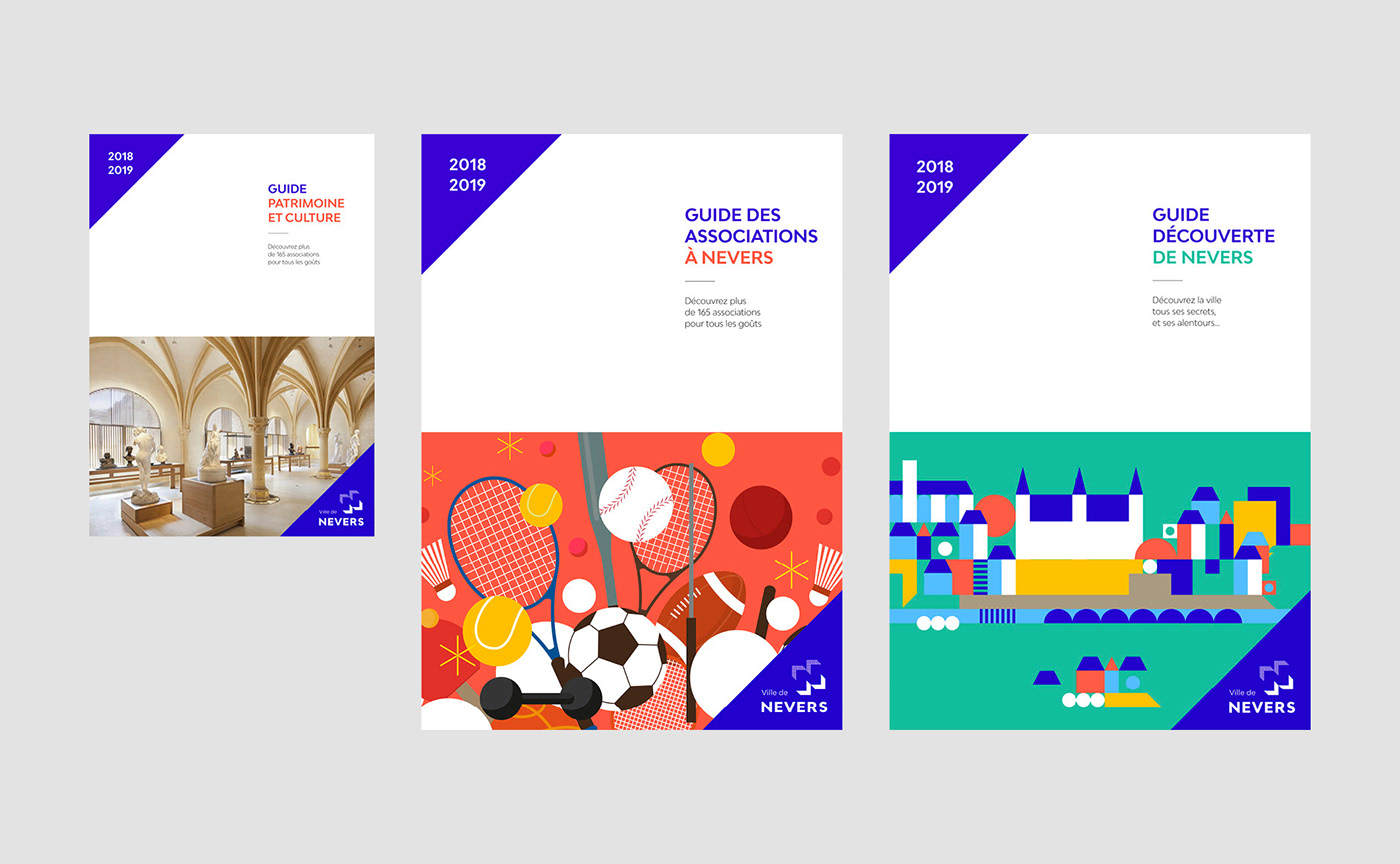
Publishing
For publishing documents, the composition is more classic than for posters. The page is divided in two parts (text/image).
—
Les éditions
Pour les documents éditoriaux, le principe de composition est plus calme que pour les affiches. La page se structure en deux parties (texte/image).
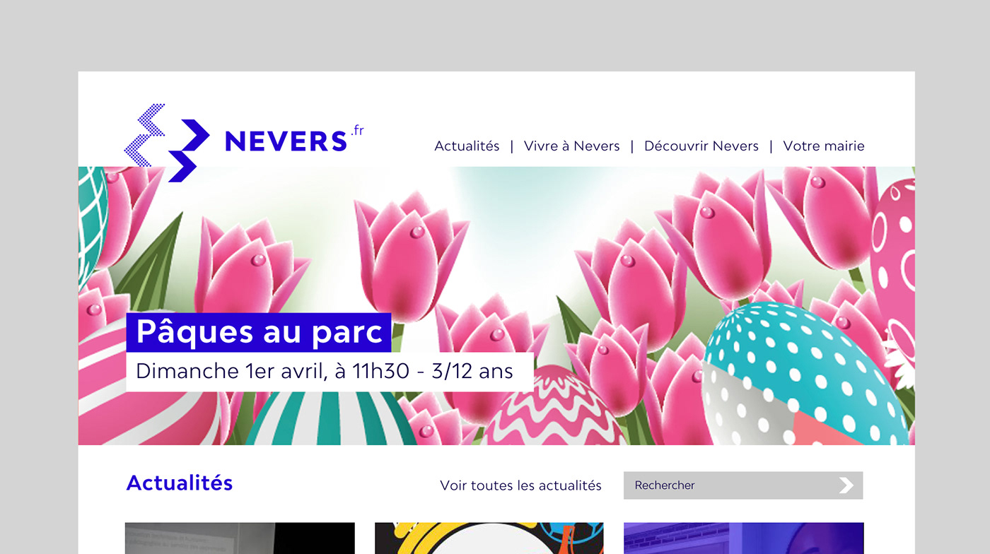
Homepage template for the city's website. The logo takes another configuration.
—
Projet de page d'accueil du site internet de la ville. Le logotype prend un autre configuration.


Credit: Motion design by Clément Gadoin.
Special thanks: Thanks to Denis Thuriot, Mayor of Nevers, Gildas Bizeul and the team
of the city's communication department for their trust and the quality of the exchanges.
of the city's communication department for their trust and the quality of the exchanges.
—
More info at:


