

NASA JPL Spacecraft Cost Estimation Tool
—
Full writeup viewable at https://www.jamiechin.me/#/nasa-jpl-cost-estimation-tool/
ROLE
UI/UX design, information architecture, wireframing, high fidelity mockups, interactive prototype
CHALLENGE
Create an interactive prototype for a spacecraft cost visualization tool.
PROJECT
The Spacecraft Cost Tool is an application that spacecraft designers will use to estimate the cost of their spacecraft. The tool will help expedite and provide accurate cost estimates in the pursuit of mission concepts and mission studies.
ROLE
I was tasked with synthesizing user research into an interactive prototype that demonstrated an understanding of the use case, and reworking the visual design to meet Material Design Guidelines. I worked with users to iterate and validate my designs.
PROCESS OVERVIEW
—
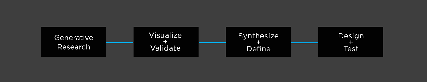
RESEARCH AND CUSTOMER JOURNEY
—
Through multiple user meetings and design reviews, I was able to ask questions, review requirements, use cases, and discuss prototypes. Through this process, I became clear with the full scenario flow and various use cases.
For our customer journey map, our goal was to be able to quickly and efficiently identify costs compared to another variable, such as mass, be able to see that data visualized in various views, and compared or contrasted with other variables.

DESIGN OBJECTIVES
—
After becoming clear with the task flows and the customer journey map, we were able to pinpoint specific questions that would inform our design strategy and guide our design intentions:
- What potential design solutions can we utilize that solve our query needs: the problem of limiting the amount of interactions it takes to get to the query and what loading pre-defined queries looks like?
- Reassess and rethink navigation decisions - what value does something provide the user?
- What are the hidden/unknown visualization needs, and how can we elegantly integrate that into the real estate?
SKETCHING INTERFACES
—
These sketches drove the ideas for our 1st and 2nd design iterations. I was able to explore various layouts and explain the benefits of each one.

MOCKUPS
—1ST ITERATION OF UI
First three ideas of visualizing the dashboard and utilizing the real estate. We ended up going with the first idea that solves the problem of spacing and minimizing the amount of clicks it takes to get to the query.


—2ND ITERATION OF UI
Here our goal is to rethink the interface. The second round of design ideas is in response to new problems such as designing for a growing list of query and filter results and the interaction of the user with the data. Here are design solutions I quickly mocked up to represent our 3 ideas.


—3RD ITERATION OF UI
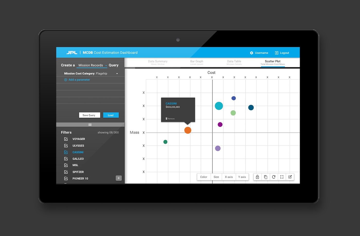
In the limited production release, we want to place an emphasis on functionality and interaction with a focus on user needs. We focused on honing down our visualization needs including attributes, evidence of deselection across all views, adjustable sidebar views, and export options.
The initial ideas of a light palette reverted to using a dark palette for more visual offset between the sidebar elements and the data.
The initial ideas of a light palette reverted to using a dark palette for more visual offset between the sidebar elements and the data.


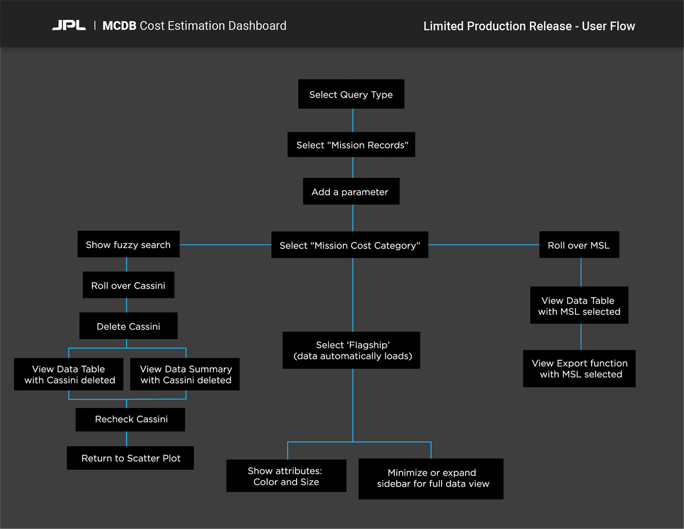
LOADING PREDEFINED QUERIES:
Full walkthrough with descriptions of the user flow on website:
https://www.jamiechin.me/#/nasa-jpl-cost-estimation-tool/


Simultaneous display of data through various graphs + Exporting data


Deleting a data point:


Addressing user requests of integrating attributes such as color selections, various export options, multi-graph views, + resizing to full screen:


User request for pulling the navigation bar to side, utilizing full screen views for the data:


—VISUAL DESIGN
Designing with intent also includes an intuitive and pleasant interface for users to interact with. There is more than meets the eye in visual design. It is beyond the rearrangement of type and color; it includes the understanding of the intention behind the selected color palette, why each piece of your design works or doesn't work, and finding a solution to represent all the interactions identified. For example, the dark palette was chosen as a solution to provide visual offset between the query and filter group elements (sidebar) and the data.
Effective design communication within a team is just as important as the product - here's the UI style guide I created for the developers to utilize.
Effective design communication within a team is just as important as the product - here's the UI style guide I created for the developers to utilize.


—INTERACTIVE PROTOTYPE
View the limited production release interactive prototype here.
—TAKEAWAYS
- Design is a learning and iterative process. While interrogating the user, I always learn something new not only about them, but also about myself and my design choices.
- Having said that, there is always something new you can uncover. Initially, I felt that the meetings seemed to go in circles and there was not a clear path - many things were still unsaid and left up for assumption. However, I learned that this iterative process enables us to uncover new questions and hidden problems overlooked before.
-The visual design may be similar to what we started with in the beginning, but what is different and makes the impact is how the design has become finessed and refined to the user.
-There is an importance in working with developers so we do not have to "reinvent the wheel" and design anything in libraries already.
-Designing to help improve the lives of other individuals is the most fun and rewarding process in the world to me.


