


Say Hello to Flyby
Flyby is a company on a journey. As one of America’s newest, most unique start-up brands, it’s steadily building a devoted community of folk who don’t have time for hangovers. Our challenge was to create a brand that brings to life their vision of drinking smarter and living better.
Flyby Your Hangover
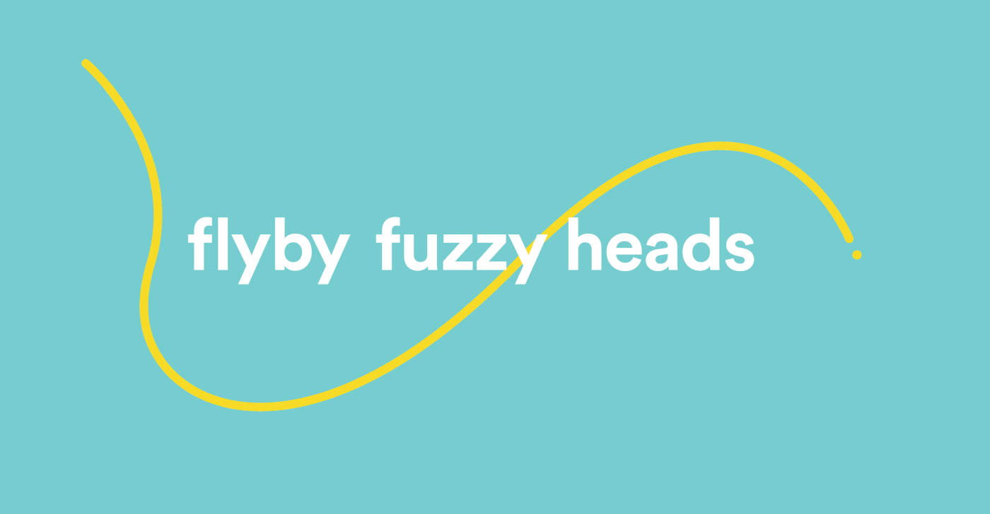
Inspired by the name of the product, we created the Flyby 'loop' as a visual representation of the product and how it allows you to 'fly by your hangover'. The loop is infinitely adaptable to its surroundings; be that the brand logo, typography, imagery or iconography and provides a flexible brand asset that is instantly identifiable to the Flyby brand.


"Being faced with the task of branding your product is essential. I spoke with a few large design agencies, and none of them gave me a feeling of intimacy and understanding when it came to my project. I felt like I was just another “To do” on their list. With Alphabet, right from the start it was their goal to get inside my head and really understand my product, and how we wanted to be perceived."
Eddie Huai
Founder, Flyby
Founder, Flyby
A Punchy Personality
We played heavily on the name of the product and connected it to real life 'hangover' situations in order to bring personality and a friendly, realistic tone to a market that can otherwise be quite dull and boring.

"The new Flyby identity is simple, welcoming and memorable — like the product itself, the brand is a direct challenge to a category that is generally boring and full of jargon."
Sam Lane
Co-founder, Alphabet.
Co-founder, Alphabet.

Brand Recognition
We created an icon suite for the brand that utilises the Flyby 'loop' whilst also creating a clear visual key relating to key areas of the brand. The icons are used as a visual aid to help make the complex simple when it comes to product ingredients and benefits.
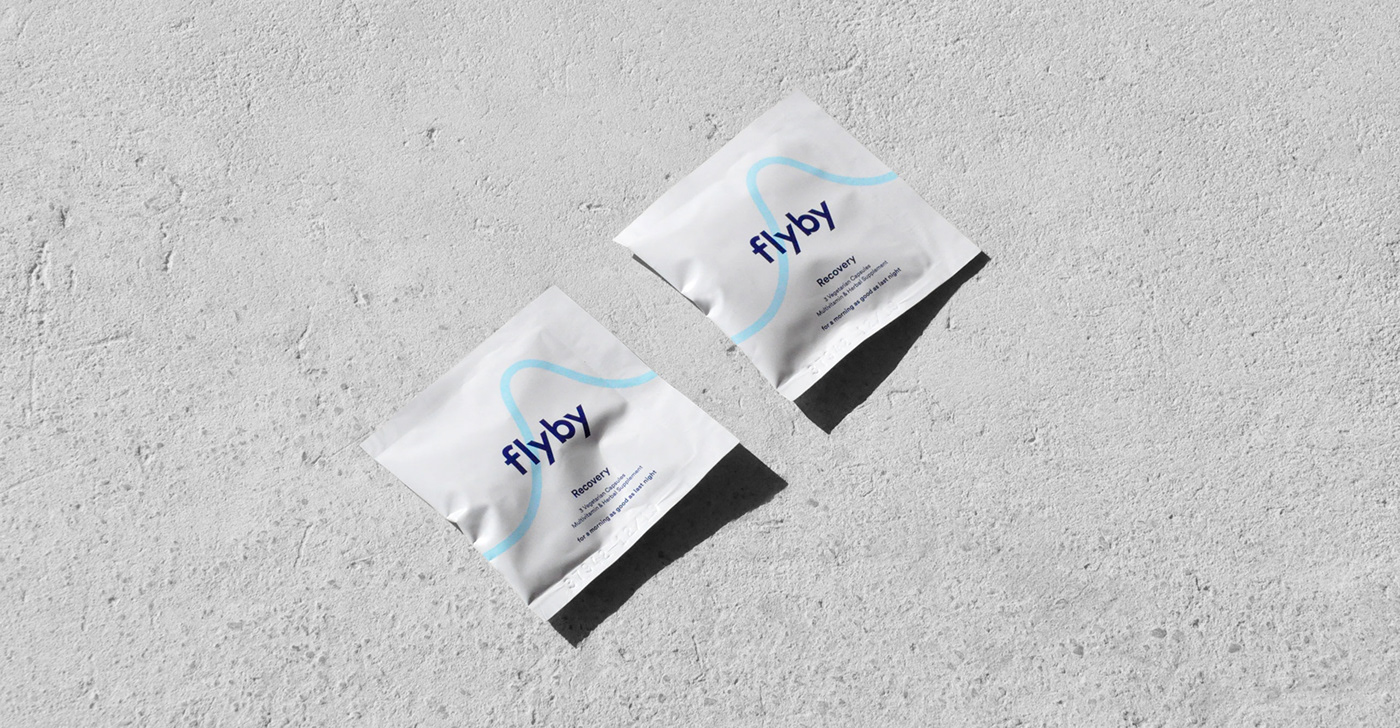

Subtle, Yet Confident
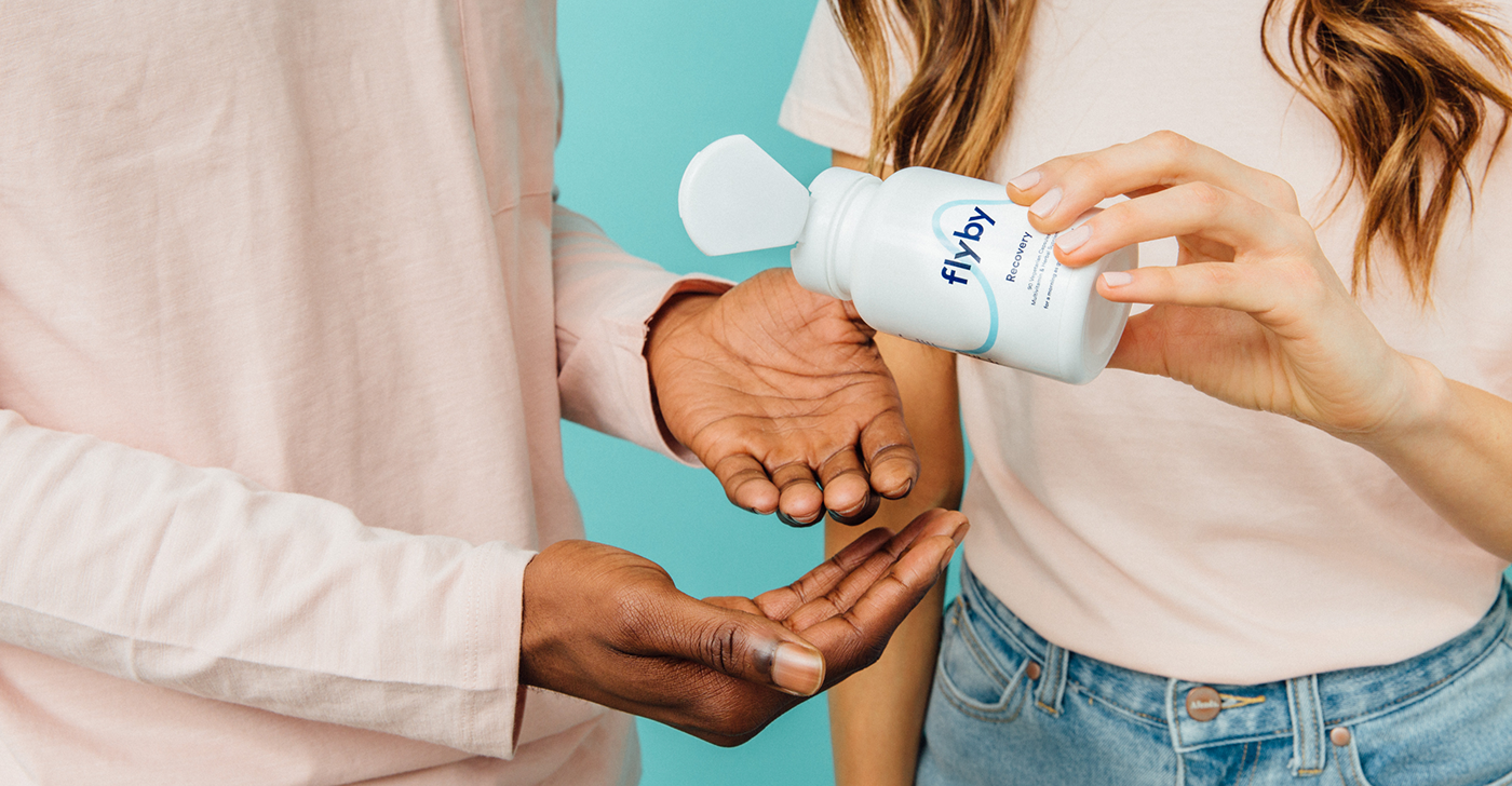
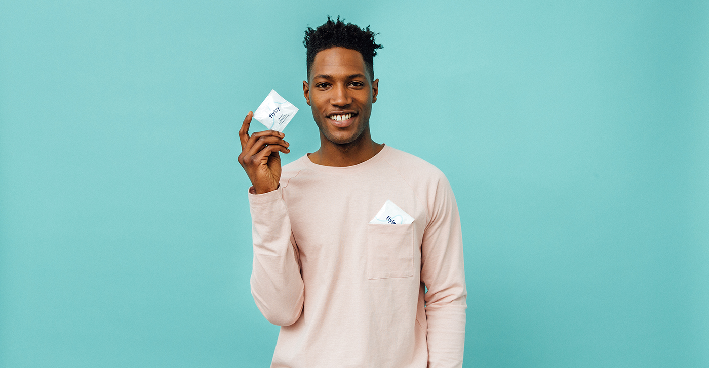
The packaging is something that consumers won’t feel the need to stash away in their medicine cabinet. Pills come in handy on-the-go sachets and also a traditional white bottle and the main attraction is the brand name and graphic device. It doesn't feel overly medicinal but still maintains a pharmaceutic quality. By embracing the health aspect, it simply feels like any other vitamin or supplement you might take regularly.


Supplements with Style
We opted to steer away from the generic stock photography that is usually associated with the supplement category and instead decided to have a little fun with it. We paired a cheerful, contemporary colour palette with millennial models and didn’t shy away from showing them interacting with the product in a playful and engaging way.
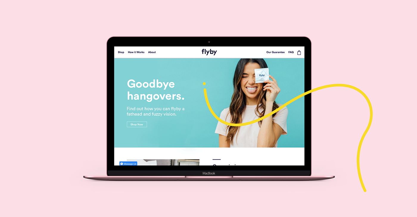
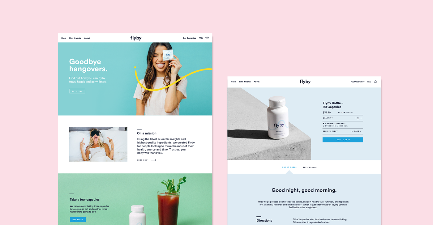
A Bespoke Web Experience
One of the first applications of the new brand was to redesign the online presence; a place initially created to clearly and concisely communicate the Flyby offer. We combined Studio and Lifestyle Photography with all other brand assets to bring personality and life to the product.
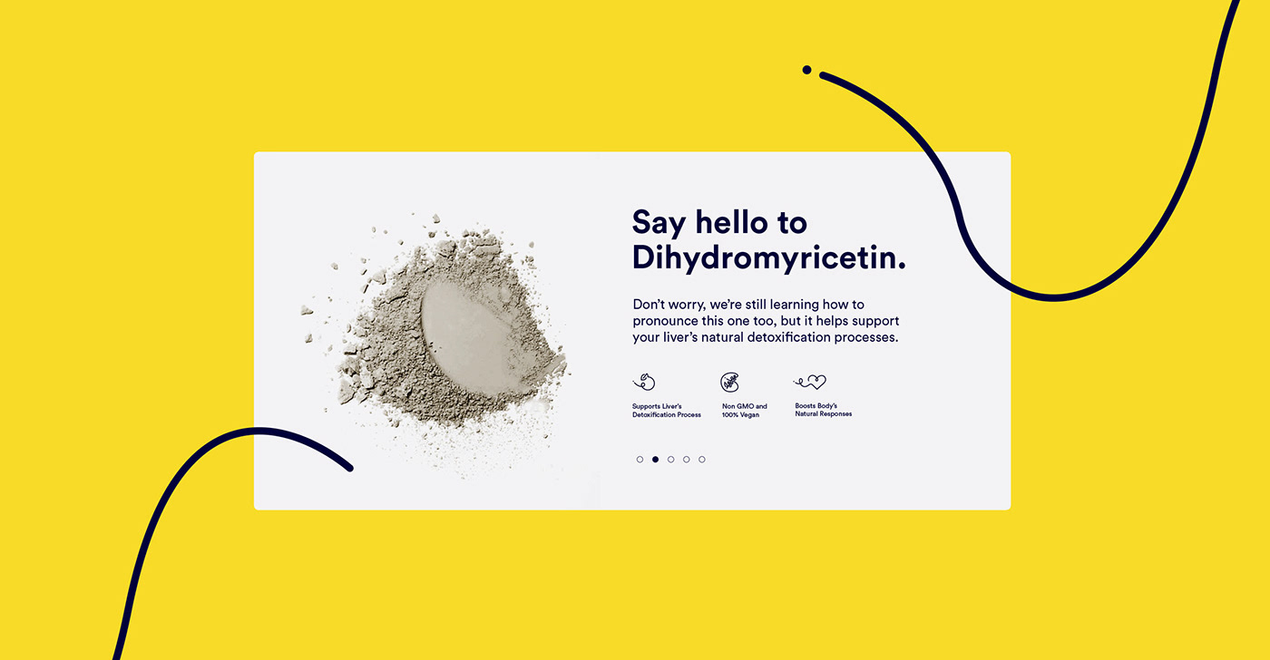
Making the Complex, Simple
We understood that the ingredients in the Flyby product are not common, and quite frankly hard to pronounce. For this reason, we introduced a light-hearted tone of voice which alluded to the fact that most consumers probably won’t have heard of these ingredients before and aimed to explain how they work in a clearer ‘human-to-human’ style.
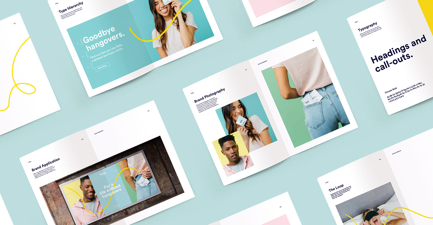
Brand Application
We created a comprehensive set of guidelines to help Flyby bring the brand to life across all channels. But we continue to work closely together, developing their internal and external communications.

Thanks for scrolling
To see the full case study, visit our website;
madebyalphabet.com
Want to work with us?
madebyalphabet.com
Want to work with us?
hello@madebyalphabet.com
Copyright Alphabet 2018. All Rights Reserved
Copyright Alphabet 2018. All Rights Reserved


