The Client
—
Olive Poem is a single-estate extra virgin olive oil extracted from the earth of Vrontamas in Lakonia, Greece. Meaning to differentiate itself and stand out for its fine character thanks to its natural ingredients and pure production processes, it sought for a packaging that would tell its story with an artistic and mystical essence.
The Objective
—
The main request was to create a premium-quality brand identity, addressing people with high nutrition and taste standards, who are truly concerned about the quality and purity of their alimentation. Acquiring a luxury and mostly artistic sense, the packaging was required to differentiate itself in a market full of good-looking, yet low-quality, competition.
The Solution
—
—
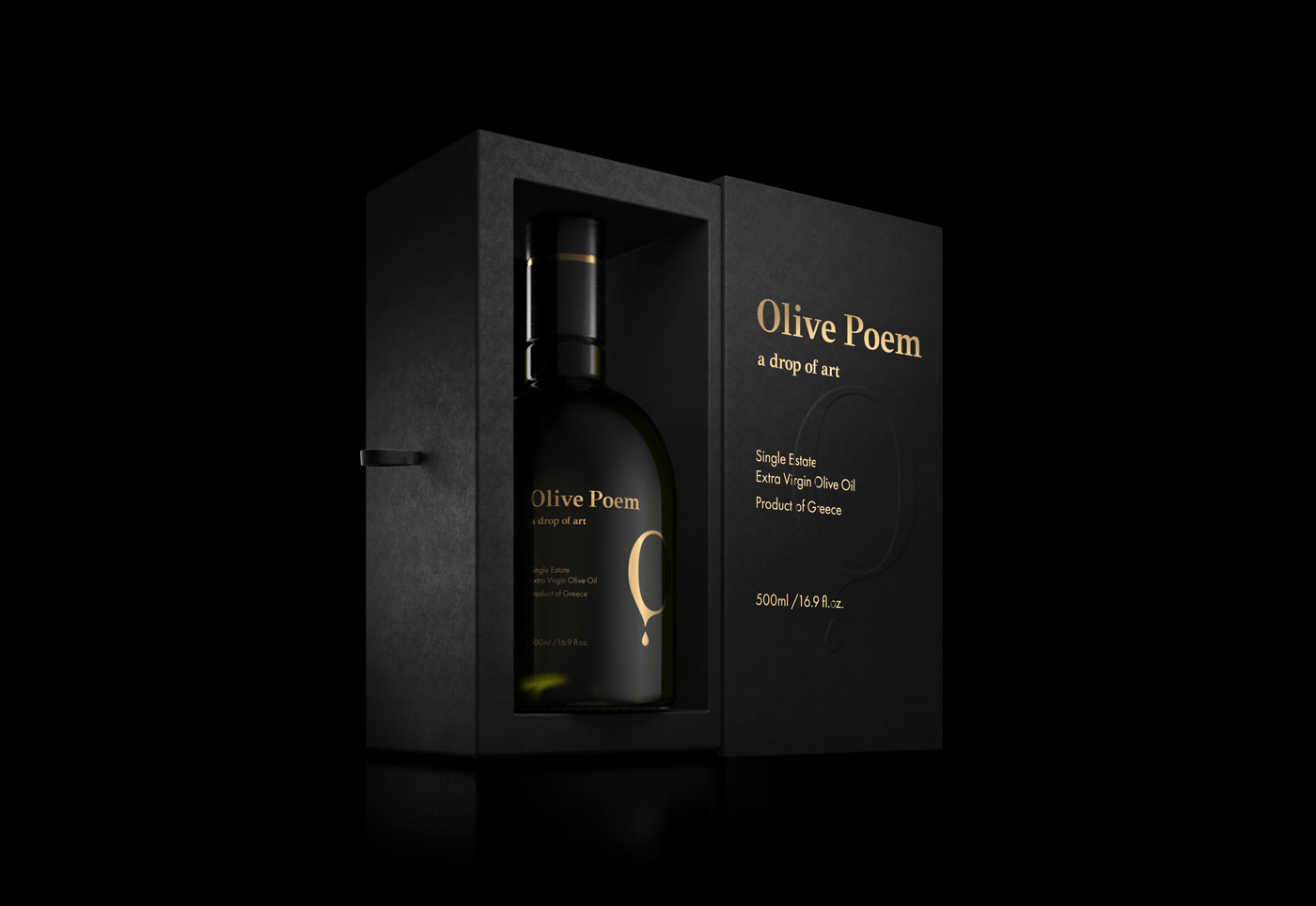
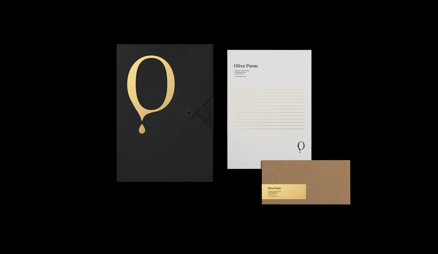
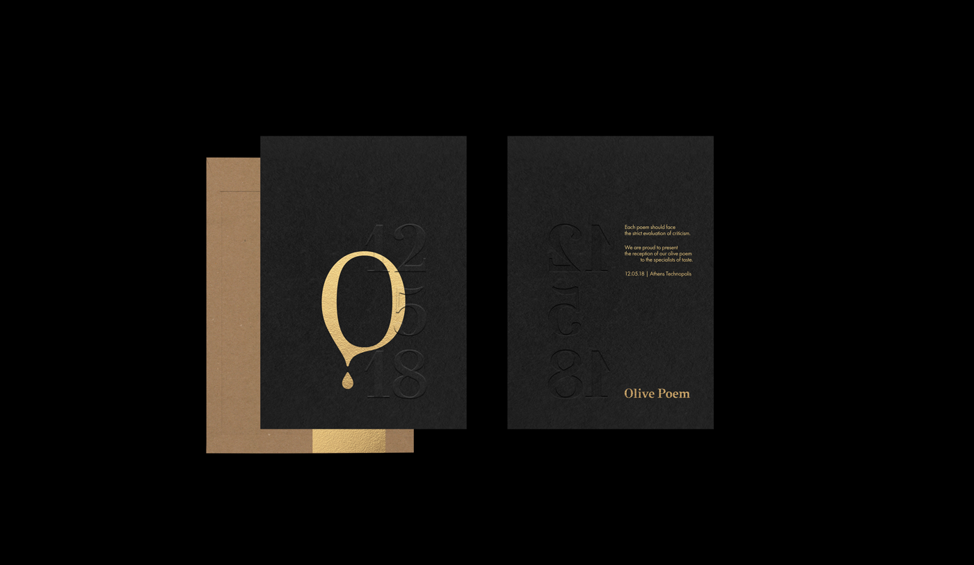
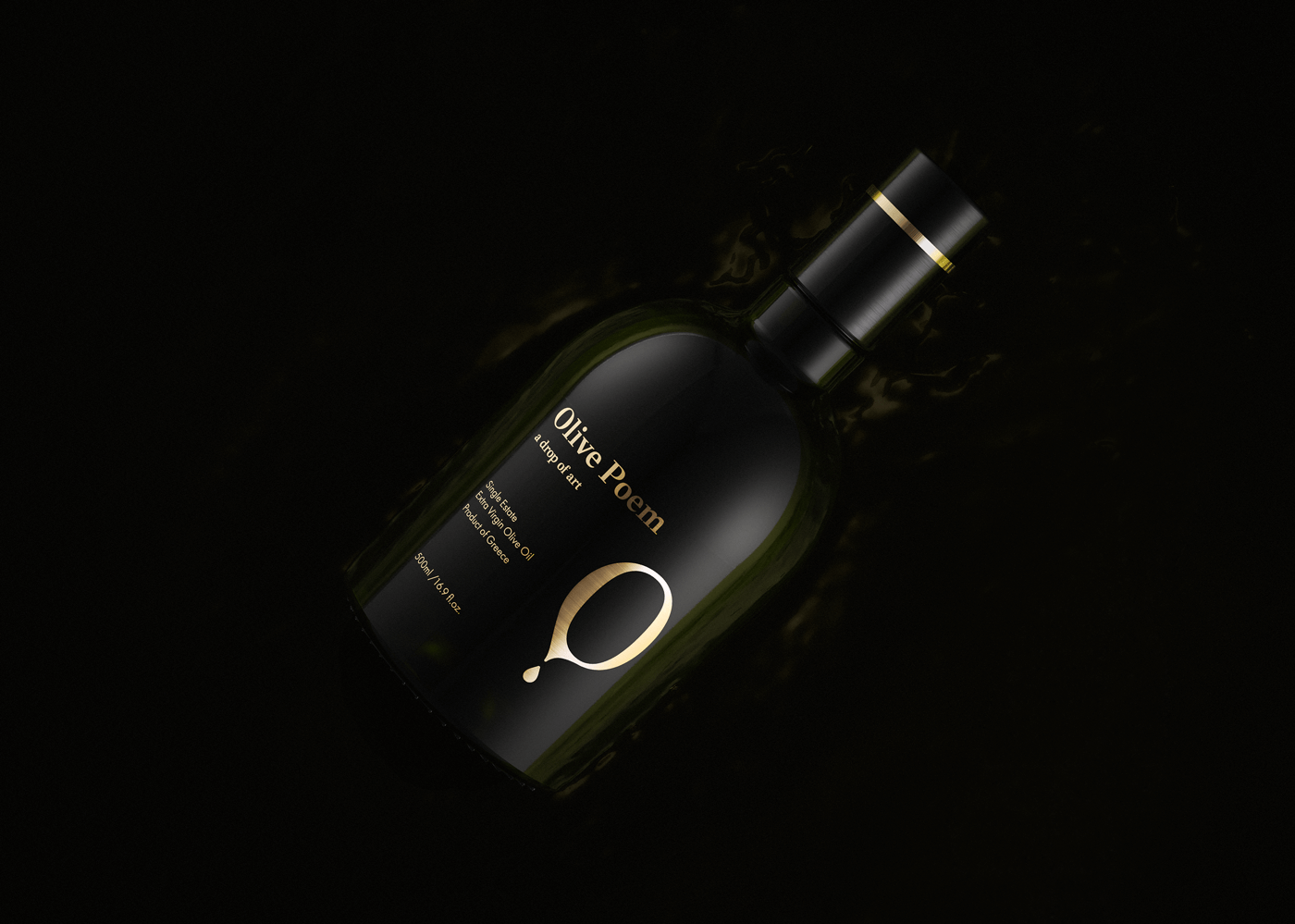
During the logotype design process, we mostly experimented with brand name’s initials to invent how P can be born through O's fluidity. Thus, pointing to the liquidity of olive oil, while visually representing the product’s tagline, “a drop of art”, the logotype means to infuse product’s both physical and conceptual distinctive attributes into its visual identity.
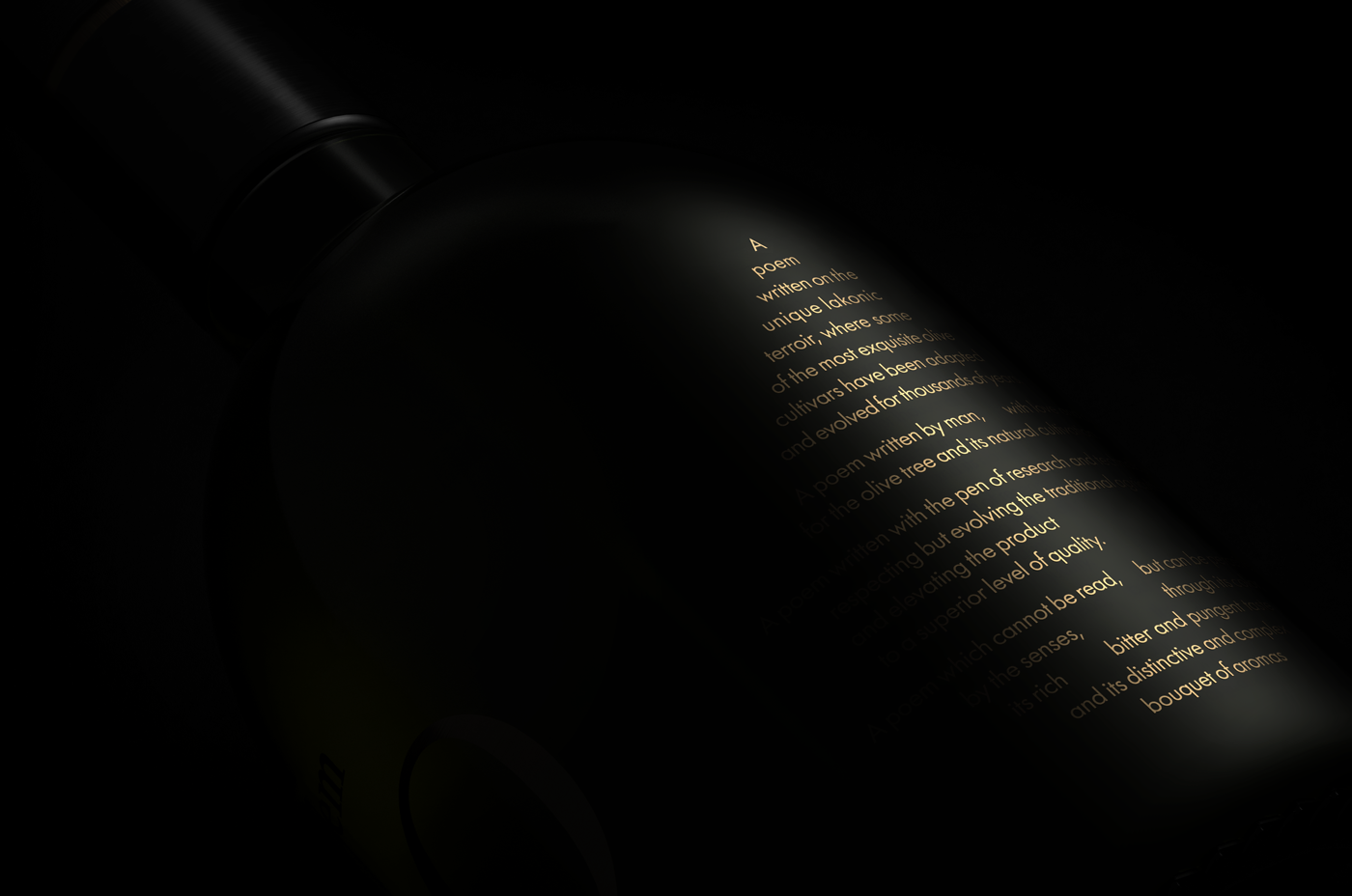
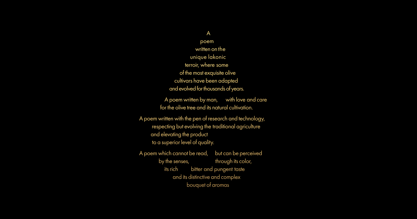
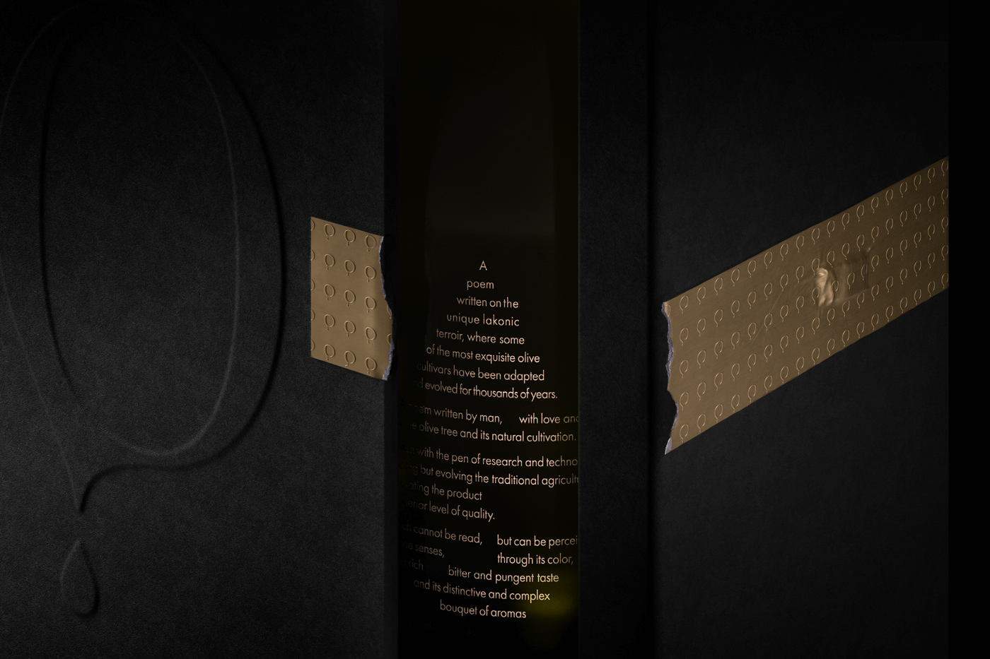
The premium character of each olive oil drop, alongside with its artistic spirit, is also credited on the packaging design, with drop-shaped texts, aligned with the formatting met in poetic compositions. Enhancing the overall high-quality identity, silkscreen printing with Gold Pantone highly attributes the conception of olive oil as “green gold”.
Preserving the secrets of taste, while valuing and honoring the art of olive oil production, Olive Poem is a new entry to the EVOO market and it surely was a pleasure to undertake its branding and packaging design!