


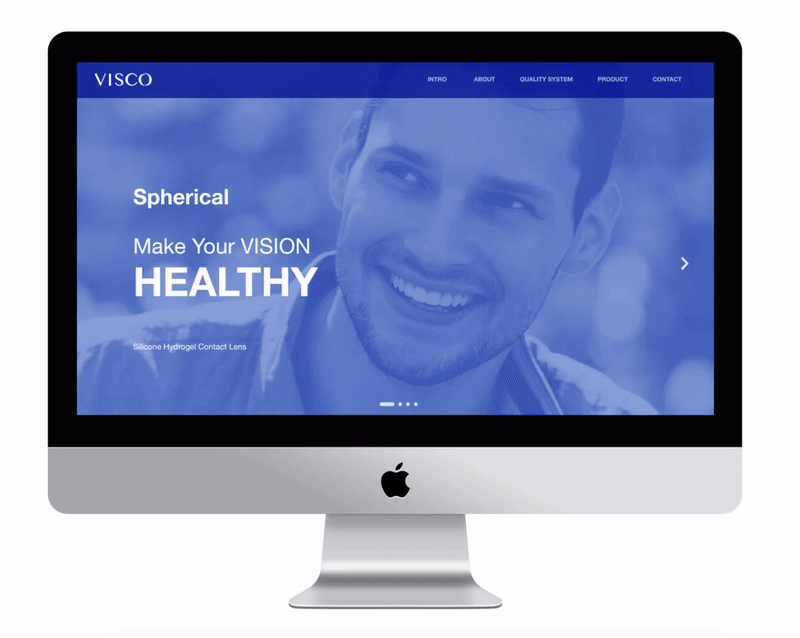

VISCO VISION BRANDING IDENTITY / VISCO品牌識別設計
To express the stylishness and professional optical imagery of the contact lenses, the VISCO Vision brand identity design used Modern Typeface with thick and thin contrasts as the logotype. The “O” in the logo is given a wave and light refraction metaphor. Only part of the supporting graphic is shown when it uses. The metaphor is used to magnify visual space. This produces easy identity and yet not to be prominent too much, and could expresses the image characteristics of the contact lens brand.
為了表現隱形眼鏡時尚與光學專業的形象,使用粗細變化強烈的現代字體( Modern Typeface ) ,並將標誌中的O,賦予水波與光線折射的意象。應用時只露出部分輔助圖形,以隱喻手法放大視覺空間感,辨識性高卻不會過份突出,是隱形眼鏡品牌形象的特色
Graphic Design / Szu-Yu Chen Tzu-Chun Yuan Yi-Ju Cho Yun-Hsuan Chang
Client / VISCO VISION INC.
Year: 2018
Year: 2018


