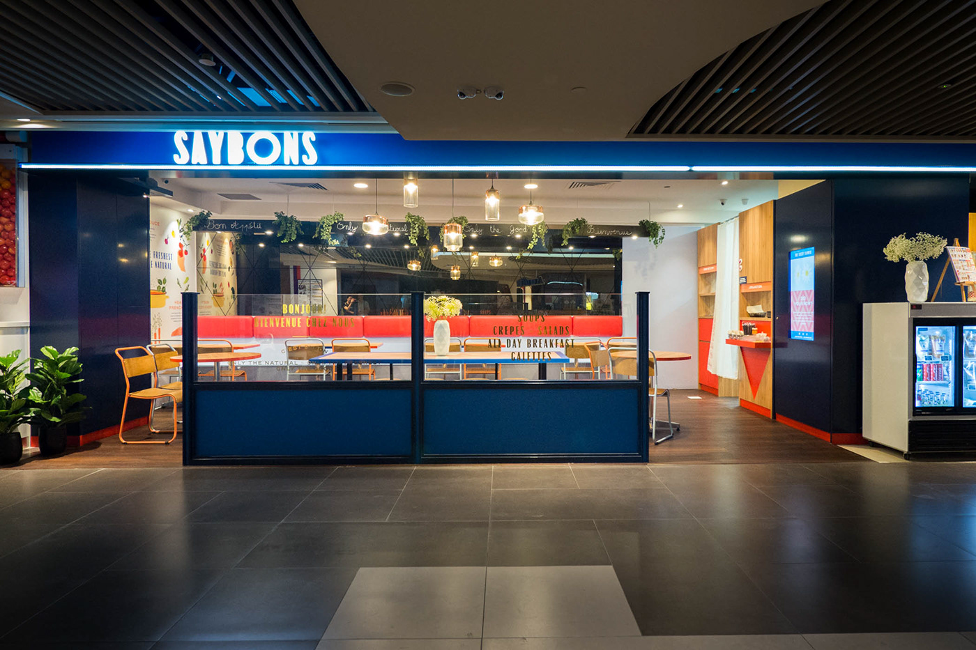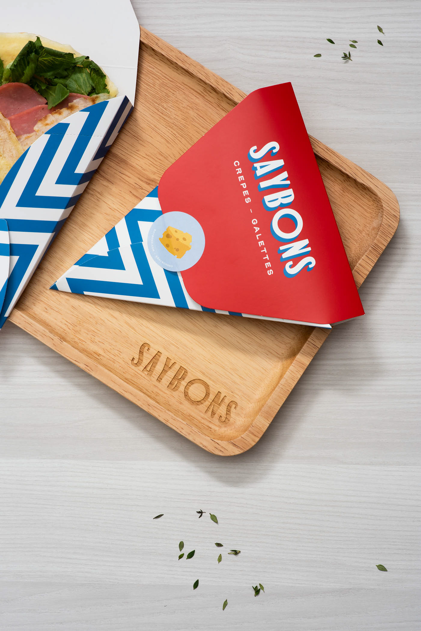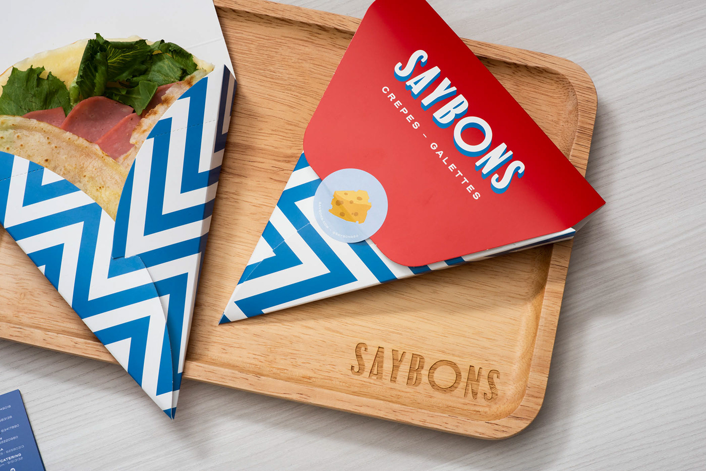
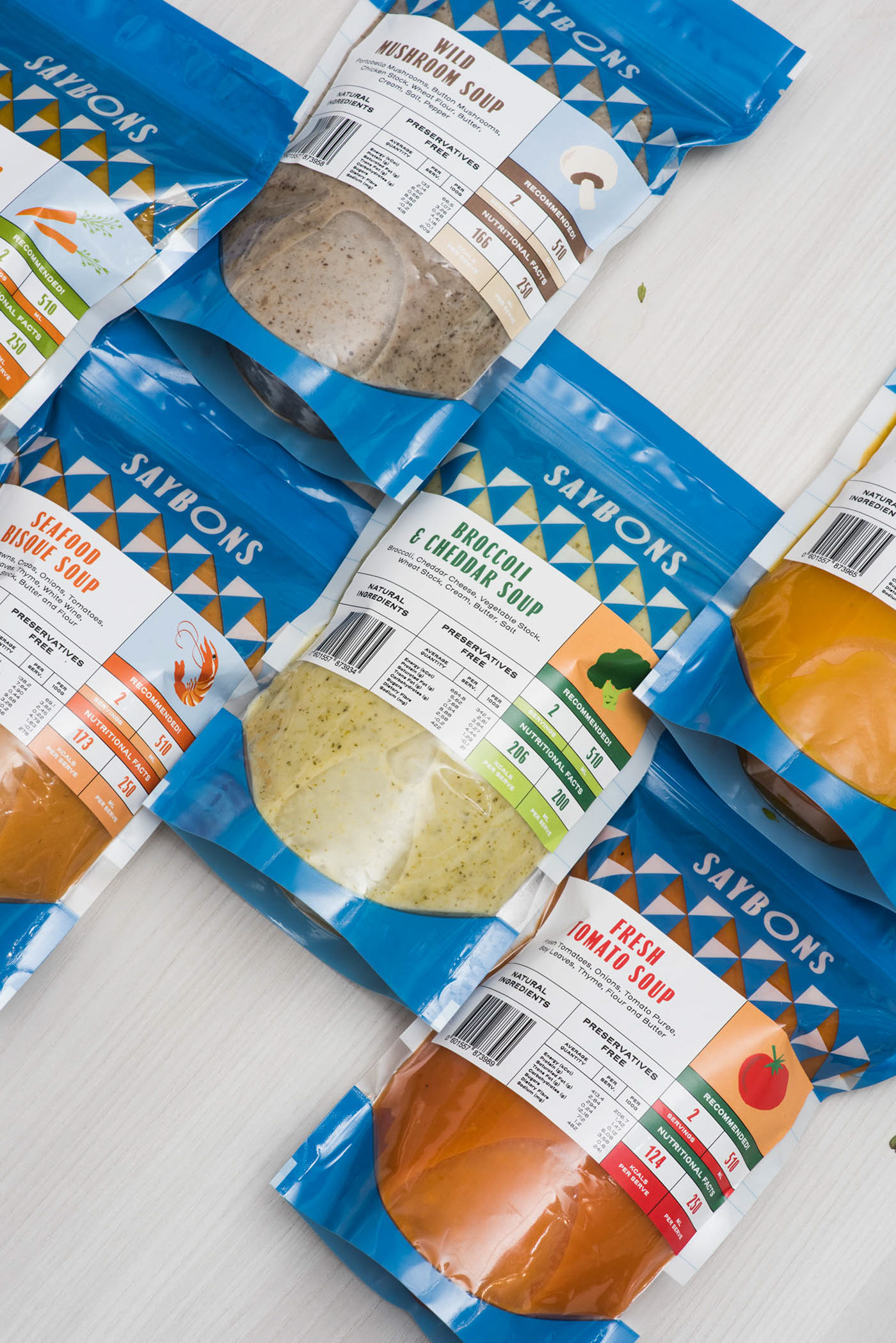
Saybons is a casual dining boutique chain serving affordable, wholesome French-inspired cuisine such as crepes, galettes and soups in over five outlets across Singapore.
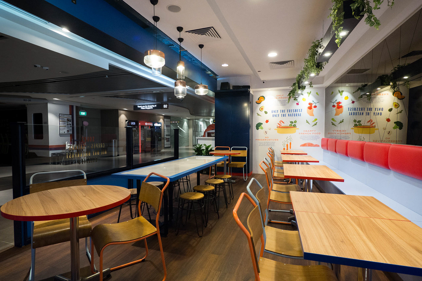
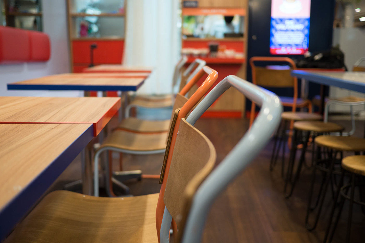
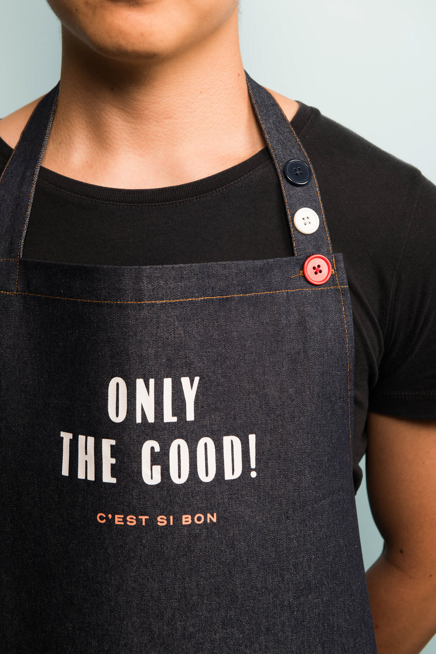
The rebranding of the popular 9-year old brand fused an eclectic mix of French-inspired architecture features, motifs and colours in a modern and casual setting.
The rebranding of the popular 9-year old brand fused an eclectic mix of French-inspired architecture features, motifs and colours in a modern and casual setting.
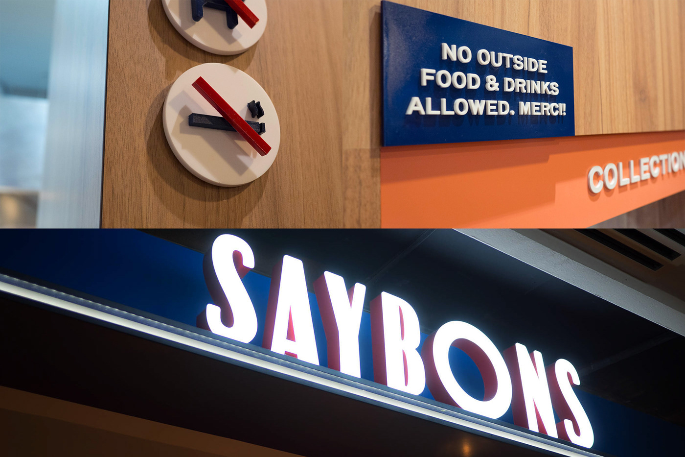
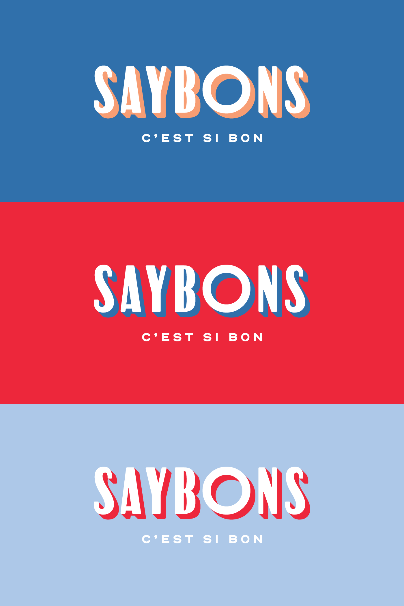
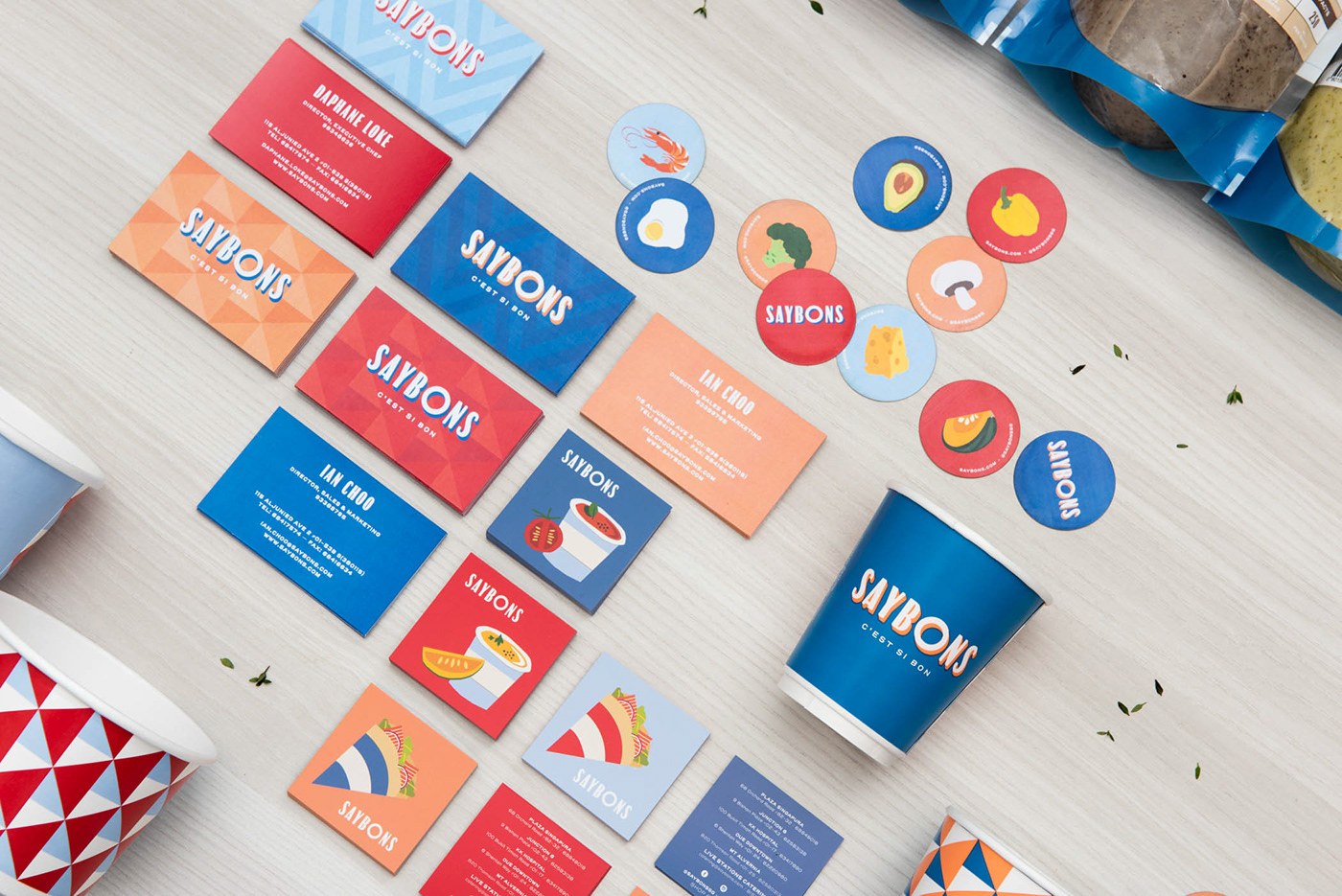
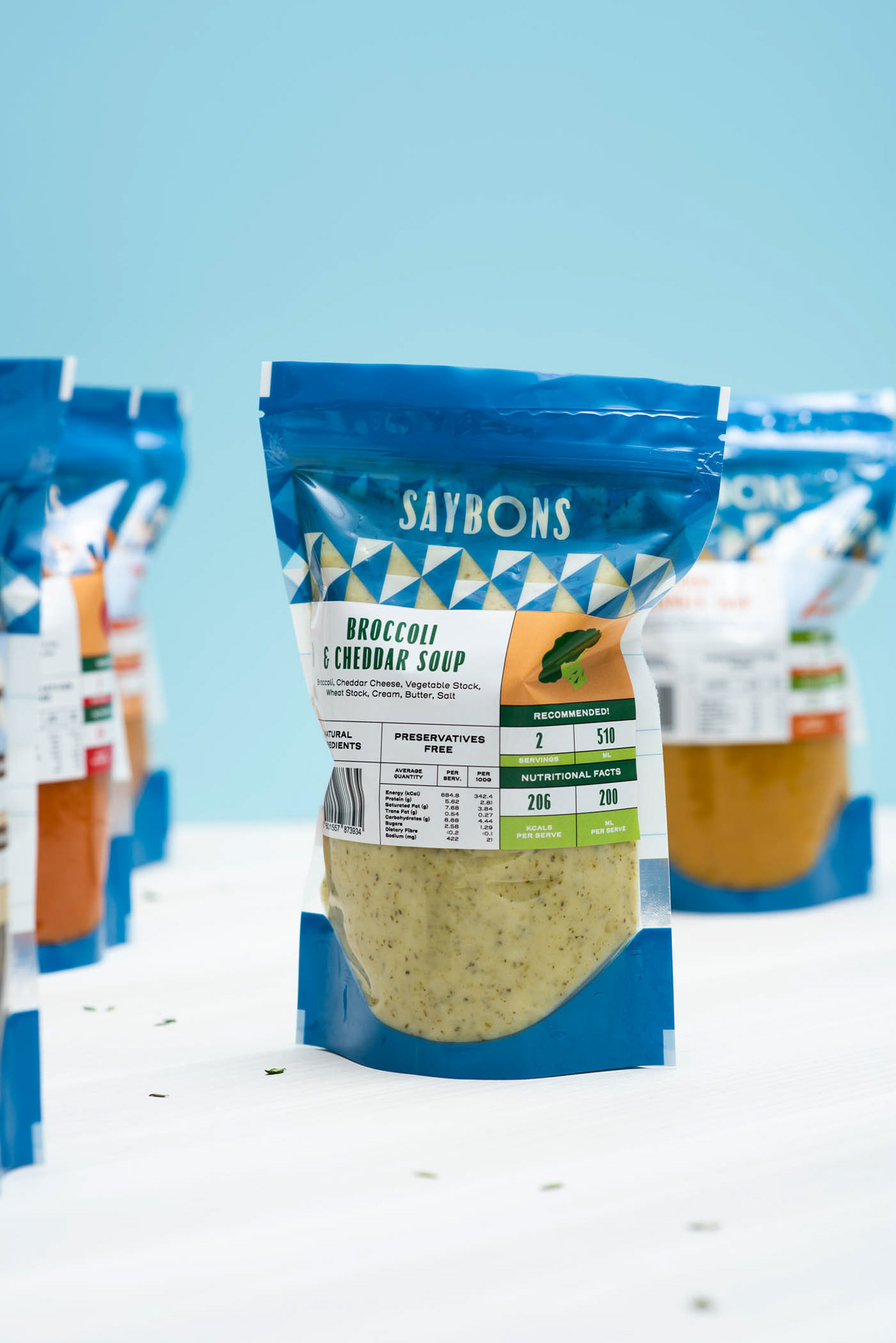
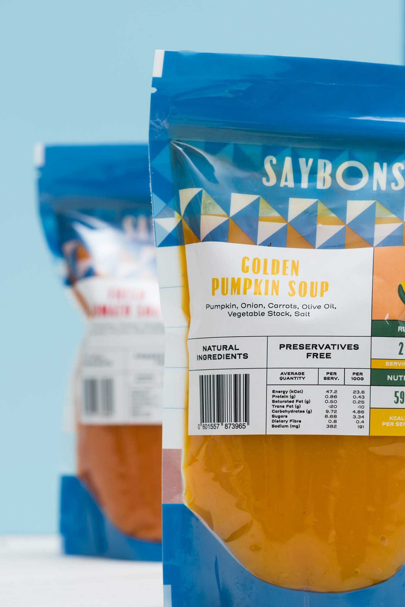
The art direction takes reference from the Art Deco era and was the inspiration behind the logotype which was crafted to reflect the style of signages and posters reminiscent of that period.


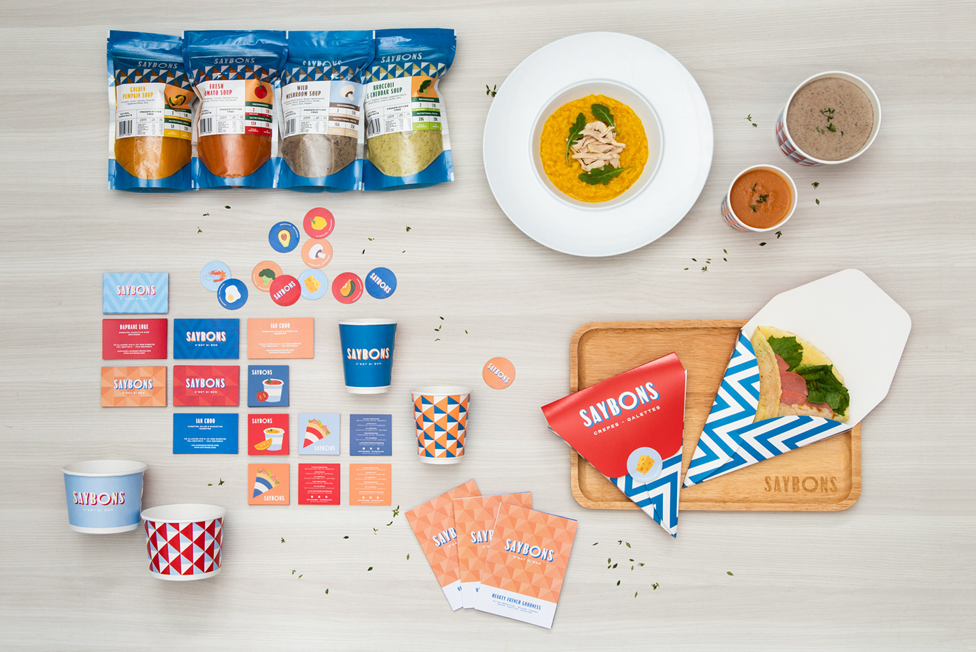
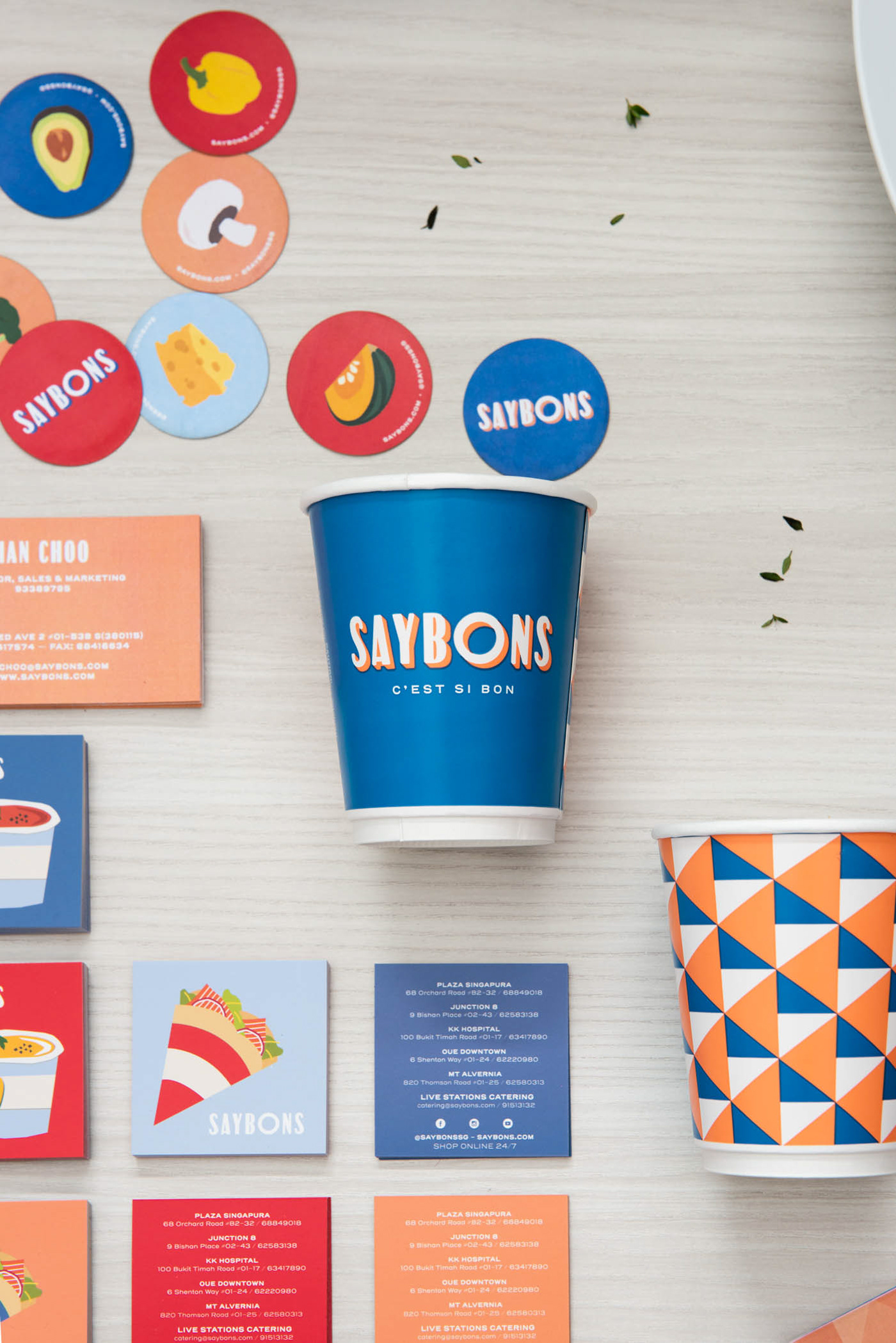
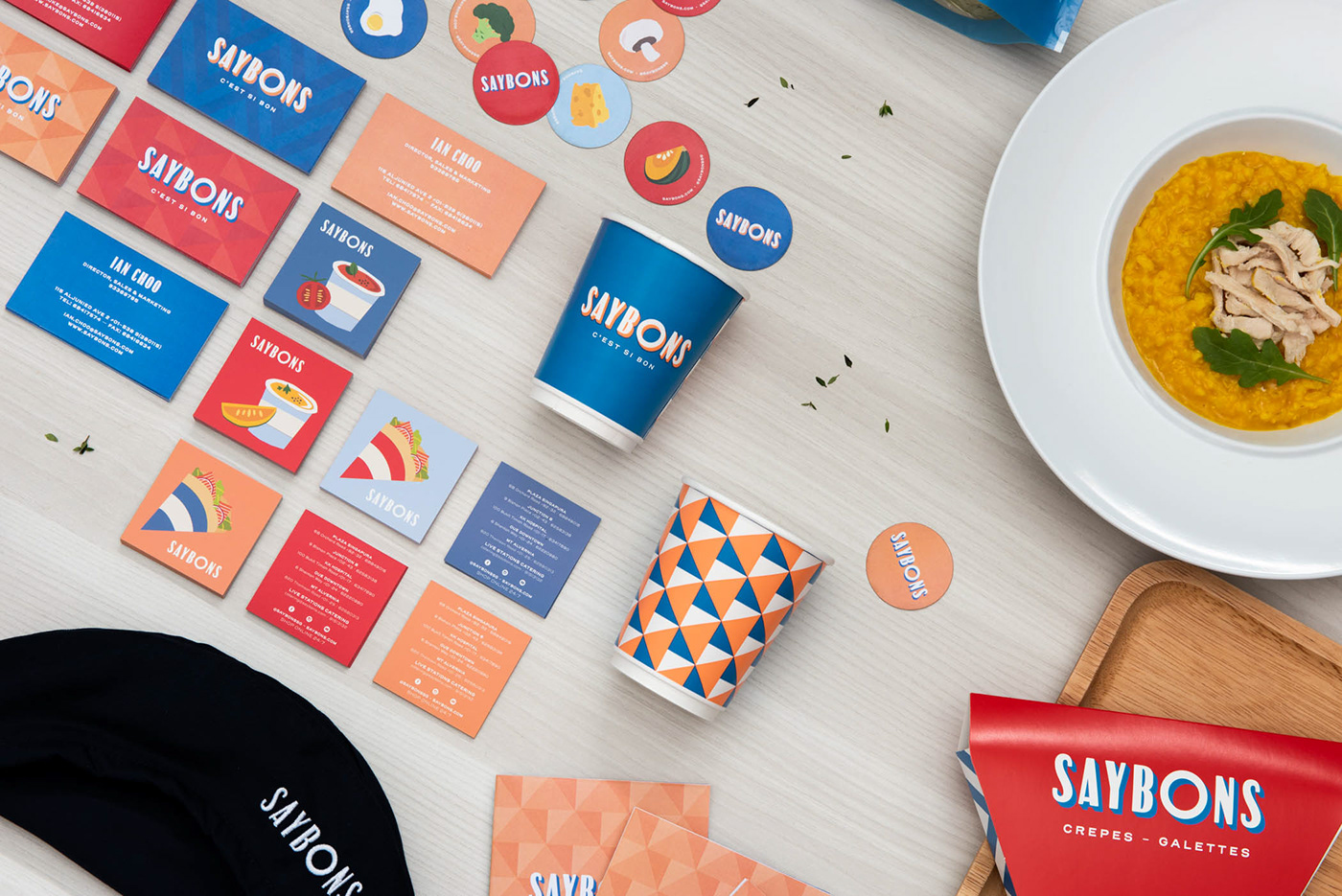
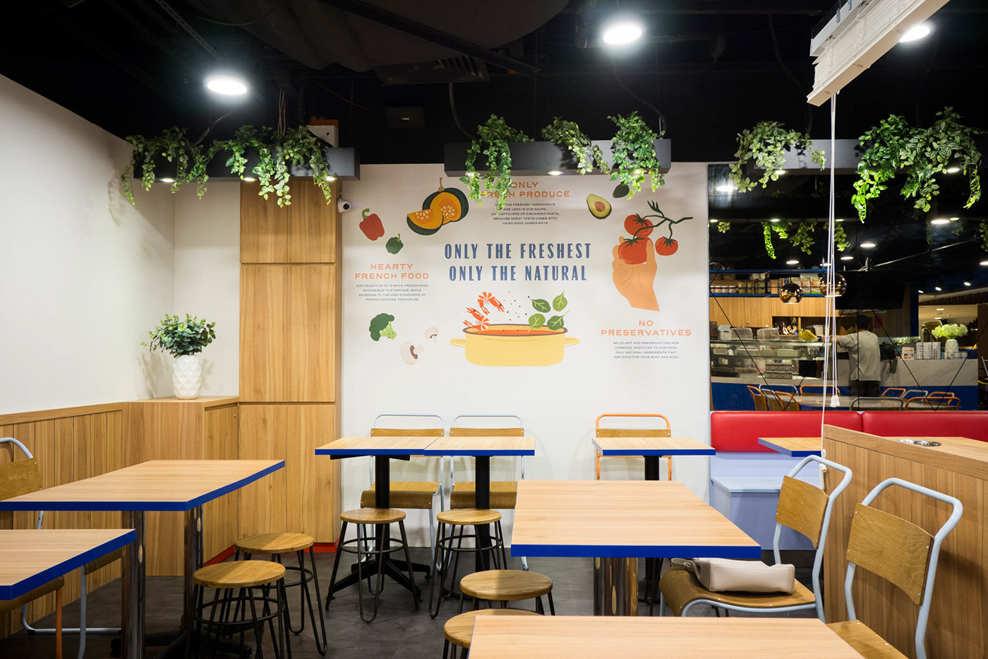
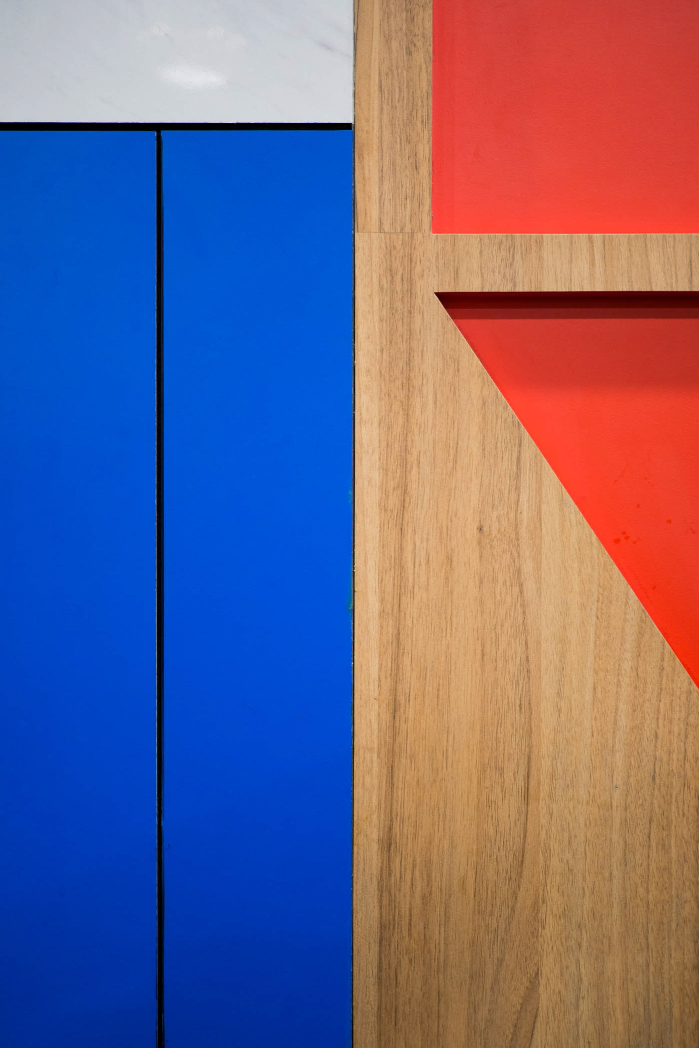
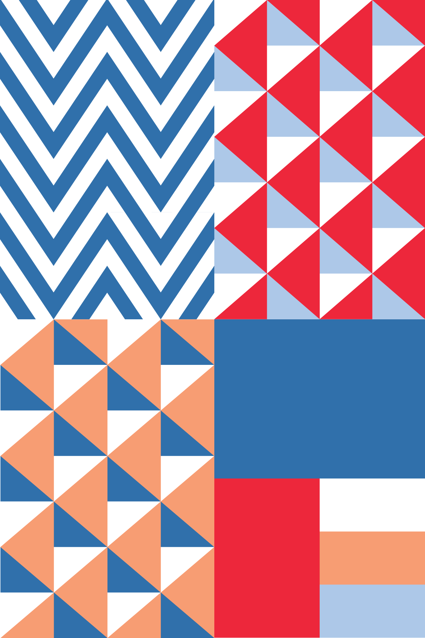
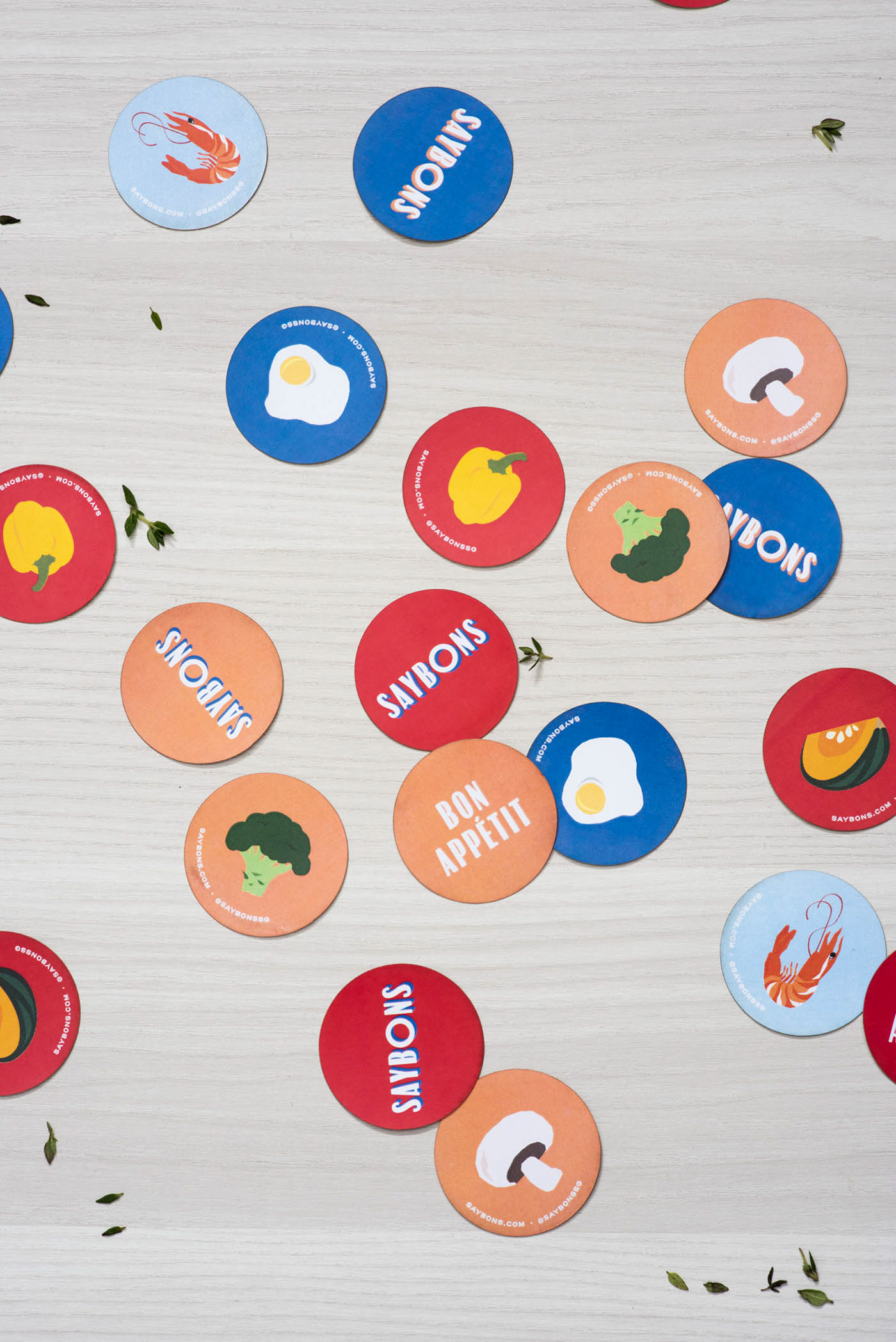
The colours blue, red, and their derivates baby blue and orange, were used to reflect the concept’s roots in French cuisine.
They are applied throughout the brand along with geometric patterns characteristic of the style in those times — bold, symmetrical and vibrant.
They are applied throughout the brand along with geometric patterns characteristic of the style in those times — bold, symmetrical and vibrant.

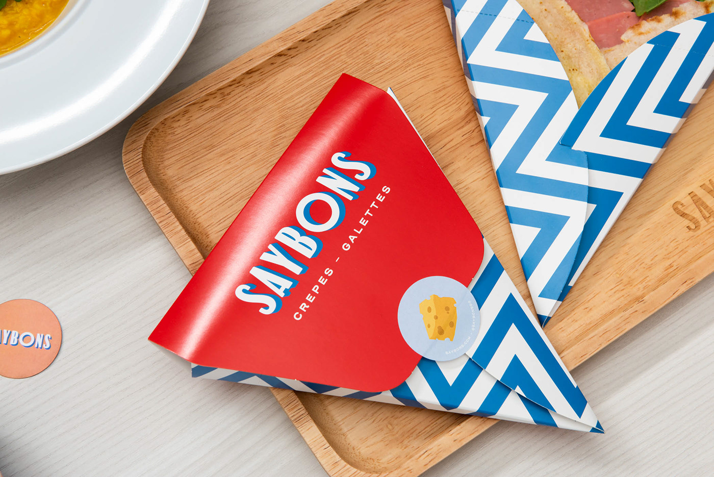

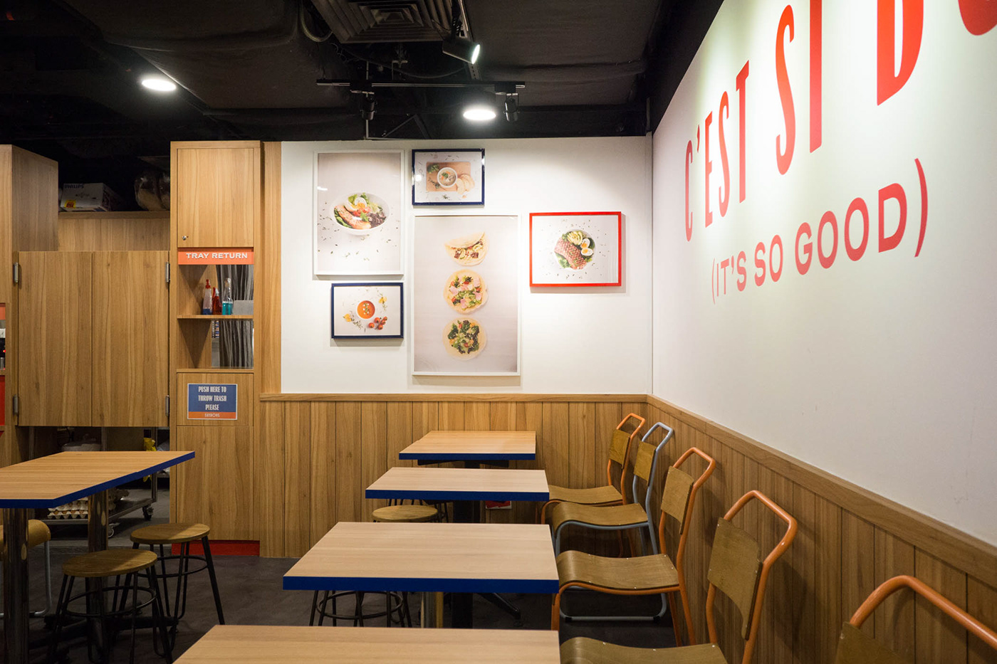
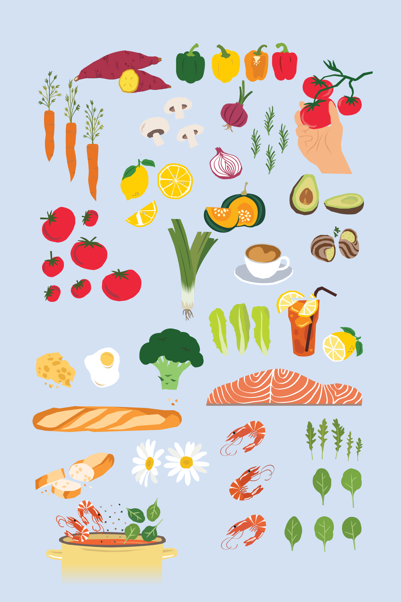
To give a personal touch, illustrations of ingredients were applied across the collaterals in a Matisse-inspired cut-out style for an honest, simple and casual feel.
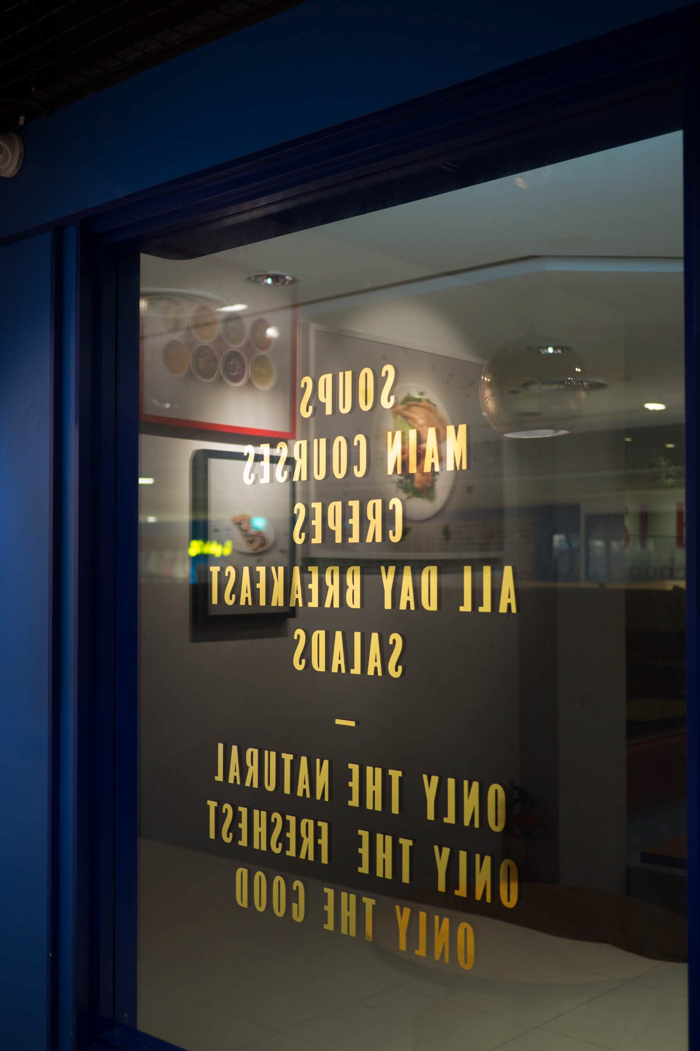
The outlet design mimics features typically found on street-fronted shops in olden French districts — such as framed glass windows with gold letterings, and a ledge detail to prop up signage.