Cambridge Labs, an emerging and successful new ecommerce company is breaking ground with their innovative products.
The objective in forging the new identity was to create a brand that is established, trusted and recognized. The new identity uses strong and primary shapes, font, and color to create the desired mark and build the befitting reputation.
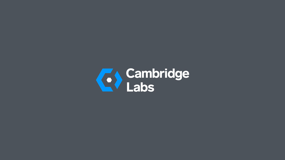
Right off the bat, the hexagon shaped icon incorporates the C and L letters of Cambridge Labs to truly make it personal and unique. A closer look reveals hidden images (it's almost an optical illusion) of a 3 dimensional box, nuts and bolts, gears, a wrench, and a key head to subtly invoke imagery and feelings of innovation, technology, production, science, research and development -- the full package.
The slate grey and bright azure colors create a strong and appropriate palette representing innovation, authenticity, establishment, trust and security.
The icon is flexible and can be used alone, or with the accompanying brand name, "Cambridge Labs".