Contest per l'ideazione dell'identità visiva di Palazzo Vertemate Franchi
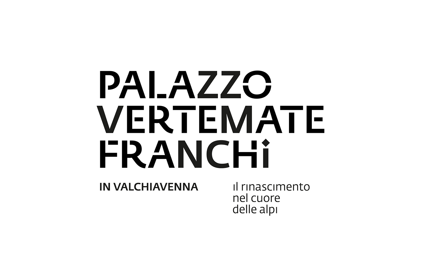
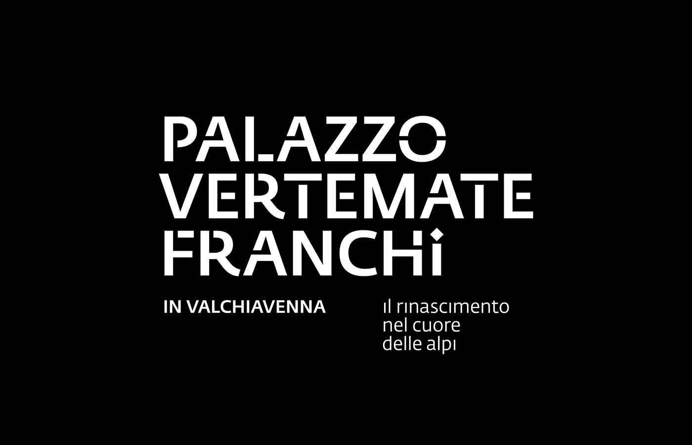
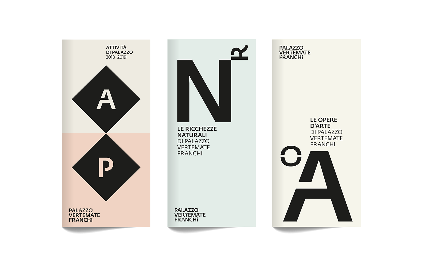
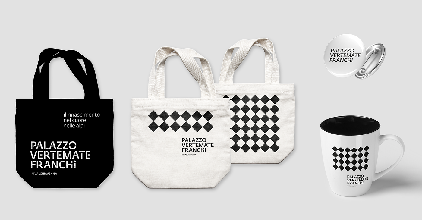
Il logotipo è costruito su tre righe come il numero di piani del palazzo mentre la tipografia è trattata per trasformare le lettere in vere e proprie stanze da esplorare. Il dettaglio del puntino della lettere "i" è infine un rombo con lati e diagonali uguali, il quale si identifica come il riassunto delle decorazioni rinascimentali presenti sul soffitto ed elemento architettonico tipico della cultura rinascimentale.
Progetto secondo classificato.
The logotype is composed by three line as the number of building's floors. For what concerns typography it is shaped and transformed to make letters become real rooms which are ready to be explored. Moreover, the attention goes to the detail of the letter "i": its point is a rombal with equal sides and diagonals, a real summary of the renaissance's decorations that can be found on the ceiling of the palace, and a perfect symbol of renaissance culture.
The project reaches the list's second place.
The project reaches the list's second place.