
CHANGING THE FACE
OF A BUSINESS CHANNEL
The challenge, the way we see it:
Being a part of one of the fastest growing economies in the world, business news is a staple across households in the country. There is no dearth of news channels, but a scarcity of quality reporting, and more importantly differentiation amongst channels.
Creative solution:
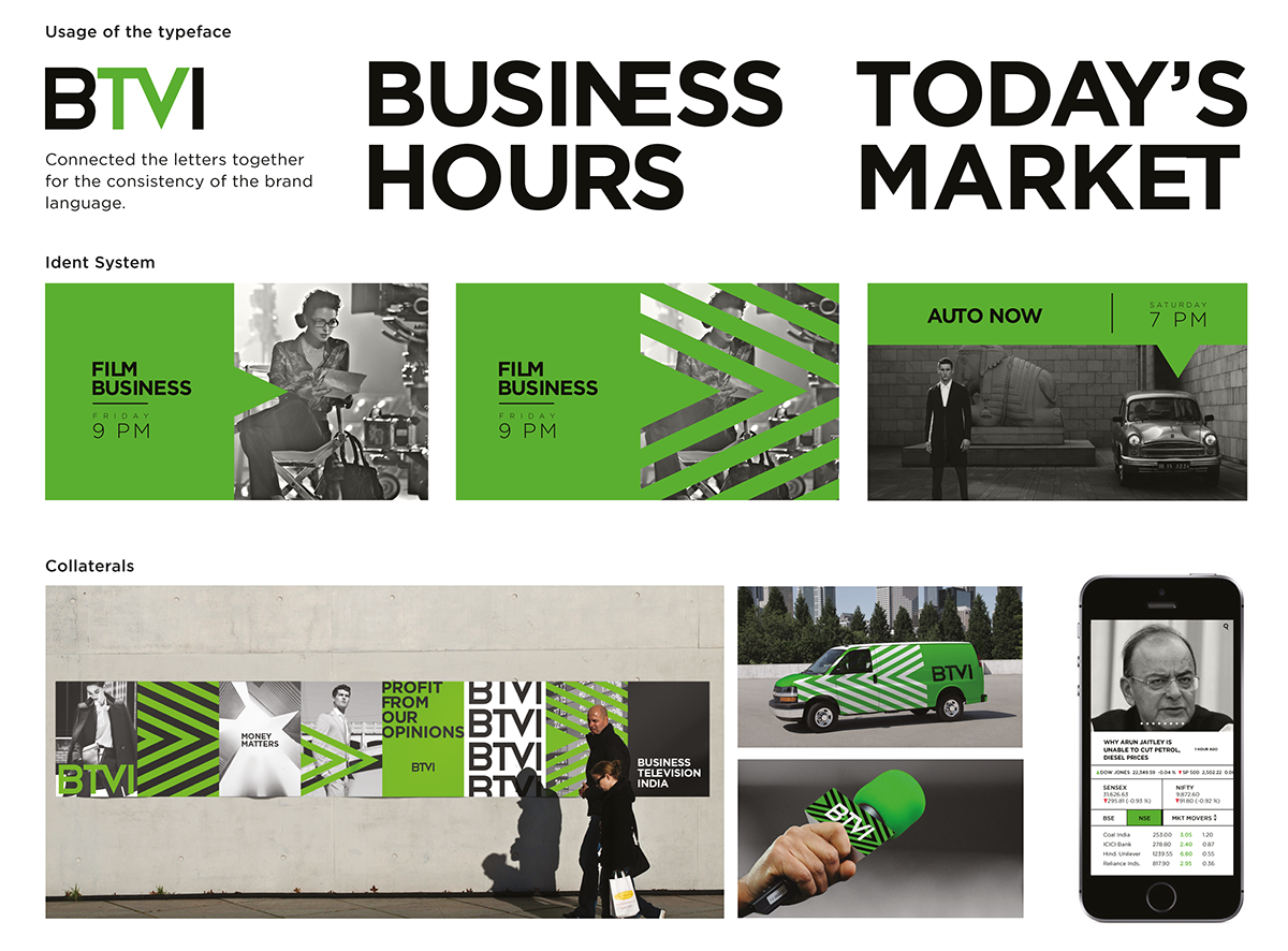
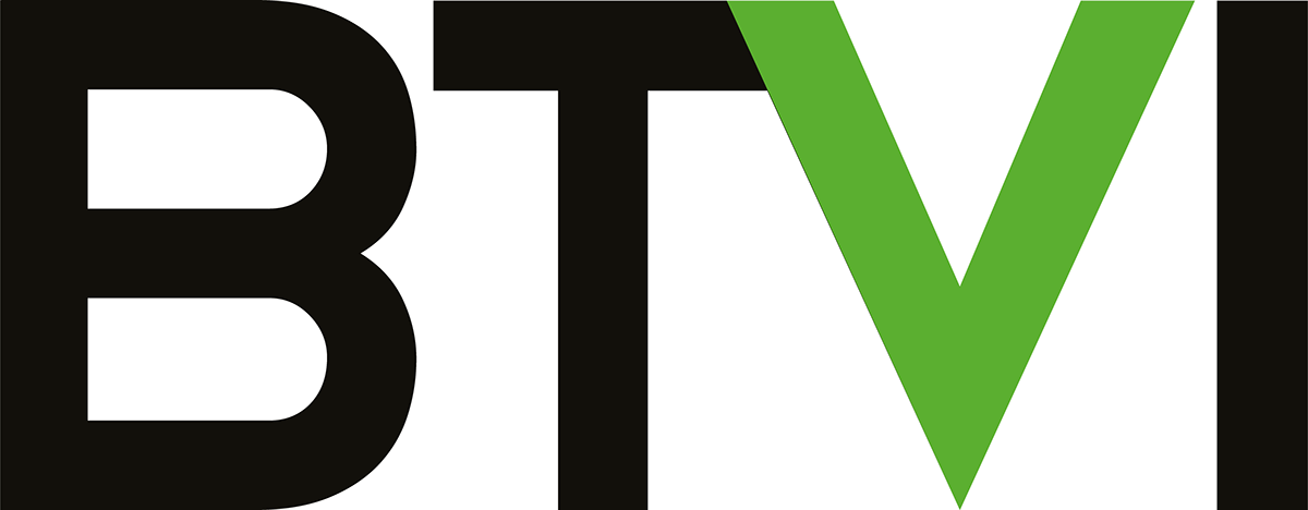
Like most tough problems, this one begged a solution that was simple but perceptible. It started small - a melding together of the letters T and V to draw attention to the nature of the product at offer.
Next, the V is visualised as an arrow symbolising a progressive shift in reporting and ideology. It also represents the fast pace world of business.
The final addition came in the form of some help to the colour palette. A dash of Lime Green against stark black-and-white imagery cranked up an element of lifestyle. Green, to us, drove home a sense of progress and prosperity as is regarded in cultures across the world.
Interestingly enough, the V-shaped graphic lent itself to identity and branding across collaterals. Used in repetition, the graphic shows immense potential and recall value when used on canvases such as billboards and large format web communication.