Platige is a vehicle for creative endeavors specializing in designing CG imagery, 3D animation, and digital special effects. At Platige, we combine film and advertising work with a strong passion for art, education, and entertainment. After 15 years we decided to change the logo and comprehensively overhaul the Platige brand. We wanted to achieve maximum simplicity and consistency in all elements of our new identity. The rebranding concept was developed by Adam Tunikowski and Michał Misiński from Juice, a Polish design agency. How did all of that happen?
New Logo
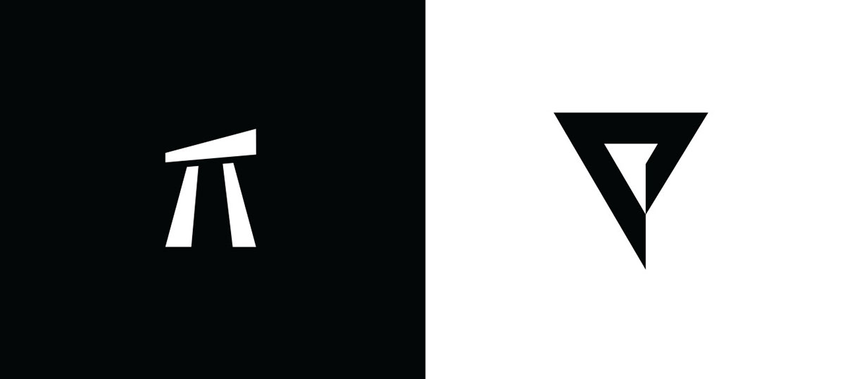
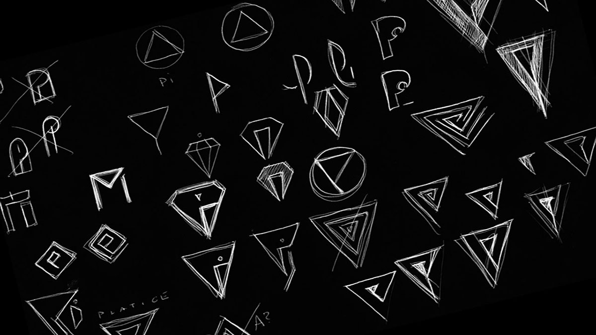
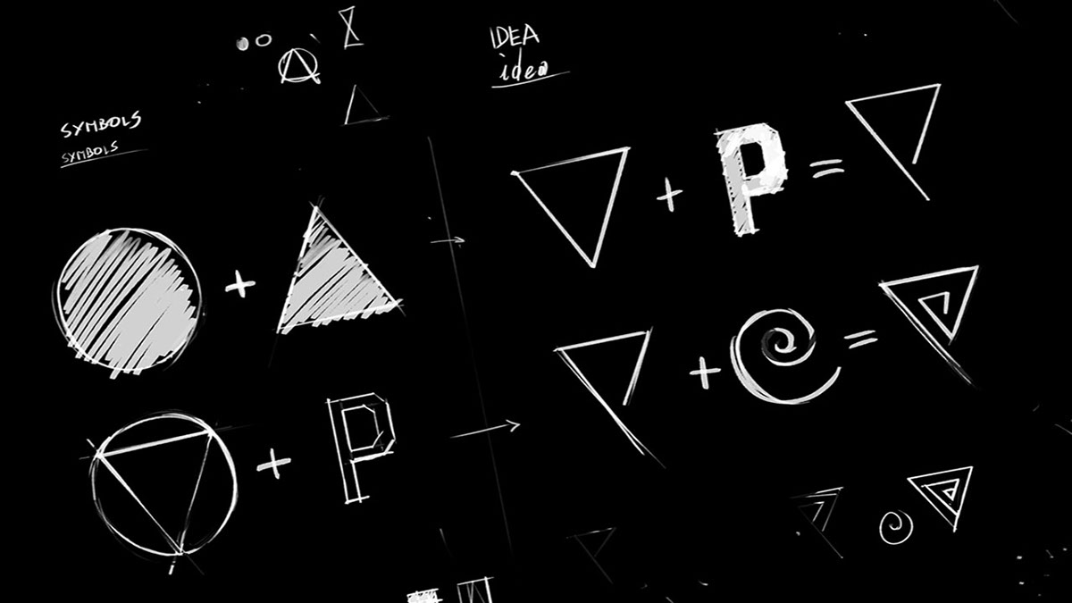
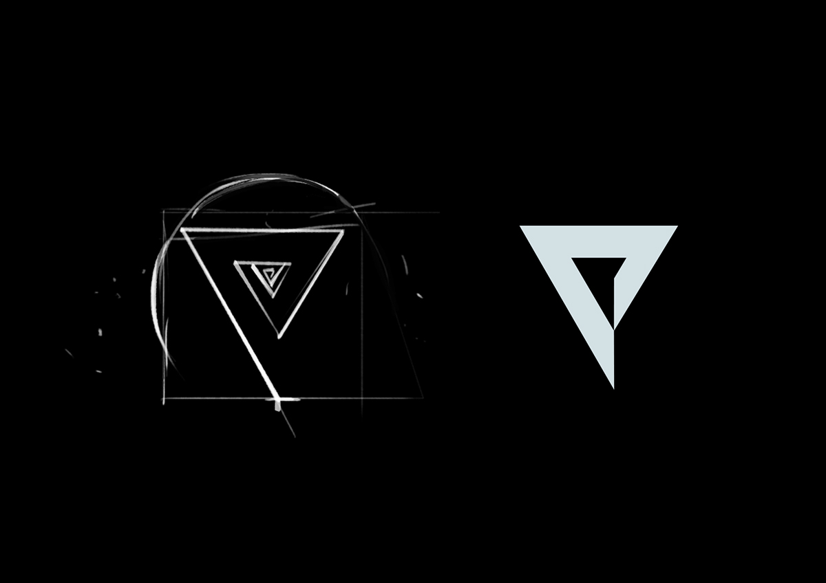
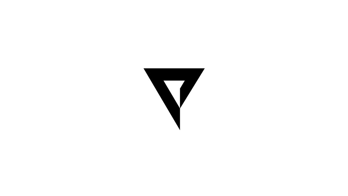
The new symbol refers to the studio's previous logo and creates a strong, expressive symbol. We like simple and heavy forms, that’s why we turned to the best brand logos of the 1960s and 1970s for inspiration. These logos are recognizable even today because they are simple and “edgy” – just like our previous visual identity, founded upon the words Platige Image and the Π symbol.
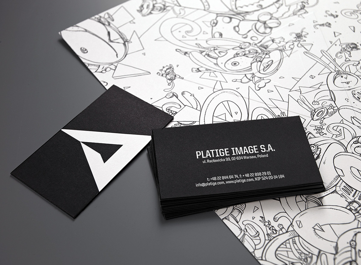
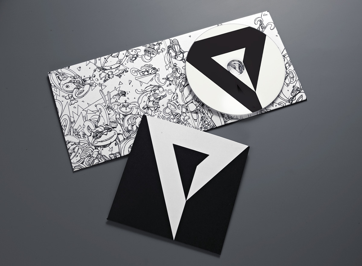
Pi is a mathematical constant that cannot be described with a finite set of numbers, and is thus a wellspring of unceasing inspiration and curiosity. The quest for a new logo culminated in the creation of a symbol comprised of a stylized letter “P” inscribed into a triangle, its shape retaining a clear reference to the mathematical symbol. This new “P” signifies the new Platige and is the centerpiece of the company's visual identity.
Juice:
Creative Direction & Art Direction: Michał Misiński & Adam Tunikowski
Lead Programmer: Szymon Karpiński
Design: Paweł Janczarek
Creative Direction & Art Direction: Michał Misiński & Adam Tunikowski
Lead Programmer: Szymon Karpiński
Design: Paweł Janczarek
Fonts by: House ind.
Platige Image:
Key Art: Jakub Jabłoński
Production Manager: Olga Cyganiak
Executive Producer: Marcin Kobylecki
Platige Image:
Key Art: Jakub Jabłoński
Production Manager: Olga Cyganiak
Executive Producer: Marcin Kobylecki

New font
The elegant geometry of the logo was undermined by the use of a stark and militaristic typeface. It introduces a slightly predatory and disturbing quality to the logo. We originally picked Belwe for the font but have since replaced it with the more minimalistic User typeface.
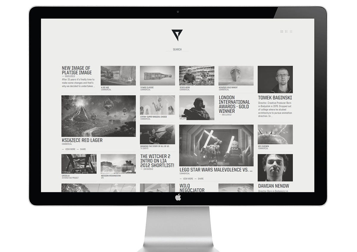
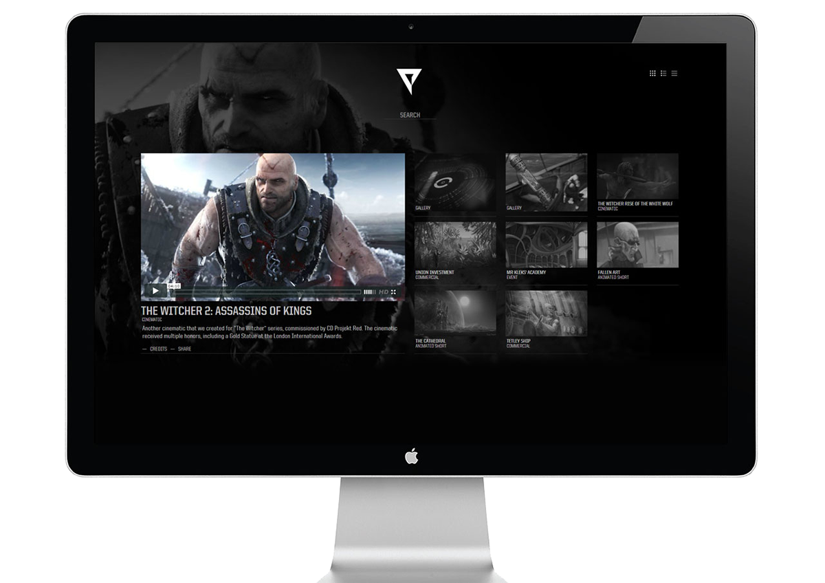
New platige.com
Launch of the new visual identity is accompanied by an overhauled and innovative website. It’s simple, stark, and clear. There's no menu and a rigid, preset “route” for the users to take to get to know Platige. The site works like a search engine. It's up to the user to discover and experience the rich and diverse collection of dozens of Platige productions and projects.
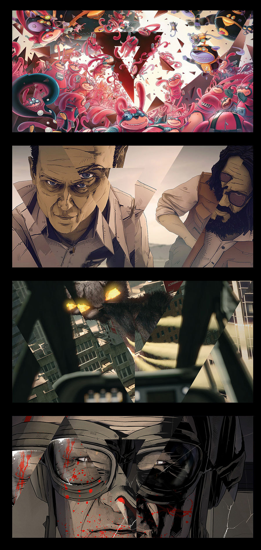
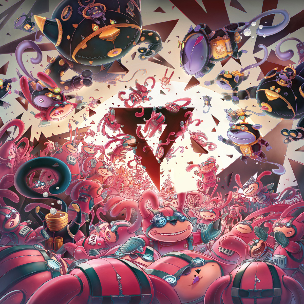
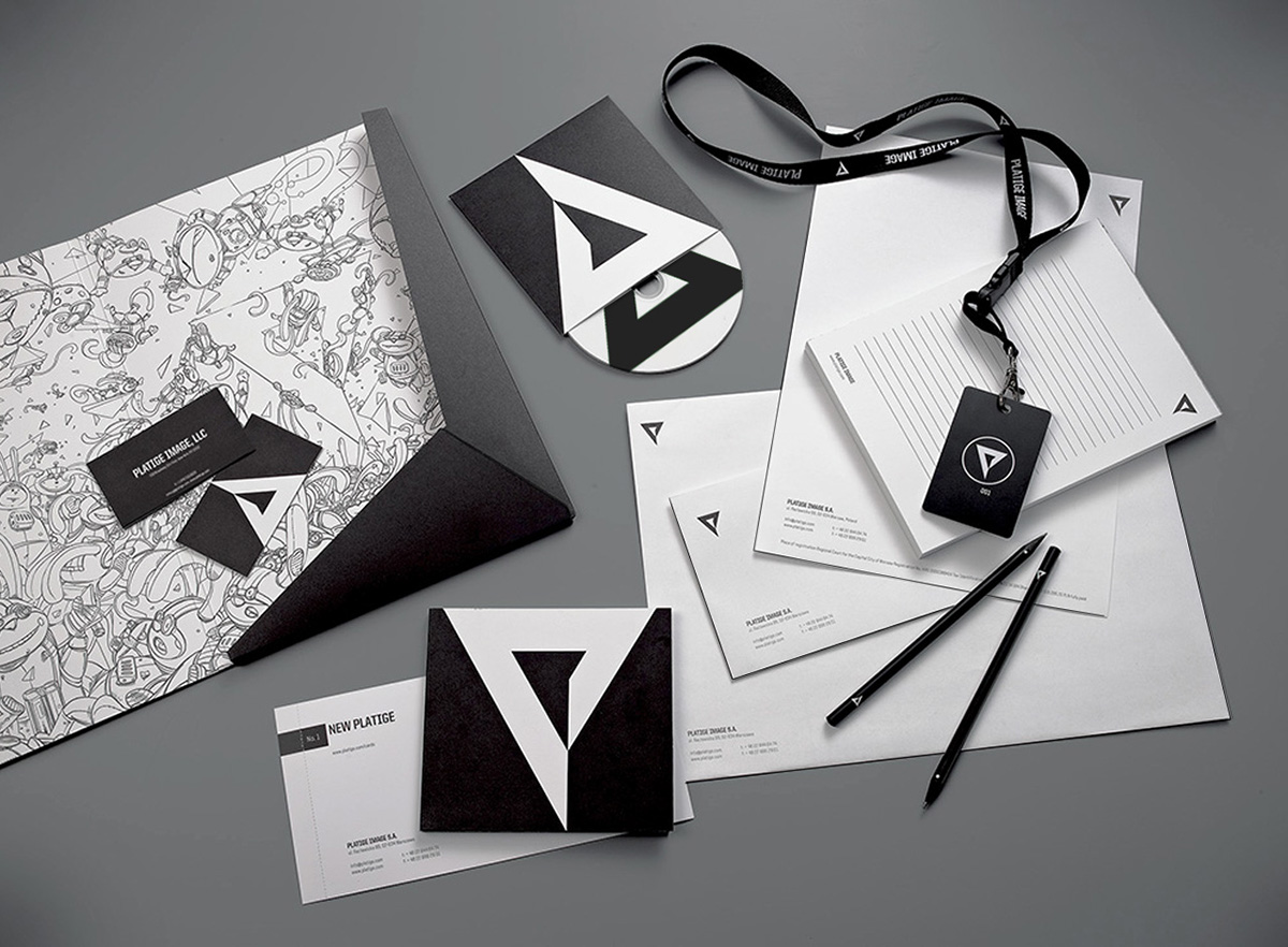
Key Art
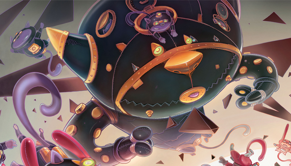
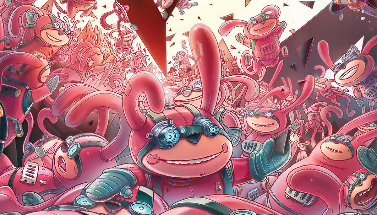

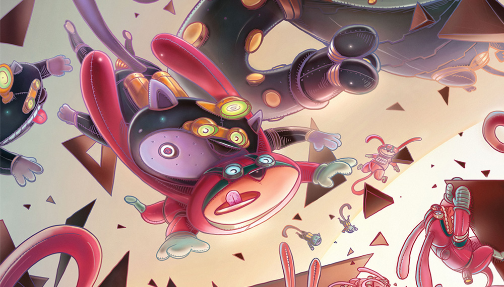

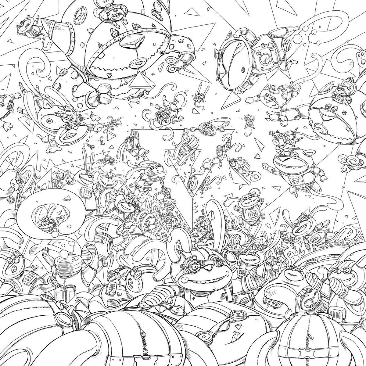
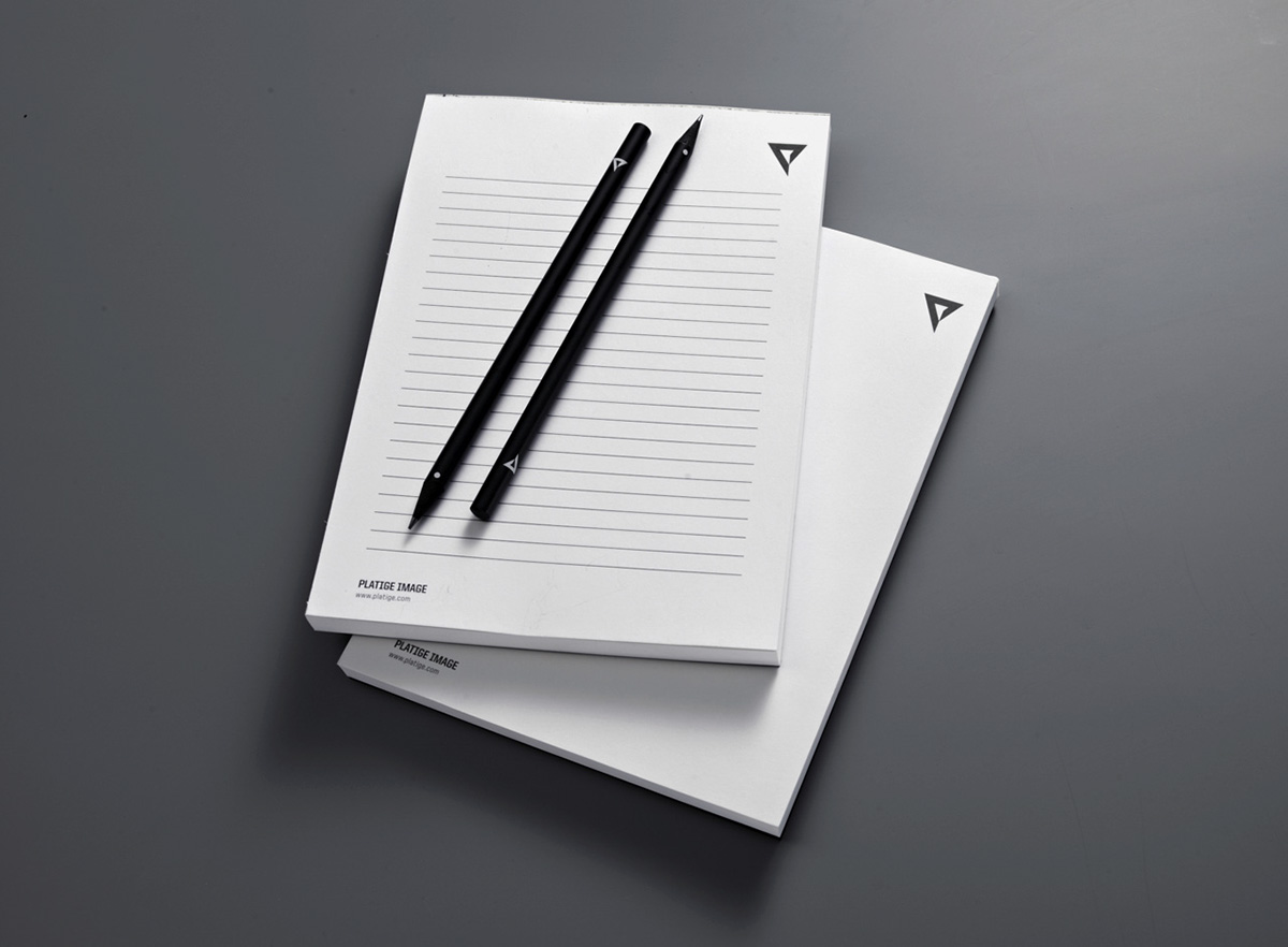
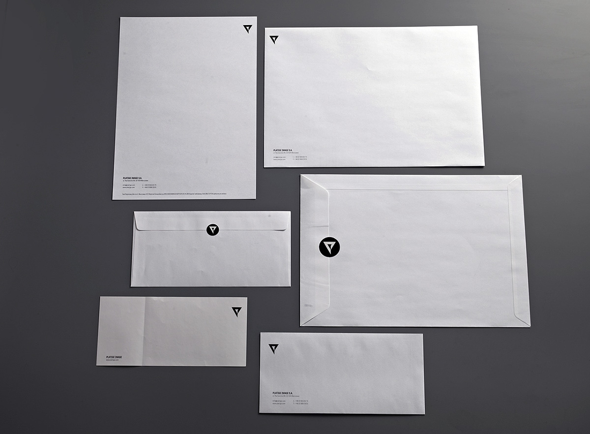
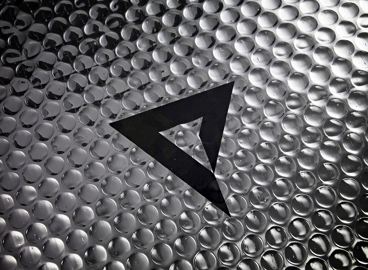
Branding
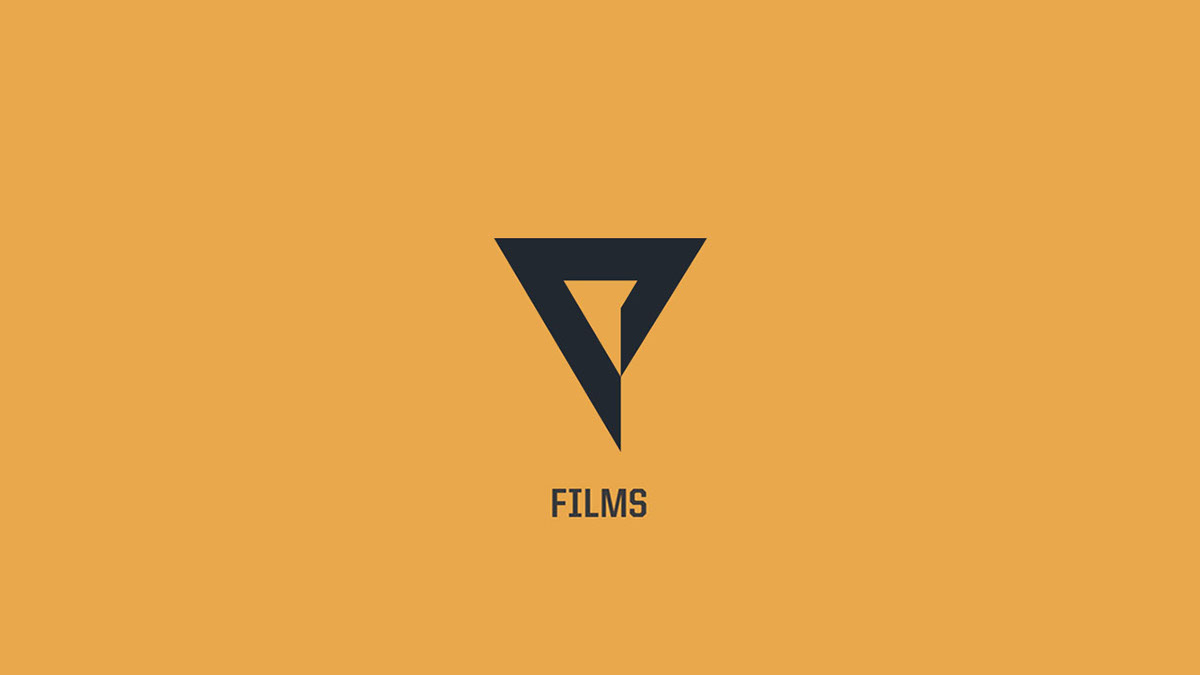
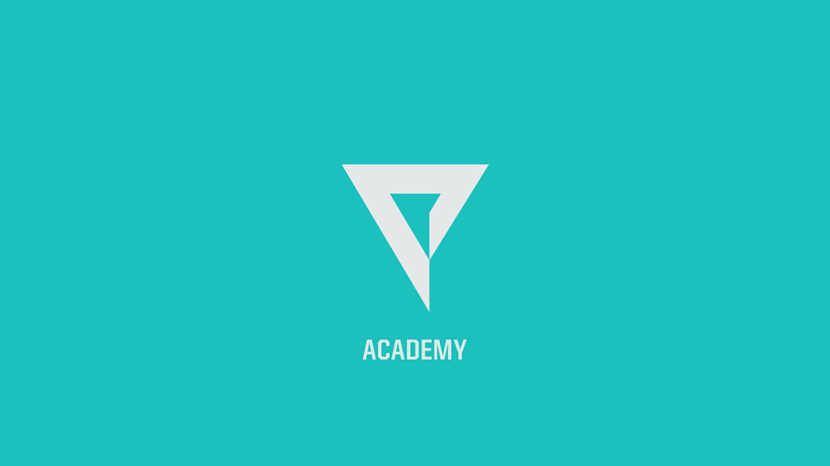
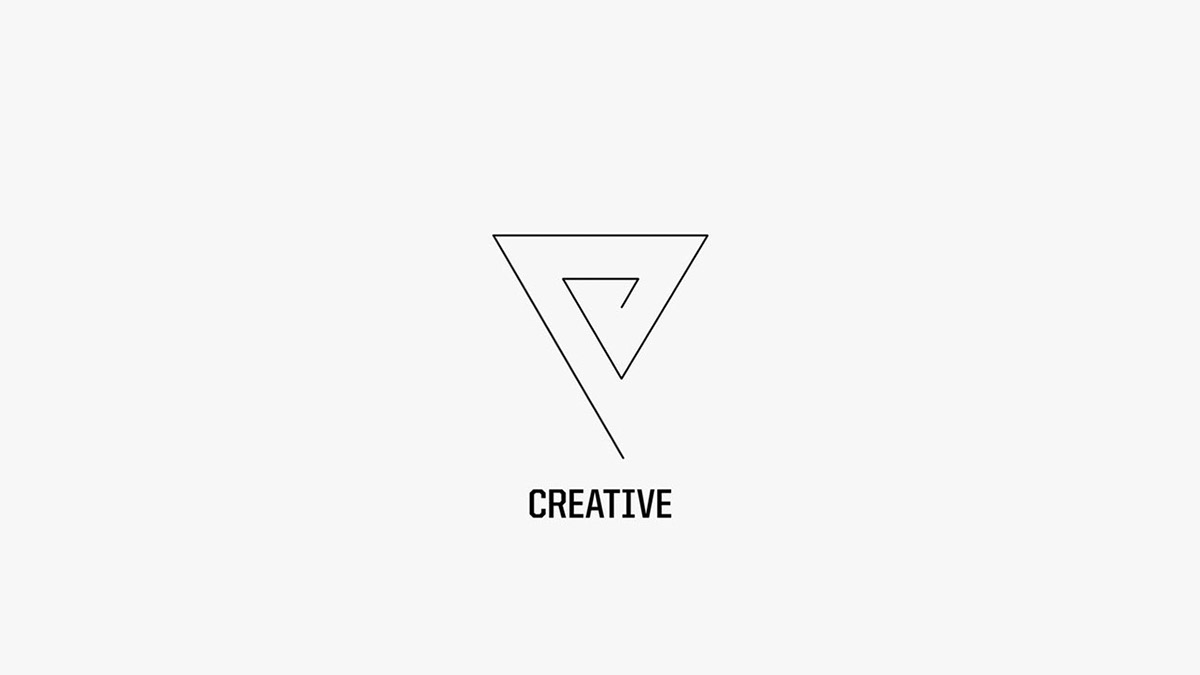
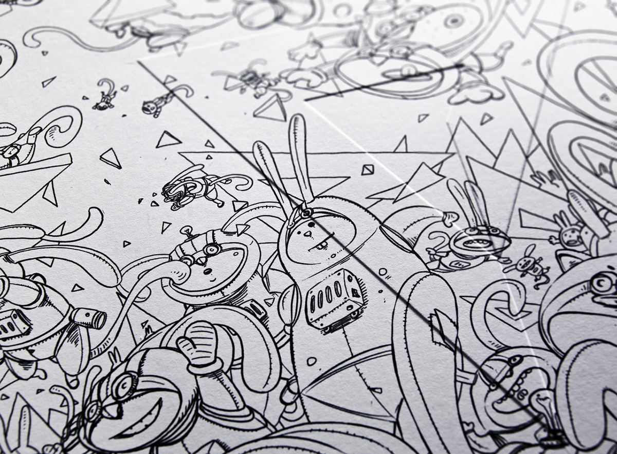
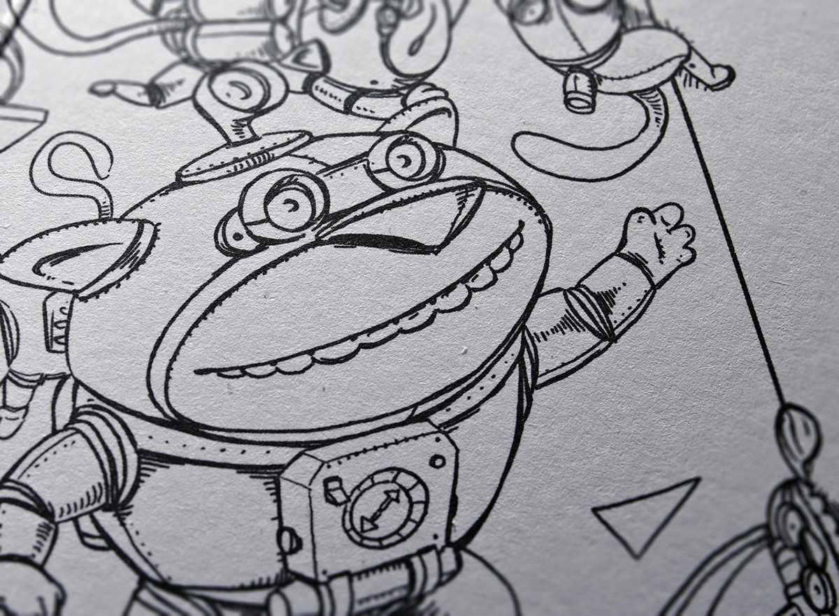
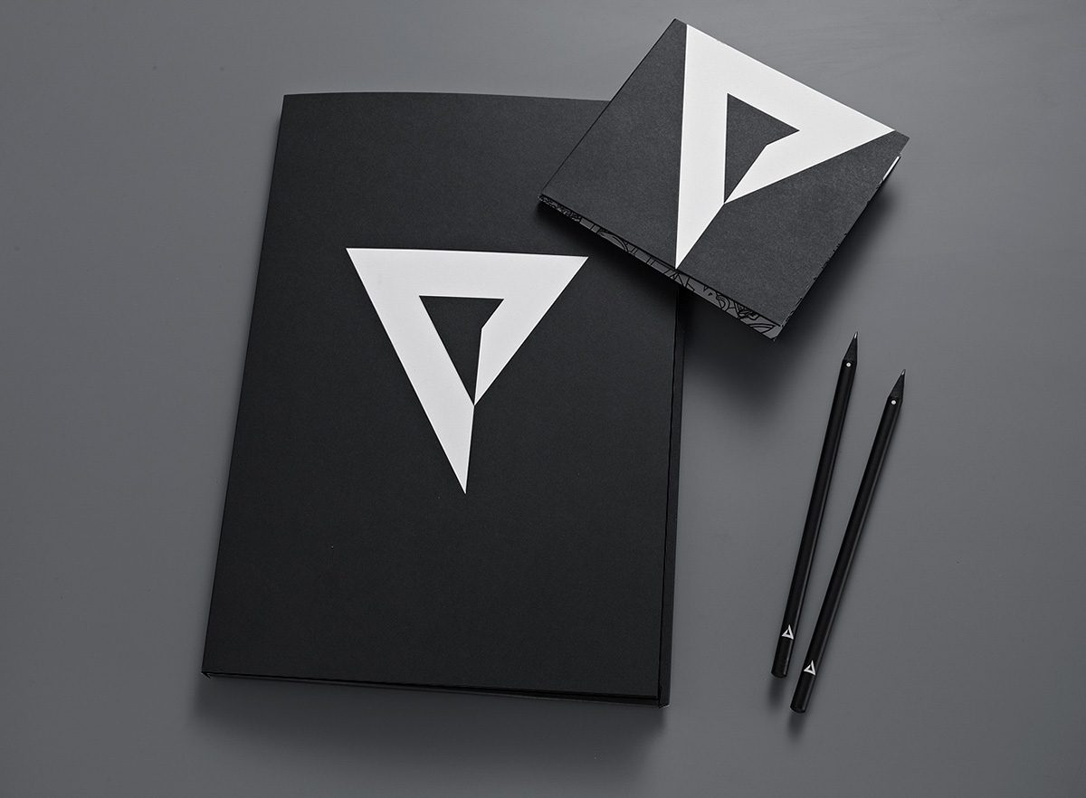
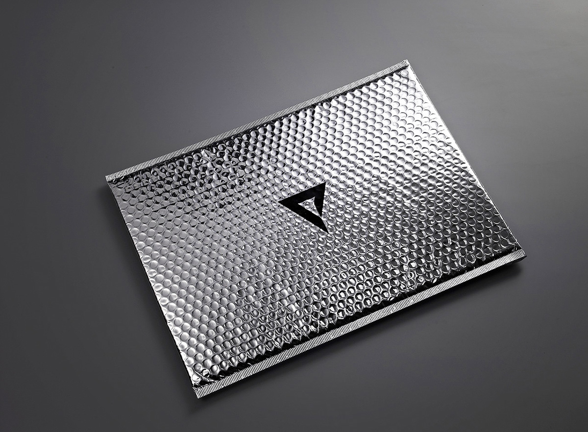
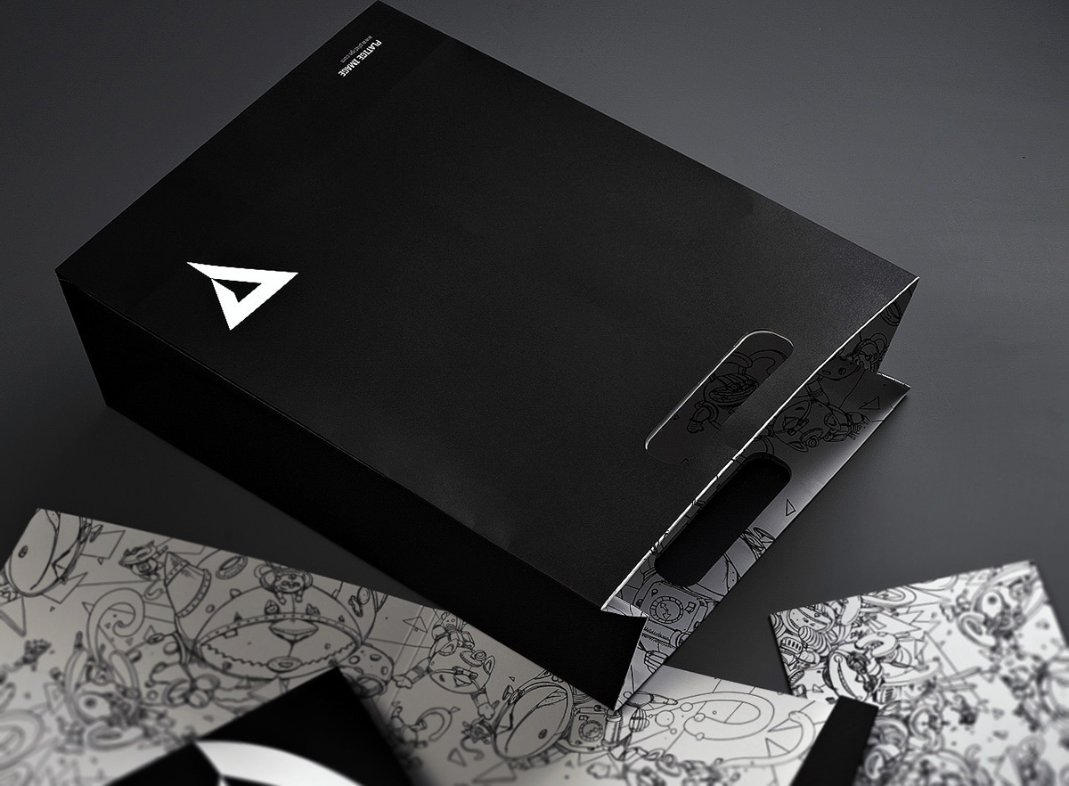
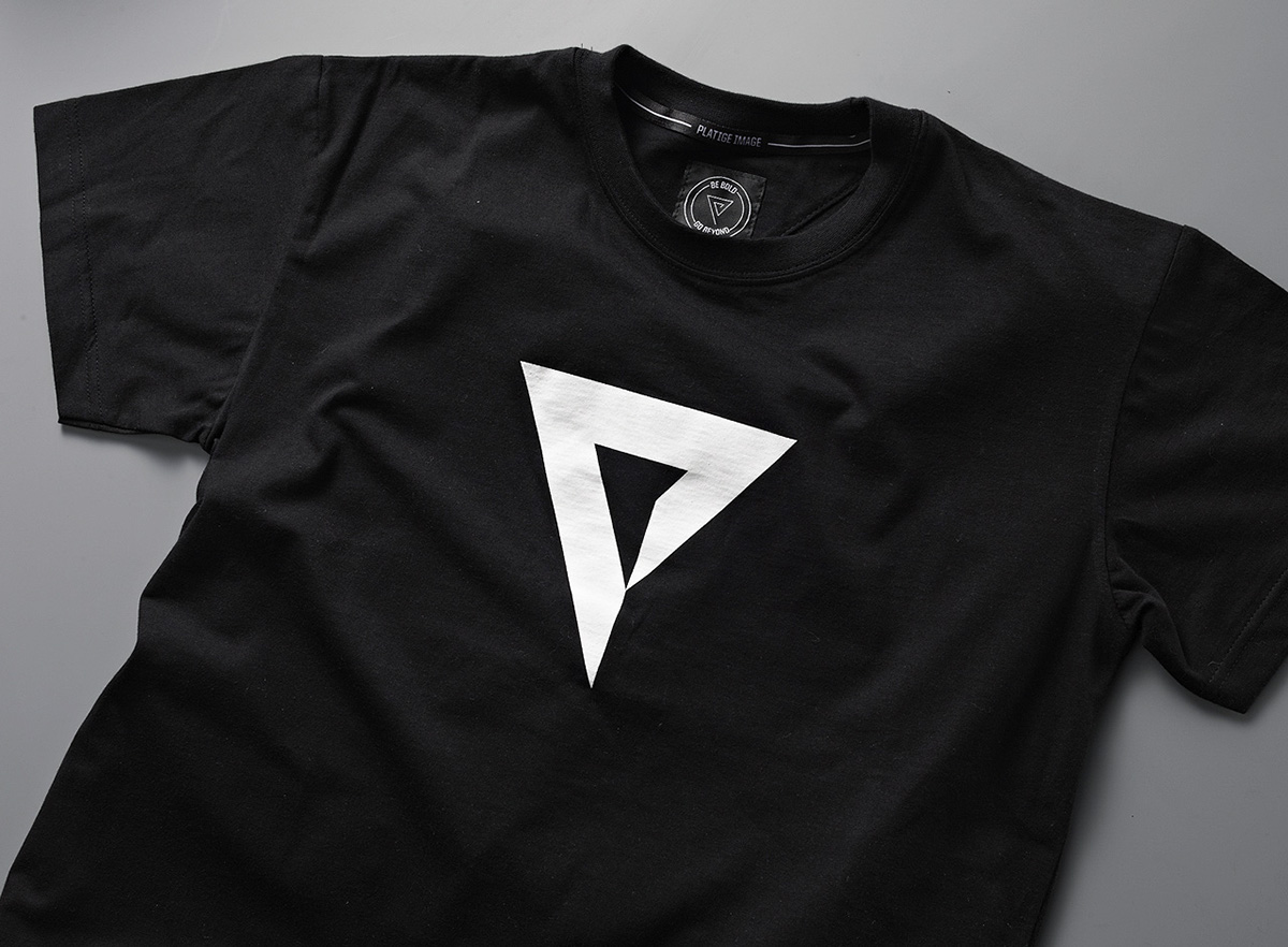
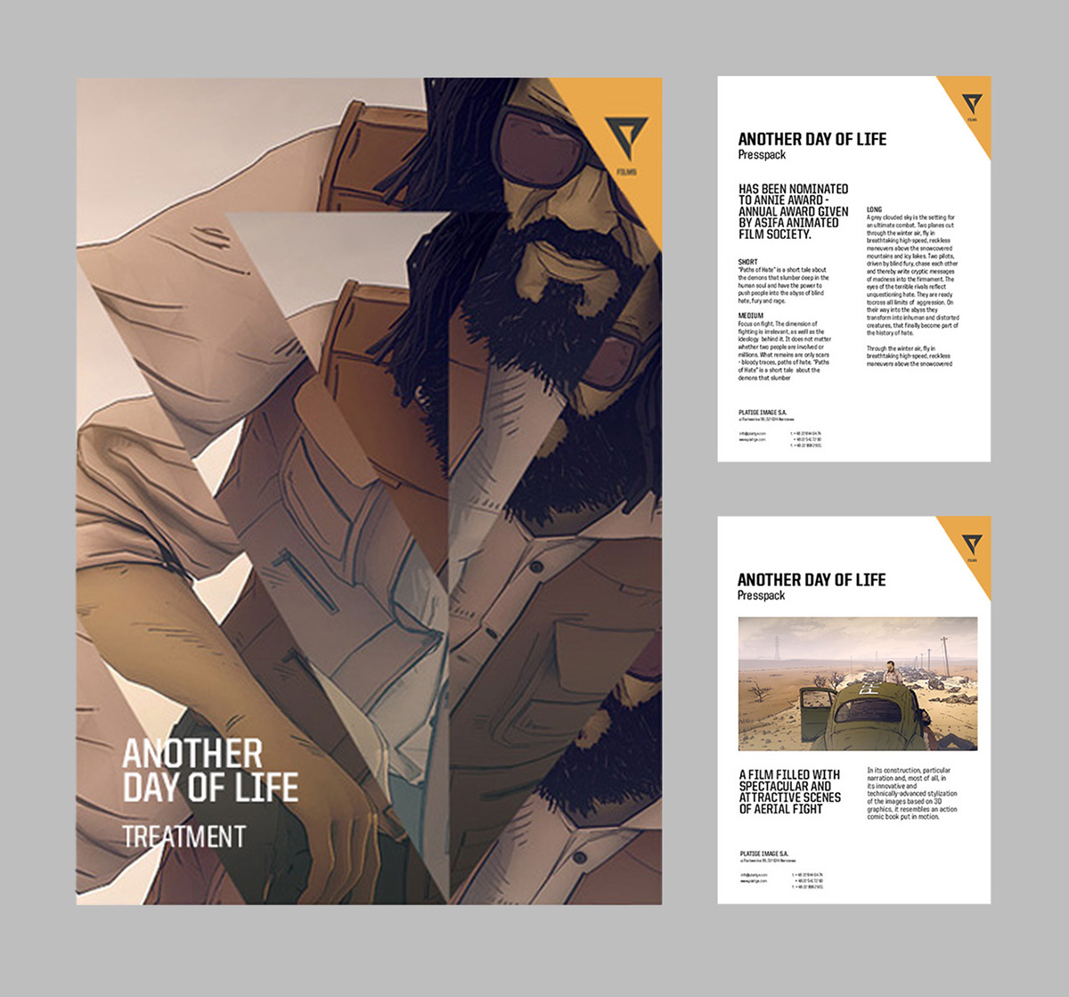
The “P” is the centerpiece of Platige’s new visual identity. The austere design presented us with very interesting options for modification. We used the logo as a sort of prism through which we present our work to the world. The dispersed picture created almost-Cubist compositions and enabled us to play with both the scale and detail of the image.

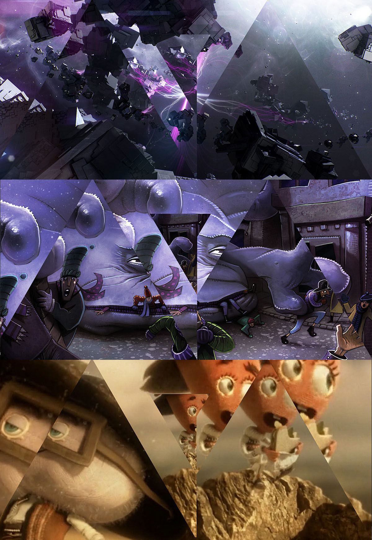
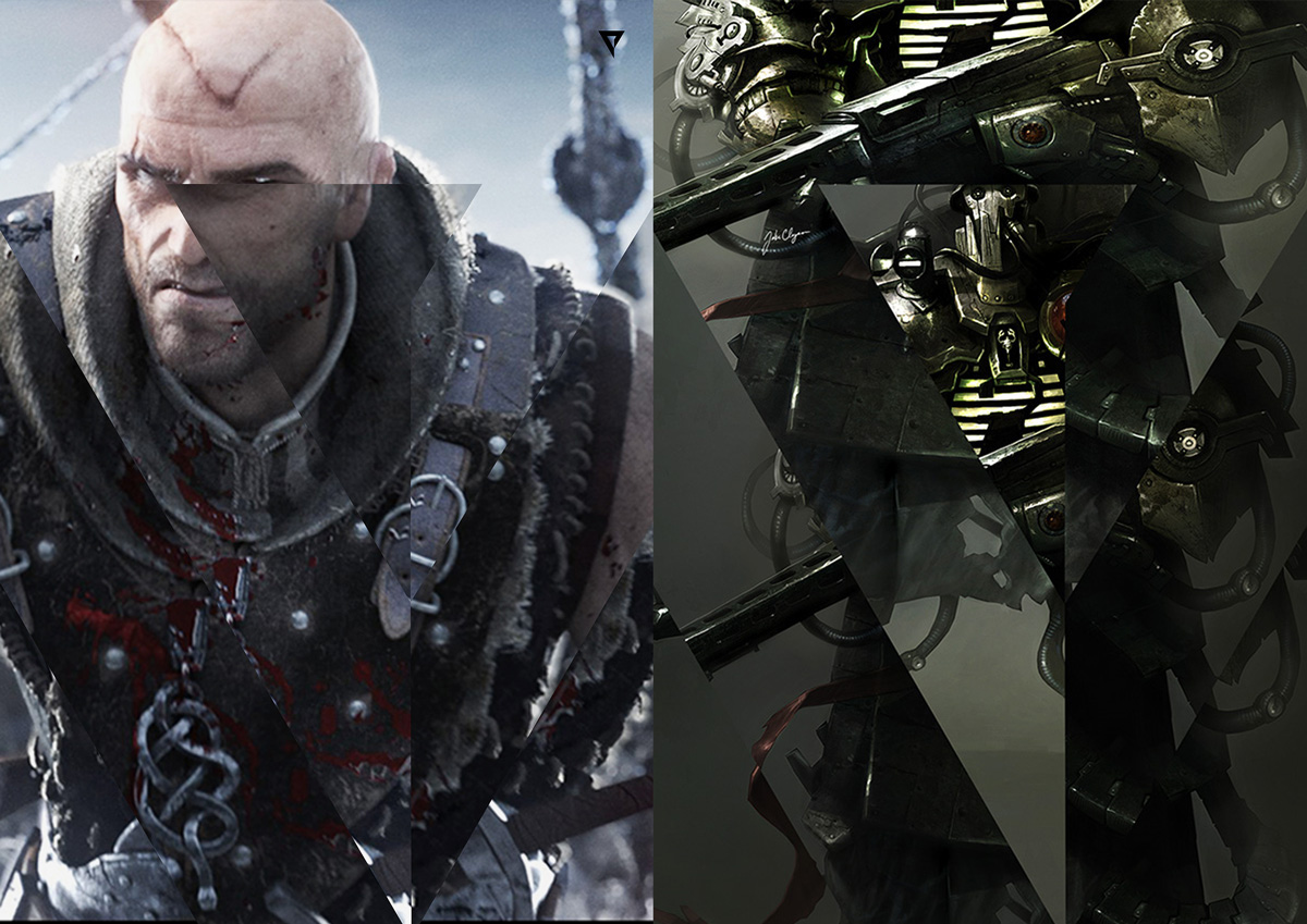
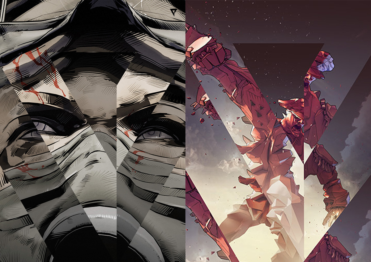
The logo looks great in different color compositions. We use the same logo in different color combinations to identify individual sections of the studio.

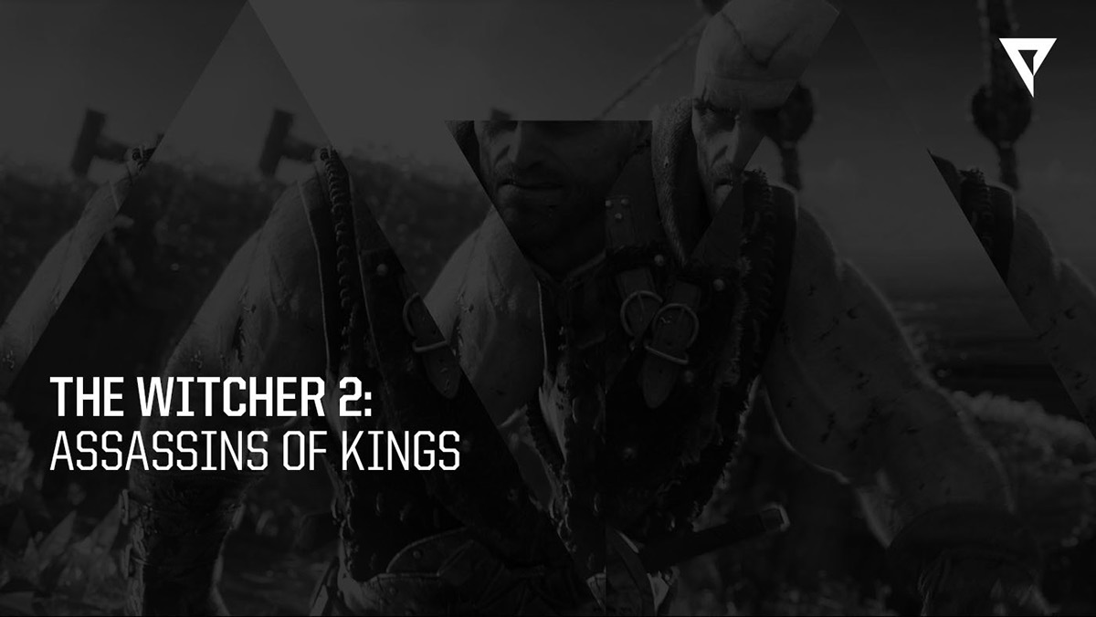
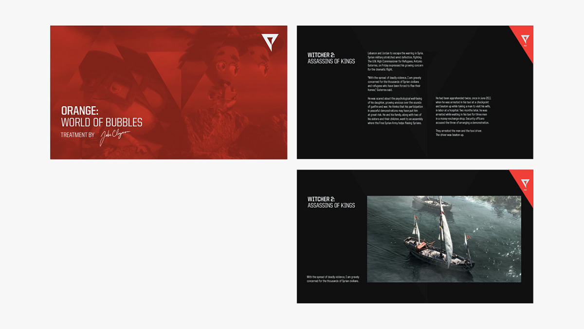
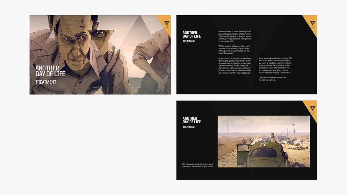
Director's treatments


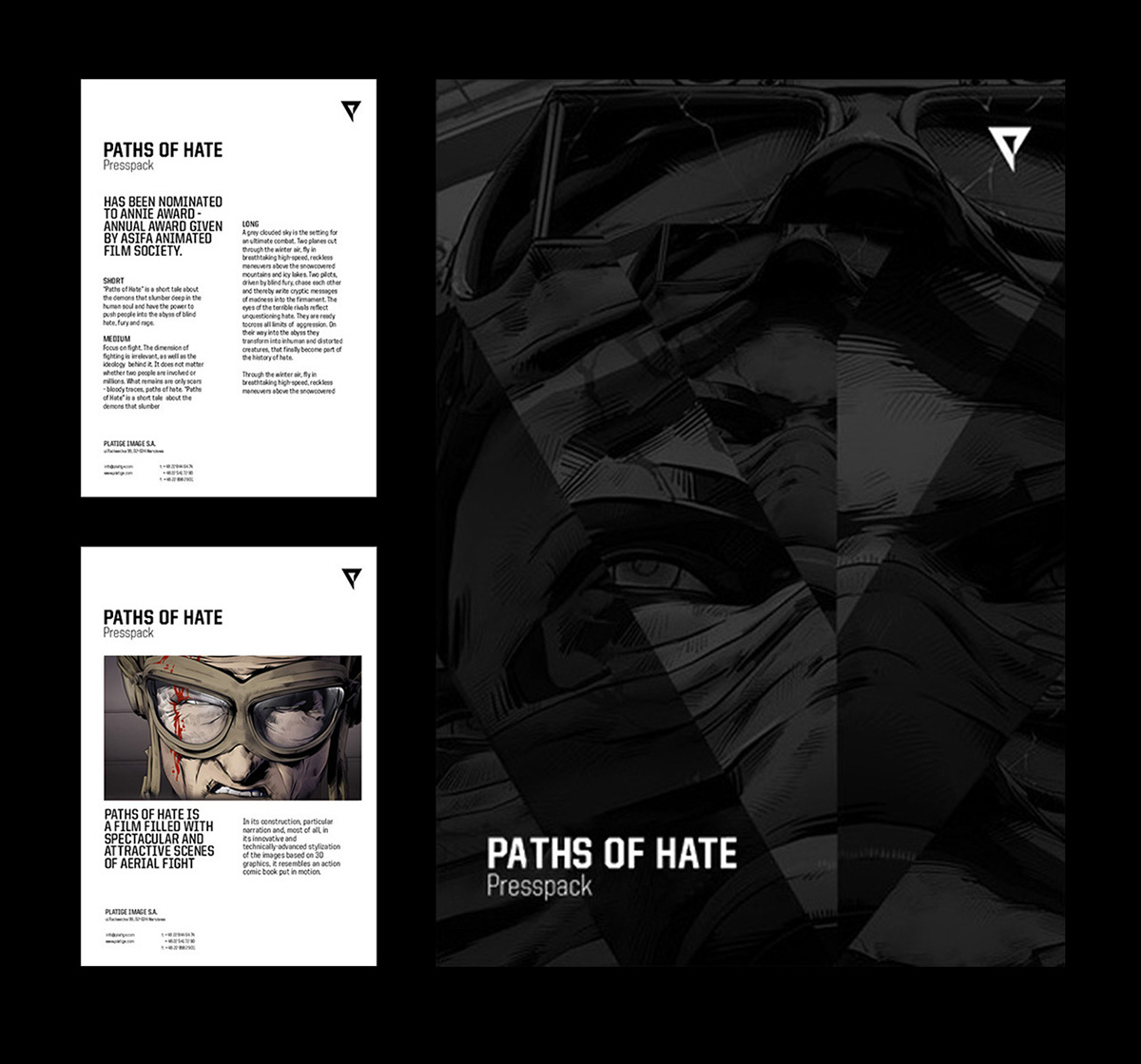
Press release template
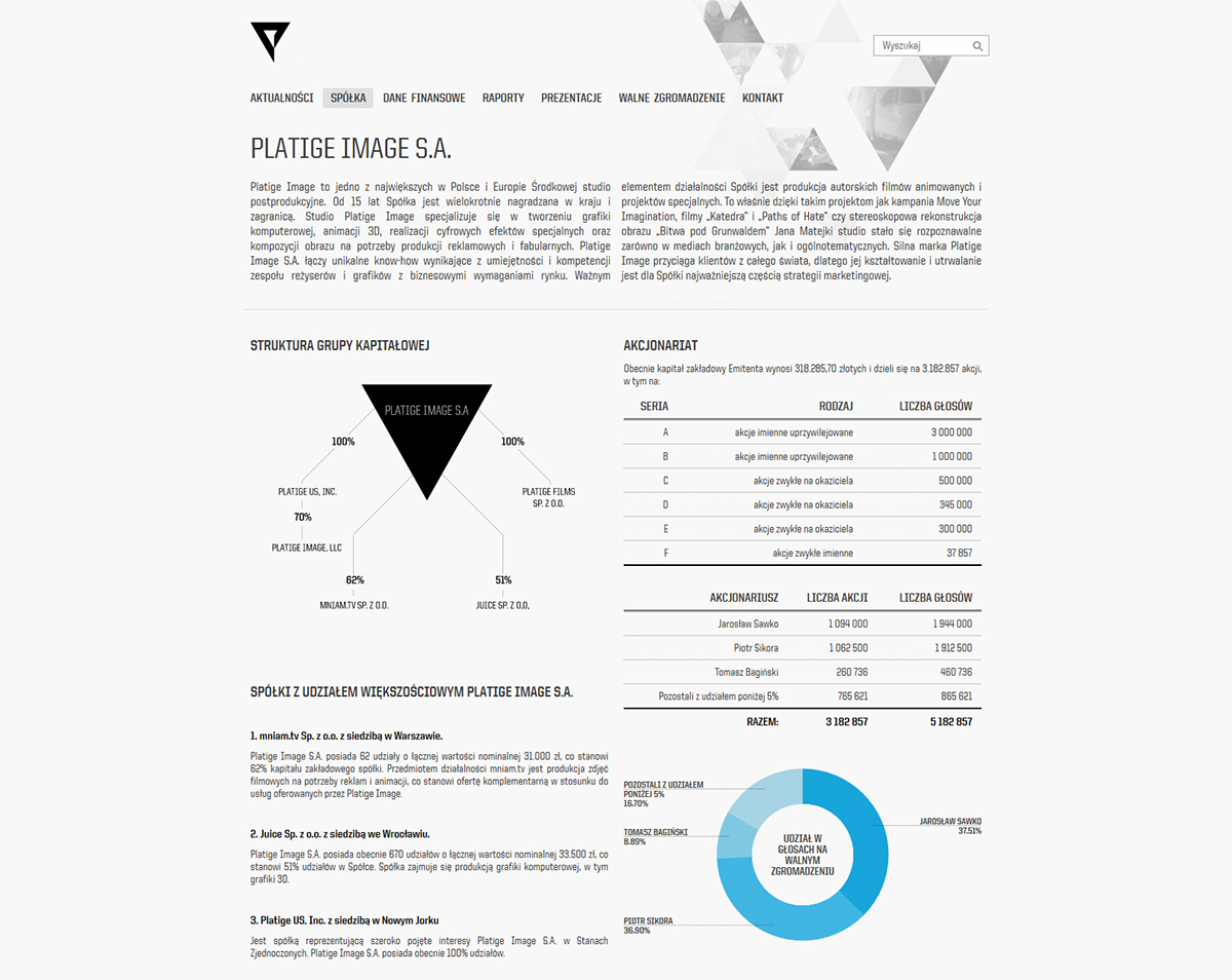
Stock exchange website

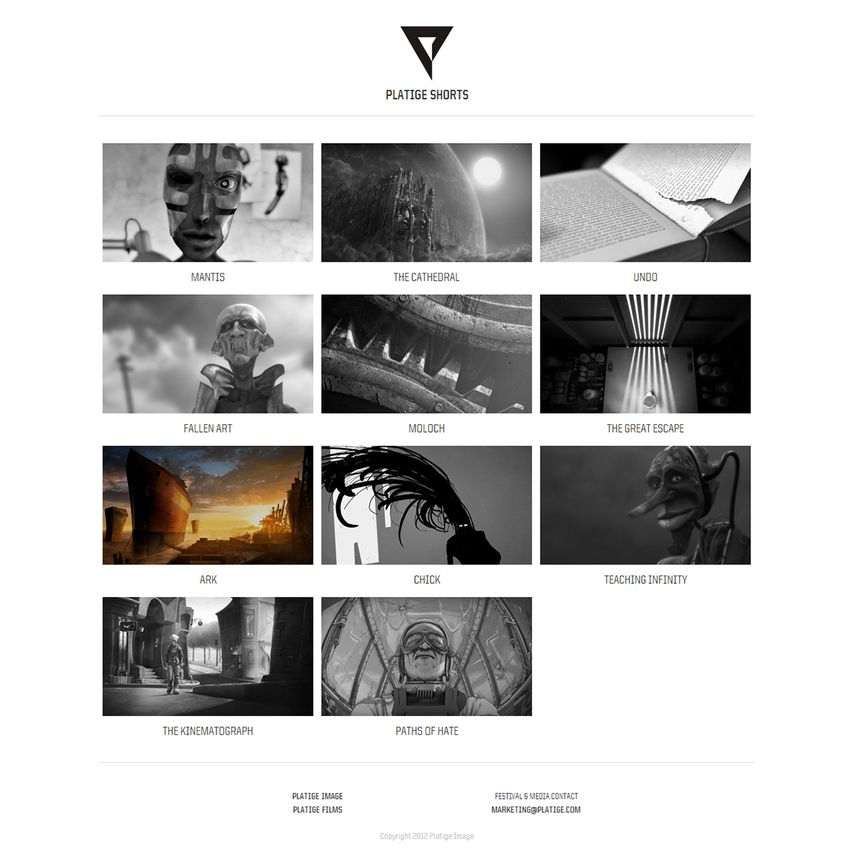
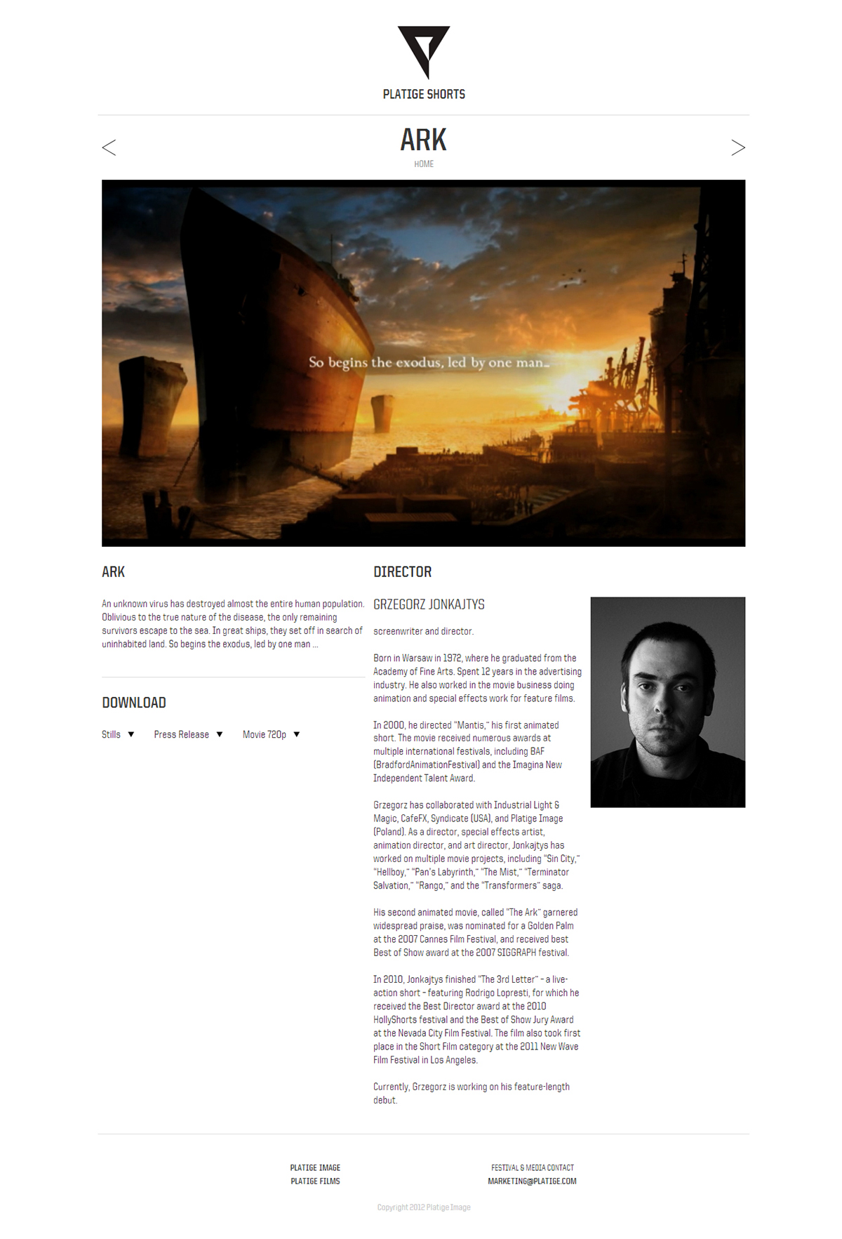
Platige shorts
In the last 15 years, the Platige team has created a sizable collection of shorts. Until now, each short had its own website. From now on, they will be collected in a single location, to be viewed in their entirety or downloaded.
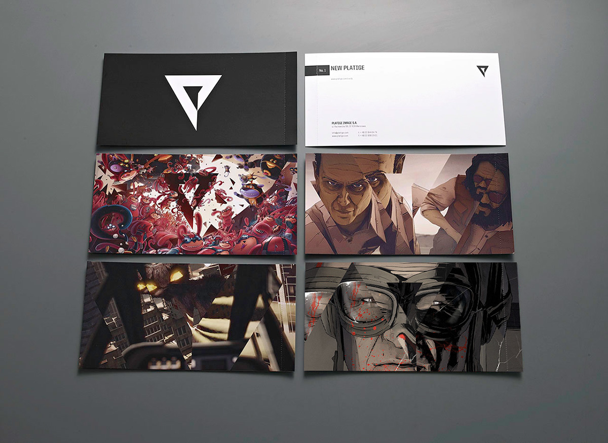
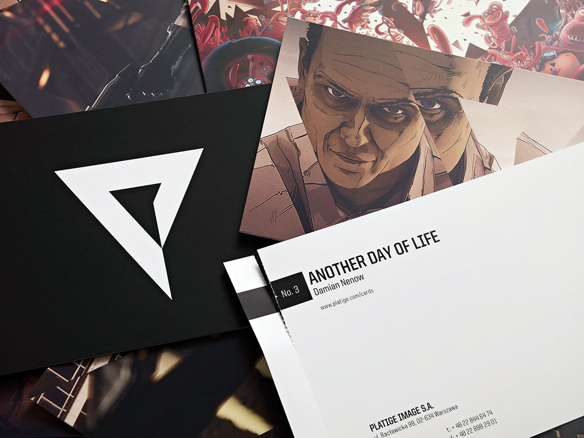
Gift cards set
We want to pay homage to the time-honored tradition of sending greeting cards. We know how nice it feels to receive such a card. That’s why we decided to create a collection of cards featuring shots from our productions we feel especially proud of. Each card will be issued in a limited edition of 250 numbered copies. When we finish working on a new project, a new card will be added to the collection. You can track the appearance of new cards on this website.
From time to time we will surprise our clients with a card from Platige in the mailbox.