Mama Chlo's Kitchen - Logo & Business Card Design
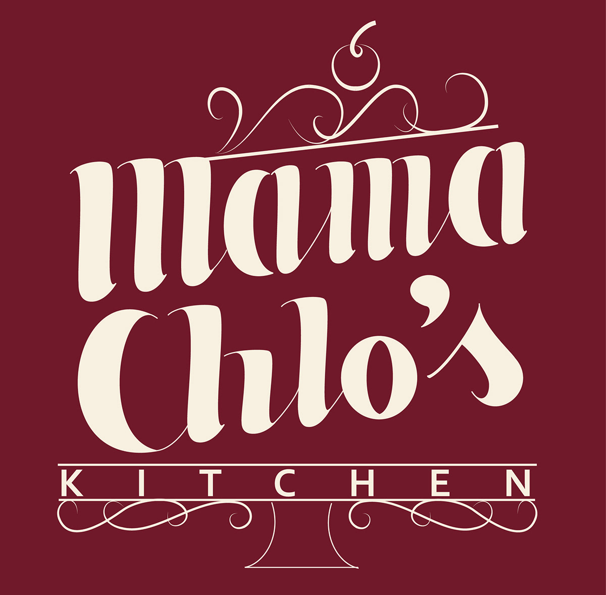
Mama Chlo's Kitchen is a local start-up business specializing in delicious home baked goods. The values behind Mama Chlo's is that all bakes are home made and made to order - ensuring ingredients are fresh!
Needing a strong branding image to really make an impact, Mama Chlo's also wanted to be able to capture the homely feel of home baking and good quality food, so we decided on a vintage look inspired by the 1940's-1950's to evoke feelings of nostalgia.
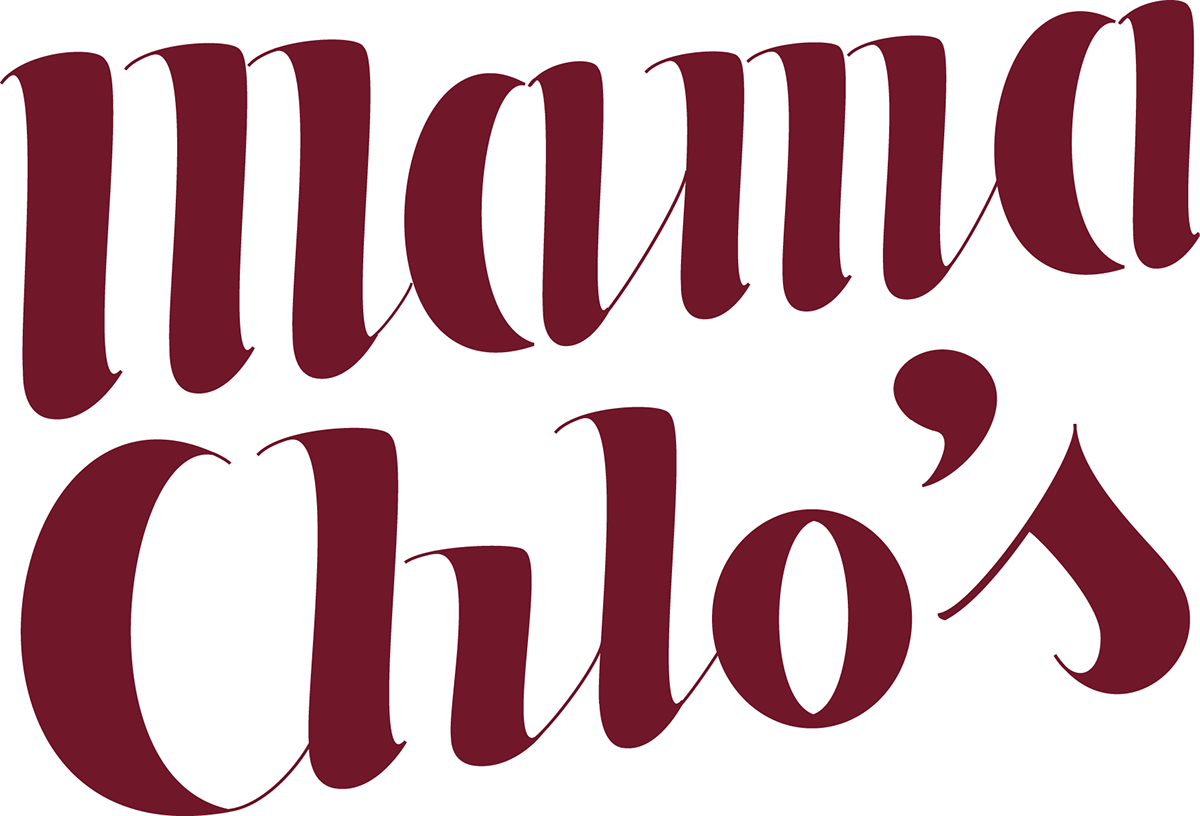
Taking inspiration from retro typography found on old packaging and the likes of branding painted on the side of buildings back in these times, I created a hand-drawn logotype for Mama Chlo's, and paired it with Stony Island NF font, to really give it that vintage/retro feel.
Needing a strong branding image to really make an impact, Mama Chlo's also wanted to be able to capture the homely feel of home baking and good quality food, so we decided on a vintage look inspired by the 1940's-1950's to evoke feelings of nostalgia.
Taking inspiration from retro typography found on old packaging and the likes of branding painted on the side of buildings back in these times, I created a hand-drawn logotype for Mama Chlo's, and paired it with Stony Island NF font, to really give it that vintage/retro feel.
Bringing the cake stand into the overall logo design turned out to be a perfect fit for the essence we wanted to capture!
The colour scheme - strawberries and cream, of course! With a cherry on top!


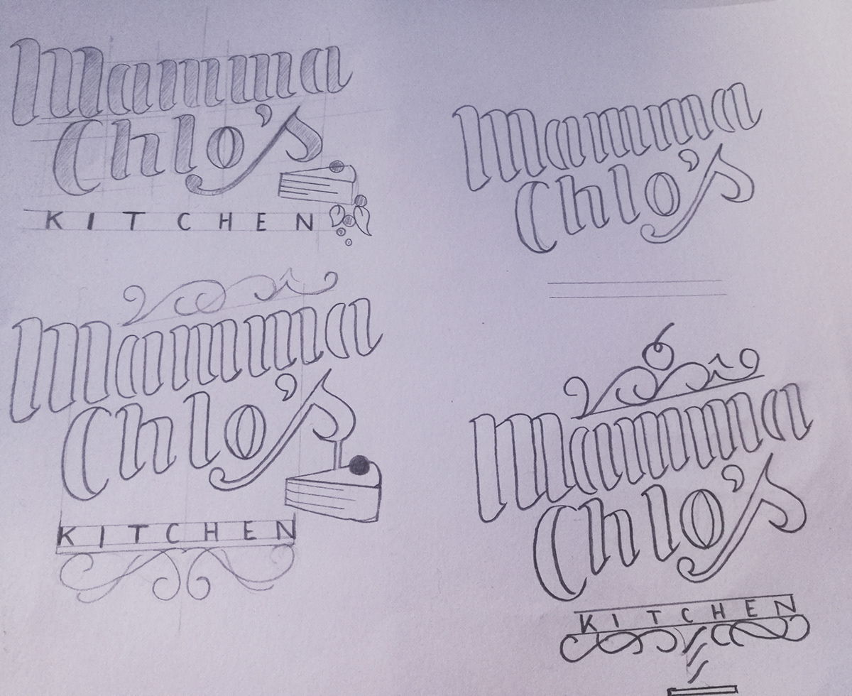
The development process allowed me to really experiment with the typography design - designing a chunky, custom hand drawn font and vectorising on illustrator allowed me to create something truly bespoke.
The style changed slightly and an "M" was dropped when I realized Mama Chlo only uses one in her title!
The style changed slightly and an "M" was dropped when I realized Mama Chlo only uses one in her title!