Using found materials, I constructed a range of letterforms based on the typeface Futura. I wanted my fabrications to resemble the characteristics of Futura, whilst creating another dimension of texture, light
and shade. I created only a few letters of the alphabet in order to work quickly and establish successful results that clearly demonstrate examples of my experimental typeface. In contrast to the geometric, sans serif Futura I also experimented with a more traditional, light serif, Garamond. However, I found that most of my chosen mediums were more effective when using Futura Medium and Extra Bold Condensed as templates.
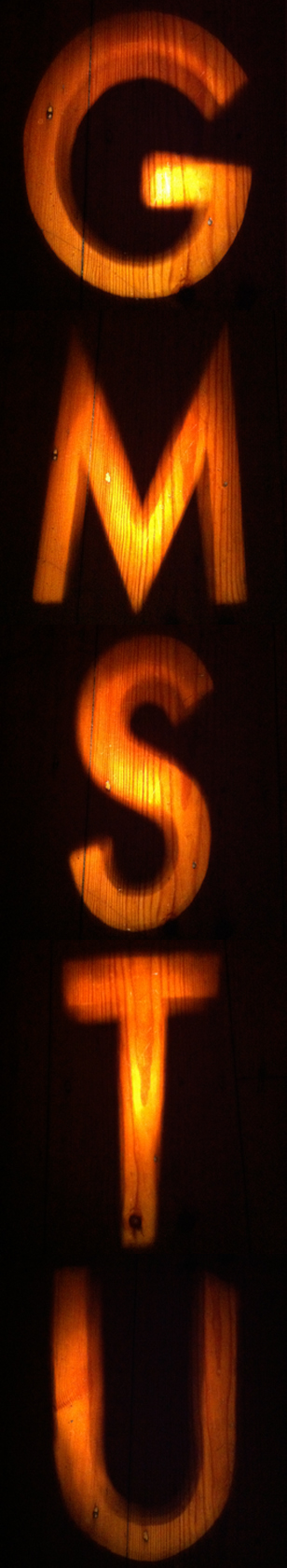
Wood Type

Carpet Type

Sieve Type

Corner Type

Bubble Type

Herb Type

Chilli Type

Turmeric Type


