The National Gallery of Singapore was in search for a brand identity for their November to March 2018 exhibition, Masterpieces Between Asia & Europe. Aquí Design contested for their idea
of the visual identity.
of the visual identity.
The exhibition pitch focusing on two different main points:
1. Colourful Impressions: Impressionism from the Musée d’Orsay Collection
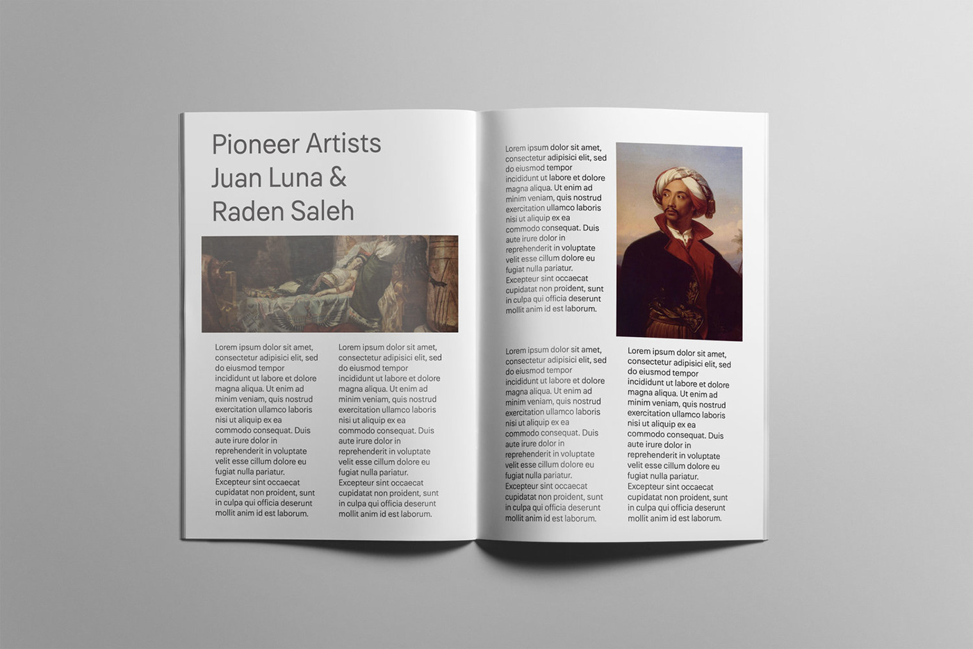
2. Raden Saleh and Juan Luna: Pioneer Artists
Both Saleh and Luna are considered touchstones in the development of modern art in Indonesia and the Philippines respectively. Their achievements as painters have been read as feats of the colonised in the land of the colonisers.
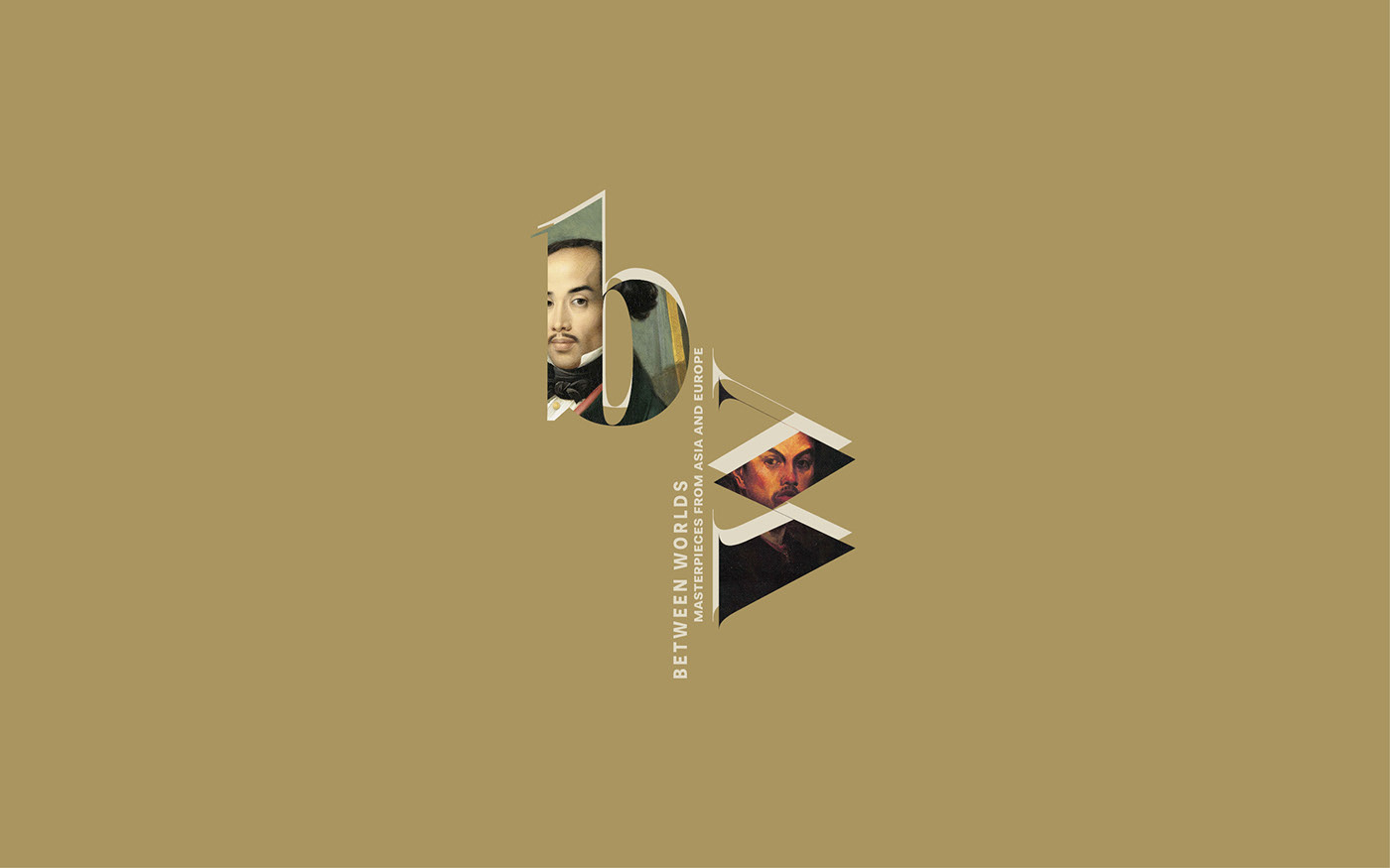
Focusing on the "B" and the "W" initials of the overarching title. Grumpy is a heavy, high-contrast serif typeface. It relates with 18th century font Caslon and provides a sophisticated flare
(used for the initials).
In association with Grumpy, we proposed the realist font Paul from the modernist family
Grotesk released in 1896 (used for the full title). It relates to the innovative approach of
the overarching theme.
(used for the initials).
In association with Grumpy, we proposed the realist font Paul from the modernist family
Grotesk released in 1896 (used for the full title). It relates to the innovative approach of
the overarching theme.
The elements are placed following different orientations, symbolising the movement
between the different worlds.
between the different worlds.
In collaboration with SNA Design.