


Color + Meaning. As color is crucial to the success of design, I created a booklet describing the meanings of various colors and the impact they can have on a brand or design.

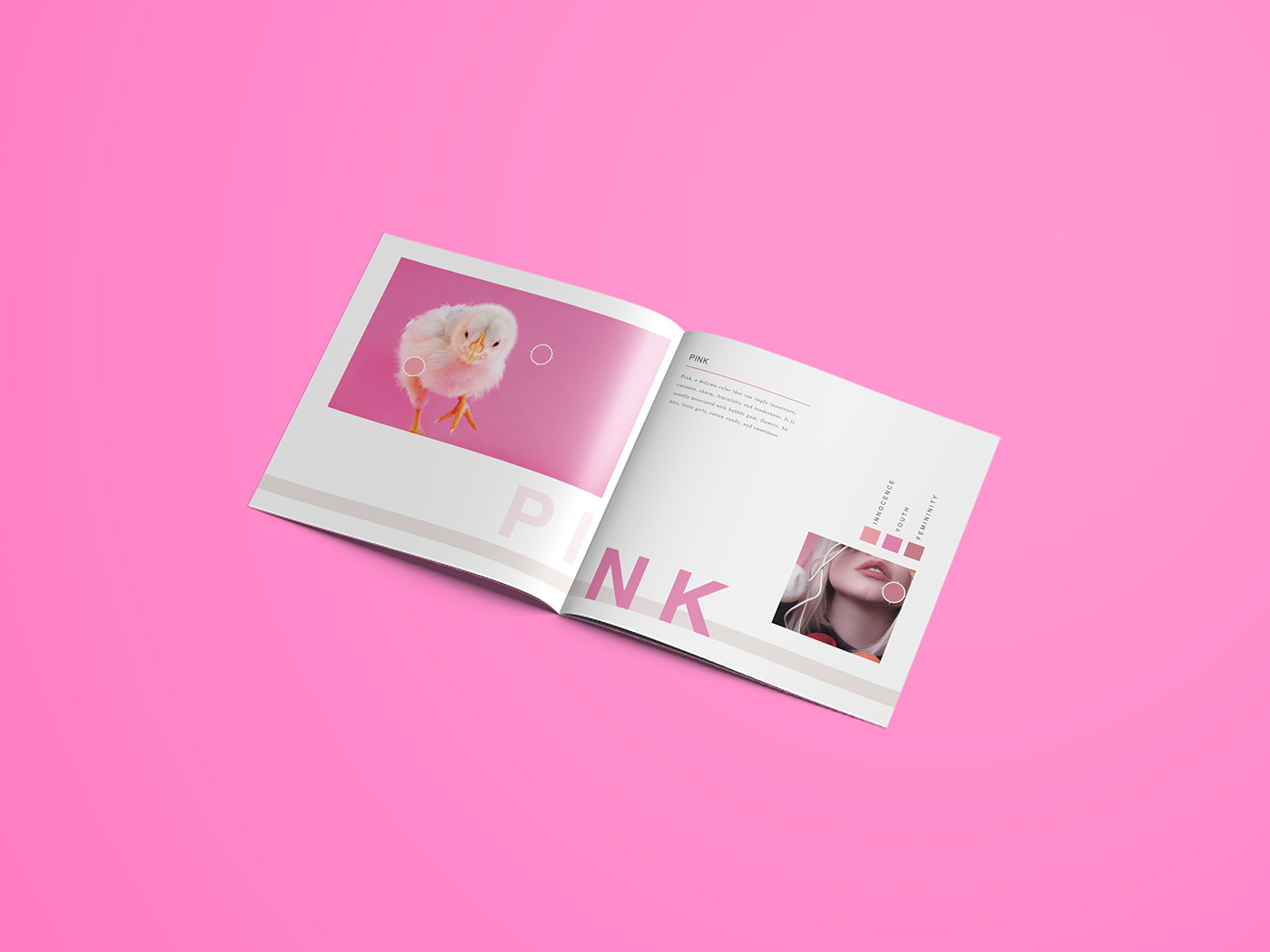
Pink: a delicate color that can imply innocence, cuteness, charm, femininity and tenderness. It is usually associated with bubble gum, flowers, babies, little girls, cotton candy, and sweetness.

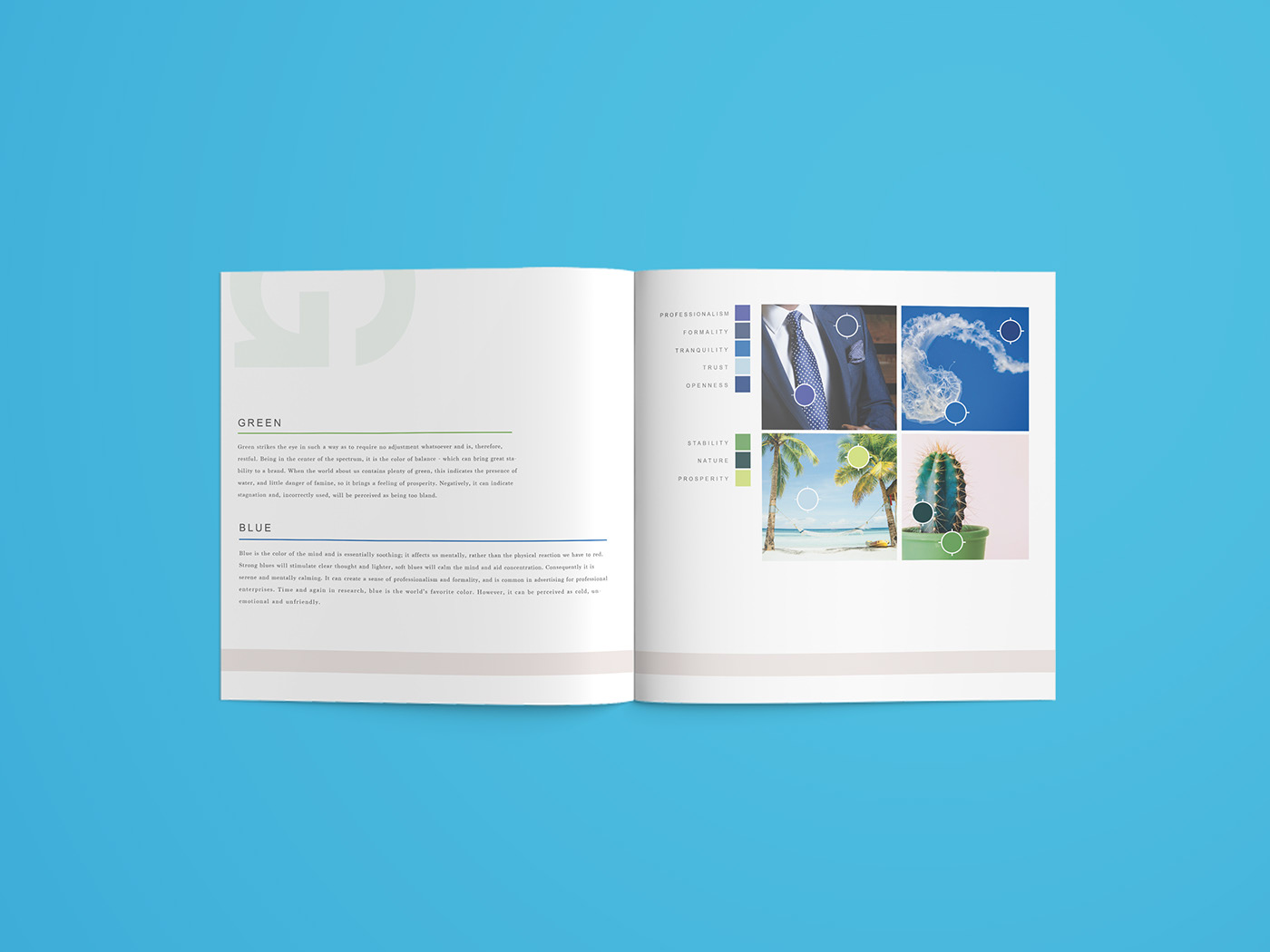
Green: strikes the eye in such a way as to require no adjustment whatsoever and is, therefore, restful. Being in the center of the spectrum, it is the color of balance - which can bring great stability to a brand. When the world about us contains plenty of green, this indicates the presence of water, and little danger of famine, so it brings a feeling of prosperity. Negatively, it can indicate stagnation and, if incorrectly use, will be perceived as being too bland.
Blue: the color of the mind and is essentially soothing. it affects us mentally, rather than the physical reaction we have to red. Strong blues will stimulate clear thought and lighter, soft blues will calm the mind and aid concentration. Consequently it is serene and mentally calming. It can create a sense of professionalism and formality, and is common in advertising for professional enterprises. Time and time again, blue is the world's favorite color. However, it can be seen as cold, unemotional, and unfriendly.
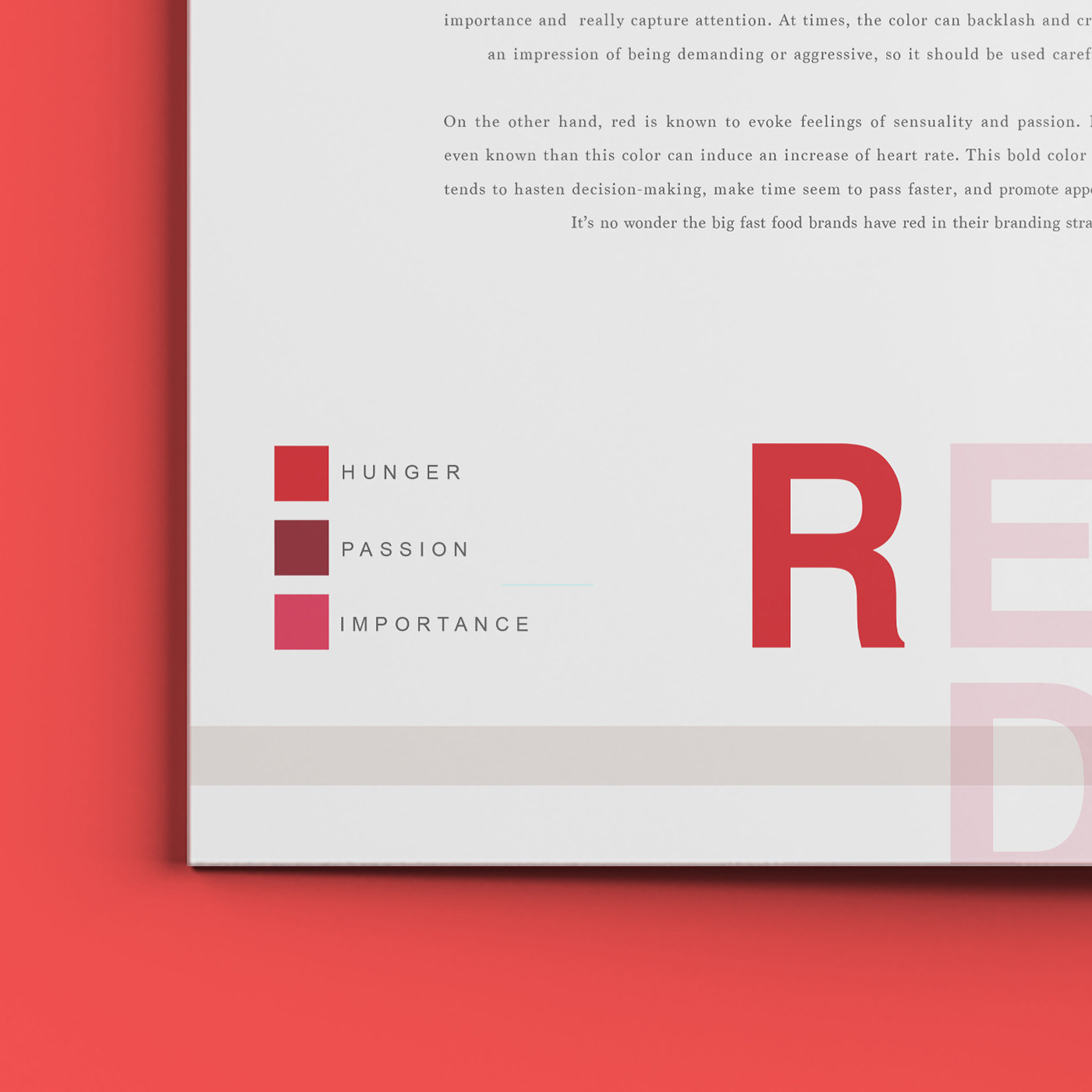
Red: Very high visibility which is why stop signs, stoplights, and fire equipment are usually painted red. It is a color found in many national flags. It can signify importance and really capture attention. At times, the color can backlash and create an impression of being demanding or aggressive, so it should be used carefully. On the other hand, red is known to evoke feelings of sensuality and passion. It is even know that this color can induce an increase of heart rate. This bold color tends to hasten decision-making, make time seem to pass faster, and promote appetite. It's no wonder that big fast food brands have red in their branding strategy.
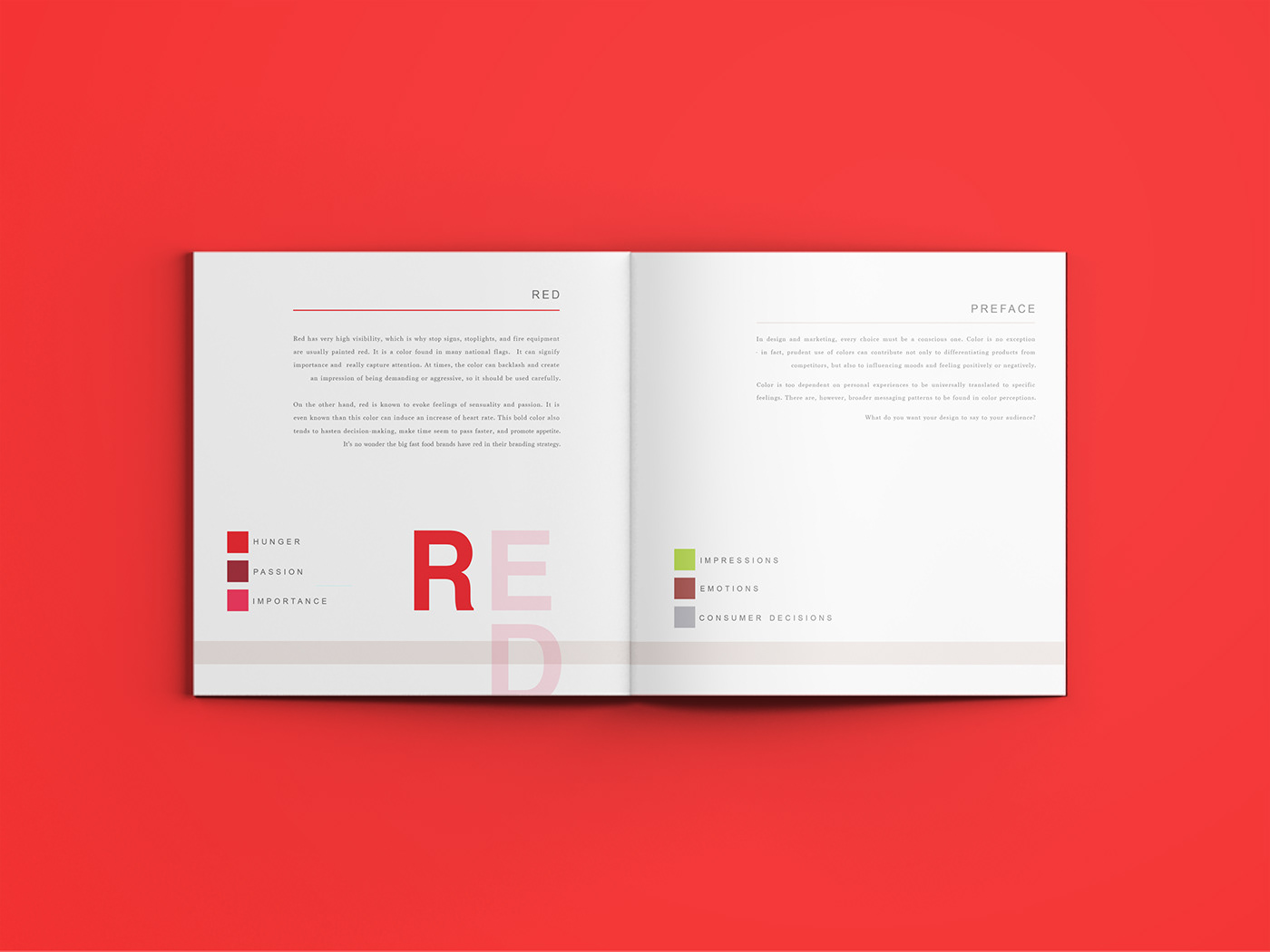
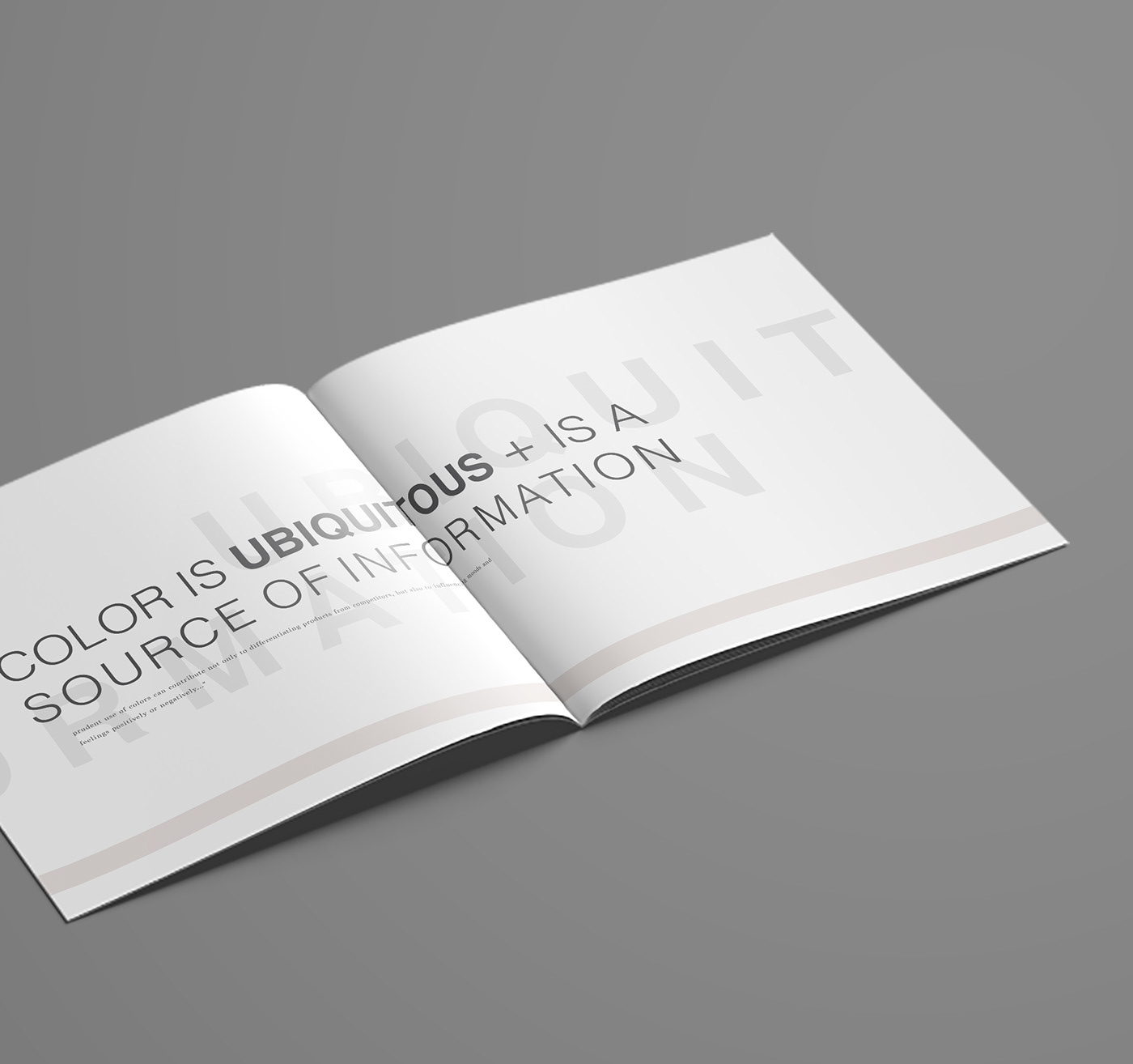
"Color is ubiquitous and is a source of information. Prudent use of colors can contribute not only to differentiating products from competitors, but also to influencing moods and feelings positively and negatively..."
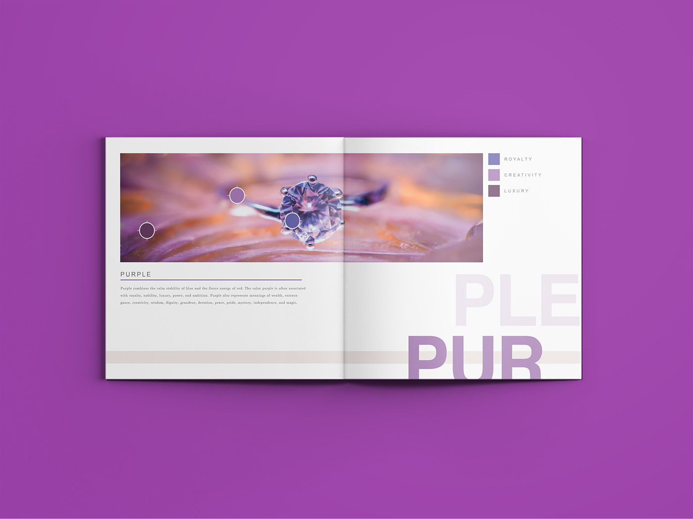
Purple: combines the calm stability of blue and the fierce energy of red. The color purple is often associated with royalty, nobility, luxury, power, and ambition. Purple also represents meanings of wealth, extravagance, creativity, wisdom, dignity, grandeur, devotion, peace, pride, mystery, independence, and magic.
Yellow: the color yellow promotes warmth, cheerfulness, increased mental activity, and increased muscle energy. The color yellow helps activate the memory, encourage communication, enhance vision, build confidence, and stimulate the nervous system. Bright yellow is an attention-getting color, and when used in combination with black, it creates great contrast that can be read and seen from long distances. This is why school buses, taxi cabs, and traffic signs use yellow.

Thanks for checking out my project. I appreciate it! If you did too, hit the button below!


