Based in Pittsburgh, PA, I-DOhC is a national, family-based medicine practice, devoted to the glory of God, that provides premier occupational healthcare solutions and consultations to clients. I-DOhC mission is to assess, meet, and exceed the occupational medicine and medical director services requested by clients.
Beyond the stellar health solutions, I-DOhC specializes in offering these services through a 24/7, direct physician on-call service.
When we began the rebranding process, they knew from the start they wanted a professional and classic brand that reflected the safety industry they serve.

The master logo is a combination of the I-DOhC wordmark and a custom symbol, to achieve a pleasing, balanced look.
In the center of the symbol is a staff with a snake set around it, designed not simply to call to the mind the caduceus or asklepian, symbols common in the field of medicine, but to expand upon this and reflect the Catholic roots of the practice. In Numbers 21:9, "Moses made a bronze serpent and set it on the standard; and it came about, that if a serpent bit any man, when he looked to the bronzeserpent, he lived."
With the two outer rings and the organizations full title surrounding the symbol, the logo conveys the interconnectivity of I-DOhC’s mission of providing premier occupational medicine solutions to clients, all while allowing its members family time devoted to God and each other.

For color, I chose a palette of clean, navy tones, while some hues of safety orange keep things fresh and reflect the safety industry clientele.


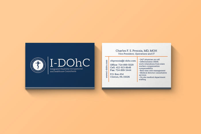
The business card front displays the classic logo, while the back, providing the essential contact information, also includes key services and details for potential clients to be aware of.

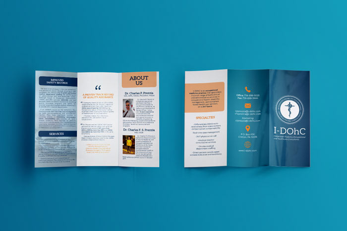
The company needed a brief brochure to summarize the organization, primary physicians, and offerings in a clear and efficient way. A standard trick-fold brochure was created to achieve this task, utilizing the new brand logo, colors and typefaces.

Finally, the original text-heavy and cluttered website was running on Joomla, which was limiting on both the design and administrative ends. The site was switched to WordPress and I created a custom site from scratch. The end result was a clean, streamlined site that reflects the brand's aesthetic and succinctly states the goal and mission of the practice.


