

Illustration Guidelines & Style Guides
Illustrations are an important visual component of any brand. They reflect a certain feel and mood, and give a better position to a company. Today, illustrations are everywhere: take Slack, Dropbox, Google, and many others, they communicate with users using illustrations in many places.
Illustration is meant to support certain information and describe the whole idea behind it while creating the right emotional background. Take any example, text information without illustration feels blank and inanimate, but information that has the right illustration with a brand mood feels totally different. In some cases, illustrations help to improve business metrics such as CTR.
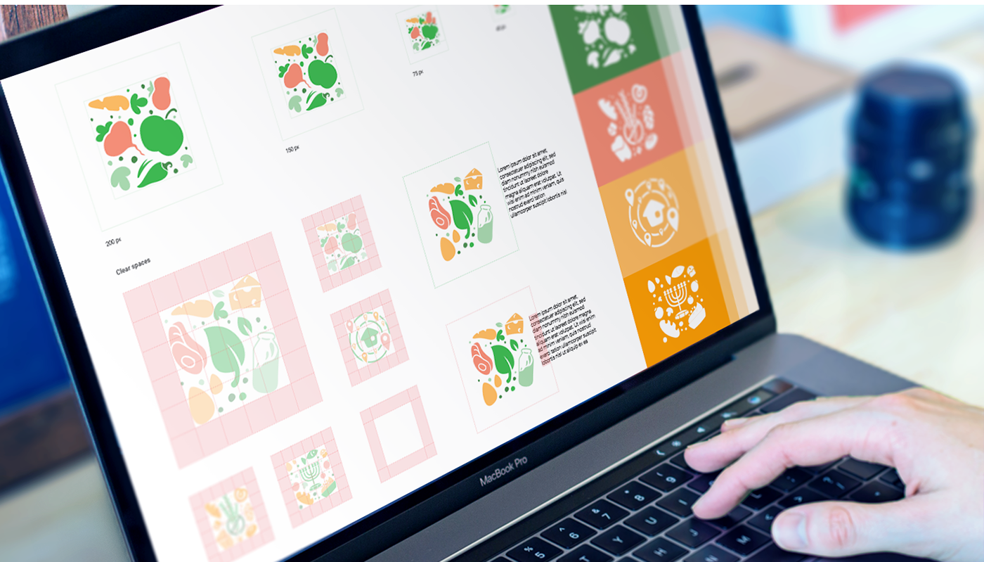
As you know, each illustration has its own style which is hard to reproduce sometimes. And what if you need to create 100 or 1000 illustrations for a product? Obviously, this takes many years of work if there is only one illustrator working on that. Also, this approach doesn't work well from a risk management perspective. What if this unicorn illustration disappears one day? In such cases having illustration guidelines is a must have thing for you. This helps to maintain overall brand consistency, increase the speed of work when adding new experts, and protect you from any staff-incidents.


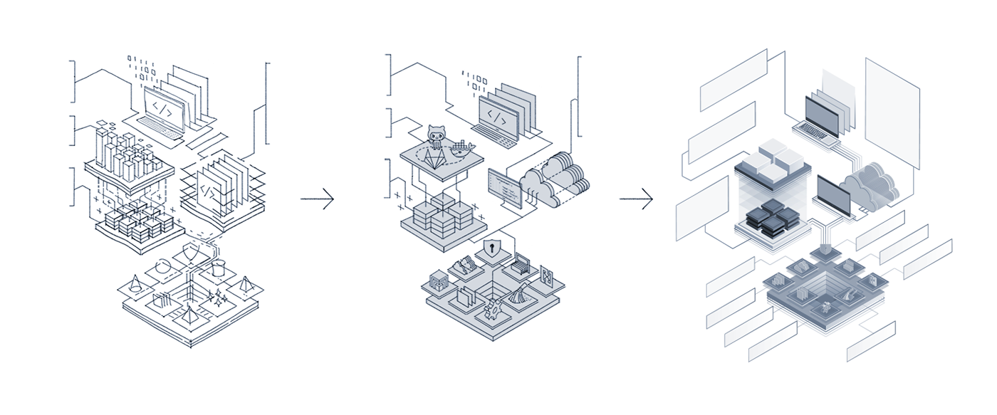
Reflecting complex information for Mobingi
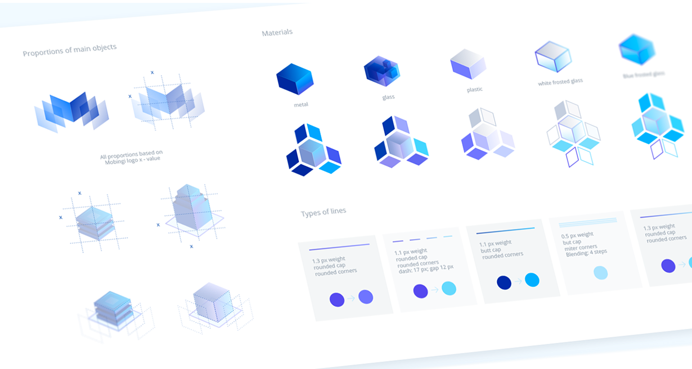
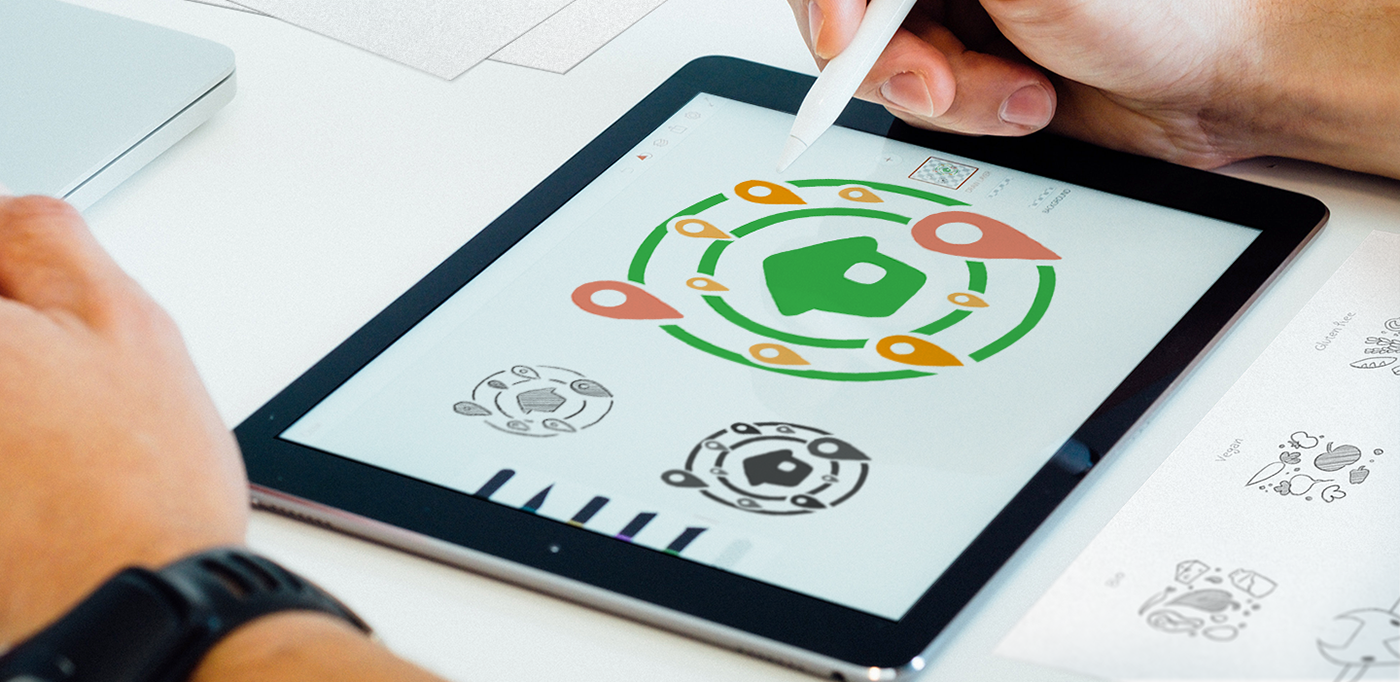
As you may know, sketches are a great thing to start with when talking about complex illustrations or any UI design task. At the beginning of work on any illustration, it's important to define the right metaphor for the information that should be reflected.
When we did the branding work for Mobingi.com, we started working on illustrations.
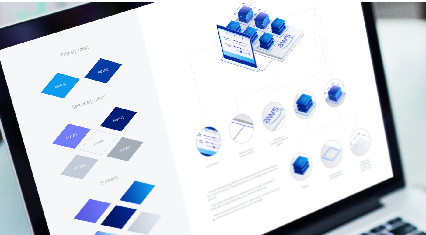
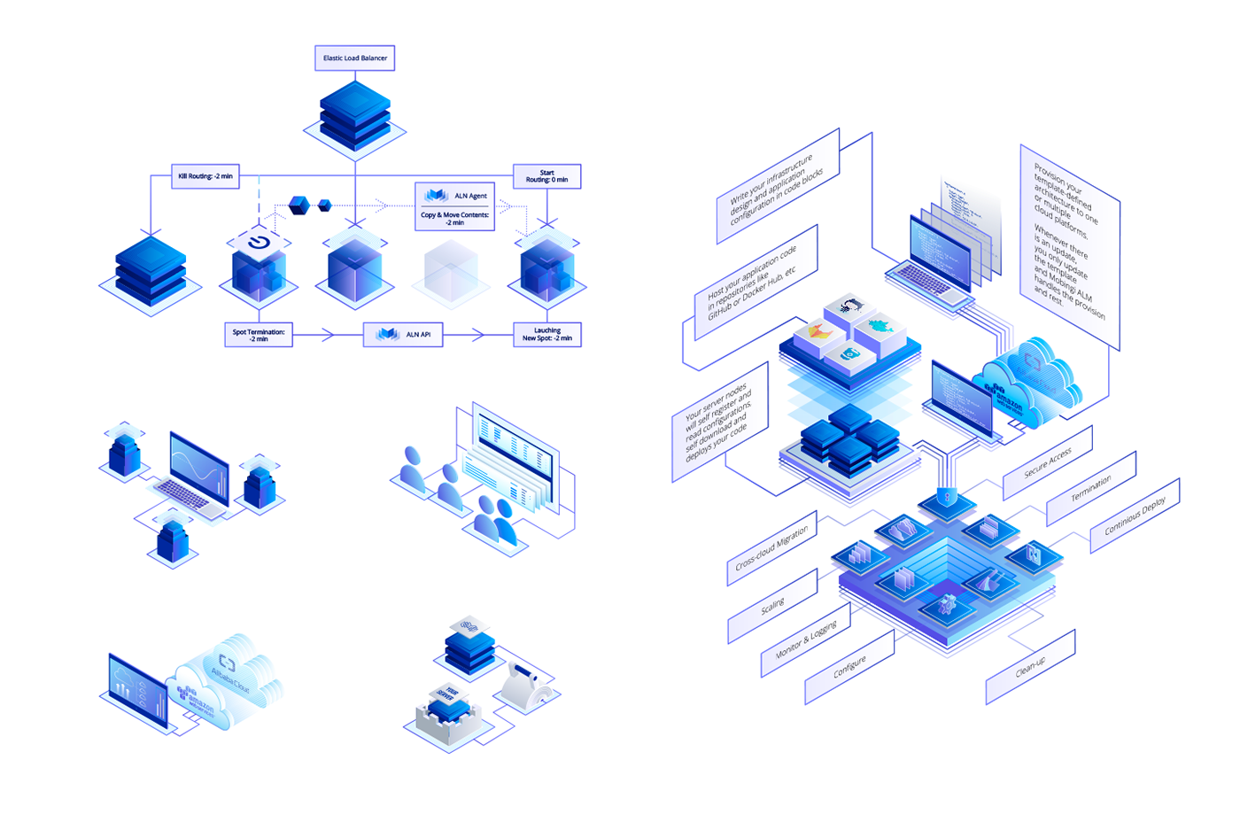
The information that we had to reflect was pretty complex and as usual, we started from mood boards and sketches. Considering the complexity of the information, an isometric approach gave us a good ability to design complex illustrations and reflect pretty much aspects of the information as you can see below.
At the end of the day, we had complex, technological illustrations, and a style guide, so their internal designers could design consistent illustrations whenever they're needed.

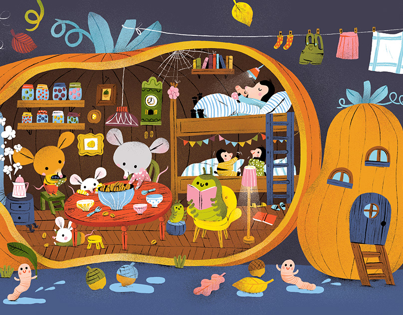
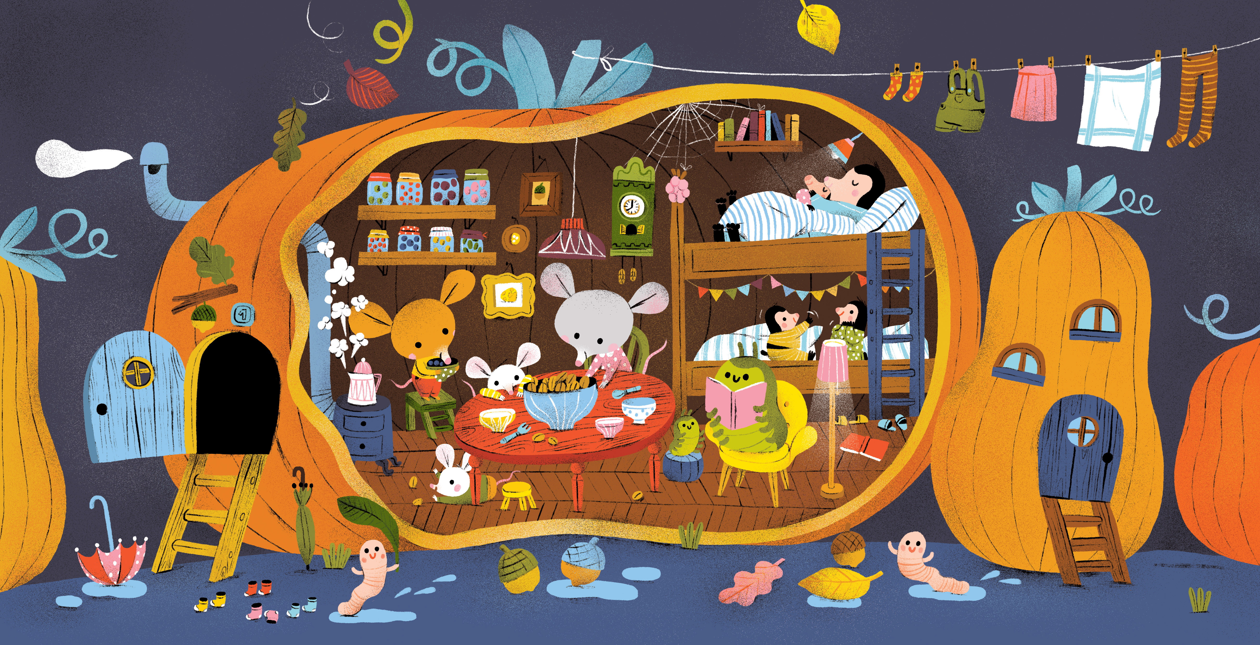
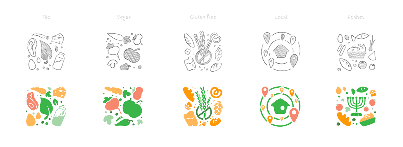
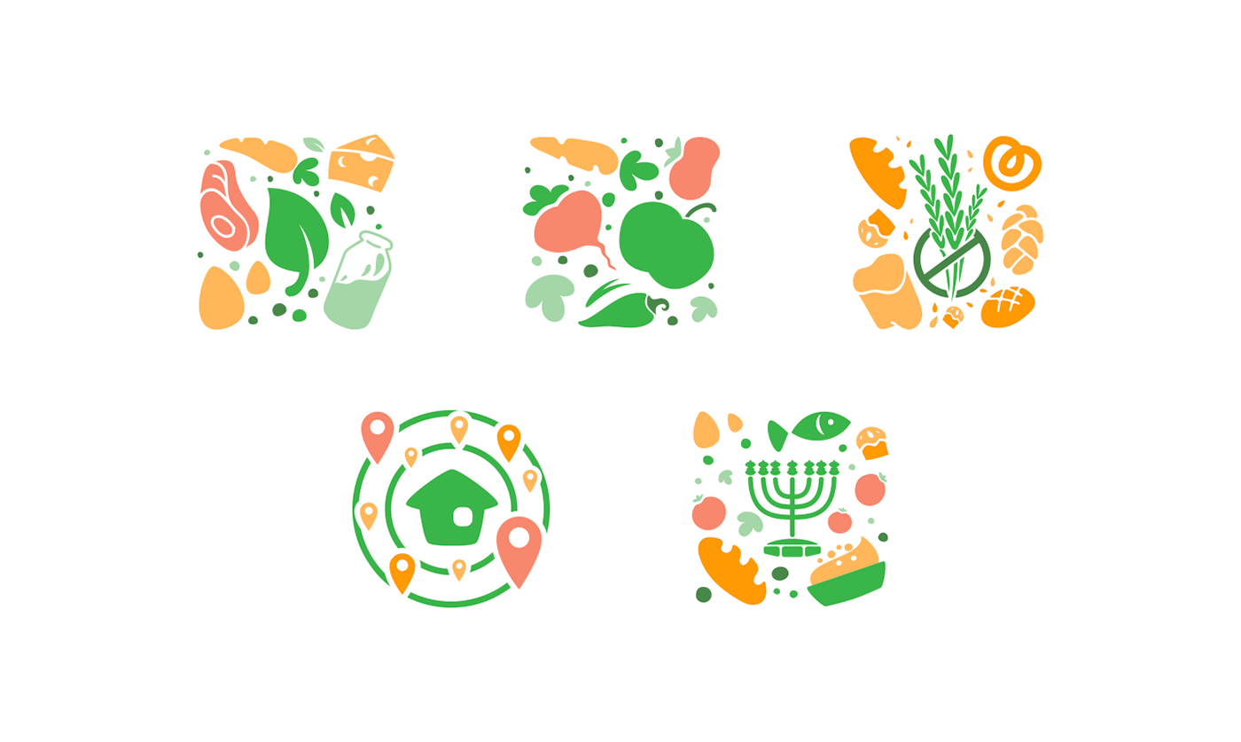
Fun illustrations for Nelio
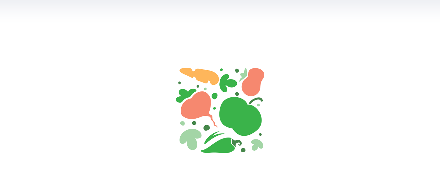
As you might know from another case, Nelio is a France-based digital startup with a mission to deliver fresh and delicious products from local stores.
Illustrations for Nelio had to be different than those described above. As soon as we finalized the branding part, we started working on illustrations. Considering that Nelio is a locally produced food delivery service, illustrations had to look and feel organic, natural, and reflect craftsmanship.
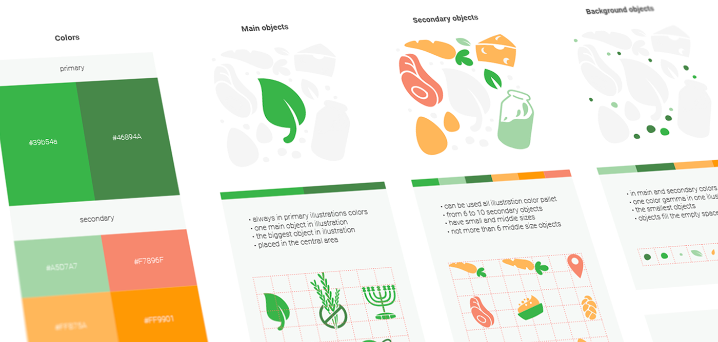
We tested several style options and decided to lean towards a more fun, frontal, and flat approach. These illustrations also have guidelines and could be reproduced later.


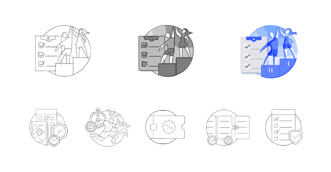
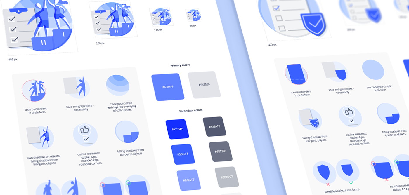
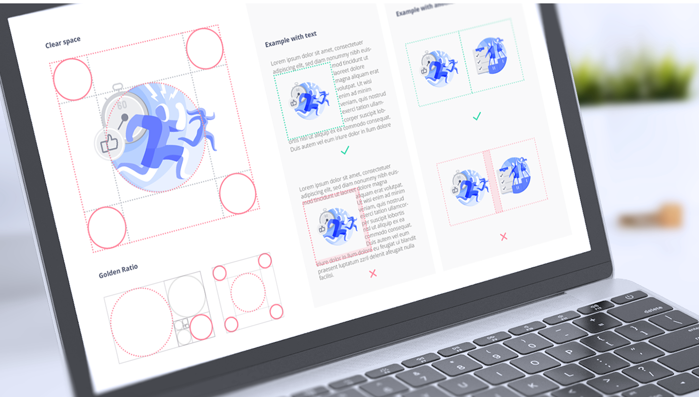
Supportive in-app illustrations
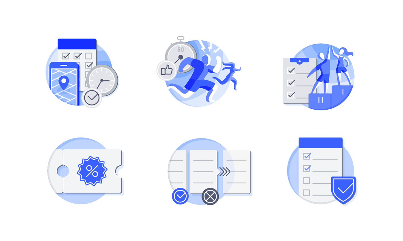
Illustrations for the location-based fitness app Vyta had another style.
Curvy lines, waves, rounded corners and objects, incorporated into the circle that worked as a base, were a good combination for in-app support. As soon as Vyta approved them, we also animated them, so that way it would evoke an even better emotional effect than a static illustration.
Color palettes and other details were based on the branding, so everything looks consistent and works well as a whole.


Thanks for viewing!